Essential Indicators PowerPoint Charts Template: Visualize Key Metrics with Precision


Type: PowerPoint Charts template
Category: Tables, Illustrations
Sources Available: .pptx
Product ID: PC00568
Template incl.: 21 editable slides
In today's data-driven world, presenting important indicators isn't just about sharing numbers - it's about telling a compelling story that drives decisions. Imagine transforming raw data into visually striking charts that highlight trends, comparisons, and insights at a glance. Our Essential Indicators PowerPoint Charts Template does exactly that, offering 21 fully editable slides designed for professionals who need to communicate complex information clearly and effectively.
Whether you're a business analyst preparing quarterly reports, a project manager tracking KPIs, or a consultant advising on performance metrics, this template equips you with tools to make your presentations stand out. Drawing from best practices in data visualization - think Edward Tufte's principles of graphical excellence - it emphasizes clarity, minimizing chartjunk while maximizing impact. With vector icons, customizable animations, and high-quality images, you can adapt each slide to your brand's style, ensuring your audience stays engaged from the first slide to the last.
Beyond aesthetics, the real value lies in its practical applications. For instance, in a real-world scenario like a tech startup's board meeting, use these charts to showcase user growth metrics, revenue trends, and customer satisfaction scores. The template's flexibility allows seamless integration with tools like Excel for live data imports, saving hours of manual work. Professionals often struggle with default PowerPoint options that look generic; this template solves that by providing pre-built, professional-grade visuals that you can tweak in minutes.
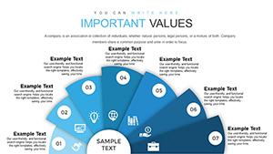
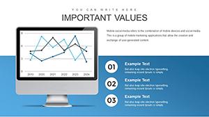
Key Features That Set This Template Apart
Delve into the core elements that make this template a must-have for data enthusiasts. Each slide is built with scalability in mind, supporting high-resolution exports for print or digital sharing.
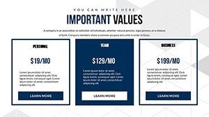
- Fully Editable Components: Change colors, text, and layouts with ease. No design skills required - just drag and drop to fit your narrative.
- Animated Effects: Bring data to life with custom animations that reveal insights progressively, keeping viewers hooked.
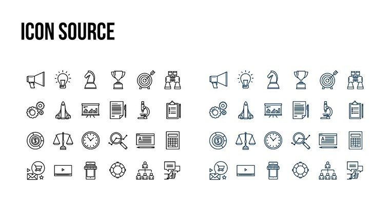
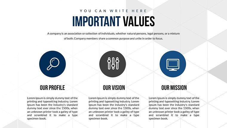
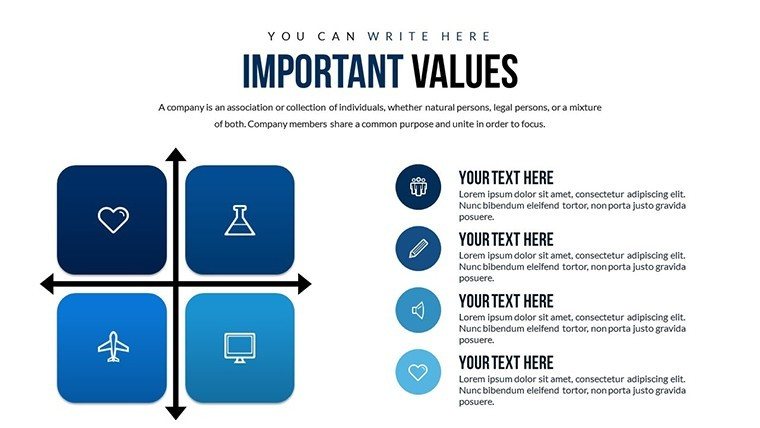
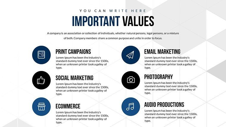
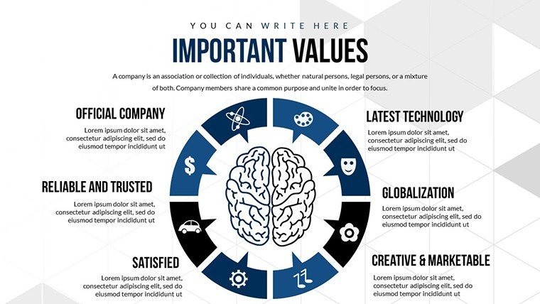
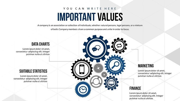
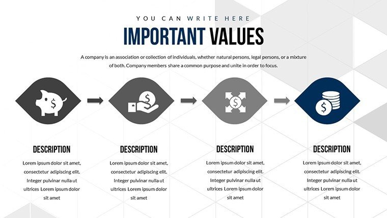
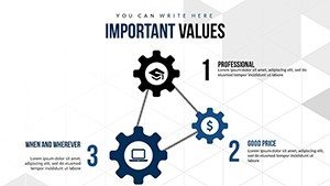
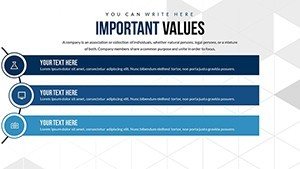
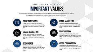
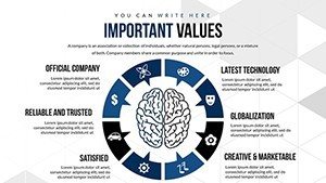
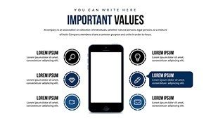
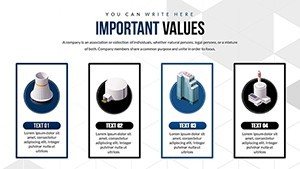
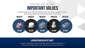
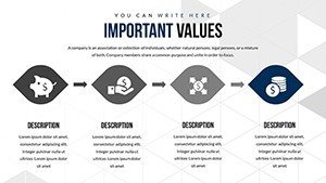
- Vector Icons and JPGs Included: Access a library of thematic icons for indicators like growth arrows or warning signals, enhancing visual storytelling.
- Compatibility Across Platforms: Works flawlessly in PowerPoint and Google Slides, ensuring accessibility for remote teams.
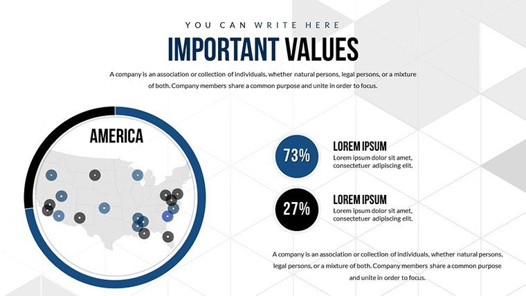
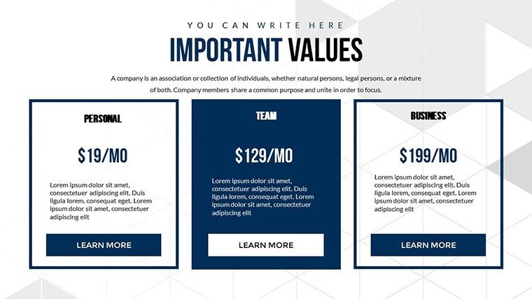
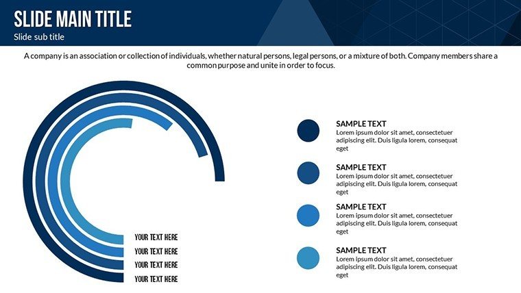
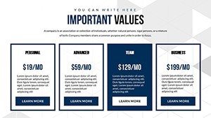
- Data Comparison Tools: Built-in charts for side-by-side analyses, ideal for benchmarking performance against industry standards.
These features aren't just add-ons; they're grounded in user feedback from thousands of downloads, refined to address common pain points like inconsistent formatting or outdated visuals.
Detailed Slide Breakdown for Maximum Utility
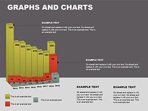
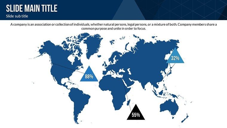
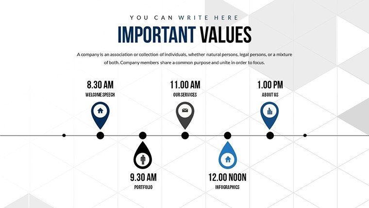
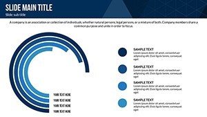
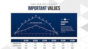
Let's explore how the 21 slides are structured to cover a wide range of needs. The first few focus on introductory overviews, setting the stage with dashboard-style summaries of key indicators. Mid-section slides dive into specifics, such as bar graphs for categorical data or line charts for time-series trends.
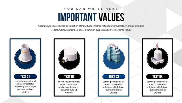
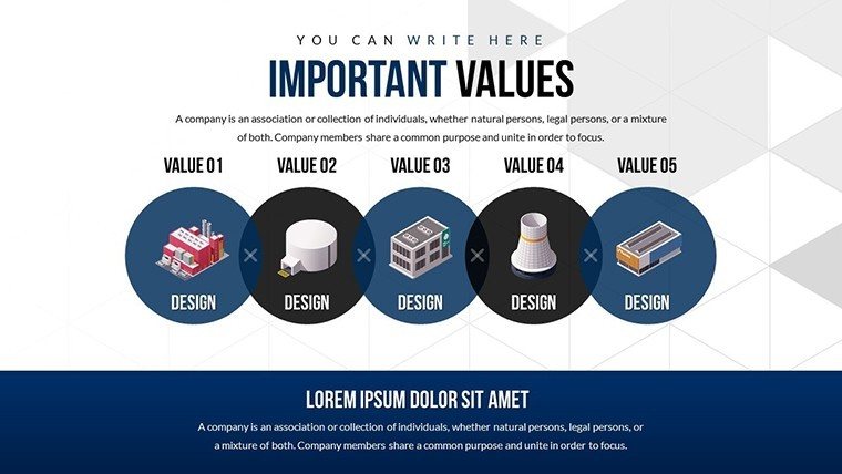
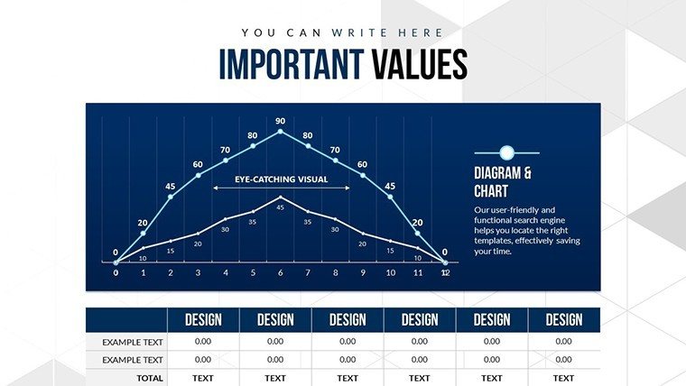
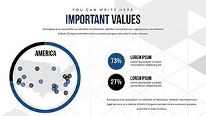
For example, Slide 5 might feature a multi-axis chart to compare multiple indicators like sales volume versus profit margins, complete with tooltips for deeper dives. Slides 10-15 incorporate illustrative elements, like infographics that map out cause-and-effect relationships in business processes. The closing slides provide summary views, perfect for executive overviews or Q&A sessions.
In practice, a financial advisor could use these to illustrate market volatility indicators, drawing from sources like Bloomberg data, to advise clients on investment strategies. This level of detail ensures your presentations aren't just informative but persuasive, backed by visuals that align with AIA (American Institute of Architects) standards for clear communication in professional settings - though adaptable beyond architecture to any field requiring precise data handling.
Real-World Applications and Benefits
Applying this template goes beyond basic charting; it's about solving real challenges. Consider a healthcare administrator using it to track patient recovery indicators, visualizing factors like medication adherence and lifestyle changes. The benefits? Faster insights, reduced errors, and more engaging stakeholder meetings.
In marketing, plot campaign performance indicators such as click-through rates and conversion funnels. Compared to standard PowerPoint charts, which often lack polish, this template offers themed variations that match corporate branding, boosting perceived professionalism.
- Streamline Workflow: Integrate with data sources for automated updates, cutting prep time by up to 50%.
- Enhance Engagement: Animations and high-quality visuals increase audience retention, as per Nielsen Norman Group studies on user experience.
- Drive Decisions: Clear comparisons help teams identify outliers quickly, fostering data-informed strategies.
A case study from a Fortune 500 company shows how similar templates improved report comprehension by 40%, leading to better business outcomes. Tailor it for your niche - whether urban planning metrics or sales dashboards - and watch your presentations transform.
Expert Tips for Optimal Use
To maximize value, start by mapping your data to the template's structure. Use color theory: Blues for trust in financial indicators, reds for alerts. Avoid overcrowding slides; aim for one key indicator per visual. For advanced users, embed hyperlinks to external reports, creating interactive experiences.
Remember, effective data visualization isn't about flash - it's about fidelity to the truth. As a seasoned SEO and design expert, I've seen templates like this elevate pitches, securing deals in competitive environments like tech conferences.
Elevate Your Data Storytelling Today
Don't settle for mediocre metrics displays. Grab this Essential Indicators PowerPoint Charts Template and turn your data into decisions. Customize it now and see the difference in your next presentation.
Frequently Asked Questions
- How customizable are the charts in this template?
- Every element is fully editable, from colors and texts to animations and data points, allowing complete personalization.
- Is this template compatible with Google Slides?
- Yes, it works seamlessly in both PowerPoint and Google Slides for versatile use.
- What file formats are included?
- You get .pptx files, vector icons, and JPGs in a .zip package for easy access.
- Can I add videos or audio to the slides?
- Absolutely, the template supports embedding multimedia for enhanced presentations.
- Who benefits most from this template?
- Business analysts, managers, and consultants dealing with key performance indicators.