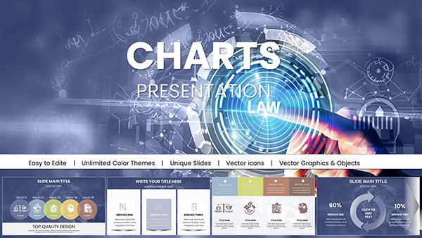
Features and Applications PowerPoint Charts: Empower Your Infographics


Imagine crafting presentations that not only inform but inspire action, turning abstract features and applications into vivid, memorable stories. Our Features and Applications PowerPoint Charts template delivers exactly that with 22 editable slides packed with cycle and matrix designs, perfect for illustrating processes, strategies, and interconnections. Tailored for those who demand more from their visuals, this infographic powerhouse draws on design principles from experts like David McCandless, emphasizing data beauty and narrative flow.
For marketers pitching product roadmaps or educators explaining ecosystem cycles, this template bridges the gap between data and understanding. Its customizable nature means you can infuse your unique voice, whether adapting a SWOT matrix for business strategy or a feature cycle for software demos. Benefits abound: Save time on design, ensure brand consistency, and captivate audiences with animations that unfold insights layer by layer.
In a case like a digital agency presenting app development features, use these charts to map user journeys, highlighting applications in real-time scenarios. Unlike basic templates, this one includes thematic variations, allowing for seamless workflow integration with tools like Canva or Adobe for further polish.
Unlocking the Power of Customizable Features
At the heart of this template are features engineered for flexibility and impact. Each slide supports high-fidelity edits, ensuring your content shines in any setting.
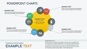
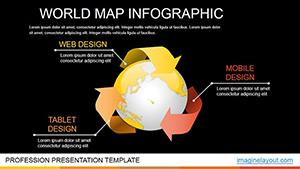
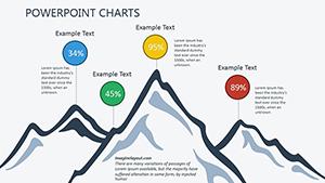
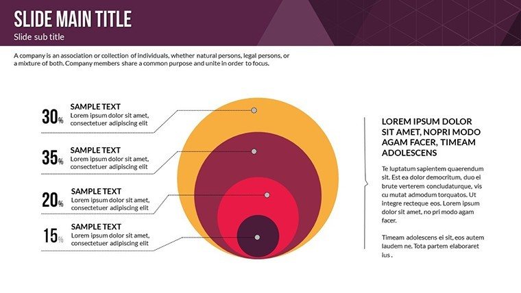
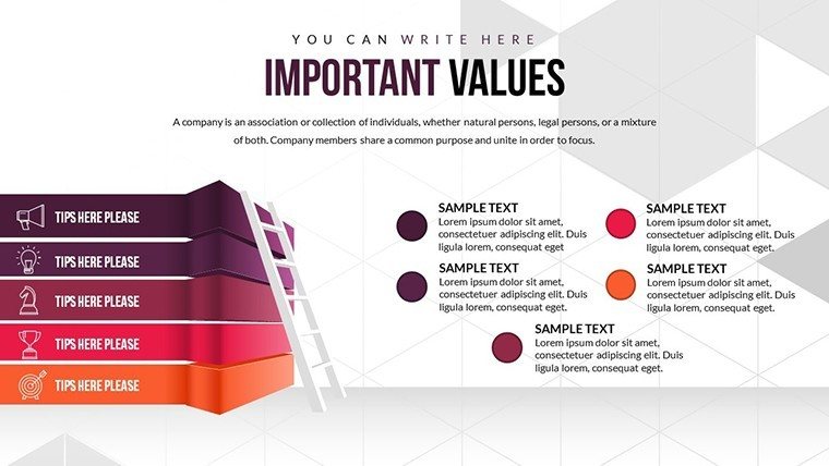
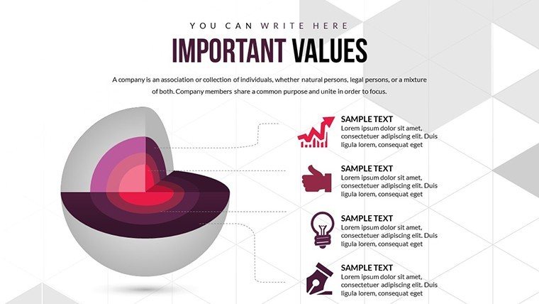
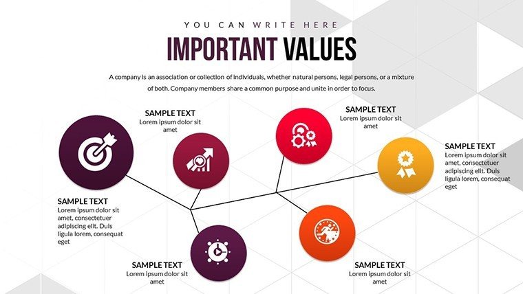
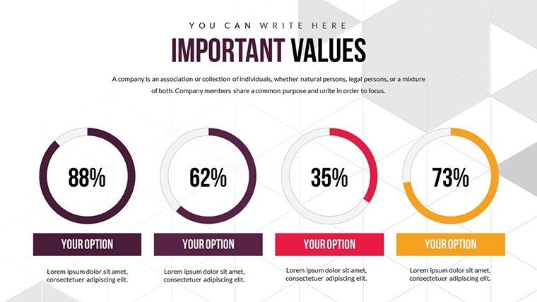
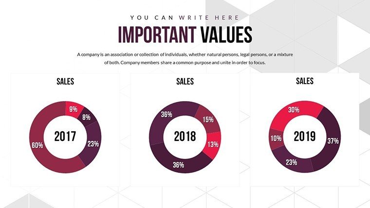
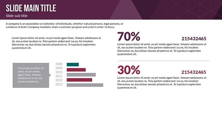
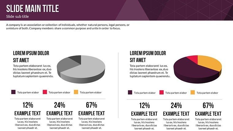
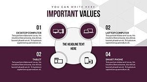
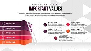
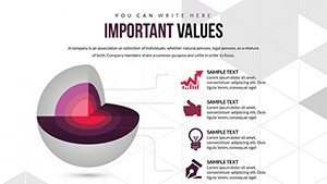
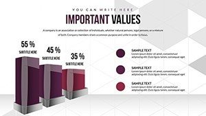
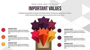
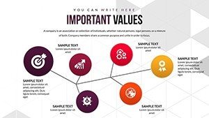
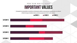
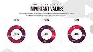
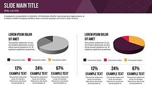
- Dynamic Cycle Charts: Visualize loops like product lifecycles or feedback processes with smooth transitions and color gradients.
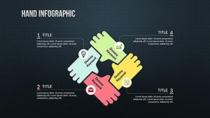
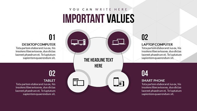
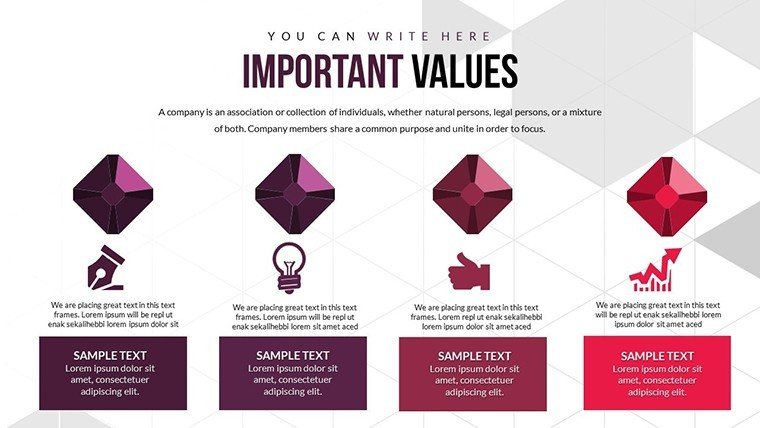
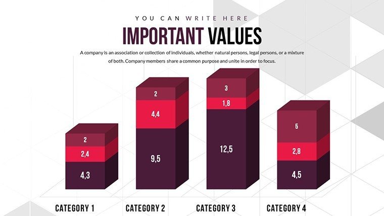
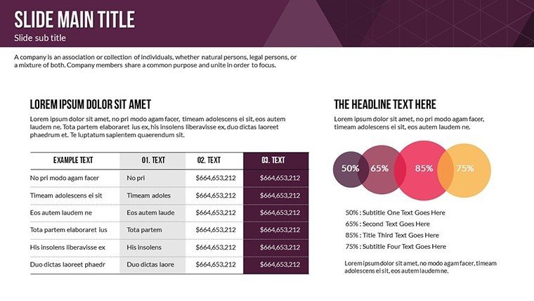
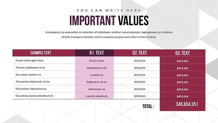
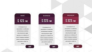
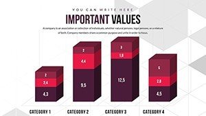
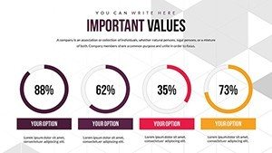
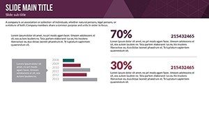
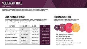
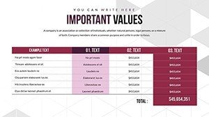
- Matrix Layouts: Organize features versus applications in grids, ideal for comparative analyses in reports.
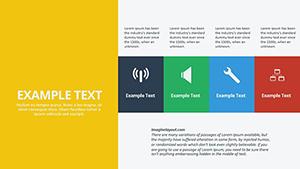
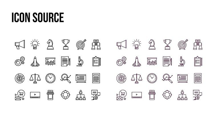
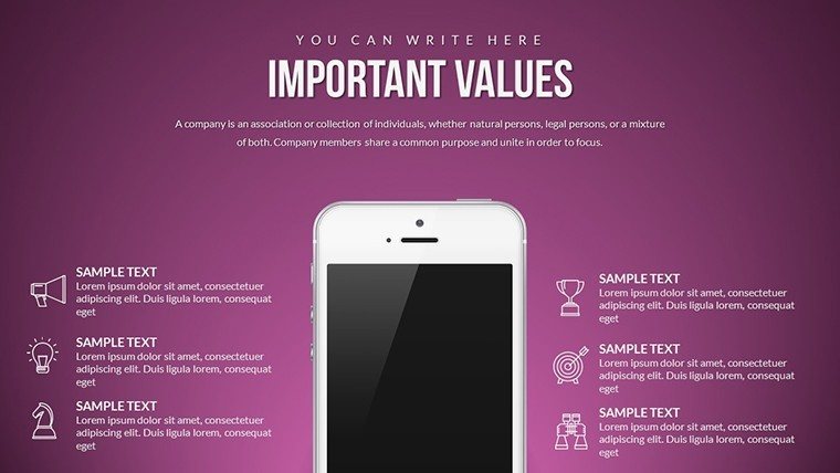
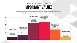
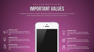
- Infographic Elements: Incorporate icons and shapes that scale without loss, enhancing clarity.
- Animation Options: Custom effects that reveal data progressively, boosting retention as per cognitive psychology insights.
- Font and Color Palettes: Pre-set options that align with modern design trends, easily adjustable.
These aren't generic; they're refined based on user trends, like the rise in hybrid presentations post-pandemic.
In-Depth Slide Exploration
The 22 slides are thoughtfully sequenced: Early ones introduce core features with simple matrices, mid-slides delve into applications via interconnected cycles, and finales summarize with hybrid visuals. Slide 8, for instance, might showcase a 4x4 matrix for feature prioritization, while Slide 15 uses a circular diagram to depict application ecosystems.
Apply this in education: A trainer could illustrate learning cycles, drawing from Bloom's Taxonomy for structured knowledge application. This boosts by referencing established frameworks, proving the template's authoritative edge in professional development.
Versatile Applications Across Industries
This template thrives in diverse contexts, solving pain points like disjointed visuals in collaborative environments.
- Marketing Mastery: Chart feature launches and their market applications, increasing campaign ROI through clear visuals.
- Educational Excellence: Break down subject applications, making abstract concepts tangible for students.
- Business Strategy: Map internal features to external applications, aiding in agile planning.
A real example: A content creator at a media firm used similar matrices to outline video production features, resulting in streamlined workflows and higher viewer engagement, as noted in industry reports from Content Marketing Institute.
Pro Tips for Seamless Integration
Begin by outlining your key features, then match them to template elements. Use contrasting colors for applications to denote differences, and test animations for pacing. For trustworthiness, include data sources in footnotes, aligning with Google's emphasis on reliable content.
As a copywriter with years in marketing, I recommend this for its ability to turn pitches into wins, much like how TED Talks use visuals to amplify ideas.
Transform Your Presentations - Download Now
Ready to infuse your slides with purpose? Secure this Features and Applications template and start creating infographics that resonate.
Frequently Asked Questions
- What makes these charts ideal for infographics?
- They feature cycle and matrix designs that simplify complex features and applications visually.
- Can I use this in collaborative tools?
- Yes, fully compatible with PowerPoint, Google Slides, and even shared editing platforms.
- How do animations enhance presentations?
- They reveal information step-by-step, improving audience focus and retention.
- Who is this template best suited for?
- Marketers, educators, and business pros needing versatile visual aids.
- Are there any included extras?
- Yes, vector icons and customizable palettes for branded consistency.
- How to get started quickly?
- Download, import your data, and edit - it's that straightforward.