Sphere of Influence PowerPoint Charts: Map Networks and Impact


Understanding spheres of influence is key in leadership, marketing, and community building. Our Sphere of Influence PowerPoint Charts Template equips you with 20 editable slides to visualize linkages, hierarchies, and stakeholder dynamics intuitively. This professional tool, featuring clean designs and customizable elements, helps convey complex systems at a glance, making it indispensable for corporate leaders, educators, and consultants aiming to illustrate reach and relationships.
Think of it as a visual map for influence: from organizational charts showing power flows to marketing diagrams depicting brand reach. Categorized in matrix, arrows, and puzzles, it blends these for versatile applications, ensuring compatibility with PowerPoint for easy edits and broad playback.
Standout Features for Professional Visuals
Built for efficiency, this template offers professional layouts that save design time, focusing your energy on content. Fully customizable, it adapts to your needs with options for color changes, text edits, and shape modifications.
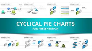
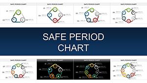
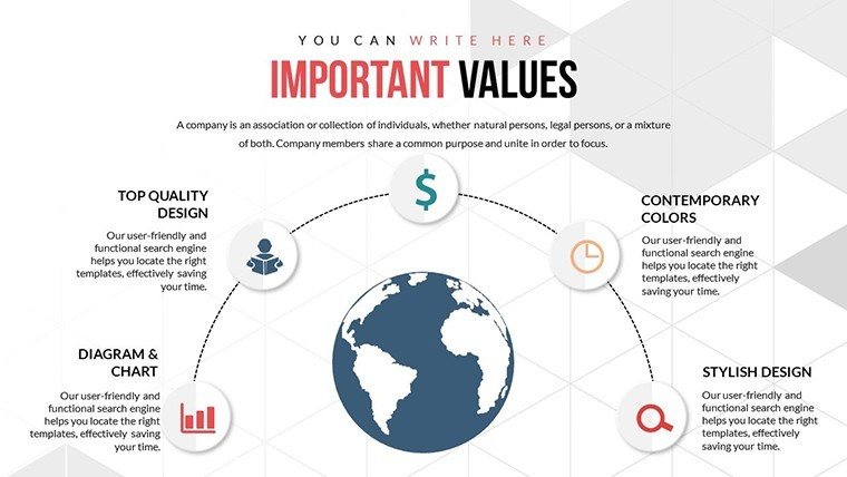
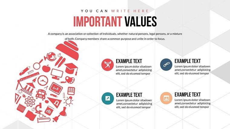
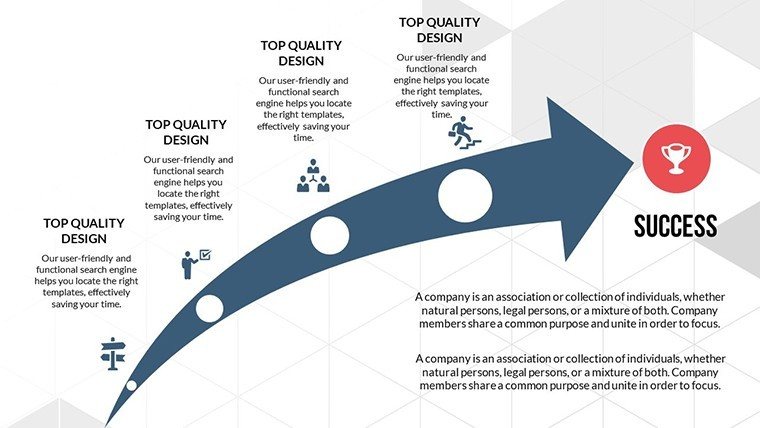
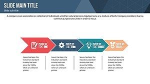
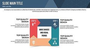
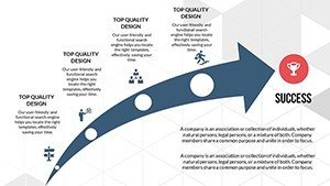
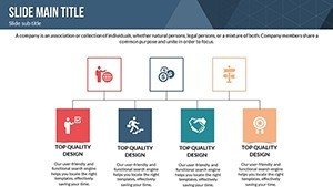
- Intuitive Charts: Spheres and arrows to depict influence radii and directions.
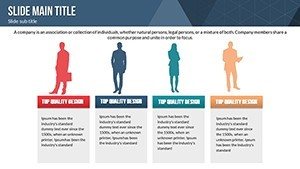
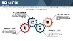
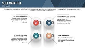
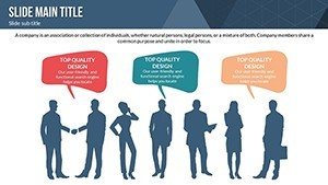
- Modern Aesthetics: Clean, appealing designs that enhance comprehension.
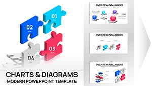
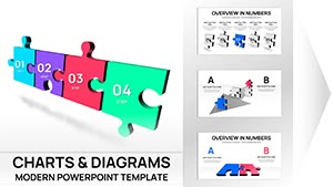
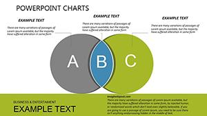
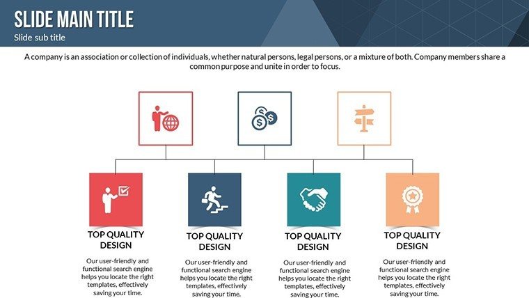
- Versatile Elements: Matrix for interactions, puzzles for complex linkages.
- 20 Slides: Covering basics to advanced influence models.
- Time-Saving Tools: Pre-built for quick personalization.
These draw from authoritative sources like Stephen Covey's leadership principles, boosting your presentation's credibility.
Diverse Applications in Real Scenarios
From business strategy where executives map stakeholder influences, to education for teaching social networks. For instance, a project manager might use arrow charts to show team hierarchies, referencing PMI standards for project influence mapping.
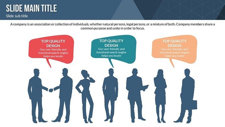
In marketing, visualize brand spheres overlapping with customer segments, akin to successful campaigns by companies like Coca-Cola. Non-profits can diagram community impacts, inspired by real initiatives from UNICEF.
Step-by-Step: Creating an Influence Strategy Presentation
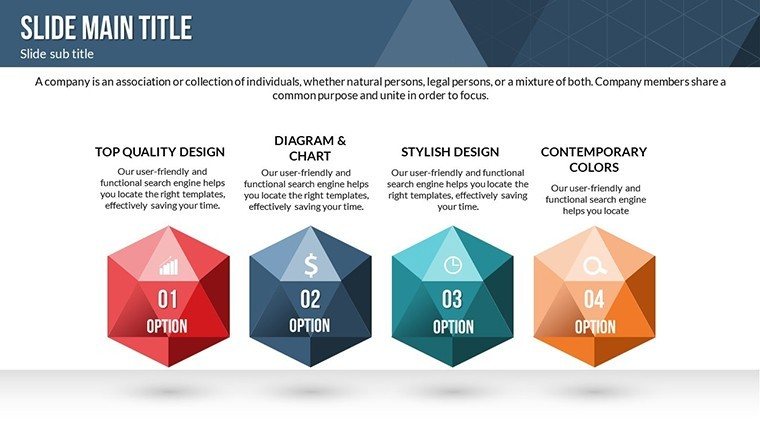
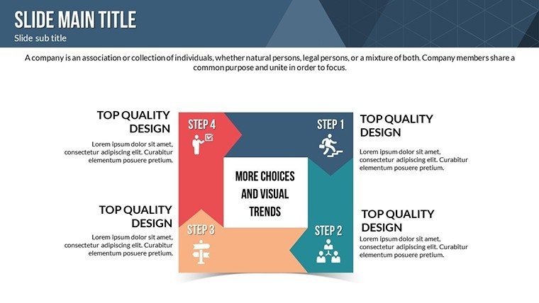
- Outline Core Spheres: Slide #1 introduces central influence nodes.
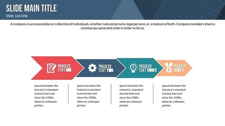
- Map Linkages: Use slide #6's arrows for directional flows.
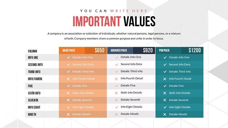
- Analyze Interactions: Slide #11's matrix details stakeholder overlaps.
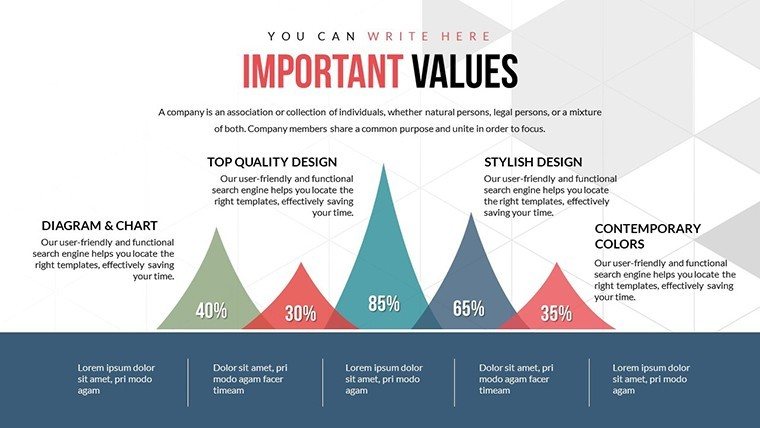
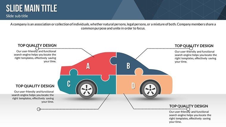
- Visualize Reach: Puzzle elements on slide #15 solve complexity.
- Recommend Actions: Conclude with slide #19's summary diagram.
This resolves issues like vague hierarchies, fostering clearer communication.
Advantages Over Generic PowerPoint
Basic tools lack the specialized sphere visuals; this template provides ready-made, elegant options with built-in versatility. It embodies design expertise from pros like those at Gartner, ensuring authoritative outputs.
Integrate seamlessly: Customize with data imports, then present confidently. Users note enhanced engagement in workshops.
Pro Tips for Effective Influence Mapping
Use size variations in spheres to denote influence strength - larger for greater impact. Incorporate gradients for depth, per visual design theory. Test for audience flow in rehearsals. For experts, add layers with hyperlinks to case studies, like Harvard's influence research.
Narrate as a web of connections, increasing retention based on cognitive studies.
Amplify your influence - grab this template today and chart your path forward.
FAQ
How customizable are the sphere elements?
Completely, including size, color, and positioning for tailored visuals.
Suitable for virtual presentations?
Yes, compatible with Zoom and Teams, with smooth playback.
Who typically uses this template?
Leaders, marketers, educators, and non-profit organizers for influence visualization.
Can I incorporate videos?
Absolutely, embed multimedia to enrich influence narratives.
What if I need more slides?
Duplicate and modify existing ones for expansion.