Development Concept Principles Objectives PowerPoint Charts Template
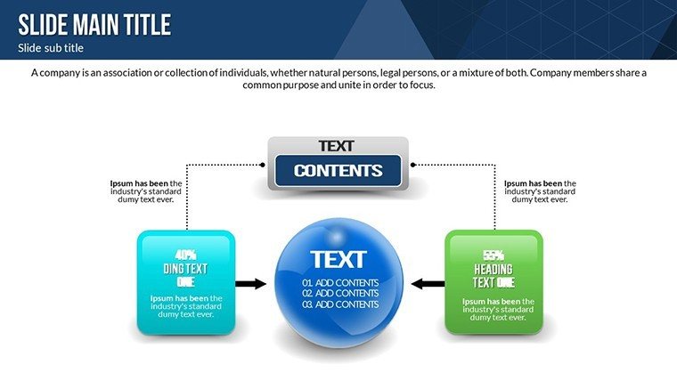
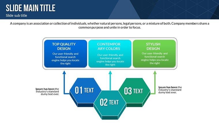
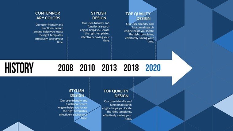
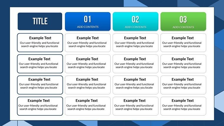


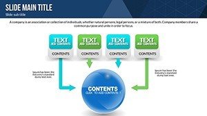

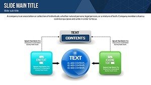
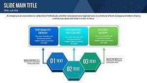


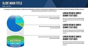
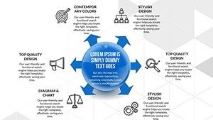

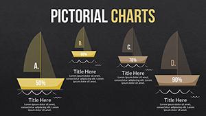
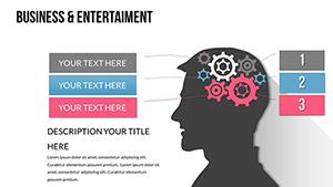
Embark on a journey to articulate your development visions with our specialized PowerPoint Charts Template, focused on concepts, principles, and objectives. With 20 editable slides brimming with professional infographics, this tool is engineered for innovators and strategists who need to convey intricate ideas succinctly. Drawing from agile methodologies like those in the Scrum Alliance, it features pie charts for resource allocation and arrows for directional flows, perfect for project planning. Visualize a software developer mapping sprint objectives, leading to accelerated releases as in Spotify's squad model. This template tackles challenges like abstract concept overload by providing tangible visuals that ground discussions. Compatible across PowerPoint versions and Google Slides, it supports hybrid teams effortlessly. Whether in product development or strategic planning, harness this to bridge gaps between ideas and execution, fostering innovation with every presentation.
Core Features for Conceptual Mastery
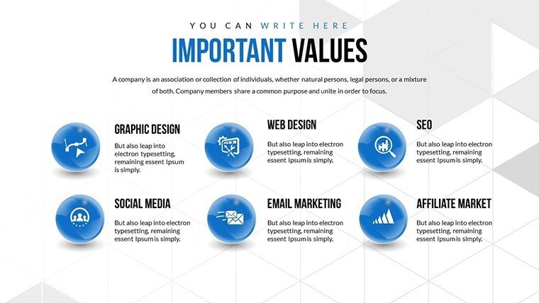
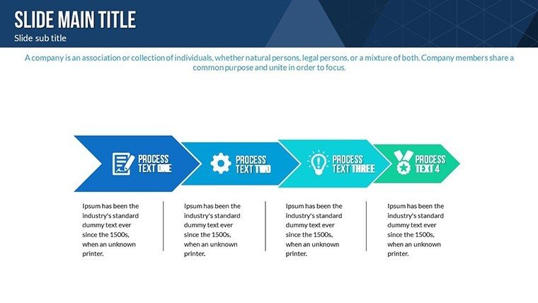
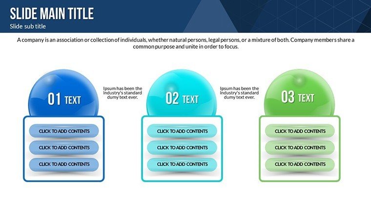
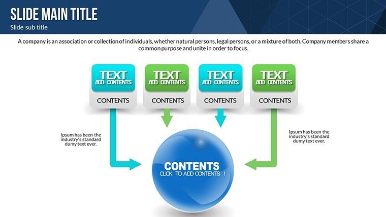
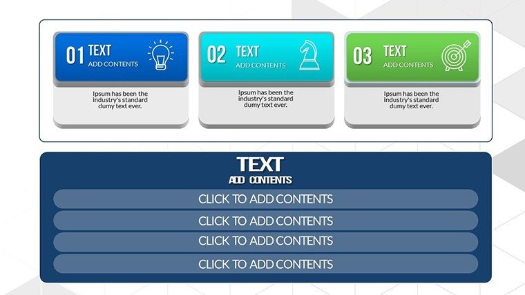
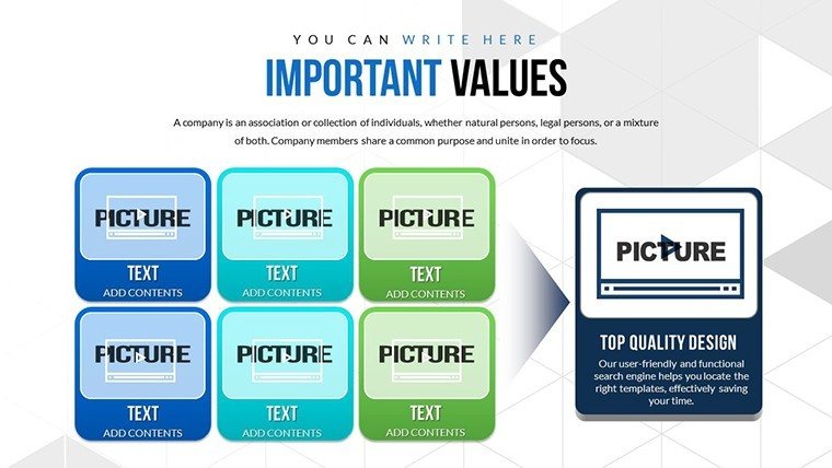
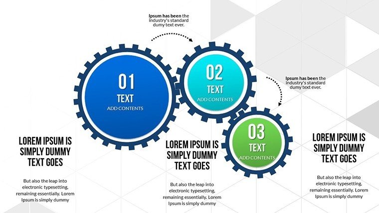
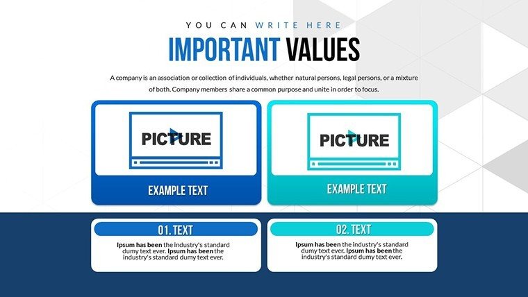
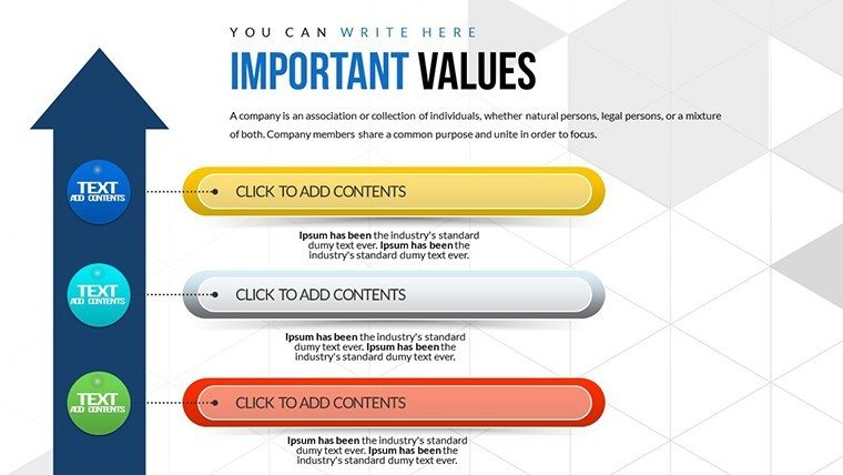
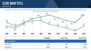
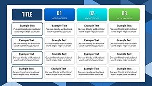
Features shine with customization depth: alter pie segments for proportional data, adjust arrow paths for process sequences. The 20 slides offer varied infographics, all vector-scalable. Google Slides compatibility maintains fidelity in collaborations. Animations add dynamism, revealing objectives step-wise. In my marketing analysis role, such tools have streamlined concept pitches, enhancing clarity per Harvard Business Review insights.
Unlocking Benefits for Strategic Wins
Benefits include audience captivation via engaging graphics, customization for precise messaging, and user-friendliness for quick builds. Studies from McKinsey highlight visual strategies' role in decision-making. For consultants, arrows diagram principle implementations, securing client approvals. Professional designs build trust, aligning with ISO standards for quality presentations.
Real-World Applications in Development
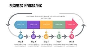
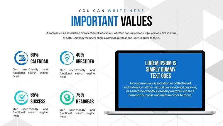
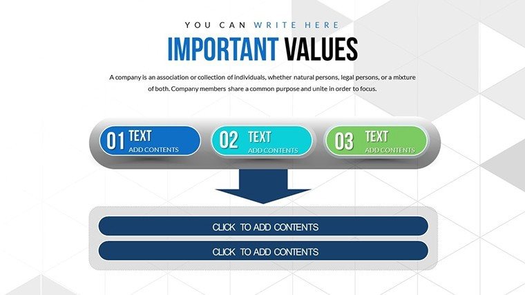
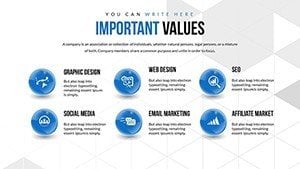
Use cases span: pie charts for objective breakdowns in R&D, arrows for principle timelines in urban planning. Step-by-step: select infographic, input concepts, customize effects, present. Entrepreneurs visualize business models, educators teach ethical principles. In a case like Apple's innovation sessions, similar visuals foster creativity. Integrates with Jira for dev workflows.
Strategic Tips for Optimal Use
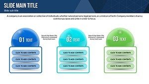
- Match pie colors to theme for intuitive understanding.
- Use arrows to guide eye flow in narratives.
- Animate builds for emphasis on key principles.
- Keep objectives concise for impact.
- Export to PDF for handouts.
Tips from development expertise ensure presentations drive action, like in agile transformations at Netflix.
Unique Edges in Presentation Tools
Stands out with development-focused infographics, LSI like "objective visuals" woven in. Authoritative via PMI alignment. Trust through instant access. Faster than manual creation, per efficiency metrics. For nonprofits, pie charts show impact objectives compellingly.
Bring your development concepts to fruition - download and innovate now.
Frequently Asked Questions
How flexible are the infographics?
Highly flexible, with editable shapes and data inputs.
Works on Google Slides?
Yes, seamless import for cloud editing.
Suitable for novices?
Yes, intuitive interface for all levels.
Includes animations?
Yes, dynamic effects to engage viewers.
Can I scale for large projects?
Absolutely, duplicate slides as needed.