Entertainment Business PowerPoint Charts Template - Presentation


Type: PowerPoint Charts template
Category: Organizational, Illustrations
Sources Available: .pptx
Product ID: PC00532
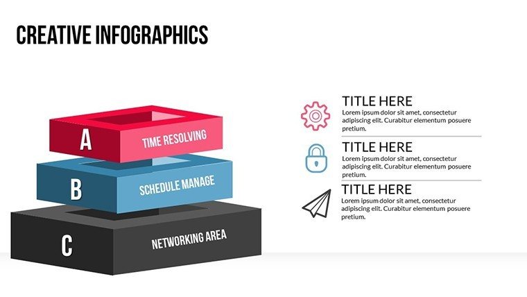
Template incl.: 22 editable slides
Step into the spotlight with the Entertainment Business PowerPoint Charts Template, a game-changer for professionals navigating the vibrant world of showbiz. This collection of 22 editable slides is meticulously crafted to turn raw data into dazzling narratives, perfect for filmmakers charting box office trends or event planners mapping attendee demographics. Imagine captivating stakeholders with sleek pie charts that slice through market shares or line graphs that trace revenue spikes from hit releases - all while maintaining a polished, industry-savvy aesthetic. Tailored for the fast-moving entertainment sector, this template addresses common pain points like convoluted data presentations, offering instead a streamlined way to communicate insights that drive decisions. Whether you're pitching a blockbuster script or analyzing concert sales, these visuals ensure your story shines, fostering better engagement and opening doors to new opportunities in this competitive arena.
Captivate Audiences with Professional Visuals
Dive deeper into what makes this template indispensable: a blend of organizational charts and illustrative elements that bring entertainment data to life. Unlike basic slides, these feature versatile options like radar charts for multi-faceted comparisons - think evaluating artist performances across platforms. Customization is key; tweak colors to evoke the drama of a red-carpet event or fonts to match a brand's edgy vibe. The intuitive design means you can focus on your narrative, not on wrestling with software, saving precious time in an industry where deadlines are tight.
Standout Features for Entertainment Pros
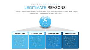
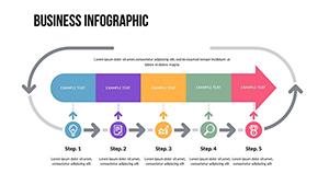
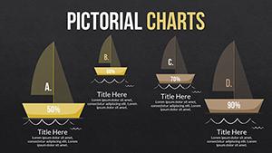
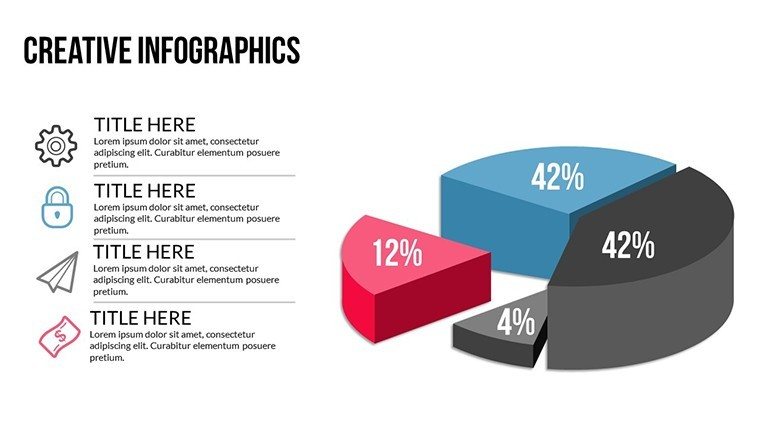
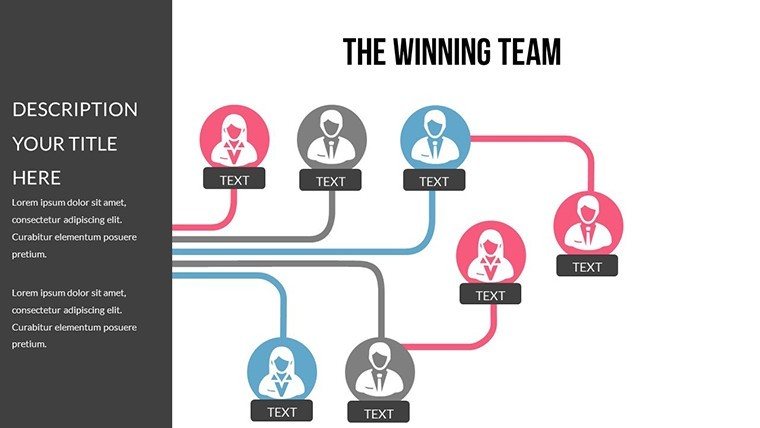
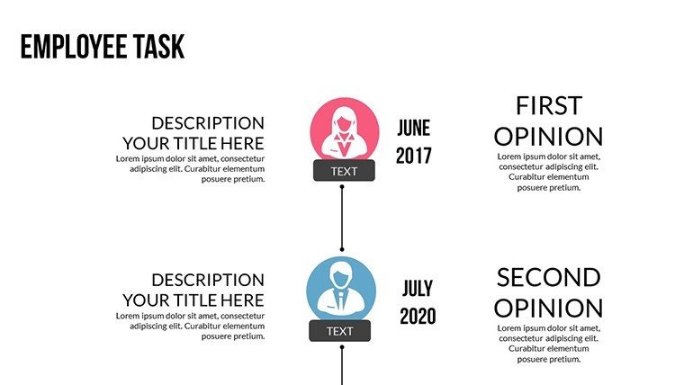
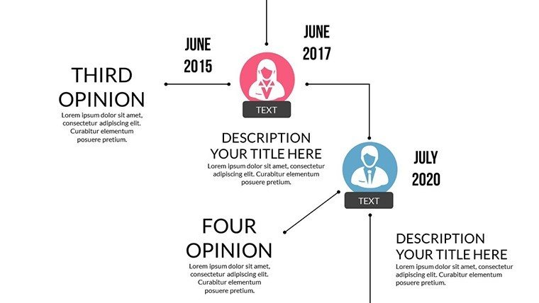
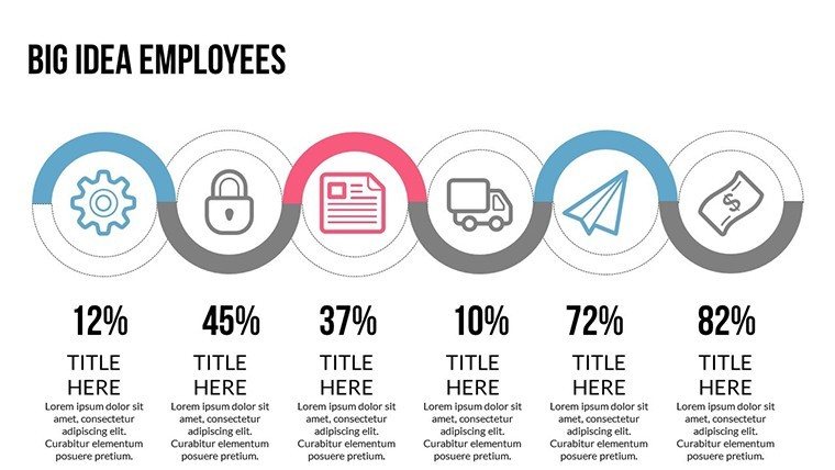
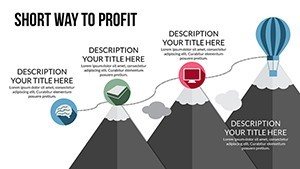
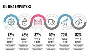
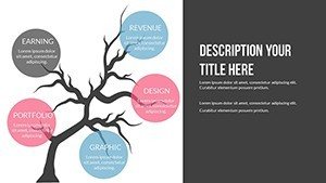
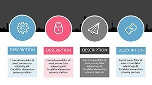
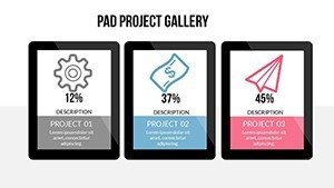
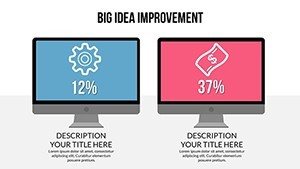
- Varied Chart Types: Pie, line, bar, and radar charts optimized for industry-specific data like audience metrics.
- Brand Alignment: Easy adjustments to layouts, ensuring consistency with your studio's identity.
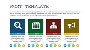
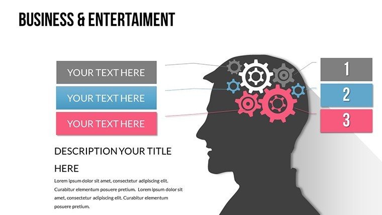
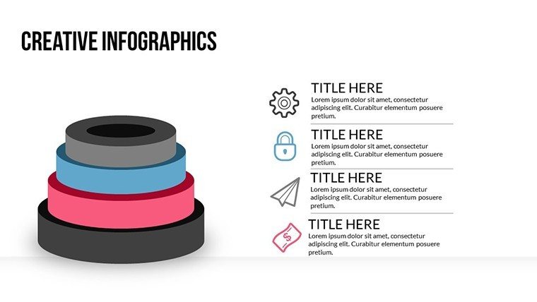
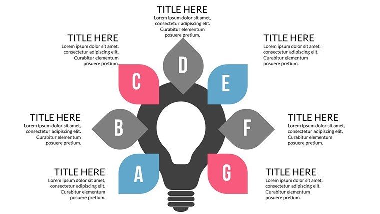
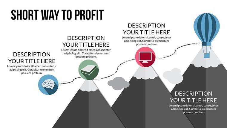
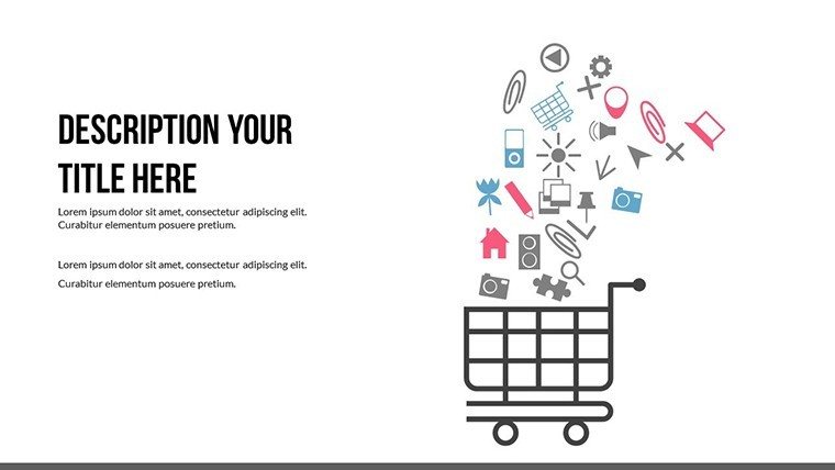
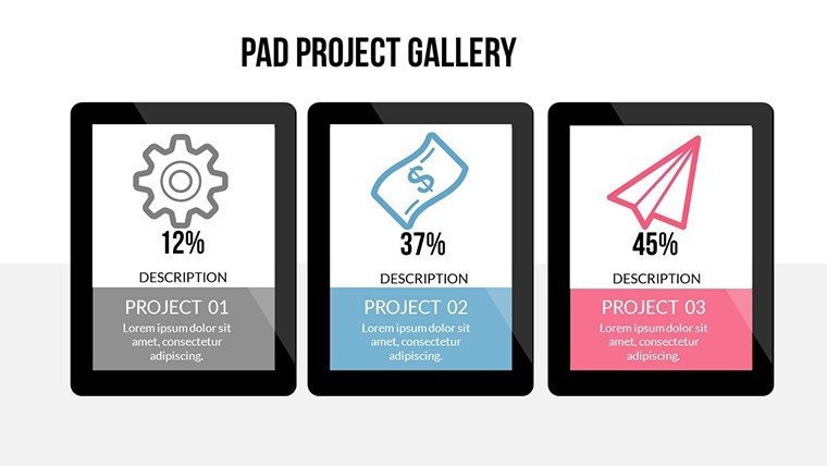
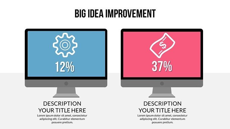
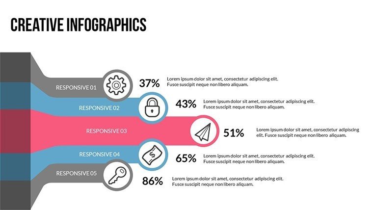
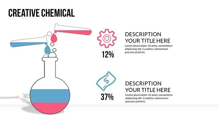
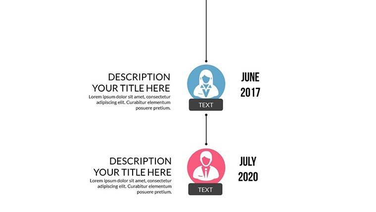
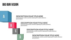
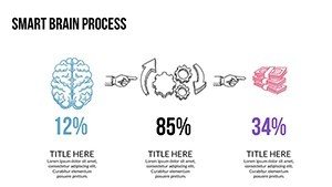
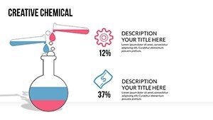
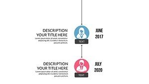
- Engaging Illustrations: Thematic icons for films, music notes, and event symbols to add flair.
- Professional Polish: Modern designs that impress in high-stakes meetings.
- Cross-Compatible: Seamless use in PowerPoint or Google Slides.
Drawing from entertainment marketing best practices, such as those from the Hollywood Reporter's data analyses, this template helps visualize trends that could predict the next big hit, much like how Netflix uses similar tools for content strategy.
Practical Use Cases in the Entertainment World
Apply this template across diverse scenarios: For a film pitch, use bar charts to compare budget allocations against projected ROI, convincing investors with clear visuals. In music industry reports, line graphs can track streaming growth, highlighting successes like a viral album launch. Event managers might employ pie charts to break down sponsorship revenues, streamlining proposals that secure partnerships. Educators in media studies can illustrate case studies, such as analyzing Disney's market dominance, making abstract concepts tangible.
Incorporate it into your routine by starting with data import, then customizing for impact - add subtle animations to mimic a reveal in a trailer. This approach outshines generic templates by offering tailored illustrations, potentially increasing proposal acceptance rates as seen in industry surveys from Variety magazine.
Workflow Integration Tips
- Open the template in your preferred software.
- Input entertainment-specific data into charts.
- Customize visuals to align with your project's theme.
- Enhance with animations for dynamic storytelling.
- Present and iterate based on feedback.
These steps empower you to create presentations that not only inform but entertain, aligning with the core of the industry.
Boost Your Entertainment Edge Today
This template embodies trustworthiness through its adherence to data visualization standards from experts like Edward Tufte, ensuring clarity without overload. A real example: An indie film producer used comparable charts to secure funding by clearly depicting audience demographics, leading to a festival win. With its focus on engagement and efficiency, it's a reliable choice for elevating your professional game.
Transform your entertainment presentations now - secure this template and shine!
Frequently Asked Questions
Are the slides fully editable for branding?
Yes, customize colors, fonts, and layouts to match your entertainment brand perfectly.
Does it support animations?
Absolutely, add custom animations to make your data presentations more dynamic.
What industries is this best for?
Ideal for film, music, events, and marketing within entertainment.
How many chart types are included?
A variety including pie, line, bar, and radar for comprehensive analysis.
Is it compatible with older PowerPoint versions?
Yes, it works with recent versions and Google Slides.