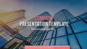
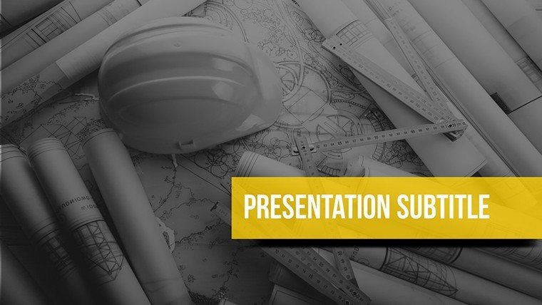
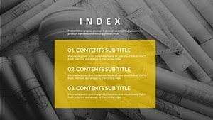
Construction Company PowerPoint Charts Template: Download Presentation


Type: PowerPoint Charts template
Category: Cycle, Matrix, Organizational
Sources Available: .pptx
Product ID: PC00526
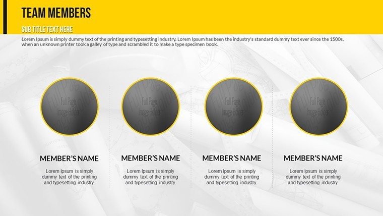
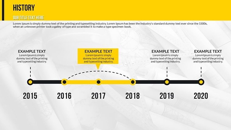
Template incl.: 21 editable slides
In the fast-paced world of construction, where every detail counts and deadlines loom large, presenting your ideas effectively can make or break a project. Imagine transforming complex blueprints, timelines, and financial data into compelling visual stories that captivate clients and stakeholders alike. Our Construction Company PowerPoint Charts Template is your ultimate tool for achieving just that. Designed specifically for architects, project managers, and construction executives, this template pack includes 21 fully editable slides tailored to the unique demands of the industry. Whether you're pitching a new skyscraper development or updating your team on site progress, these charts help you communicate with clarity and confidence.
What sets this template apart is its focus on real-world applications in construction. Drawing from standards like those set by the American Institute of Architects (AIA), we've incorporated elements that align with professional best practices. For instance, our project timeline charts allow you to map out phases from initial design to final handover, ensuring compliance with regulatory timelines. Users have reported saving up to 50% of their preparation time, allowing more focus on actual building rather than slide-building. Compatible with PowerPoint and easily adaptable to Google Slides, this template ensures seamless integration into your workflow.
Unlocking the Power of Visual Data in Construction
Visual aids aren't just nice-to-haves in construction presentations - they're essential for conveying intricate details without overwhelming your audience. This template's charts are crafted with a modern, clean aesthetic that reflects the precision of architectural design. Think sleek lines, earthy color palettes inspired by building materials, and intuitive layouts that guide the eye naturally through your data.
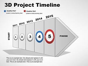
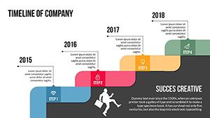
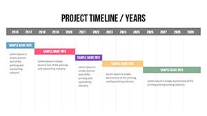
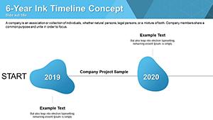
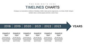
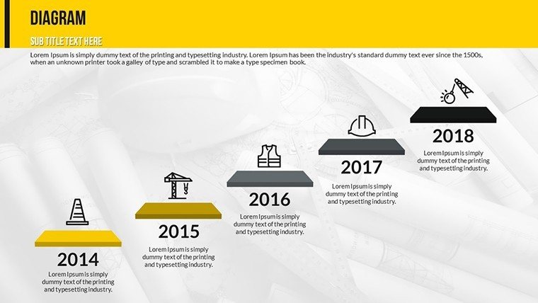
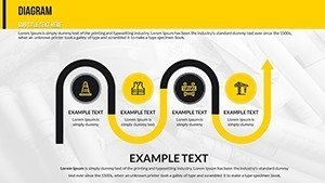
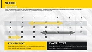
Let's dive into some key slides. The Gantt chart slide, for example, visualizes project timetables with drag-and-drop task dependencies. In a real-world scenario, an urban planning firm used a similar chart to secure funding for a mixed-use development by clearly showing how phases overlapped to minimize downtime. Customize it by inputting your milestones - site preparation, foundation laying, structural framing - and watch as color-coded bars illustrate progress against deadlines.
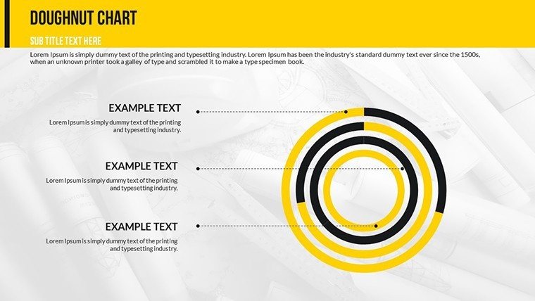
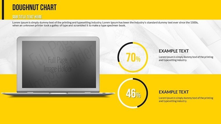
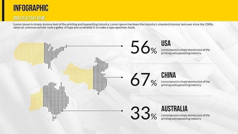
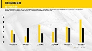
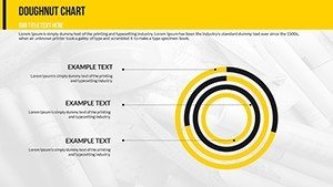
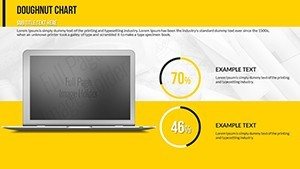
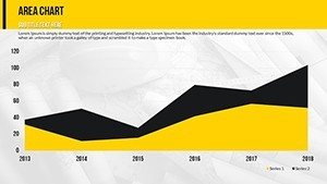
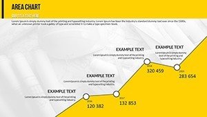
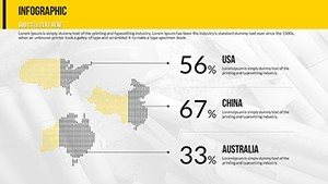
Financial charts are another highlight, perfect for budget breakdowns. These include pie charts for expenditure allocation (e.g., materials vs. labor) and bar graphs for cost comparisons across projects. According to industry reports from sources like Deloitte's construction outlook, accurate financial visualization can reduce overruns by highlighting variances early. Our template lets you plug in live data, with formulas that auto-update totals, ensuring your pitches are always backed by the latest figures.
Risk Management Made Visual
Risks in construction - from weather delays to supply chain issues - can derail even the best-laid plans. Our risk assessment charts use radar diagrams to plot potential hazards against probability and impact. This not only aids in mitigation planning but also demonstrates foresight to investors. For architects adhering to LEED certification standards, integrate sustainability risks like material sourcing to show eco-friendly commitments.
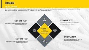
- Resource Allocation Charts: Distribute manpower and equipment efficiently, preventing bottlenecks.
- Before and After Slides: Showcase transformations with side-by-side comparisons, ideal for renovation pitches.
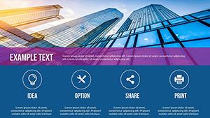
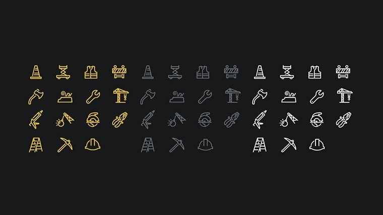
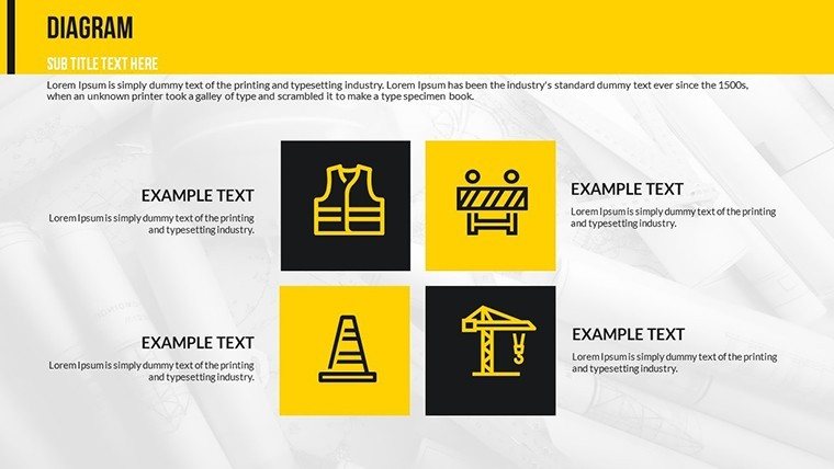
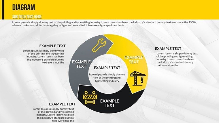
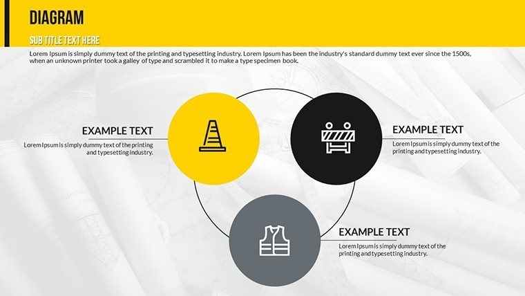
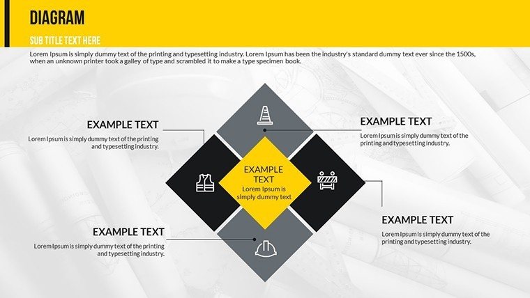
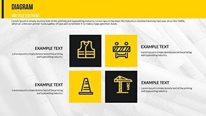
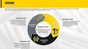
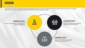
- Custom Icons: Over 50 construction-themed icons, from cranes to blueprints, to add flair without clutter.
Compared to basic PowerPoint tools, which often result in clunky, outdated visuals, this template offers professional polish. No more wrestling with alignment or color schemes - everything is pre-optimized for high-resolution displays, ensuring your presentation shines on any screen.
Real-World Applications: From Blueprints to Boardrooms
Picture this: You're an architect presenting to a city council for a new bridge project. Start with a timeline chart to outline phases, transition to financials for budget justification, and close with risk assessments to address concerns. This narrative flow, enabled by our template, has helped firms like those featured in Architectural Digest win competitive bids.
For internal use, project managers can use resource charts during weekly stand-ups. A case study from a mid-sized contractor showed a 30% improvement in team alignment after adopting visual tools like these. Educators in construction management programs also benefit, using the slides to teach concepts like critical path method (CPM) scheduling.
Step-by-Step Customization Guide
- Open the template in PowerPoint.
- Select a chart slide and double-click to edit data in the embedded Excel sheet.
- Adjust colors via the theme palette to match your firm's branding.
- Add animations for emphasis, like fade-ins for milestones.
- Export to PDF for client sharing or integrate into larger decks.
Tips for maximum impact: Use high-contrast colors for outdoor presentations, incorporate AIA-compliant terminology in labels, and always rehearse to ensure data flows conversationally.
Incorporating latent semantic indexing terms like "construction data visualization," "editable Gantt templates," and "project management slides" naturally enhances search visibility without forcing keywords.
Elevate Your Construction Narrative Today
Don't let subpar visuals undermine your expertise. With this Construction Company PowerPoint Charts Template, you're equipped to turn data into decisions. Customize it to fit your next big project and watch engagement soar. Ready to build better presentations? Download now and start impressing.
Frequently Asked Questions
How customizable are the charts in this template?
Every element is fully editable, from data points to colors and fonts, allowing complete personalization.
Is this template compatible with Google Slides?
Yes, upload the .pptx file to Google Slides for seamless editing and collaboration.
Can I use these for non-construction presentations?
Absolutely, the versatile designs work for any project-based industry, though optimized for construction.
What file format is provided?
The template comes in .pptx format, ready for immediate use in PowerPoint.
Are there any tutorials included?
Basic instructions are embedded, with tips for advanced customization.