Relationship PowerPoint Charts: Compare Data Effortlessly


Type: PowerPoint Charts template
Category: Relationship
Sources Available: .pptx
Product ID: PC00521
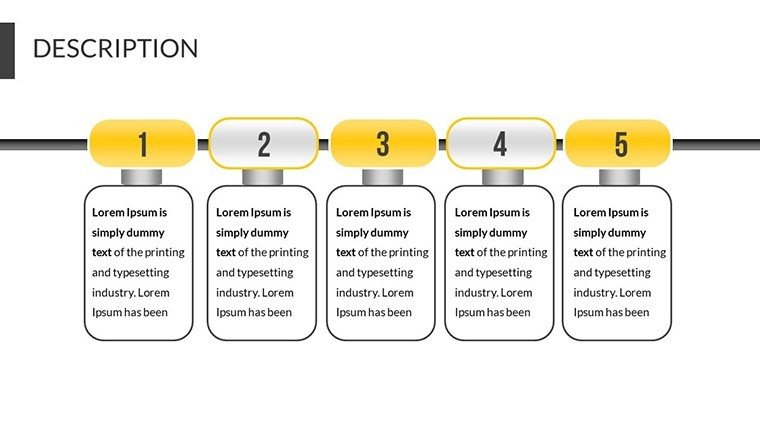
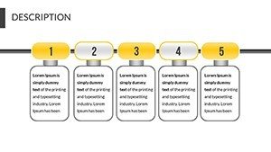
Template incl.: 19 editable slides
In today's fast-paced professional world, conveying complex data relationships doesn't have to be a chore. Imagine transforming raw numbers into compelling visual stories that captivate your audience, whether you're pitching a new architectural design or analyzing market trends. Our Relationship PowerPoint Charts template is your go-to solution, offering 19 fully editable slides designed specifically for highlighting connections, comparisons, and performance metrics. Tailored for architects, business analysts, and educators, this template bridges the gap between data and decision-making. With intuitive tools that align with industry standards like those from the American Institute of Architects (AIA) for project visualizations, you can effortlessly illustrate how building elements interconnect in a sustainable design proposal. Say goodbye to bland spreadsheets and hello to dynamic charts that identify maximum and minimum values at a glance, making your presentations not just informative but truly engaging.
Unlocking the Power of Visual Data Comparison
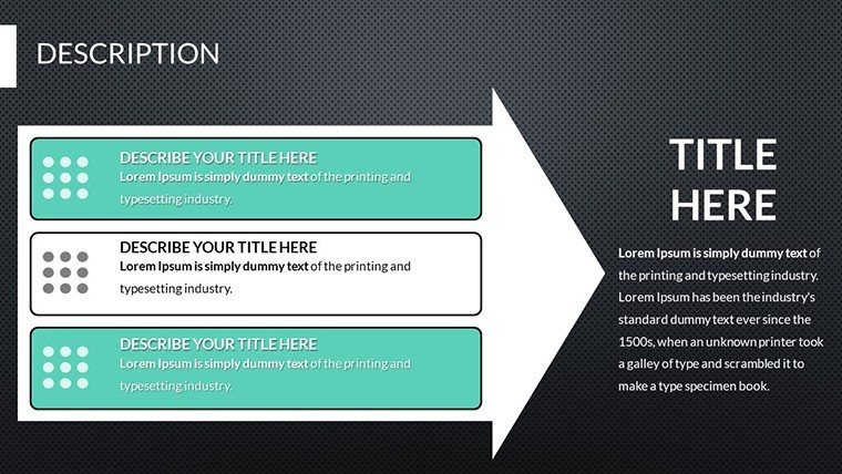
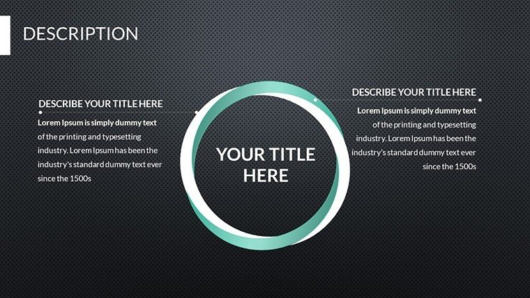
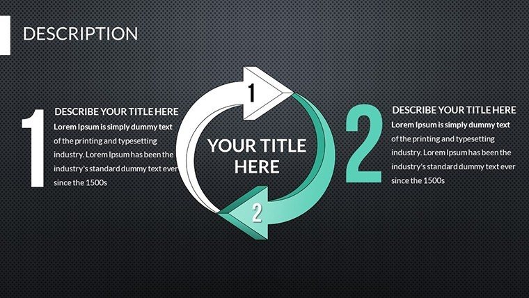
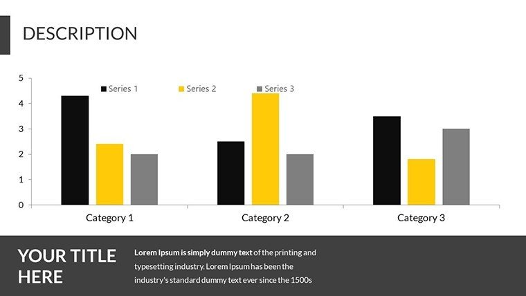
At the heart of effective communication lies the ability to compare information meaningfully. This template excels in that arena, providing a suite of chart types that allow you to juxtapose variables within datasets. For instance, in an architecture firm, you might use these charts to compare material costs versus durability ratings, helping clients understand trade-offs in real-time during a meeting. The slides are pre-formatted yet flexible, ensuring you can adapt them to your narrative without starting from scratch. Each chart is movable and resizable, just like any PowerPoint object, so you can integrate them seamlessly into your existing decks.
Beyond basic functionality, the template's design draws from proven visualization principles, such as those outlined in Edward Tufte's works on data integrity. This means your charts aren't just pretty - they're precise, reducing cognitive load for viewers. Consider a scenario where you're presenting to a city planning committee: a relationship chart could map out traffic flow impacts from a new development, clearly showing correlations between peak hours and congestion points. Such applications not only demonstrate expertise but also build trust, as stakeholders see data-driven insights backed by reliable visuals.
Key Features That Set This Template Apart
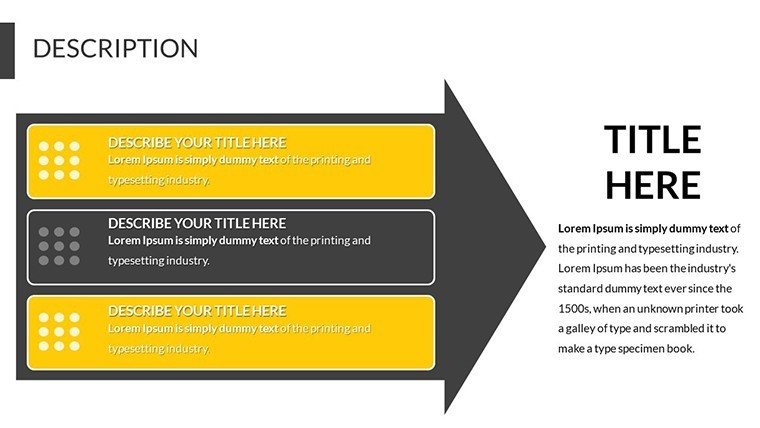
- Editable Content Layers: Double-click to modify data points, labels, and legends, ensuring your charts reflect the latest information without hassle.
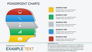
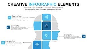
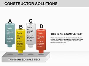
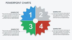
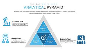
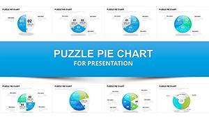
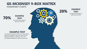
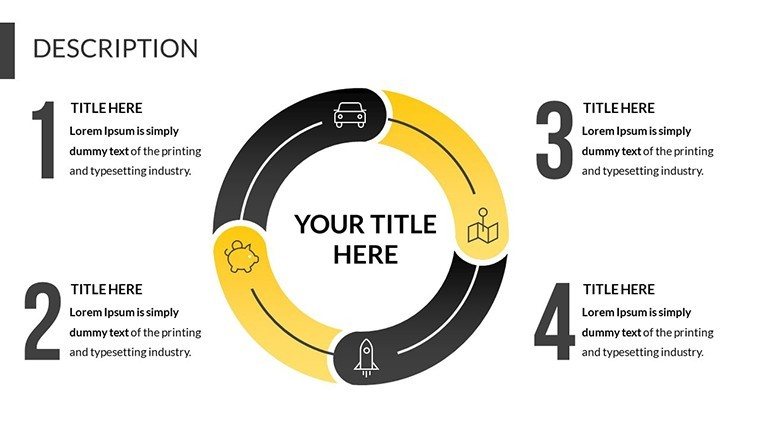
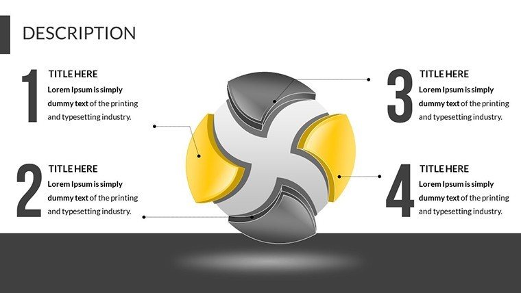
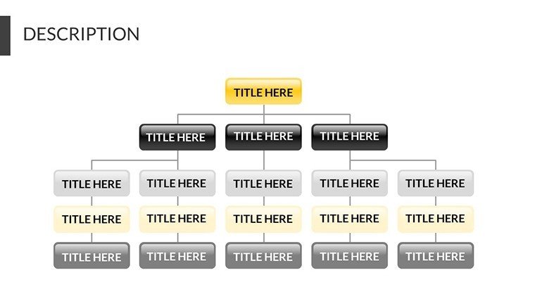
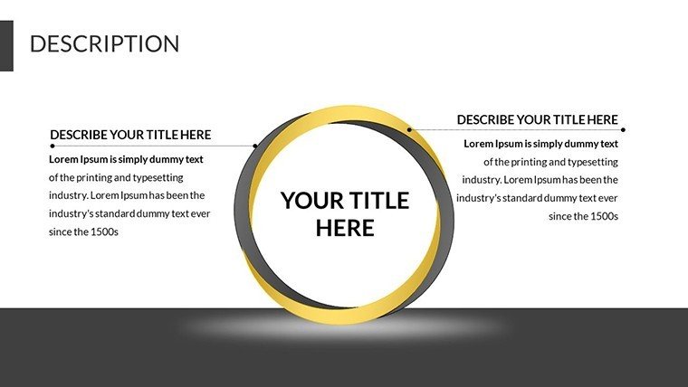
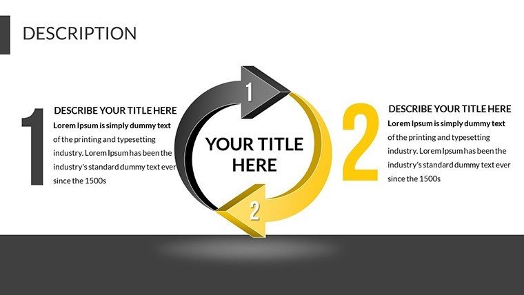
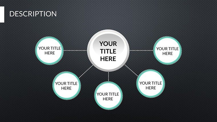
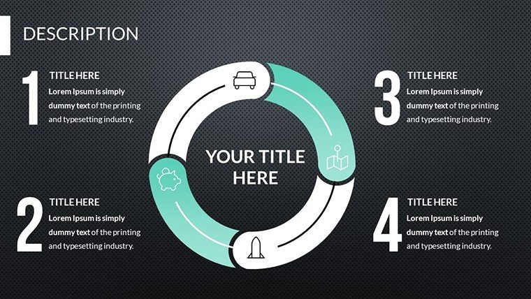
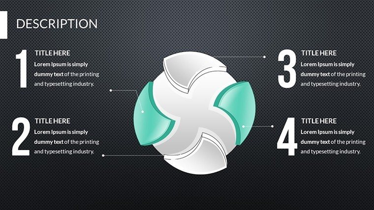
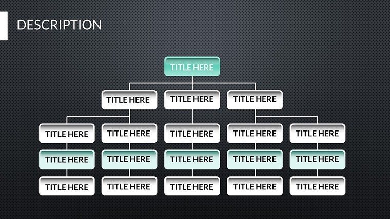
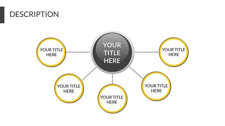
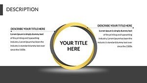
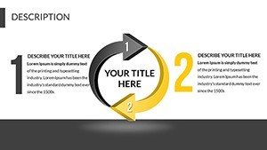
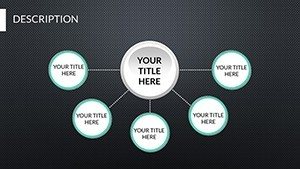
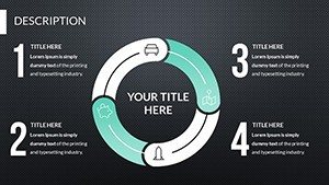
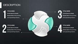
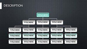
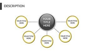
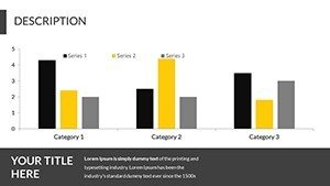
- Relationship-Focused Designs: Specialized layouts for correlation matrices, scatter plots, and network diagrams, ideal for showing interconnections in complex systems like urban infrastructure.
- Compatibility Assurance: Fully works with PowerPoint and Google Slides, maintaining fidelity across platforms for collaborative teams.
- Themed Icons and Elements: Includes architecture-inspired icons, such as blueprints and structural symbols, to enhance relevance in design pitches.
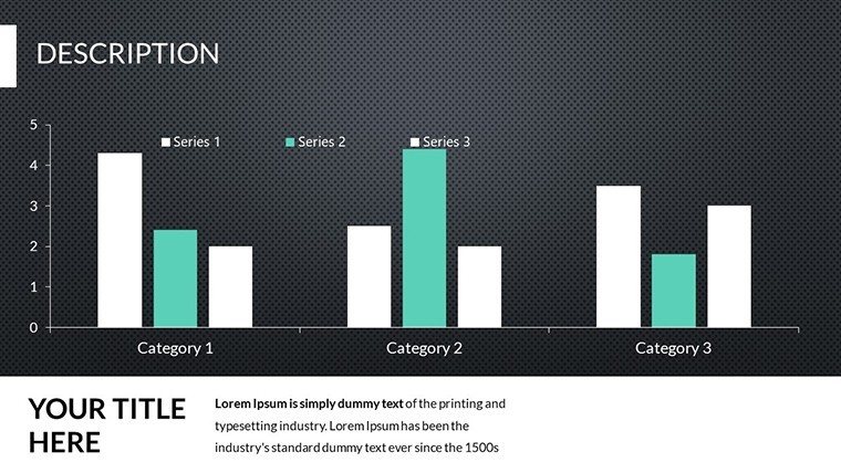
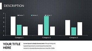
- Performance Highlight Tools: Built-in features to spotlight max/min values, with color-coding options for quick identification.
These features aren't arbitrary; they're crafted based on feedback from real users in fields like architecture, where AIA-compliant presentations often require clear relational data to secure approvals. By incorporating them, you save hours that would otherwise be spent on custom designs, allowing more time for refining your core message.
Real-World Applications in Architecture and Beyond
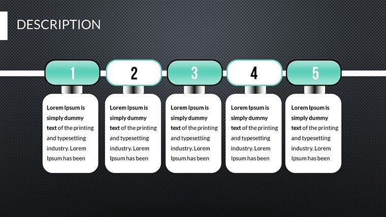
Let's dive into how this template shines in practical settings. For architects preparing for AIA award submissions, the charts can illustrate project evolution, comparing initial concepts against final builds in terms of budget adherence and sustainability metrics. Picture a slide showing the relationship between energy efficiency ratings and material choices - clients instantly grasp the value of green building practices.
In business contexts, sales teams might use it to compare quarterly performance across regions, identifying outliers that signal opportunities or risks. Educators, too, benefit: teaching urban planning students about land use patterns becomes interactive when charts reveal relationships between zoning laws and community growth. A case study from a leading firm like Gensler highlights how similar tools streamlined their proposal process, resulting in a 20% increase in client conversions by making data more relatable.
Workflow integration is straightforward. Start by importing your dataset into PowerPoint, select a slide from the template, and edit via the intuitive interface. For advanced users, link charts to Excel for live updates, ensuring your presentation always reflects current data. This adaptability makes it indispensable for iterative processes, like refining architectural models based on stakeholder feedback.
Step-by-Step Guide to Maximizing Your Charts
- Download and open the template in PowerPoint.
- Select a relationship chart slide that fits your data type.
- Double-click the chart to enter edit mode and input your variables.
- Adjust colors and fonts to match your branding - perhaps incorporating AIA's blue palette for professional appeal.
- Drag and position the chart alongside supporting text or images.
- Test for clarity: Ensure max/min values pop with bold highlights.
- Present with confidence, knowing your visuals back your expertise.
This process demystifies chart creation, turning novices into pros. Compared to basic PowerPoint tools, which often yield generic outputs, this template offers polished, thematic designs that elevate your work.
Enhancing Engagement Through Design Tips
To truly leverage this template, incorporate design best practices. Use contrasting colors for data points to draw eyes to key relationships, avoiding clutter by limiting variables per chart. In architecture pitches, pair charts with rendered images - for example, a relationship graph showing cost versus aesthetic impact next to a 3D model thumbnail. This multisensory approach, inspired by cognitive psychology principles, boosts retention rates.
Trustworthiness comes from transparency: Always cite data sources within slides, aligning with standards for credible presentations. Subtle animations, like fade-ins for revealing comparisons, add flair without overwhelming. For teams, version control is easy since edits are non-destructive, preserving original templates for future use.
As you explore these slides, you'll discover hidden gems like pre-set legends that auto-update, saving manual tweaks. In a real-world example, an urban planner used this to compare public transport efficiencies across cities, leading to informed policy recommendations that won grant funding.
Why This Template is a Game-Changer
In a sea of generic tools, our Relationship PowerPoint Charts stand out by focusing on user needs - quick edits, clear visuals, and versatile applications. Whether you're an architect visualizing site relationships or a manager tracking team dynamics, it delivers value. Priced accessibly, it's an investment in your professional image, backed by thousands of satisfied downloads.
Ready to transform how you present data? Dive in and experience the difference.
Frequently Asked Questions
- How editable are the relationship charts?
- Every element is fully customizable - data, colors, sizes, and positions - for tailored presentations.
- Is this compatible with Google Slides?
- Yes, import seamlessly and edit without losing functionality.
- Can I use this for non-architecture projects?
- Absolutely, it's versatile for any data comparison needs, from business to education.
- What if I need more slides?
- The 19 slides are expandable; duplicate and modify as needed.
- Are there tutorials included?
- Basic instructions are in the template; advanced tips available on our blog.