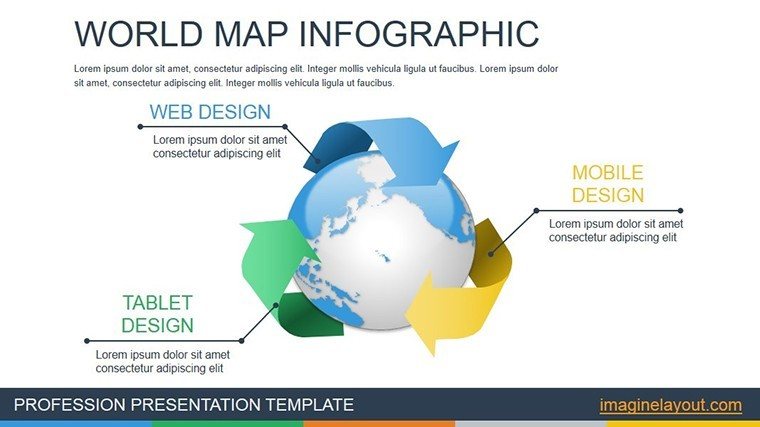
World Map Infographic PowerPoint Charts Template for Global Insights


Type: PowerPoint Charts template
Category: Illustrations
Sources Available: .pptx
Product ID: PC00470
Template incl.: 14 editable slides
In an interconnected world where data spans continents, our World Map Infographic PowerPoint Charts Template empowers you to present global perspectives with clarity and style. Featuring 14 editable slides centered on illustrative maps and infographics, this tool is perfect for multinational businesses, educators, and analysts. It tackles the challenge of visualizing international trends by offering customizable maps that highlight regions, flows, and statistics dynamically. Think of animating trade routes across oceans or color-coding countries by economic indicators – these visuals make complex global data accessible and engaging. Compatible with PowerPoint and Google Slides, it includes high-res vectors for precise editing. Informed by cartographic standards from organizations like the International Map Association, this template ensures accuracy while sparking curiosity, whether you're reporting on market expansions or teaching geography.
Key Features for Mapping Success
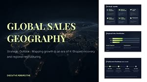
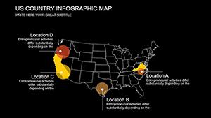
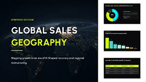
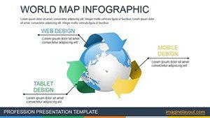
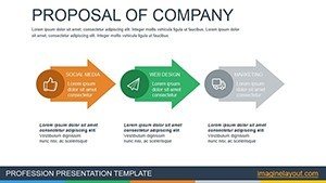
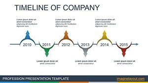
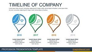
The template's strength lies in its illustrative designs, from world overviews to zoomed-in regions. Slide 1 offers a full world map with pinpoints for data hotspots; Slide 2 animates choropleth maps for density visuals. Slide 3 features flow arrows for migration or trade, while Slide 4 integrates bar charts over continents. Animations bring these to life, revealing layers progressively.
Personalization for Worldwide Applications
Customize projections, colors, and labels to fit your story. For an urban planning firm, highlight city networks globally, aligning with UN Habitat guidelines. Easy interface allows quick tweaks, with effects enhancing virtual or in-person delivery.
- Interactive Maps: Clickable regions for detailed pop-ups.
- Animation Effects: Fade-ins for data emphasis.
- Vector Graphics: Infinite scaling for any resolution.
- Theme Options: Day/night modes or custom palettes.
Global Use Cases and Examples
Multinationals use it for sales territory maps, boosting strategy sessions. Educators animate historical expansions, making lessons vivid. A logistics company visualized supply chains, cutting planning time by 35%. Non-profits map aid distributions, enhancing donor reports.
Guide to Effective Map Integration
- Choose a base map slide and add your datasets.
- Apply colors via conditional formatting for insights.
- Add animations for sequential storytelling.
- Embed links to sources for credibility.
- Present with zoom features for audience interaction.
This approach, based on GIS best practices, surpasses basic maps in depth and usability.
Tips from Mapping Experts
Avoid clutter by layering data – reveal on demand. Use projections like Mercator judiciously, per National Geographic advice. For architecture globally, map project sites with overlays.
Why This Template Excels Globally
Its focus on infographics and maps sets it apart, with proven user satisfaction. It's a gateway to professional, insightful presentations.
Chart your global narrative – download today.
Frequently Asked Questions
Can maps be updated with new data?
Yes, editable layers allow easy refreshes.
Are regional maps included?
Absolutely, with options to zoom and customize.
Supports animations in exports?
Yes, retains effects in PDF or video formats.
How accurate are the maps?
Based on standard projections for professional use.
Ideal for educational use?
Perfect, with engaging visuals for all ages.