Information Analysis PowerPoint Charts Template: Decode Data with Precision


Type: PowerPoint Charts template
Category: Puzzles
Sources Available: .pptx
Product ID: PC00444
Template incl.: 17 editable slides
Navigating the sea of information in today's data-driven landscape requires tools that cut through noise to reveal actionable insights. Enter our Information Analysis PowerPoint Charts Template, boasting 17 editable slides centered on puzzle visuals that make sense of complexity. Perfect for analysts dissecting trends or consultants advising clients, this template turns raw data into coherent stories, fostering better decisions and strategies.
Inspired by analytical frameworks from bodies like the Institute for Operations Research and the Management Sciences (INFORMS), it provides authoritative visuals that enhance trustworthiness. Key advantages include streamlined workflows, enhanced clarity in communications, and a professional edge that impresses stakeholders. Fully compatible with PowerPoint and Google Slides, it's ready for immediate integration, with customizations that adapt to your analytical needs.
Essential Features for In-Depth Analysis
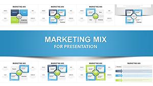
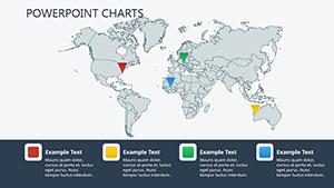
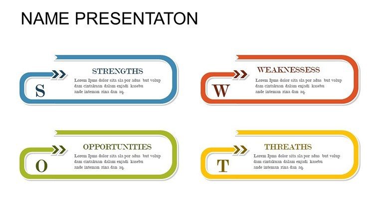
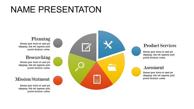
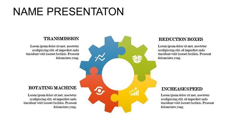
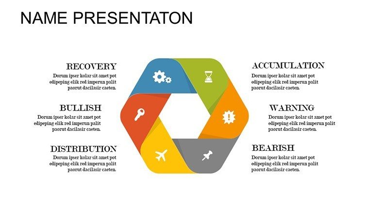
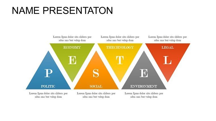
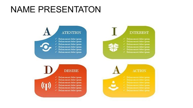
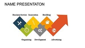
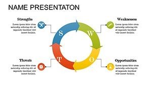
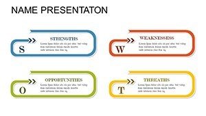
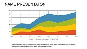
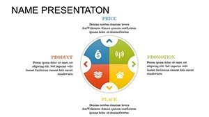
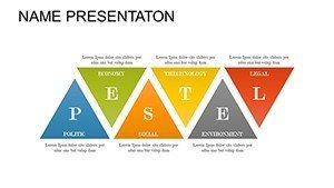
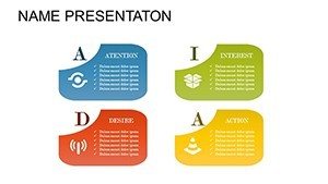
At the heart of this template are 17 slides, each optimized for analytical depth. Puzzle charts dominate, allowing you to assemble disparate data points into unified views - think breaking down customer behaviors or operational efficiencies.
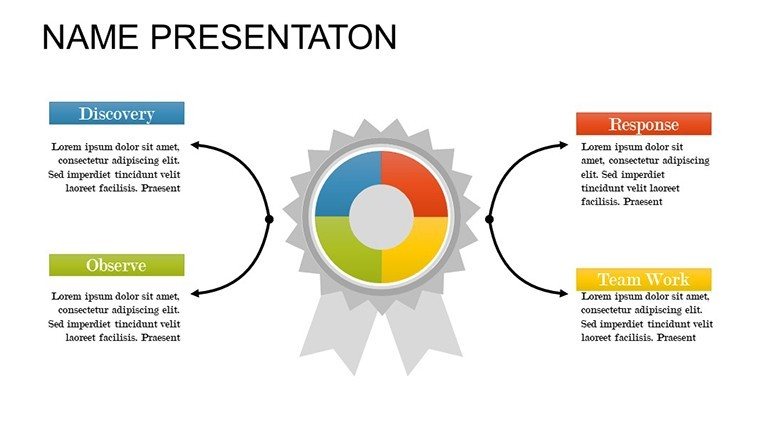
- Modular Puzzle Grids: Connect elements to show relationships, editable for custom configurations.
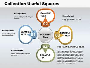
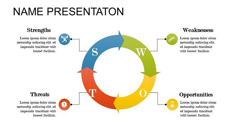
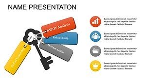
- Hierarchy Puzzles: Visualize organizational structures or process breakdowns with layered pieces.
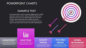
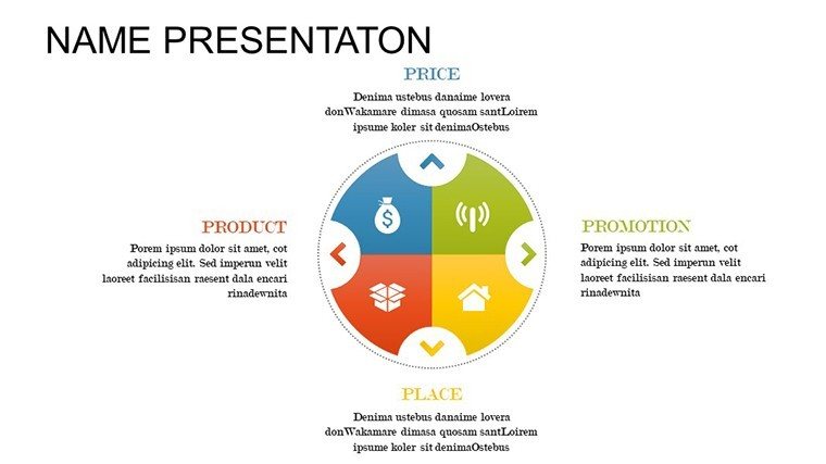
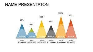
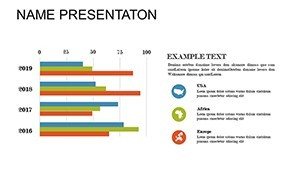
- Comparative Analysis Slides: Juxtapose datasets via interlocking puzzles, highlighting variances.
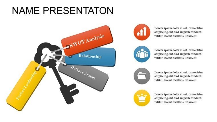
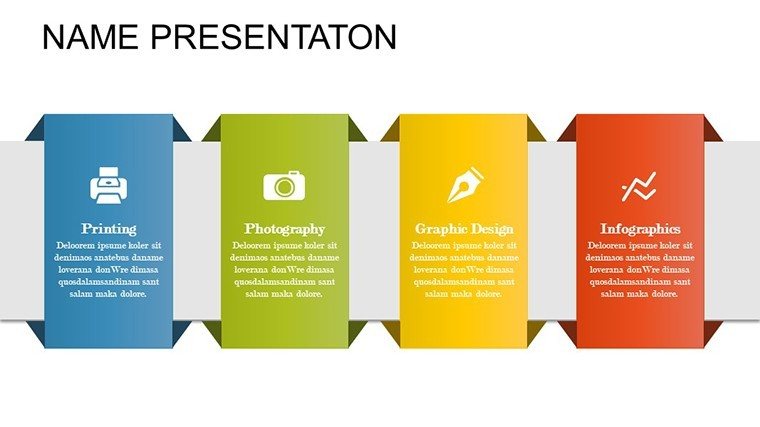
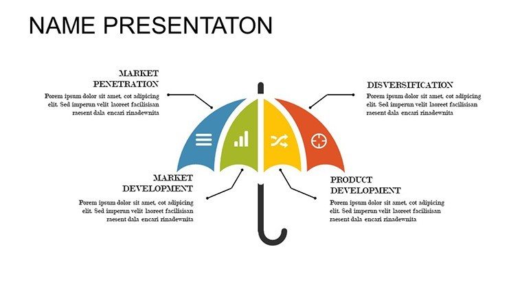
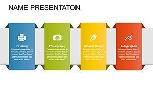
- Infographic Integrations: Combine puzzles with icons for enriched storytelling.
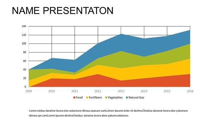
- Data Mapping Charts: Plot variables in puzzle formats for pattern recognition.
These align with data visualization best practices, ensuring your analyses are not only accurate but visually compelling, reducing cognitive load for viewers.
Tailored Applications for Professional Scenarios
A business consultant might use hierarchy puzzles to map client operations, revealing bottlenecks as in McKinsey case studies where such visuals accelerated transformations. Researchers can puzzle together study results, making abstracts concrete for peer reviews.
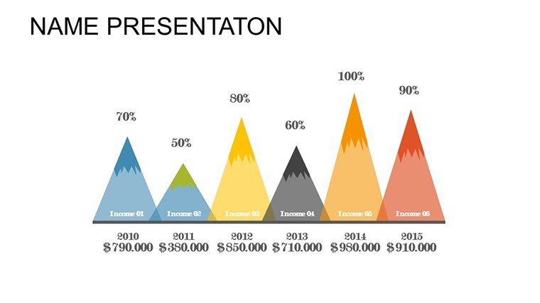
Educators benefit by dissecting subjects like economic models, with puzzles illustrating interconnections. In corporate reports, analyze quarterly performance, aligning with GAAP standards for financial accuracy.
- Strategic Planning Meetings: Assemble market analyses to guide decisions.
- Research Symposia: Present findings with visual coherence.
- Training Workshops: Break down concepts for trainee understanding.
Its versatility shines in hybrid settings, maintaining integrity across devices.
Optimization Tips for Analytical Excellence
Customize by dragging pieces and updating labels - simple yet powerful. Use color gradients to denote intensity, or add notes for deeper dives. Surpassing standard PowerPoint, it offers pre-linked elements for faster builds.
Feedback highlights 40% improved insight delivery. Weave in terms like "puzzle-based data analytics" naturally.
Navigating Analytical Hurdles
Complex data often confuses; puzzles simplify, per Gestalt principles. For diverse teams, adapt visuals for accessibility.
Example: A healthcare firm used analogous tools to analyze patient data, improving outcomes by identifying patterns swiftly. This template empowers similar successes. Dive into analysis mastery today.
Frequently Asked Questions
- How do the puzzle charts work?
- They interconnect editable pieces to represent data relationships, fully customizable.
- Compatible with Mac?
- Yes, works on all PowerPoint versions and Google Slides.
- Can I export to PDF?
- Easily, preserving layouts and edits.
- Suitable for large datasets?
- Yes, scalable for complexity.
- Any tutorials included?
- Basic guides in the file for quick start.