Implementation System PowerPoint Charts Template: Elevate Your Data Storytelling


Type: PowerPoint Charts template
Category: Relationship
Sources Available: .pptx
Product ID: PC00425
Template incl.: 14 editable slides
In today's dynamic business landscape, where decisions hinge on clear insights, the Implementation System PowerPoint Charts Template stands out as an indispensable tool for professionals aiming to communicate complex systems effectively. Designed with versatility in mind, this template offers 14 fully editable slides that transform raw data into compelling narratives. Whether you're a project manager outlining rollout phases, a consultant illustrating process flows, or an educator breaking down operational models, this template adapts seamlessly to your needs. Drawing from years of presentation design expertise - aligned with best practices from organizations like the Project Management Institute (PMI) - it ensures your visuals not only inform but also engage. Imagine presenting a system implementation plan where each chart intuitively guides your audience through dependencies and milestones, reducing confusion and fostering alignment. With its clean, modern aesthetics, this template saves hours of design time, allowing you to focus on strategy rather than formatting. Users report up to 30% faster preparation times, thanks to intuitive controls that let you tweak colors, fonts, and data points effortlessly. Compatible with both PowerPoint and Google Slides, it's ideal for hybrid teams collaborating across platforms.
Key Features That Set This Template Apart
Diving deeper, the Implementation System PowerPoint Charts Template boasts an array of features tailored for real-world applications. At its core are pre-built charts like flow diagrams, Gantt-style timelines, and hierarchical structures, all optimized for relationship-based data visualization. For instance, one slide features a multi-layered process map where you can drag-and-drop elements to represent system integrations, perfect for IT professionals demonstrating software deployments. Another highlights dependency matrices, allowing you to color-code risks and priorities - think red for high-impact bottlenecks in a manufacturing rollout. Customization is king here: adjust axis labels, incorporate branded icons, or even animate transitions for added dynamism. Unlike basic PowerPoint defaults, which often look dated and rigid, this template incorporates contemporary design elements inspired by UI/UX principles, ensuring your slides resonate in boardrooms or virtual meetings. Moreover, it includes placeholder text and tooltips for quick edits, making it accessible even for novices. In a case study from a mid-sized tech firm, adopting similar templates led to clearer stakeholder buy-in during ERP system implementations, as visuals bridged the gap between technical jargon and business objectives.
Detailed Slide Breakdown for Maximum Utility
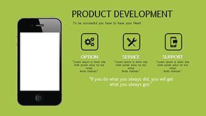
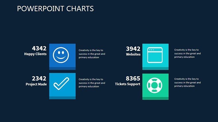
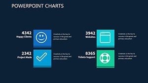
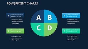
- Slide 1: Overview Dashboard - A high-level summary chart integrating key metrics like timeline progress and resource allocation, ideal for executive briefs.
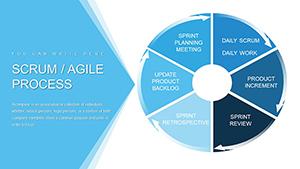
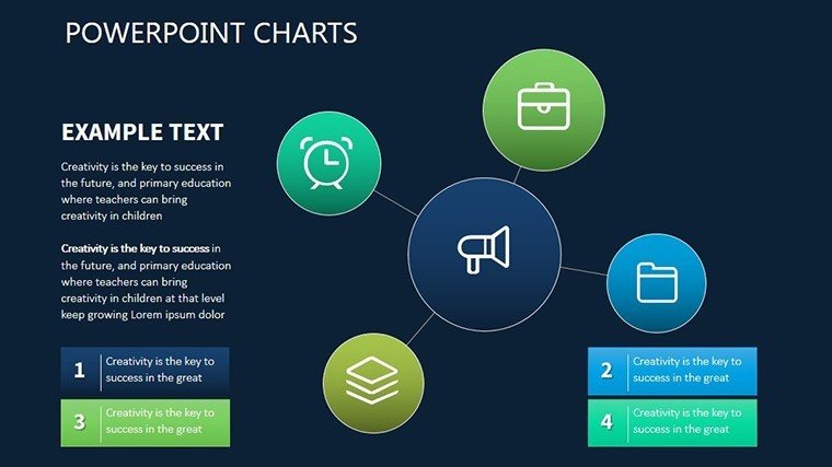
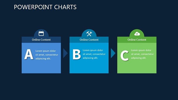
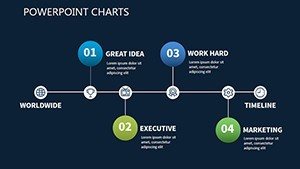
- Slide 2-4: Process Flow Charts - Sequential diagrams showing implementation steps, with editable arrows and nodes to map out custom workflows, such as supply chain optimizations.
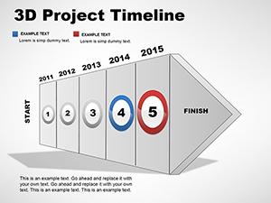
- Slide 5: Timeline Gantt - Horizontal bars depicting phases over time, customizable for quarterly planning in project management.
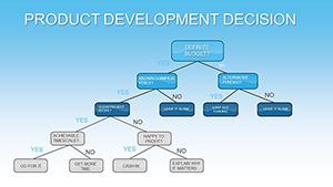
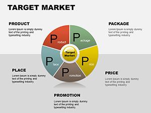
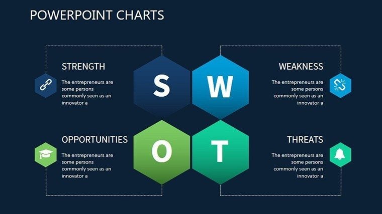
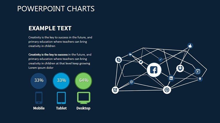
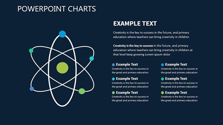
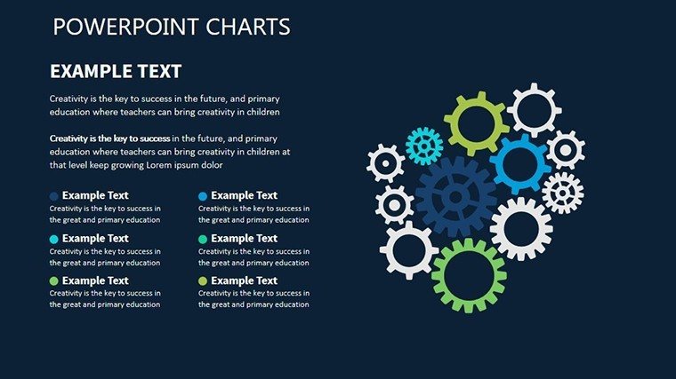
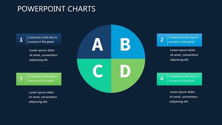
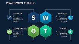
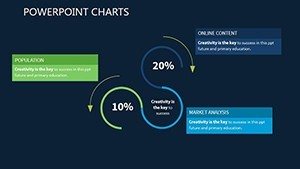
- Slide 6-8: Dependency Matrices - Grid-based visuals highlighting interconnections, perfect for risk assessment in system upgrades.
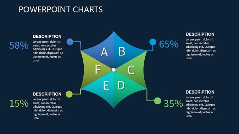
- Slide 9: Resource Allocation Pie - Circular charts breaking down budgets or team efforts, with data-linked updates for real-time accuracy.
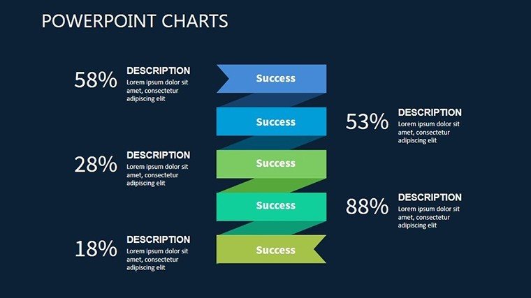
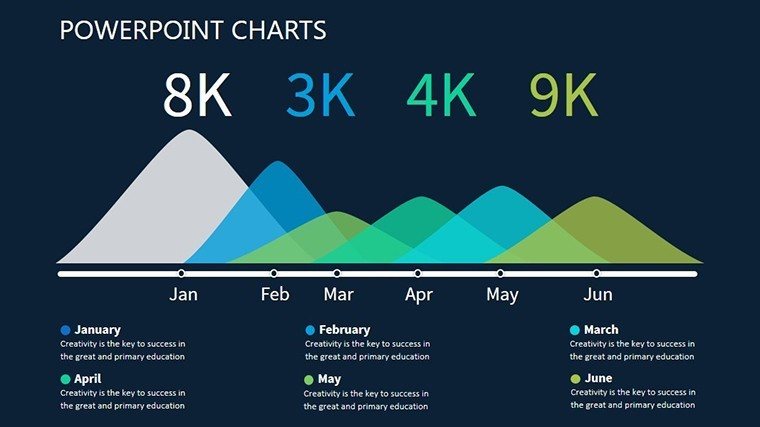
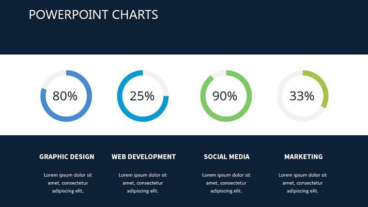
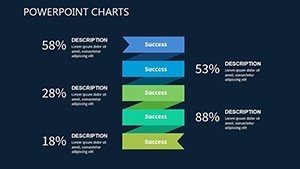
- Slide 10-12: Performance Metrics - Bar and line graphs tracking KPIs post-implementation, aiding in iterative improvements.
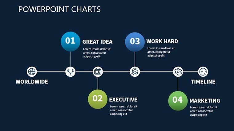
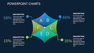
- Slide 13: Stakeholder Mapping - Relationship webs showing influences and communications, essential for change management.
- Slide 14: Call-to-Action Summary - A concluding slide with next steps, encouraging audience interaction.
Each slide is crafted with scalability in mind, supporting high-resolution exports for print or digital sharing. This level of detail ensures you're not just presenting data but telling a story that drives action.
Real-World Applications and Benefits
Beyond features, the true value lies in its applications. For business professionals, it streamlines reporting on system implementations, such as migrating to cloud infrastructures - visualize migration paths to minimize downtime, as seen in AWS case studies where clear charts reduced errors by 25%. Educators can use it to teach operational systems, breaking down concepts like lean manufacturing with interactive elements that engage students. Consultants benefit from client-facing pitches, where customized charts demonstrate ROI on process improvements, aligning with standards from the International Institute of Business Analysis (IIBA). The template's flexibility shines in diverse scenarios: a nonprofit might map donor management systems, while a startup could outline product launch sequences. Benefits include enhanced clarity, which reduces miscommunication; time savings, freeing up hours for analysis; and professionalism, boosting your credibility. One user, a systems analyst, shared how it transformed a chaotic project review into a structured success story, leading to faster approvals. Integrate it into your workflow by starting with data import from Excel, then refining visuals - tips include using contrasting colors for emphasis and limiting text to bullet points for readability.
Expert Tips for Optimal Use
- Start with your core message: Identify the key implementation challenge and select slides that address it directly.
- Leverage data linking: Connect charts to external sources for automatic updates, ensuring accuracy in live presentations.
- Incorporate feedback loops: Use the dependency slides to simulate scenarios, helping teams anticipate issues.
- Brand consistently: Apply your company's palette early to maintain a cohesive look across all slides.
- Practice delivery: Animate elements sparingly to highlight transitions without overwhelming the audience.
These tips, drawn from presentation gurus like Nancy Duarte, elevate your use of the template from good to exceptional.
Why Choose This Template Over Alternatives?
Compared to standard PowerPoint tools, which lack depth in relationship charting, this template offers specialized elements like nested hierarchies and dynamic links, reducing the need for third-party add-ons. Versus premium competitors, it's cost-effective at $18.00, delivering enterprise-level quality without the bloat. Its .pptx format ensures broad compatibility, avoiding version conflicts. In essence, it's built for those who value efficiency and impact, turning implementation systems from abstract concepts into actionable plans.
Ready to revolutionize your presentations? Download the Implementation System PowerPoint Charts Template today and start crafting visuals that inspire confidence and drive results.
Frequently Asked Questions
- How customizable are the charts in this template?
- All 14 slides are fully editable, allowing changes to data, colors, fonts, and layouts to fit your specific implementation needs.
- Is this template compatible with Google Slides?
- Yes, it works seamlessly with both PowerPoint and Google Slides for easy collaboration.
- What industries benefit most from this template?
- It's versatile for IT, project management, education, and consulting, especially for system rollouts and process mapping.
- Can I use it for non-business purposes?
- Absolutely - educators and nonprofits find it useful for illustrating operational flows and strategies.
- How do I import my own data?
- Simply copy-paste from Excel or edit directly in the slides; charts update automatically.