Money Demand PowerPoint Charts - Editable PPTX | ImagineLayout


Type: PowerPoint Charts template
Category: Relationship, Illustrations
Sources Available: .pptx
Product ID: PC00423
Template incl.: 11 editable slides
11 Editable Slides: Package Contents
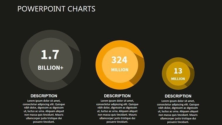
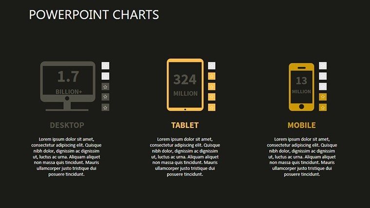
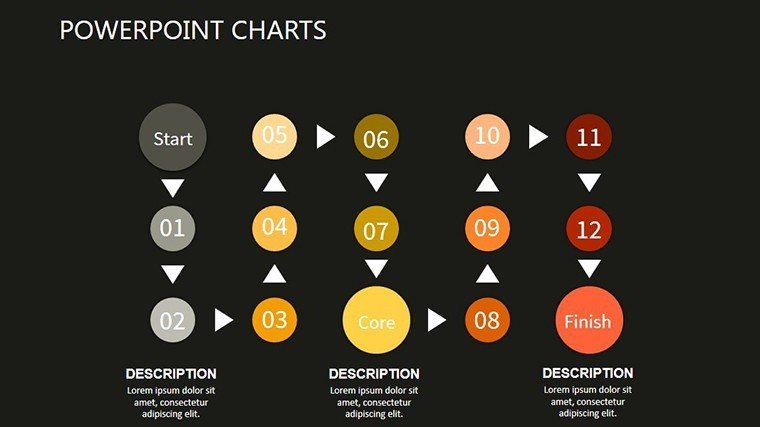
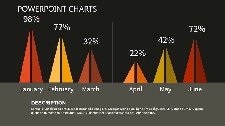
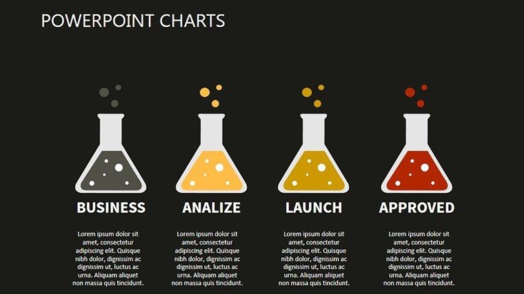
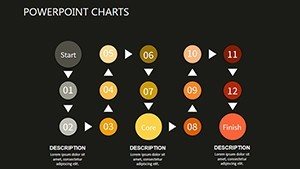
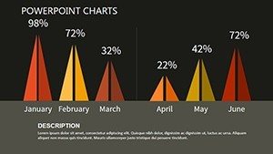
11 editable slides contain supply-demand curves and liquidity diagrams.
These enable investor deck presentations through economic flow mapping.
Unlike puzzle-focused sets this one centers on curve structures for demand hierarchy with specific zone segmentation.
Format and Compatibility Details
| Feature | Details |
|---|---|
| Slides included | 11 economic curve diagrams |
| Diagram categories | supply-demand and interest rate models |
| Editable elements | curves and labels edit separately |
| Aspect ratio | 16:9 |
| Compatibility | PowerPoint 2016+ Google Slides |
| Export options | PPTX and PDF |
Customization in 5 Steps
Moderate difficulty.
- Open the PPTX file in PowerPoint (1 minute).
- Replace placeholder text (3 minutes).
- Update colors on the master (2 minutes).
- Modify curve labels and connectors (4 minutes).
- Export as PPTX or PDF (1 minute).
Three Situations Where This Pays Off
Economists in research firms forecast market shifts.
They reuse the file across five briefings with color swaps.
Finance analysts in banks illustrate liquidity preferences.
Deck time reduces from 3 hours to 45 minutes.
Download the Money Demand PowerPoint Charts now.
Compared to Starting From Zero
Scratch builds take advanced skill and 4 hours.
Curves place labels outside shapes with thin connectors.
This supports hierarchy perception in live meetings.
Manual attempts often misalign curves and crowd data.
Download the Money Demand PowerPoint Charts now.
Which PowerPoint versions does this template support?
It functions in PowerPoint 2016 2019 365 and Mac releases. Curve shapes stay intact. Earlier versions may alter connector behavior. Test the file upfront.
How do I change the color scheme?
Enter slide master mode and revise the theme colors. Curves refresh at once. Save and exit master. The process ends in 2 minutes.
What does the license permit?
Internal and client presentations are permitted. Resale or sublicensing remains forbidden. Edited decks can be distributed. Full license sits inside the download.
Is there a free version?
The page does not specify a free version. Paid purchase supplies 11 editable slides. No free tier exists. Access begins right after checkout.
What file formats are included?
A single PPTX file comes in the package. It opens in PowerPoint. PDF export is available after changes. No other formats are listed.
Finance teams often pair these with relationship chart templates for economic decks.
Analysts link it to cyclic puzzle charts for market models.
Researchers combine the set with cause and effect charts for briefings.