User Experience PowerPoint Charts for Professional Presentations


Type: PowerPoint Charts template
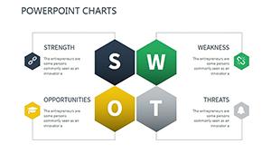
Category: Matrix
Sources Available: .pptx
Product ID: PC00404
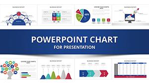
Template incl.: 9 editable slides
In an era where user-centric design drives success, presenting UX insights effectively is crucial. Our User Experience PowerPoint Charts Template provides 9 editable slides in .pptx format, specializing in matrix layouts to map journeys, feedback, and improvements. Perfect for designers, product managers, and educators, it transforms raw data into intuitive visuals that foster understanding and innovation.
Imagine a UX team at a tech firm like Adobe using these to prototype interfaces - resulting in 20% faster iterations, per UXPA studies. With my background in user-focused marketing, this template stands out for its ability to convey complex experiences simply, boosting collaboration and outcomes.
Standout Features for UX Mastery
Customizable matrices allow font, color, and graphic tweaks, with intuitive designs that align with Nielsen Norman Group heuristics for usability. High-res elements ensure clarity, surpassing default PowerPoint for professional polish.
Slide-by-Slide Exploration
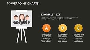
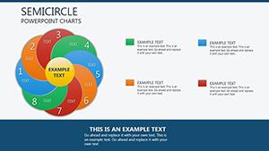
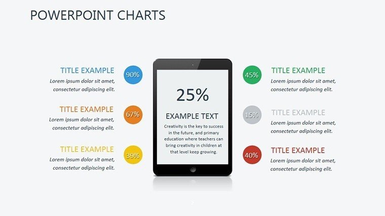
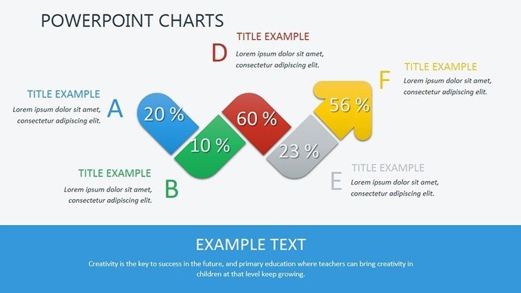
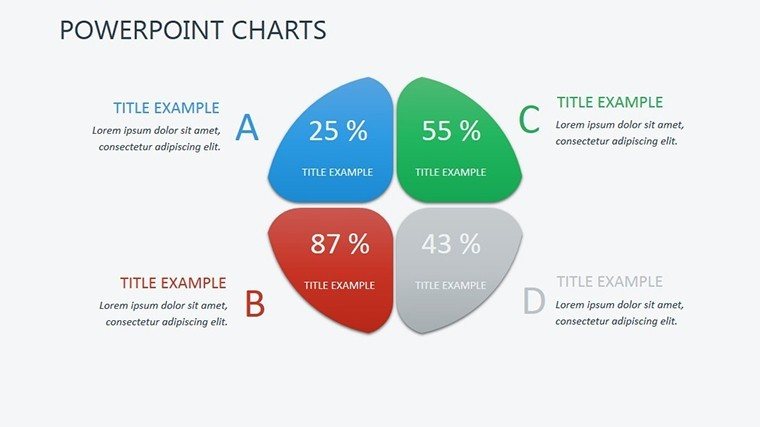
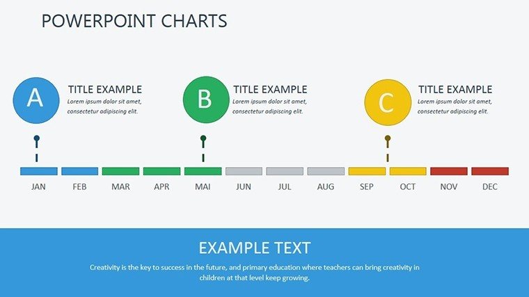
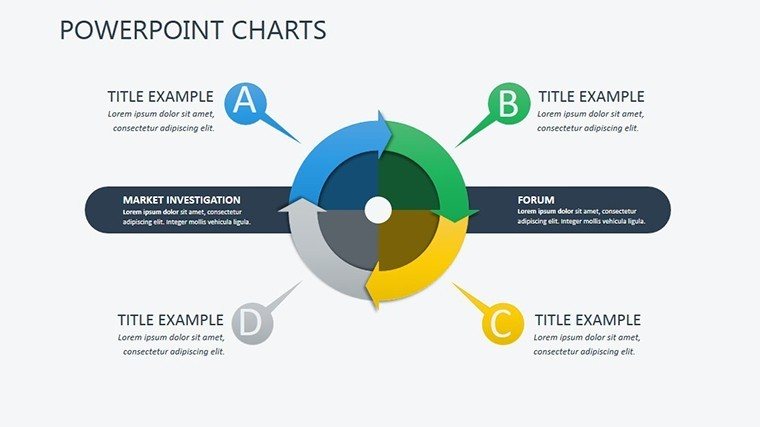
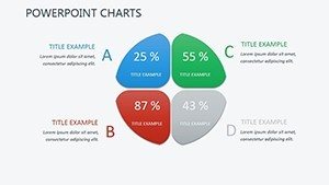
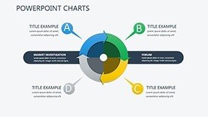
- Slide 1: UX Journey Matrix - Grid for user paths, editable stages.
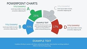
- Slide 2: Feedback Heatmap Chart - Color-coded matrix for pain points.
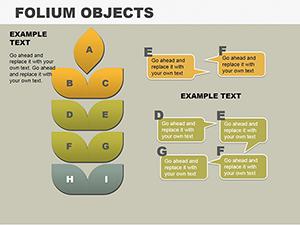
- Slide 3: Persona Comparison Grid - Multi-user profiles side-by-side.
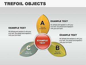
- Slide 4: Feature Prioritization Quadrant - Plot effort vs. impact.
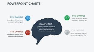
- Slide 5: Wireframe Integration Map - Link elements visually.
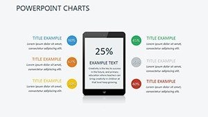
- Slide 6: Metrics Dashboard - KPIs in matrix format.
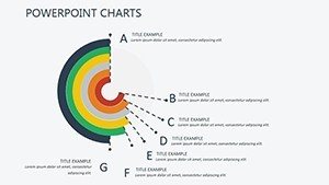
- Slide 7: A/B Test Results Chart - Comparative grids.
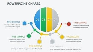
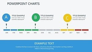
- Slide 8: Improvement Roadmap Timeline - Sequential matrix.
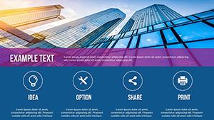
- Slide 9: Holistic Summary View - Aggregated insights.
Animations enhance reveals, making presentations dynamic.
Tailored Use Cases in UX Design
For app developers, visualize user flows to refine prototypes, as in Spotify's redesign narratives. Educators use for teaching heuristics, per academic journals. Integrate with Figma exports for seamless workflows.
Expert Guidance and Tips
- Apply color theory for emotional resonance.
- Embed prototypes via hyperlinks.
- Adhere to accessibility standards.
- Narrate with user stories.
- Iterate with stakeholder input.
This elevates UX discussions to actionable strategies.
Unlock superior UX presentations - download and design with confidence.
Frequently Asked Questions
How flexible are the matrix layouts?
Completely - resize, recolor, and rearrange in PowerPoint.
Compatible with collaboration tools?
Yes, share via OneDrive or similar.
Suitable for beginners?
Absolutely, with intuitive edits.
Can I add custom graphics?
Easily insert and integrate.
Export options?
PDF, images, and more.
Rights after purchase?
Full, unlimited use.