Renewable Energy PowerPoint Charts: Sustainable Presentation Templates


Type: PowerPoint Charts template
Category: Illustrations
Sources Available: .pptx
Product ID: PC00398
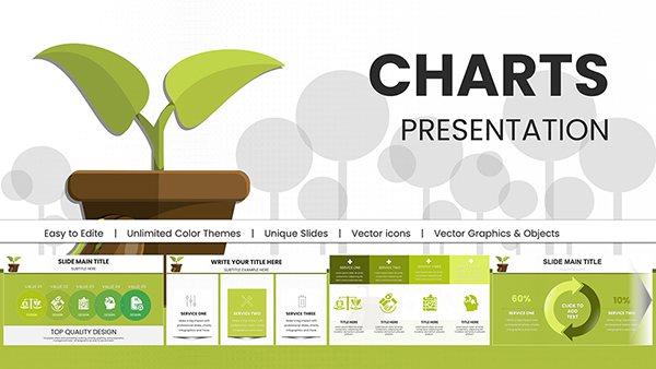
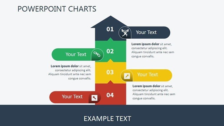
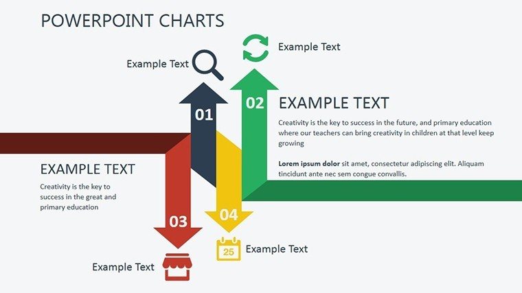
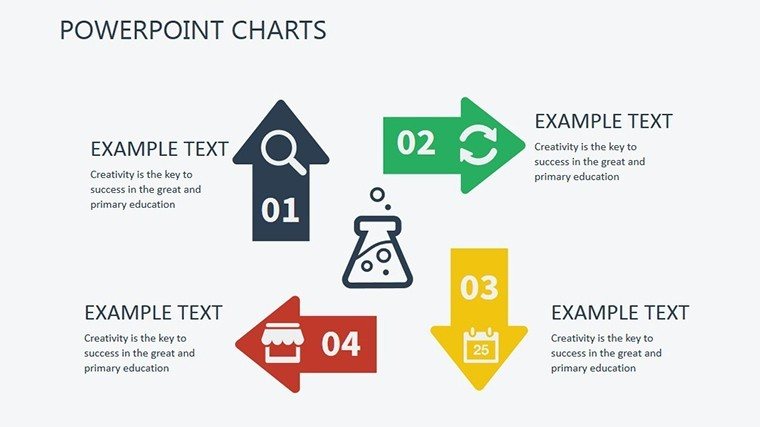
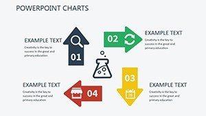
Template incl.: 13 editable slides
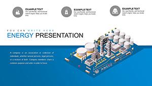
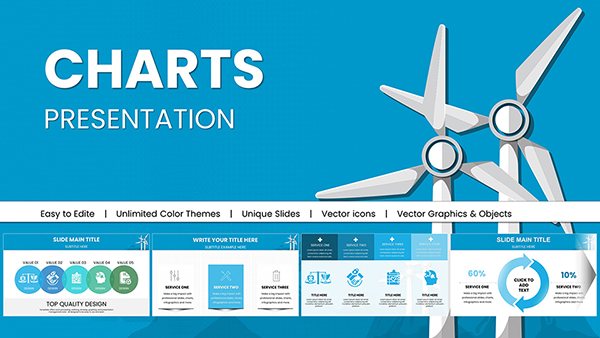
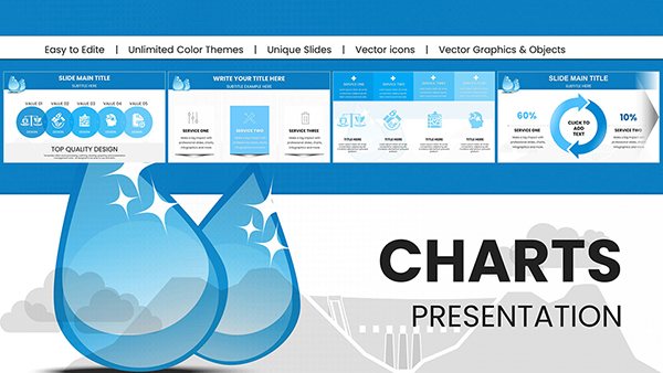
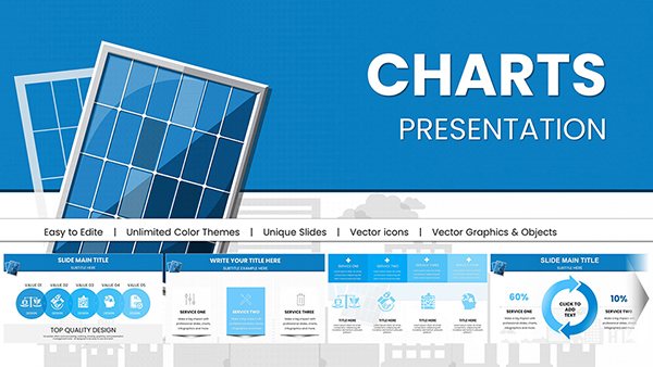
As the world pivots toward greener futures, communicating renewable energy concepts demands visuals that are as innovative as the technologies themselves. Our Renewable Energy PowerPoint Charts template delivers just that, with 13 editable slides designed to showcase solar efficiencies, wind farm outputs, and bioenergy potentials. Targeted at educators sparking curiosity in classrooms, researchers unveiling breakthroughs at symposiums, and business leaders pitching eco-investments, this tool bridges technical data with compelling stories. Drawing from IPCC visualization guidelines, it ensures your presentations are not only informative but authoritative. Compatible with PPTX and Google Slides, plus print-ready for handouts, it streamlines your process from concept to delivery. Envision transforming emission reduction stats into engaging bar graphs or policy impacts into flowcharts - all while promoting sustainability in your workflow.
Features That Power Green Narratives
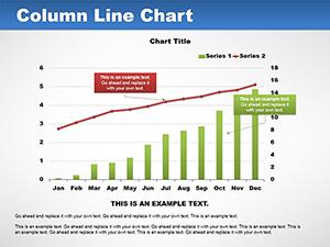
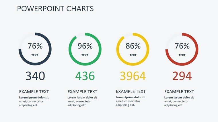
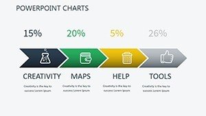
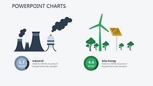
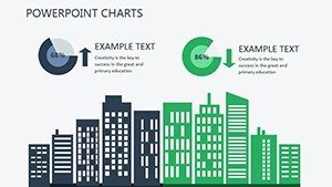
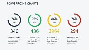
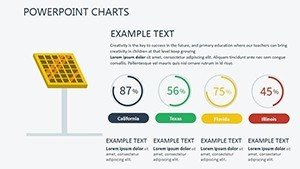
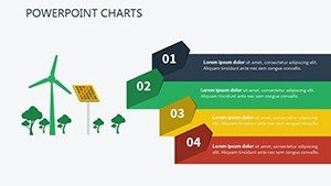
At its core, this template champions eco-design principles, using minimalistic layouts to reduce cognitive load, as recommended by sustainability communication experts. Slides include specialized charts like treemaps for energy source hierarchies or gauges for efficiency metrics, far surpassing basic PowerPoint's limitations. Benefits include heightened audience retention - visuals boost recall by 55%, per environmental education studies - and trustworthiness through accurate, scalable graphics. For a wind energy proposal, customize a line chart with real-time data from sources like IRENA, adding layers for multi-variable analysis.
Effortless Customization for Impact
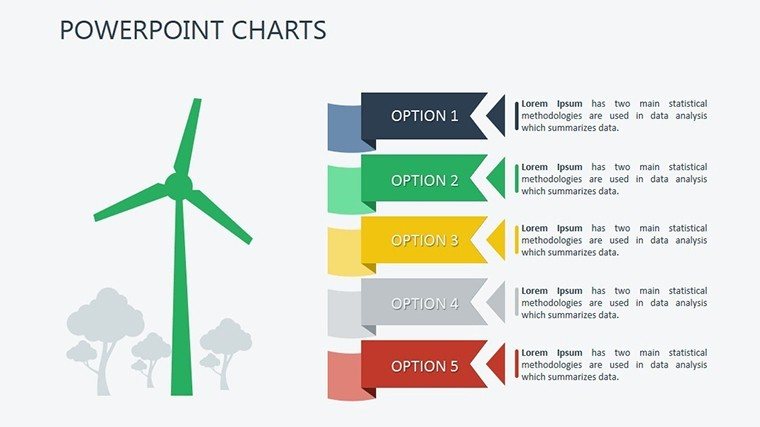
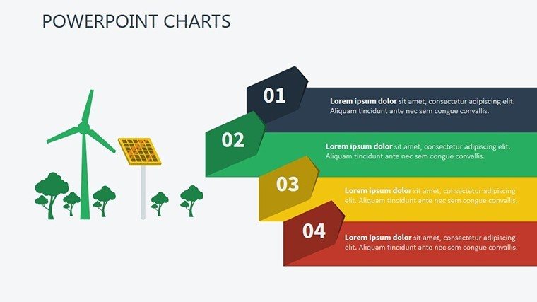
Adaptability reigns: Tweak eco-themed color gradients, from ocean blues for hydro to sunny yellows for solar, ensuring brand synergy. Embed icons representing turbines or panels, enhancing visual appeal without clutter. In contrast to rigid free templates, ours offers vector-based elements for sharp resolutions. Integrate into your routine: Pull data from EPA reports, populate slides, and apply transitions for dynamic reveals in virtual eco-forums.
Who Benefits from These Eco-Charts?
- Educators and Researchers: Illustrate climate models with heat maps, aligning with NGSS standards for science education.
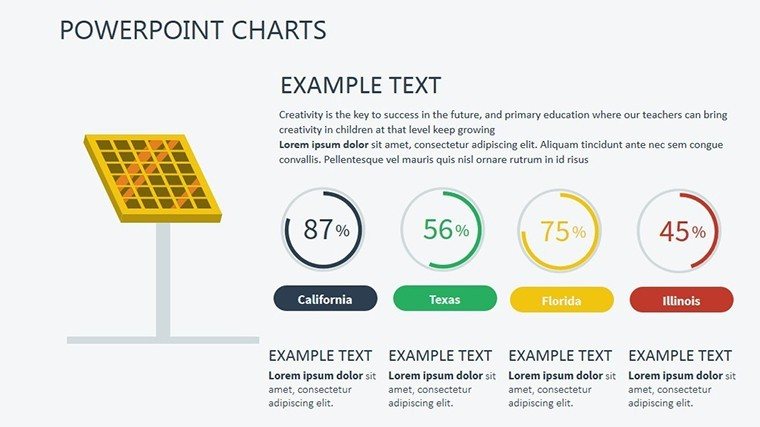
- Business Professionals: Pitch renewable portfolios using pie charts on ROI, impressing investors with data-backed projections.
- Environmental Advocates: Rally support with infographics on carbon savings, drawing from WWF case studies for credibility.
These targeted features address sector-specific needs, fostering collaborations that accelerate the green transition.
Real-World Applications in Sustainability
Explore use cases: A solar startup might use bubble charts to map installation costs vs. savings, informed by SEIA data. Step-by-step: 1) Research metrics; 2) Input into editable fields; 3) Customize aesthetics; 4) Add annotations; 5) Print for stakeholder meetings. Another: Advocacy campaigns with timelines charting policy milestones. Tips: Use LSI like "sustainable energy graphics" for better discoverability, and always cite sources to uphold .
Workflow Optimization Tips
- Assemble your renewable datasets.
- Select appropriate chart types from the template.
- Personalize with eco-icons and colors.
- Test for print and digital compatibility.
- Iterate based on feedback for refined impacts.
This approach not only efficiencies your efforts but amplifies your message's reach.
Ignite Your Green Revolution Today
Step up your renewable energy advocacy with a template that's as forward-thinking as your ideas. Download now to create presentations that don't just present data - they propel positive change.
Frequently Asked Questions
- How customizable are the visuals?
- Fully editable, from colors and fonts to layouts, for perfect alignment with your content.
- Compatible with Google Slides?
- Yes, seamless import and editing in Google Slides format.
- Is it print-ready?
- Absolutely, optimized for high-quality prints like posters or reports.
- Suitable for non-renewable topics?
- Versatile enough for any data visualization, though optimized for eco-themes.
- What support is available?
- Included guides; reach out for customization help.