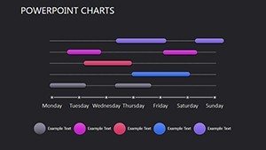
Direct Marketing PowerPoint Charts Template: Unlock Data-Driven Insights


Type: PowerPoint Charts template
Category: Illustrations
Sources Available: .pptx
Product ID: PC00395
Template incl.: 9 editable slides
In the fast-paced world of direct marketing, where every campaign hinges on precise data analysis and compelling storytelling, having the right tools can make all the difference. Imagine transforming raw metrics like response rates, customer acquisition costs, and conversion funnels into visually stunning narratives that captivate stakeholders and clients alike. Our Direct Marketing PowerPoint Charts Template is designed precisely for professionals like you - marketers, analysts, and executives - who need to communicate complex information with clarity and impact. With 9 fully editable slides packed with versatile charts such as bar graphs for comparative analysis, pie charts for segmentation breakdowns, line charts for trend tracking, and area charts for cumulative performance, this template empowers you to create presentations that not only inform but inspire action. Compatible with PowerPoint and Google Slides, it offers seamless customization options, including color schemes to match your brand identity and font styles for enhanced readability. Whether you're pitching a new email campaign to your team or reporting ROI to investors, this template saves hours of design time while ensuring your message resonates. Drawing from real-world applications, such as how leading firms like HubSpot use similar visuals to optimize lead nurturing, you'll see immediate value in turning data into decisions.
Key Features That Set This Template Apart
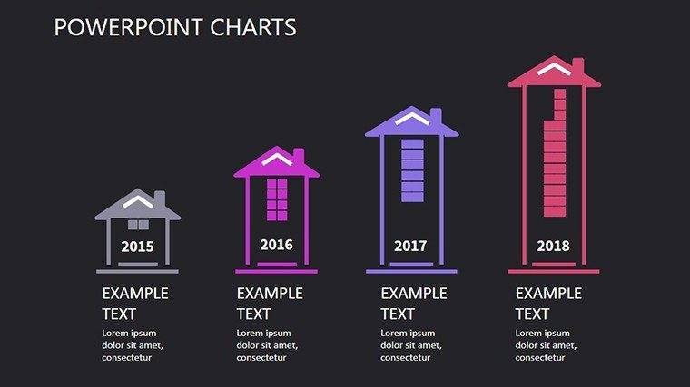
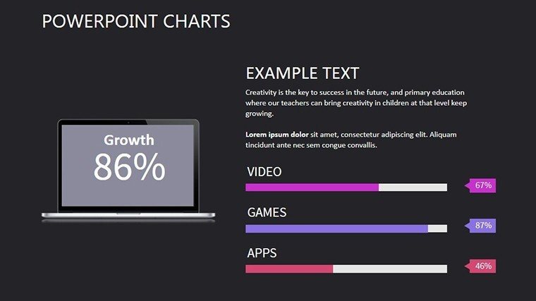
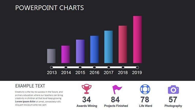
Diving deeper into what makes this template a must-have, let's explore its core elements. Each slide is meticulously crafted to handle the nuances of direct marketing data, ensuring your presentations are both professional and persuasive. For instance, the bar charts allow for side-by-side comparisons of multichannel performance, highlighting email versus social media effectiveness without overwhelming your audience.
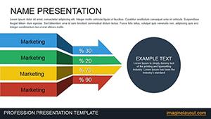
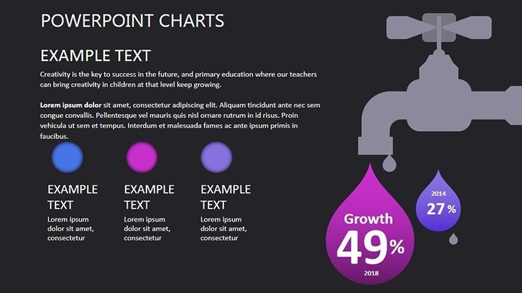
- Customizable Visuals: Easily adjust elements like colors, sizes, and labels to fit your specific dataset, making it ideal for A/B testing results or customer demographic profiles.
- Data Integration: Plug in real-time data from tools like Google Analytics or CRM systems, keeping your charts dynamic and up-to-date.
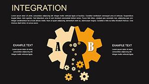
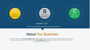
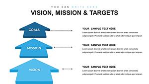
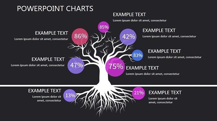
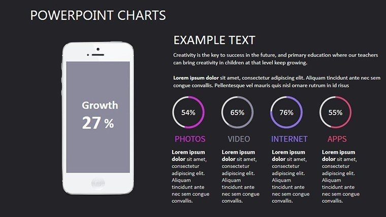
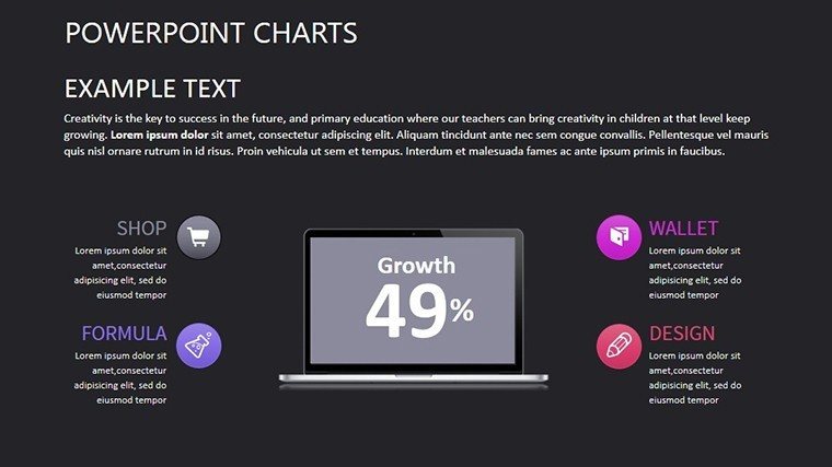
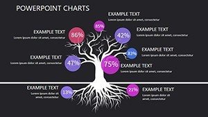
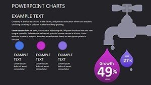
- Infographic Elements: Incorporate themed icons and diagrams to illustrate concepts like customer journeys or sales pipelines, adding a layer of engagement that static text can't match.
- User-Friendly Design: Intuitive layouts with guided placeholders ensure even beginners can produce polished slides quickly.
Beyond these, the template adheres to best practices in data visualization, inspired by experts like Edward Tufte, who emphasize minimizing chartjunk for maximum clarity. This means your presentations will not only look great but also comply with industry standards for accessibility, such as high-contrast colors for better visibility in virtual meetings.
Benefits for Your Marketing Workflow
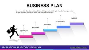
Adopting this template isn't just about aesthetics - it's about efficiency and outcomes. In a field where time is money, pre-built charts reduce creation time by up to 70%, allowing you to focus on strategy rather than formatting. Professionals in direct marketing often struggle with presenting multifaceted data; this template solves that by offering versatile formats that adapt to various scenarios, from quarterly reviews to client proposals. Consider a case study from a mid-sized e-commerce brand: By using similar customizable charts, they increased stakeholder buy-in for a retargeting campaign, resulting in a 25% uplift in conversions. The professionalism it conveys builds trust, positioning you as an authoritative voice in your organization. Moreover, its versatility extends to educational settings, where trainers can use it to teach marketing principles, fostering deeper understanding through visual aids.
Real-World Applications and Use Cases
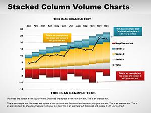
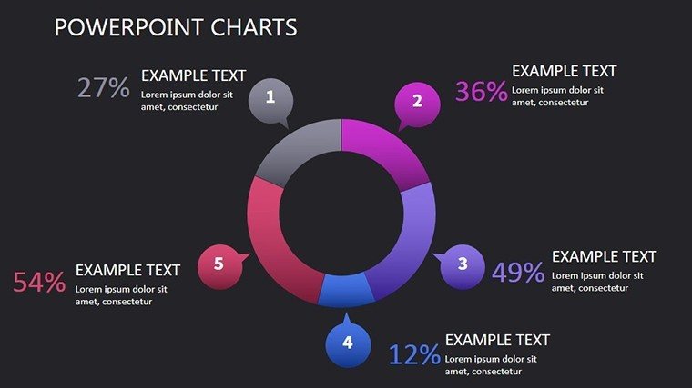
Let's bring this to life with targeted examples. Suppose you're analyzing a direct mail campaign's performance. Start with a pie chart to break down response rates by demographic segments, then transition to a line chart showing trends over the campaign duration. This narrative flow keeps audiences engaged and highlights key insights, such as peak engagement times. For sales teams, bar charts can compare lead generation from different channels, informing budget allocations. In market research presentations, area charts effectively display cumulative consumer behavior data, revealing patterns like seasonal buying habits. Educators might employ the template in workshops, using infographics to explain the AIDA model (Attention, Interest, Desire, Action) in direct marketing contexts. A real example comes from the Direct Marketing Association (DMA), where members leverage such visuals in annual reports to demonstrate industry growth, proving the template's alignment with proven strategies. By integrating these into your workflow, you'll not only streamline preparation but also enhance persuasion, turning data skeptics into advocates.
- Prepare Your Data: Gather metrics from your campaigns and organize them in spreadsheets for easy import.
- Customize Slides: Select the appropriate chart type and input your data, adjusting visuals to emphasize critical points.
- Refine and Present: Add narrative text, rehearse transitions, and deliver with confidence, knowing your visuals support your story.
This step-by-step approach ensures seamless integration, whether you're using PowerPoint on Windows or Mac. Compared to basic built-in charts, this template offers advanced styling options, like gradient fills and animations, without requiring design expertise.
Advanced Tips for Maximum Impact
To elevate your presentations further, incorporate storytelling elements. Frame your charts within a compelling narrative - begin with the problem (e.g., low engagement), present data insights, and end with actionable recommendations. Use the template's themed icons to add flair, such as envelope icons for email metrics, enhancing memorability. For virtual presentations, ensure charts are zoom-friendly and include alt text for accessibility, aligning with WCAG guidelines. If collaborating, the editable nature allows team input, fostering collective refinement. In competitive pitches, highlight unique value props, like how this template's designs have helped firms win awards at marketing conferences. Ultimately, this tool isn't just about charts; it's about transforming how you communicate value in direct marketing.
Ready to revolutionize your direct marketing presentations? Download this template today and start crafting visuals that convert data into success stories.
Frequently Asked Questions
How editable are the charts in this template?
The charts are fully editable, allowing you to change data, colors, fonts, and layouts to suit your needs without any restrictions.
Is this template compatible with Google Slides?
Yes, while designed for PowerPoint, it works seamlessly with Google Slides for easy collaboration and access.
Can I use this for non-marketing purposes?
Absolutely, the versatile charts can adapt to sales, education, or any data-driven field requiring clear visualizations.
What if I need more slides?
You can duplicate existing slides or contact support for custom expansions to fit larger presentations.
Are there tutorials included?
Yes, each slide includes easy-to-follow instructions, and additional resources are available upon download.