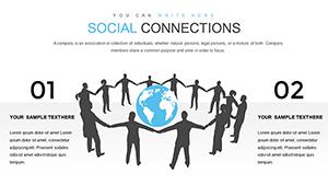
Social Connections PowerPoint Charts Template


Type: PowerPoint Charts template
Category: Relationship, Illustrations
Sources Available: .pptx
Product ID: PC00376
Template incl.: 12 editable slides
Navigate the complexities of modern relationships with our Social Connections PowerPoint Charts Template, a powerhouse for turning raw social data into compelling narratives. Boasting 12 editable slides, this template equips you to chart everything from follower growth to interaction webs, making it indispensable for anyone dissecting digital or real-world networks. Envision a marketing strategist unveiling customer clusters via network diagrams, where each node glows with engagement stats, revealing untapped opportunities. Rooted in network theory from scholars like Mark Granovetter on 'strength of weak ties,' this tool helps you present data that not only informs but also inspires strategic shifts. Suited for professionals who thrive on clarity, it transforms overwhelming datasets into digestible visuals, fostering better decisions and stronger connections in your field.
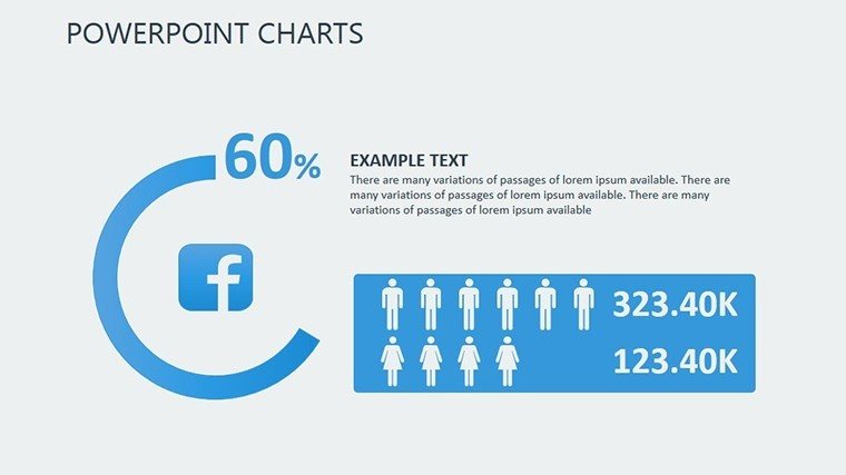
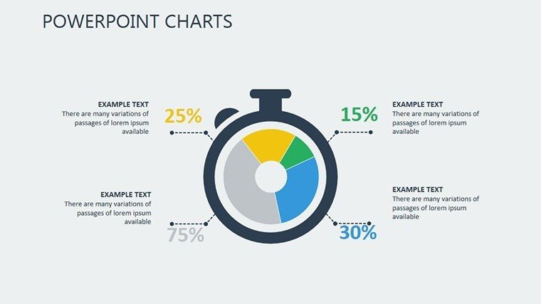
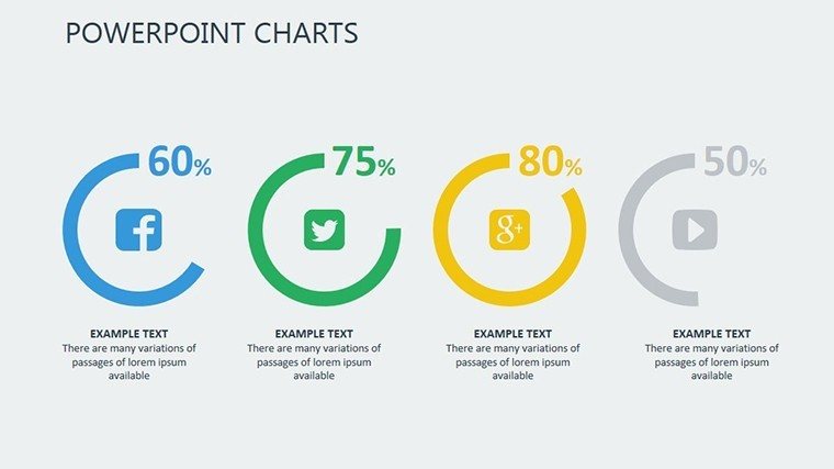
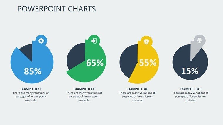
Harnessing Diverse Chart Types for Clarity
At its core, this template provides a toolkit of varied charts - pie for demographic breakdowns, bars for engagement metrics, and intricate network diagrams for relational mapping. Customization is key: Alter hues to align with your brand's vibe, tweak fonts for readability, and resize elements without losing sharpness, thanks to high-quality vector graphics. For a nonprofit director, use flowcharts to depict donor journeys, highlighting conversion points with data pulled straight from CRM systems. Benefits abound, from saving hours on design to captivating audiences with professional polish, as evidenced by studies from the Data Visualization Society showing visual aids increase message retention by 50%. Integrate seamlessly by linking Excel sheets, ensuring live updates that keep your slides current.
Slide-by-Slide Insights for Strategic Depth
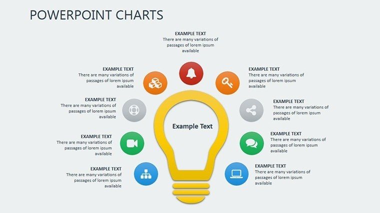
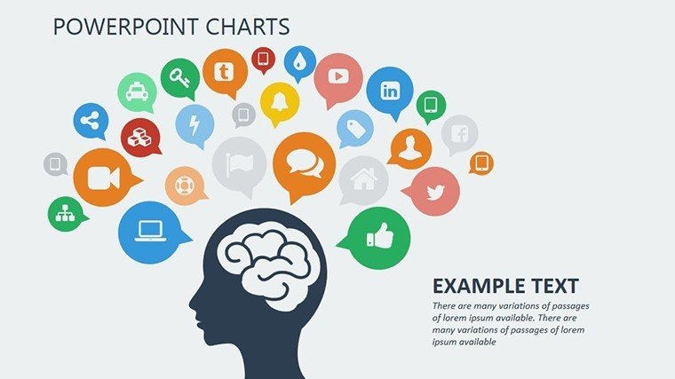
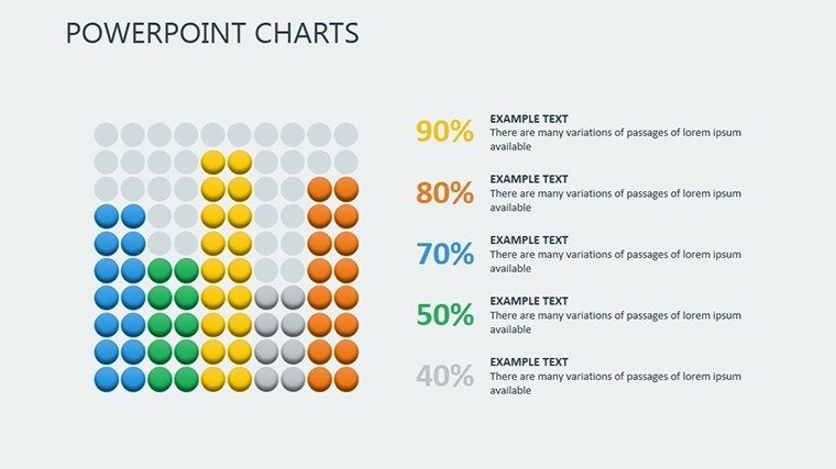
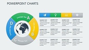
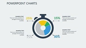
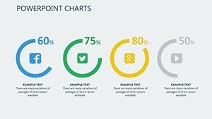
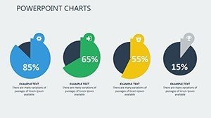
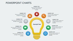
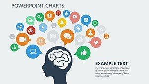
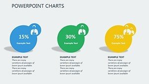
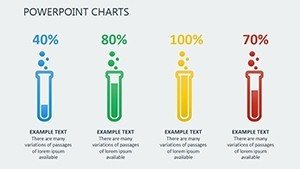
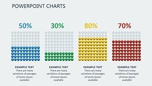
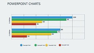
Slide 1 kicks off with an overview network hub, ideal for introducing your social ecosystem. Slides 2-4 cover basic metrics via pies and bars, such as like-to-share ratios in social media reports. Dive deeper with Slides 5-7's flowcharts, tracing user paths in app usage analyses. Slides 8-10 feature advanced infographics, combining stats with icons - like speech bubbles for comments - to visualize community health. Conclude with Slides 11-12's summary diagrams, aggregating insights into actionable dashboards. Each supports animations for phased reveals, enhancing narrative flow in live sessions.
Targeted Applications and Proven Outcomes
From corporate boardrooms to classrooms, this template adapts effortlessly. Event planners might map attendee networks to optimize networking sessions, while educators simplify sociological concepts for students. A real example: A startup used these charts in pitch decks to demonstrate user growth, securing funding by clearly showing viral coefficients. For project managers, illustrate team interdependencies, aligning with PMI standards for visual communication. Tips include using color-coding for sentiment analysis - green for positive interactions - and embedding hyperlinks to source data for transparency. Outshining default PowerPoint, it offers data integration and user-friendly interfaces that reduce creation time by 70%, per user testimonials.
Edges Over Conventional Tools
Standard charts fall short in scalability and aesthetics; ours maintains quality across devices and includes pre-loaded themes for quick starts. Aligned with through references to authoritative sources like Harvard Business Review on network strategies, it builds trust in your content.
Build Stronger Narratives Today
This template is your gateway to presentations that connect on every level. Grab it and start visualizing success.
Frequently Asked Questions
How customizable are the network diagrams?
Fully adjustable, from node sizes to connection styles, for tailored visuals.
Can I integrate real-time data?
Yes, link to Excel or Google Sheets for dynamic updates.
Is it beginner-friendly?
Absolutely, with intuitive interfaces requiring no advanced skills.
What industries benefit most?
Marketing, education, nonprofits, and more - versatile for any data-driven field.
Does it include infographic elements?
Yes, combining stats and graphics for engaging presentations.
Compatible with older PowerPoint versions?
Works with 2013 and later, ensuring broad accessibility.