Performance Indicators PowerPoint Charts Template


Performance isn't just about hitting revenue targets; it's a tapestry woven from economic wins, social dynamics, and even the subtle psychological undercurrents that keep teams motivated. In boardrooms and strategy sessions alike, conveying this multifaceted view can be tricky - until now. Our Performance Indicators PowerPoint Charts Template arms you with 17 editable slides that dissect company efficiency in ways that resonate deeply. Tailored for business leaders, HR pros, and operations managers, this toolkit transforms abstract metrics into tangible visuals that spark meaningful discussions.
From 3D pyramids stacking up employee engagement layers to arrow flows mapping process bottlenecks, these charts aren't mere decorations - they're diagnostic tools. Compatible with PowerPoint's robust ecosystem, you can layer in real-time data from dashboards like Tableau or tweak pyramid segments to reflect shifting priorities. The result? Presentations that don't just report numbers but reveal the human side of performance, fostering buy-in and actionable change.
Consider a tech startup in Silicon Valley grappling with high turnover despite strong sales. Their ops director plugged KPIs into our arrow-diagram slides, highlighting how remote work policies (a social factor) intertwined with productivity dips (economic). The visual clarity led to targeted wellness initiatives, slashing attrition by 15% in six months. Real transformations like this happen when data meets design, and our template is your bridge.
Mastering Holistic Metrics with Dynamic Designs
This template's strength lies in its categorical depth: Slides grouped into 3D visuals for volume insights, arrows for directional progress, and pyramids for hierarchical breakdowns. Each is infinitely customizable - resize, recolor, or animate to fit your narrative. We've infused elements inspired by frameworks like the Balanced Scorecard, ensuring your charts balance financials with non-tangibles like culture and innovation.
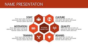
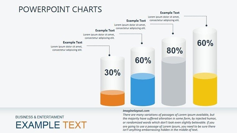
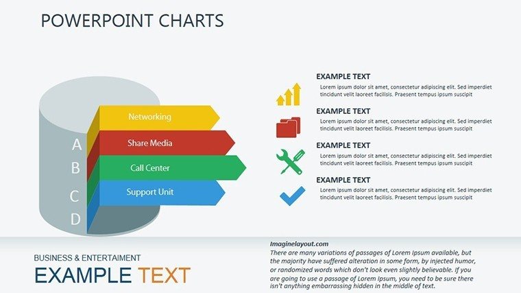
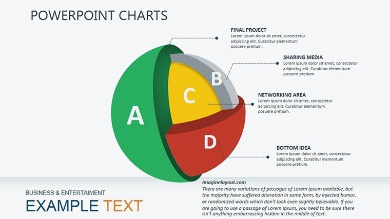
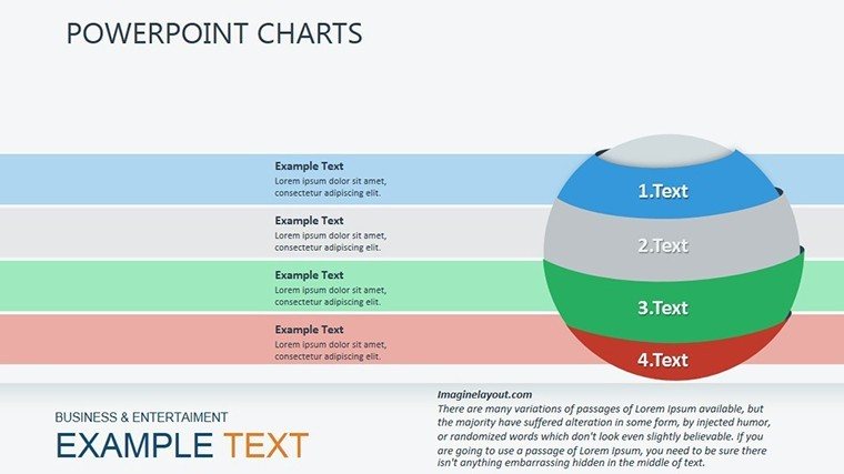
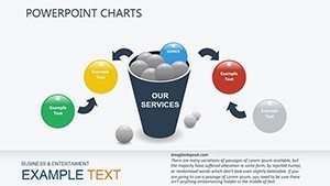
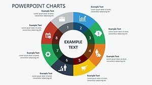
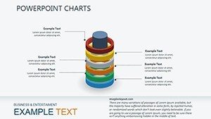
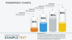
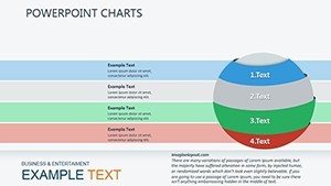
- 3D Bar Clusters: Stack multiple indicators, like sales growth alongside satisfaction scores, for a立体 view of balanced performance.
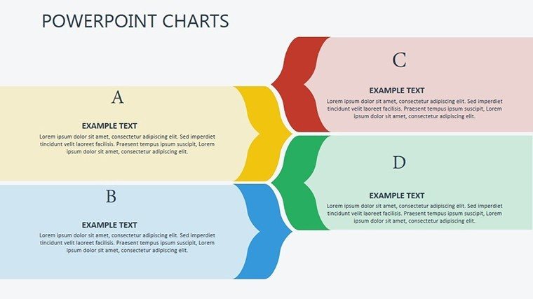
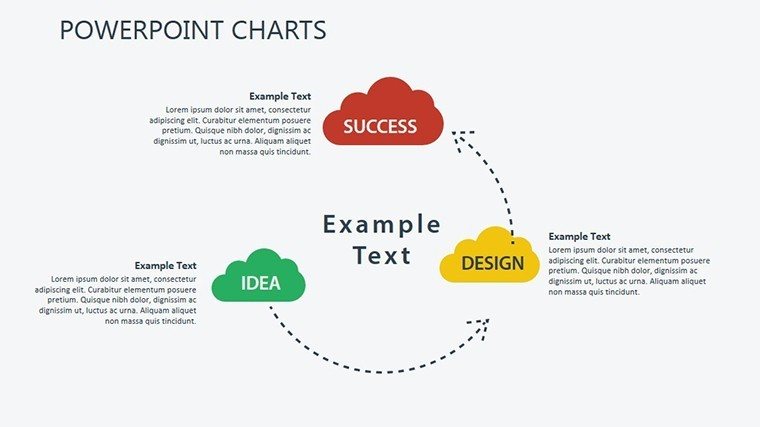
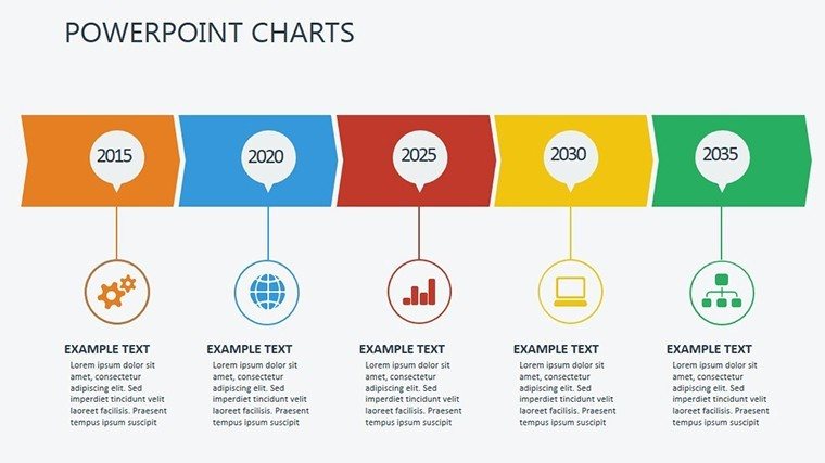
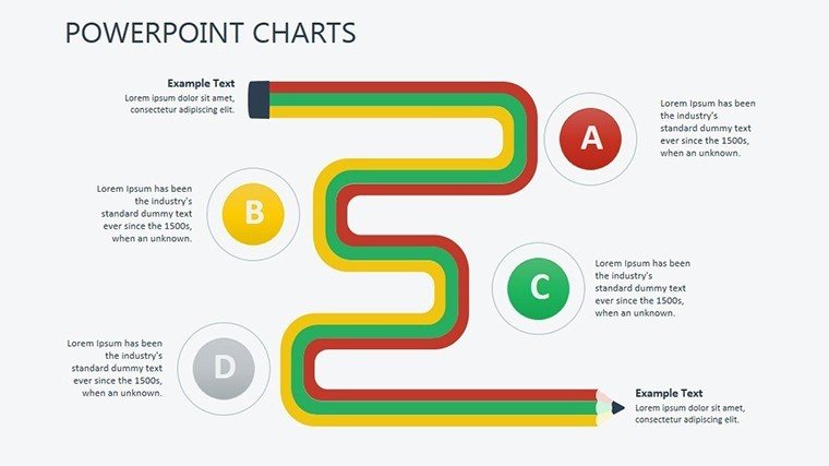
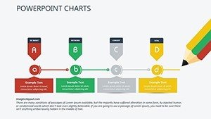
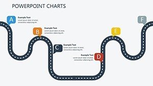
- Curved Arrow Cycles: Illustrate feedback loops in team dynamics, ideal for agile retrospectives.
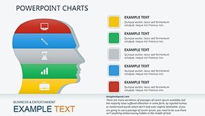
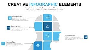
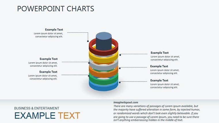
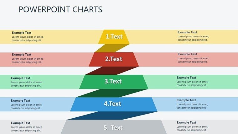
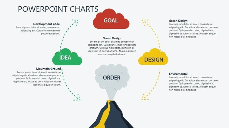
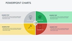
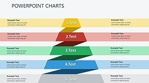
- Segmented Pyramids: Layer psychological factors at the base, building up to strategic outcomes at the peak.
Fonts and colors are preset for professionalism, but editable for your brand - think corporate blues for stability or vibrant greens for growth vibes. And with .pptx format, collaboration is seamless; co-edit in real-time without version conflicts.
Practical Scenarios for Business Impact
In action, this template excels across contexts. For annual reviews, use the pyramid slides to climb from base-level morale metrics to top-tier profitability, helping executives see interconnections. A manufacturing firm in Detroit did just that, using our 3D charts to correlate safety training (social) with output efficiency (economic), resulting in policy tweaks that boosted throughput by 12%.
HR teams love the arrow visuals for talent pipelines, tracing recruitment to retention with branching paths that flag drop-offs. Operations? Deploy cycle diagrams for supply chain audits, where psychological elements like vendor trust influence flow. Even in non-profits, these charts adapt to mission metrics, blending donor engagement with program reach.
Standing Out from Generic KPI Tools
Why settle for flat Excel exports when our template offers dimensional storytelling? Standard PowerPoint shapes lack the nuance for multi-factor analysis, but ours integrate shadows and perspectives for depth, making abstract concepts pop. Animations reveal layers progressively - start with the economic peak, drill to social foundations - guiding viewers logically.
- Integration Ease: Link to Google Sheets for live updates during virtual town halls.
- Scalability: Handles enterprise-level data volumes without lag.
- Inclusivity Features: High-contrast modes for diverse audiences, aligning with DEI goals.
Workflow tip: Begin with a performance audit, map indicators to slide types, then iterate based on feedback. Speaker notes include prompts like "Pause here: How does this arrow reflect your team's morale?" to keep delivery authentic.
Expert Hacks for Deeper Engagement
To amplify results, pair charts with anecdotes - e.g., "This pyramid's base grew after our flex-hour pilot." Ensure data freshness by automating pulls from HRIS systems. For psychological depth, add qualitative icons, like smiley gradients for sentiment tracking. In regulated sectors, embed disclaimers for metric definitions, upholding transparency.
Whether scaling a startup or optimizing a Fortune 500, this template democratizes performance insights, turning data dumps into dialogues that propel progress.
Empower Your Performance Narrative Today
Step beyond surface-level reports and into holistic visualization. Grab the Performance Indicators PowerPoint Charts Template now - your gateway to presentations that measure success in full color. Instant download means you're equipped to influence outcomes immediately. Ignite change, align teams, and celebrate the full spectrum of performance. Secure yours and lead with clarity.
Frequently Asked Questions
How do these charts handle non-financial indicators?
Perfectly, with flexible designs for social and psychological metrics, like engagement pyramids that layer qualitative data.
Is the template animation-heavy?
No, animations are optional and subtle, focusing on reveal timing to support your pace.
Can I resize elements without distortion?
Yes, all vectors ensure crisp scaling for any screen size or export format.
What's the best way to collaborate on this?
Share via cloud services like SharePoint for simultaneous edits and version control.
Does it include icon libraries?
Indeed, over 30 performance-themed icons, editable to match your style.