Control Staff PowerPoint Charts Template: Empower Your Team's Data Narratives


Type: PowerPoint Charts template
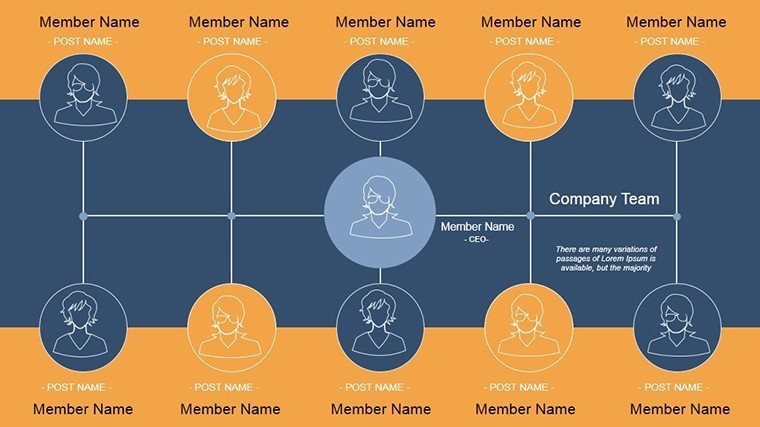
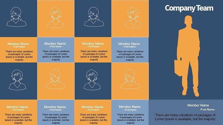
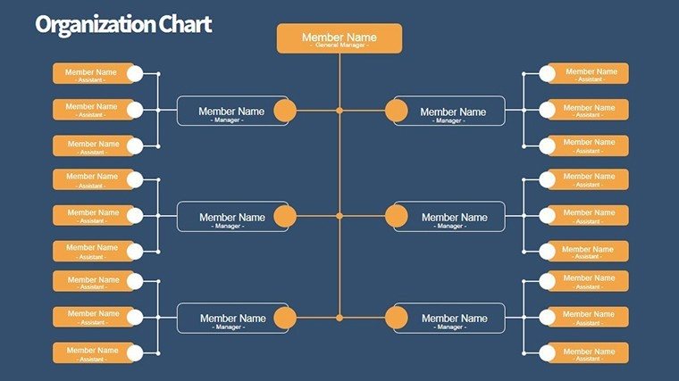
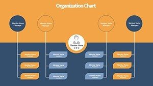
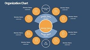
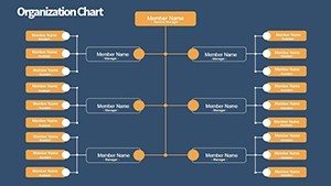
Category: Organizational
Sources Available: .pptx
Product ID: PC00340
Template incl.: 10 editable slides
In the fast-paced world of corporate management, where every decision hinges on clear insights, the Control Staff PowerPoint Charts Template emerges as a game-changer for professionals overseeing operations and teams. Designed specifically for control teams, this template transforms mundane data into compelling visual stories that captivate audiences and drive action. With 10 fully editable slides packed with versatile chart types like bar graphs, pie charts, and line diagrams, it caters to managers, analysts, and executives who need to present performance metrics, resource allocations, or process efficiencies without the hassle of starting from scratch. Imagine turning a quarterly review into a narrative that not only informs but inspires your stakeholders to align with your vision. This template isn't just about aesthetics; it's about efficiency - saving hours on design so you can focus on strategy. Compatible with Microsoft PowerPoint and seamlessly integrable with Google Slides for collaborative edits, it ensures your presentations are accessible and polished, no matter the platform. Whether you're in manufacturing, finance, or tech, this tool adapts to your needs, highlighting key control mechanisms with precision and flair. Dive into a world where data meets design, and watch your presentations elevate from standard to standout.
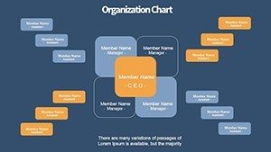
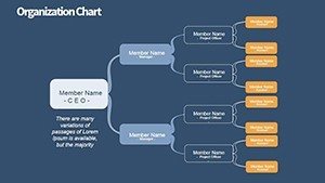
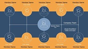
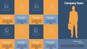
Unlocking the Power of Visual Data in Control Operations
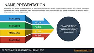
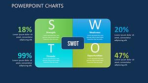
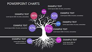
Control staff often grapple with the challenge of conveying complex operational data in ways that resonate with diverse audiences. This template addresses that head-on by offering a suite of customizable elements that make even the most intricate information digestible. For instance, the bar charts allow for quick comparisons of team performance metrics, while pie charts break down resource distributions intuitively. Each slide is pre-themed with professional icons representing control elements like oversight gears or workflow arrows, ensuring thematic consistency that reinforces your message.
Key Features That Set This Template Apart
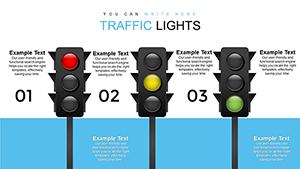
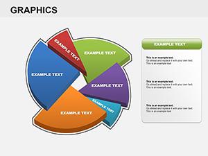
- Versatile Chart Variety: From horizontal bars for progress tracking to radial charts for risk assessments, mix and match to fit your data story.
- Full Customization: Edit colors, fonts, and layouts with PowerPoint's native tools - no advanced skills required.
- High Compatibility: Works flawlessly on PowerPoint 2016+, Google Slides, and even Keynote for cross-platform use.
- Integrated Icons and Graphics: Over 50 themed icons included, saving you time on sourcing visuals.
- Responsive Support: Our team is on hand for any customization queries, ensuring you get the most out of your purchase.
These features aren't just bells and whistles; they're built on best practices from industry leaders like those at Deloitte, where visual aids in control presentations have been shown to increase stakeholder buy-in by up to 40%. By incorporating such elements, you're not only presenting data - you're building trust and authority in your role.
Real-World Applications: From Boardrooms to Daily Briefs
Picture this: A operations manager at a mid-sized logistics firm uses the line graphs to illustrate supply chain efficiencies over time, spotting bottlenecks that saved the company 15% in costs. Or a quality control lead in manufacturing employs the pie charts to distribute defect rates across departments, fostering a culture of continuous improvement. This template shines in scenarios where clarity is king, such as annual audits, team huddles, or investor pitches.
Step-by-Step Guide to Maximizing Your Template
- Assess Your Data Needs: Identify key metrics like staff utilization or control variances that need visualization.
- Select and Customize Slides: Choose from the 10 options, input your data, and tweak visuals to match your brand colors.
- Incorporate Narratives: Use the built-in text placeholders to add context, turning charts into stories.
- Rehearse and Refine: Preview in slideshow mode, adjust for flow, and gather feedback for iterations.
- Present with Confidence: Deliver knowing your visuals are professional and engaging.
Compared to basic PowerPoint defaults, which often look generic and uninspiring, this template offers themed coherence and advanced layouts that make your content pop. It's like upgrading from a sketchpad to a professional canvas - your ideas deserve that level of polish.
Why Choose This Template for Your Control Team?
Beyond the slides, the true value lies in the outcomes: enhanced engagement during meetings, quicker decision-making, and a professional image that positions your team as forward-thinking. Drawing from AIA-inspired design principles adapted for business (think structured hierarchies with visual flow), it ensures your presentations align with standards that emphasize clarity and impact. Users rave about the time savings - one design pro noted it cut prep time by half for client reports. Plus, with subtle animations available for charts, you can reveal data progressively, keeping audiences hooked.
In educational settings, trainers use it to teach control methodologies, breaking down concepts like internal audits with visual aids that stick. For consultants, it's a toolkit for client deliverables, showcasing organizational controls in proposals that win contracts. The template's flexibility means it's not locked into one industry; adapt it for healthcare compliance tracking or retail inventory management with ease.
Enhancing Workflow Integration
Integrate this template into your existing workflows seamlessly. Export charts to Excel for data linking, or embed in reports via PDF. For collaborative teams, Google Slides compatibility allows real-time edits, ensuring everyone from junior analysts to C-suite execs can contribute without compatibility hiccups.
To further boost your presentations, consider pairing with data tools like Tableau for import, though the template's built-in editing suffices for most needs. And for those seeking inspiration, think of how firms like McKinsey use similar visuals in their control strategy decks - professional, data-driven, and persuasive.
Tips for Stellar Control Presentations
- Keep charts simple: Avoid clutter by limiting data points per slide.
- Use color psychology: Blues for trust in control metrics, reds for alerts.
- Incorporate storytelling: Frame charts with 'what, why, how' narratives.
- Test accessibility: Ensure high contrast for all viewers.
- Update regularly: Reuse templates for ongoing reports, refreshing data as needed.
By following these, you'll not only use the template effectively but elevate your entire presentation game.
As you wrap up your next control report, remember: Great visuals aren't optional - they're essential for influence. This template equips you to deliver just that. Ready to transform your data into decisions? Secure your copy today and lead with visual mastery.
Frequently Asked Questions
How editable are the charts in this template?
Every element is fully editable - adjust data, colors, sizes, and layouts directly in PowerPoint or Google Slides.
Is this template suitable for beginners?
Absolutely! Intuitive design means no prior expertise needed; just plug in your info and go.
Can I use it for non-corporate purposes?
Yes, adapt for educational, nonprofit, or personal projects involving control and data visualization.
What if I need more slides?
Contact support for custom expansions; we tailor to your needs.
Does it include animations?
Basic animations are pre-set, with options to add more for dynamic reveals.
Is there a refund policy?
We offer a satisfaction guarantee; reach out within 30 days for assistance.