Business Optimization Infographic Charts - Fully Editable | ImagineLayout


Type: PowerPoint Charts template
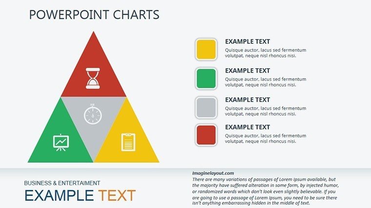
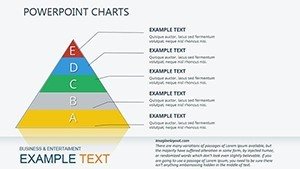
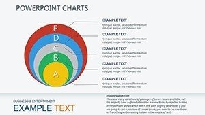
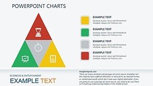
Category: Pyramids
Sources Available: .pptx
Product ID: PC00334
Template incl.: 20 editable slides
Package Contents
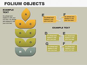
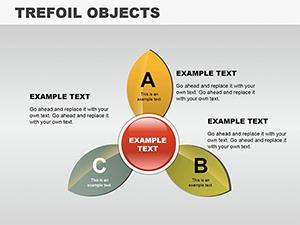
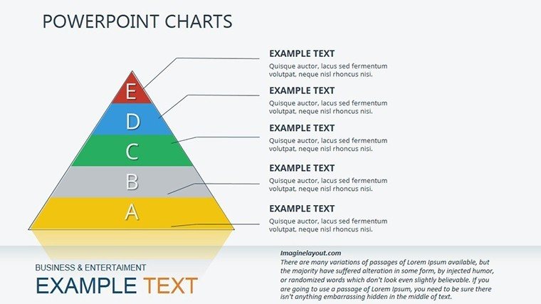
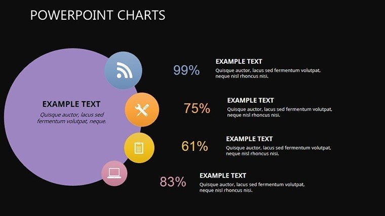
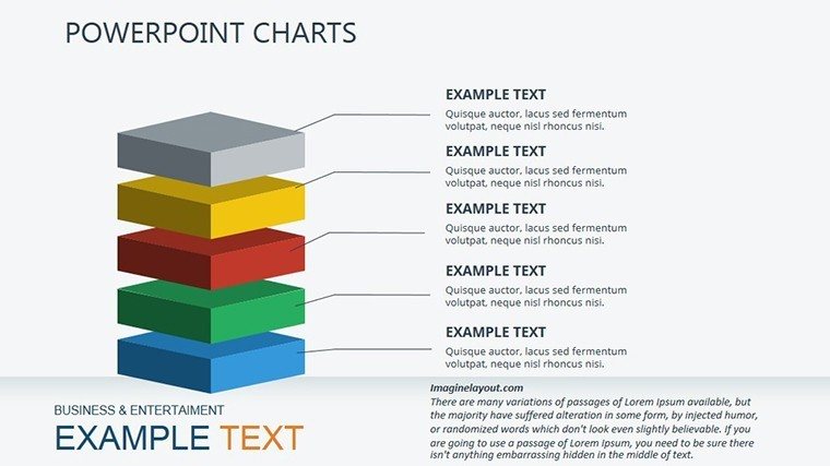
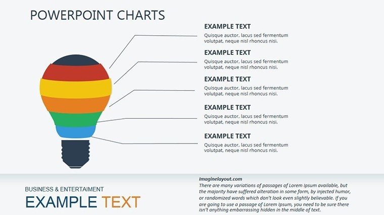
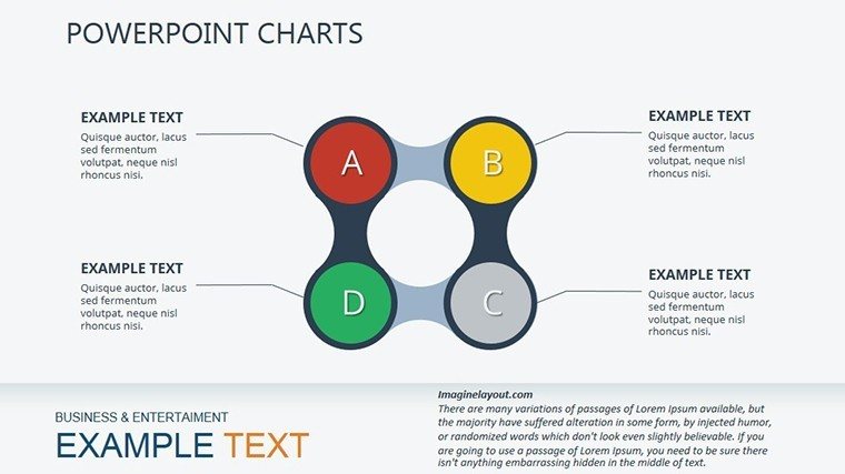
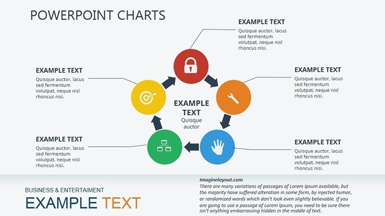
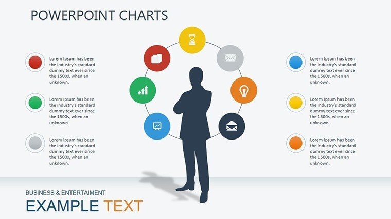
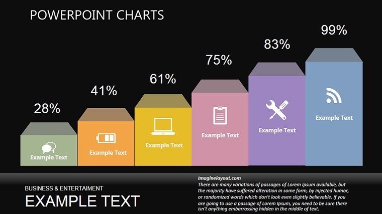
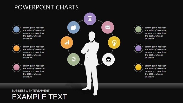
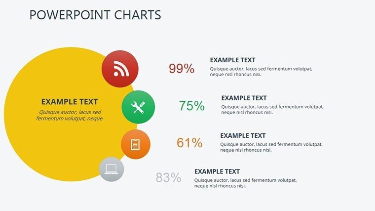
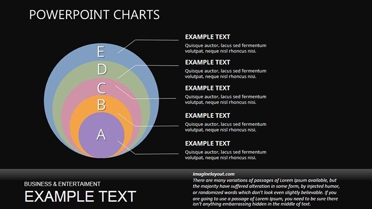
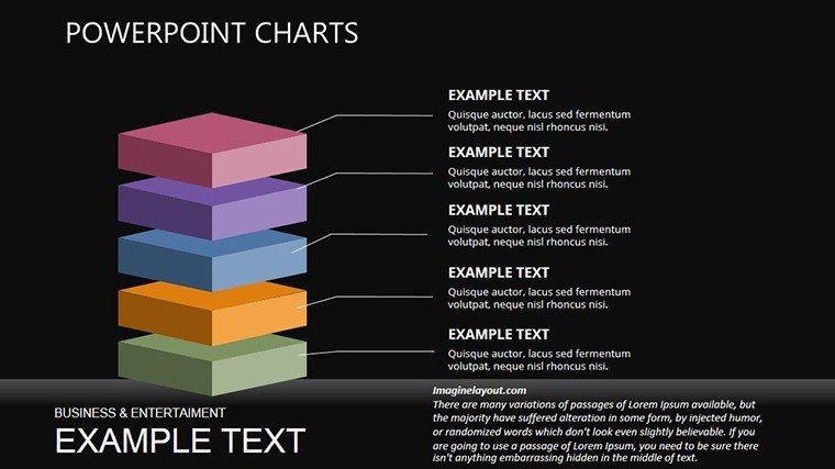
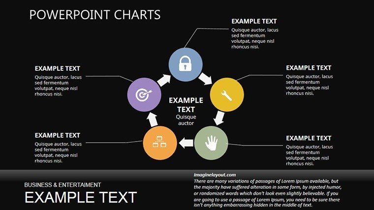
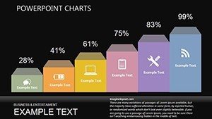
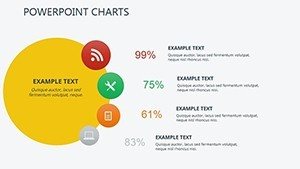
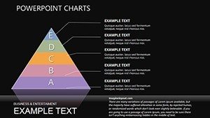
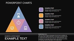
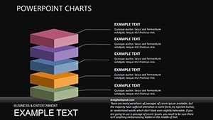
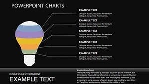
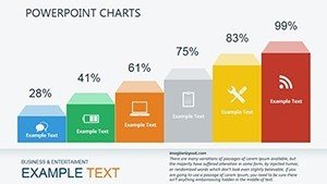
20 editable slides include pyramid infographics and process layers.
These support internal reporting presentations by showing phased improvements.
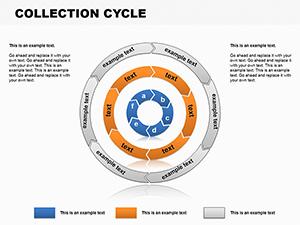
Compared to cycle-focused sets this one emphasizes pyramid structure for optimization hierarchy.
Key Specifications
| Feature | Details |
|---|---|
| Slides included | 20 pyramid-based infographics |
| Diagram categories | optimization levels and process flows |
| Editable elements | segments and labels resize independently |
| Aspect ratio | 16:9 standard |
| PowerPoint compatibility | 2016 and later including 365 |
| Animation support | basic entrance effects on layers |
Adapting the Template to Your Brand
Moderate difficulty.
- Open the PPTX file in PowerPoint (1 minute).
- Replace placeholder text (3 minutes).
- Apply brand colors through the master slide palette (2 minutes).
- Adjust pyramid segments (4 minutes).
- Export as PPTX or PDF (1 minute).
Typical Use Cases by Role
Consultants in operations firms streamline process mapping.
They adapt the same file for five consecutive quarterly briefings.
Marketing teams in tech companies visualize growth arcs.
Deck preparation drops from 3 hours to 45 minutes.
Download the Business Optimization Infographic Charts now.
Why This Template, Not a Blank Slide
Manual builds demand advanced skill and 5 hours.
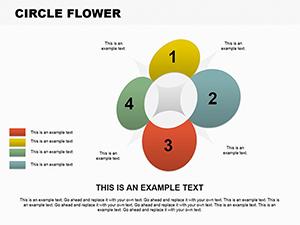
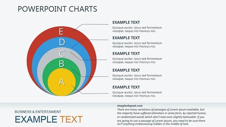
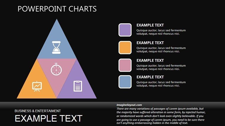
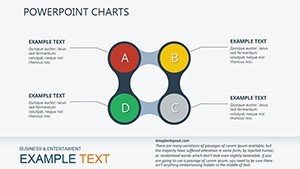
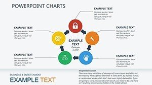
Pyramid layouts place labels outside segments connected by lines.
This aids hierarchy perception on projection screens.
It avoids readability issues common in manual designs.
Download the Business Optimization Infographic Charts now.
Which PowerPoint versions does this template support?
The template opens in PowerPoint 2016 2019 365 and Mac versions. Standard pyramid shapes ensure broad compatibility. Versions before 2016 may limit animation options. Verify in your environment before full editing.
How do I change the color scheme?
Access the slide master in View menu. Update the theme colors directly. All infographics refresh instantly. Return to normal view and save. The change completes in 2 minutes.
What does the license permit?
The license permits client work and internal presentations. It bars resale or sublicensing the file. Modified decks may be shared. Full terms sit in the download package.
Is there a free version?
The page does not specify a free version. Paid access delivers 20 editable slides in PPTX. No free tier details exist. Immediate download follows purchase.
What file formats are included?
One PPTX file arrives in the download. It opens in PowerPoint. PDF export works post-edit. No additional formats appear.
Operations teams often pair these with in optimization decks.
Consultants link it to for full workflows.
Leaders combine the set with for growth narratives.