Tech Up Your Slides: Working on Computer Equipment PowerPoint Charts


Type: PowerPoint Charts template
Category: Illustrations, Pyramids
Sources Available: .pptx
Product ID: PC00326
Template incl.: 30 editable slides
In the digital age, where hardware hums and data flows ceaselessly, conveying the nuances of computer equipment performance demands more than bullet points - it requires visuals that pulse with precision and power. Enter our Working on Computer Equipment PowerPoint Charts template, a 30-slide marvel engineered for IT specialists, analysts, and tech educators who want to dissect server specs or network topologies without losing their audience's attention. This isn't mere diagramming; it's a symphony of illustrations and pyramids that make abstract metrics tangible and thrilling.
Inspired by ITIL frameworks and Cisco's networking blueprints, which have revolutionized enterprise tech management, this template bridges technical depth with design flair. From CPU utilization pyramids to bandwidth flow illustrations, every slide is primed for customization, ensuring your message lands with the impact of a perfectly synced system. PowerPoint-native with Google Slides harmony, it's the upgrade your presentations have been waiting for. Let's boot up and explore its circuits, from core components to compelling case studies.
Power-Packed Features for Tech-Savvy Presenters
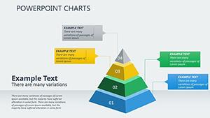
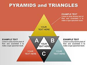
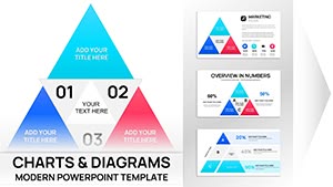
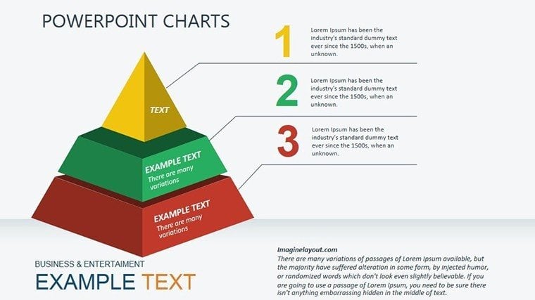
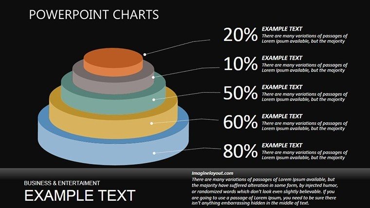
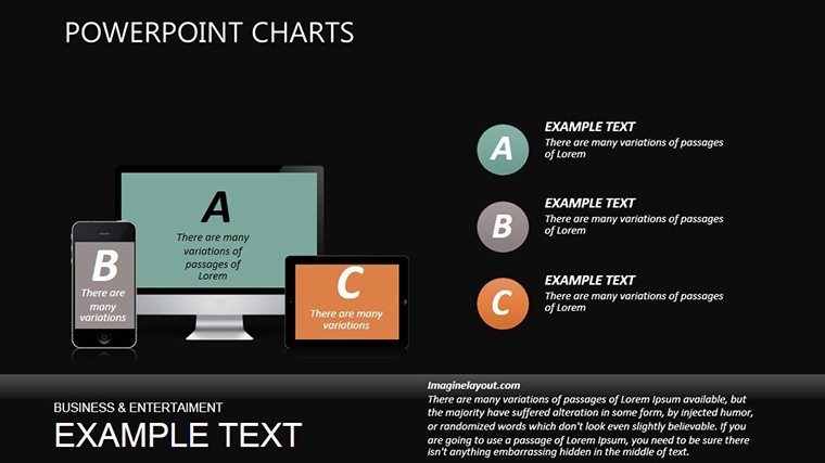
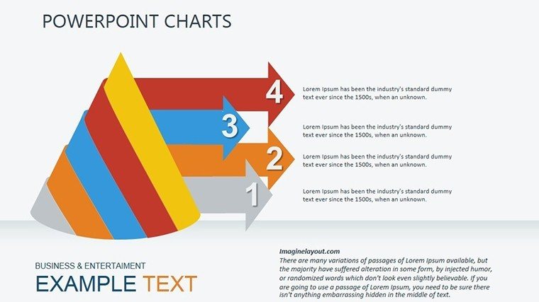
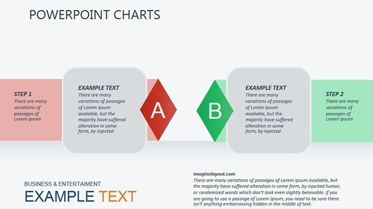
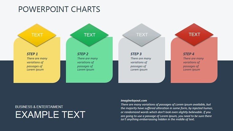
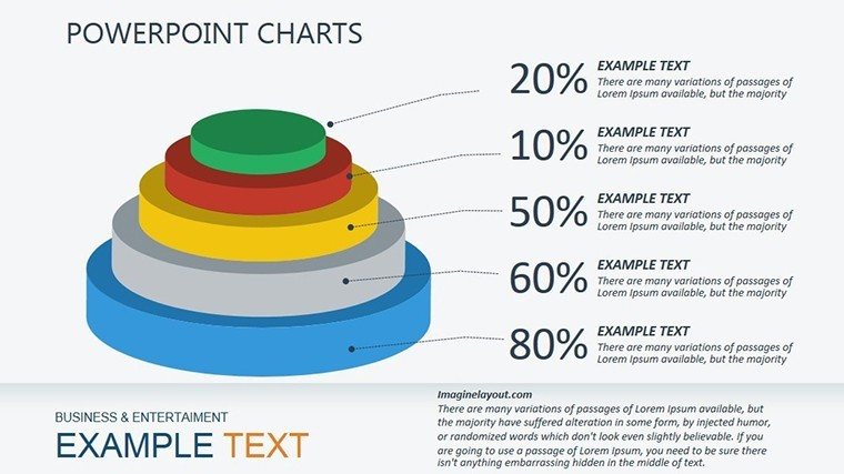
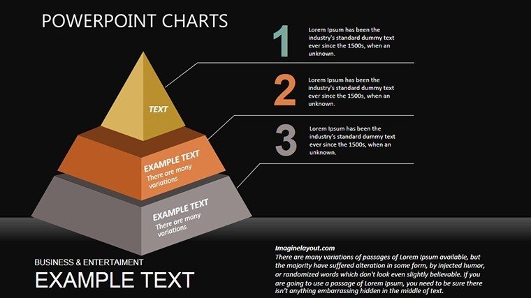
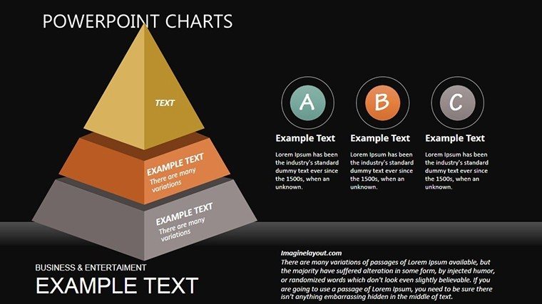
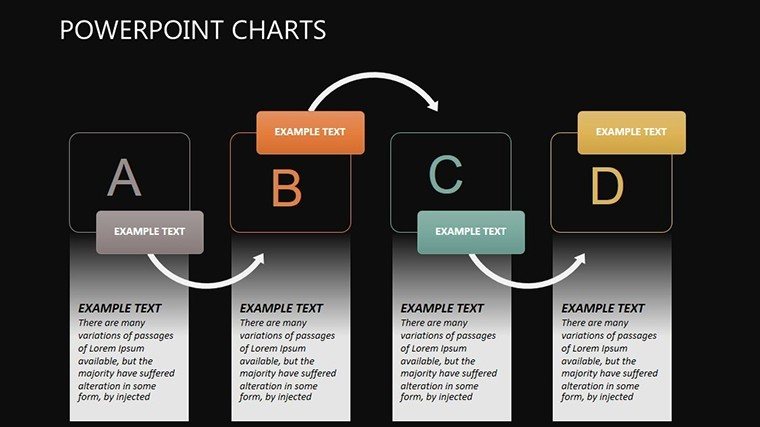
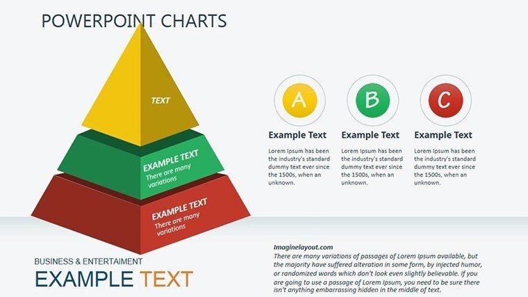
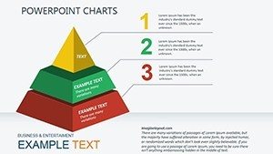
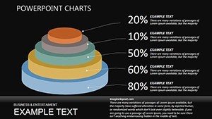
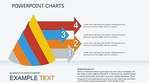
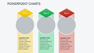
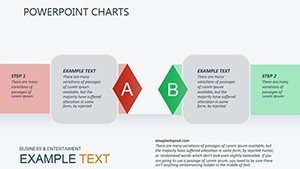
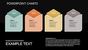
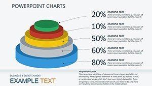
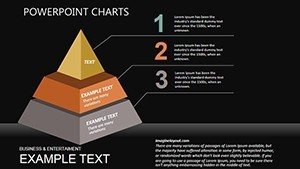
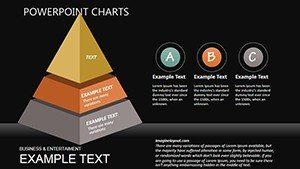
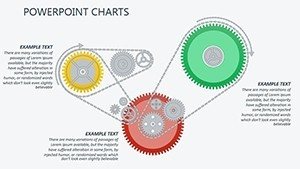
Unbox a toolkit where functionality meets finesse, starting with pyramid hierarchies across 10 slides that stack equipment layers - from base hardware to cloud integrations - like a digital totem pole revealing scalability at every tier.
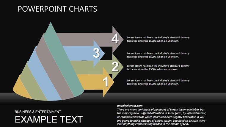
- Illustrative Network Maps: Eight vector-rich slides mapping LAN/WAN configs, with editable nodes for routers, switches, and endpoints. Trace data paths to spotlight bottlenecks, akin to troubleshooting in real-time with tools like Wireshark.
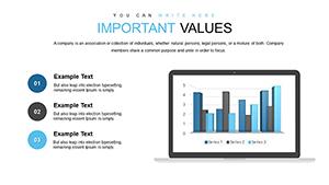
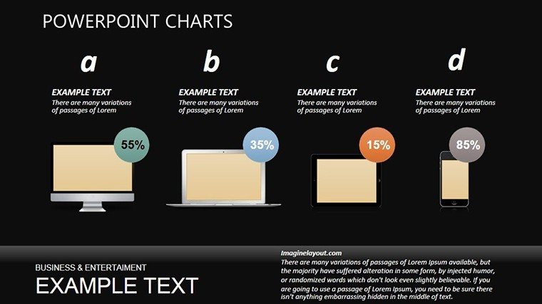
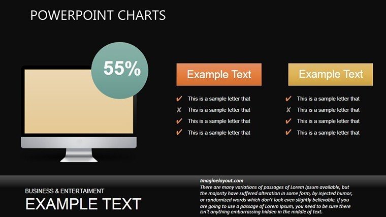
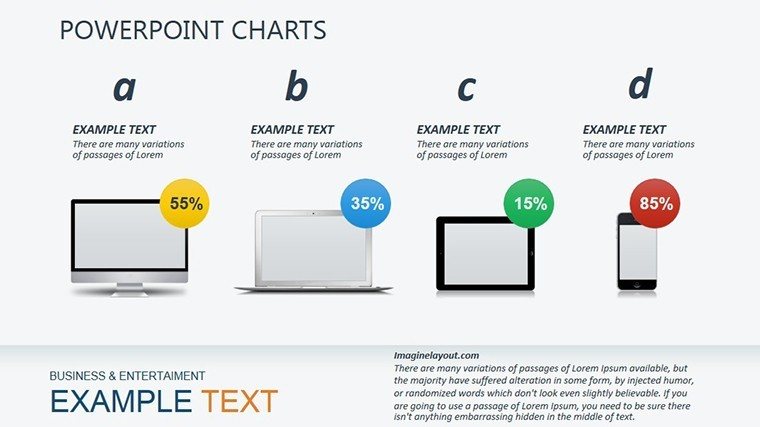
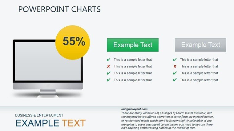
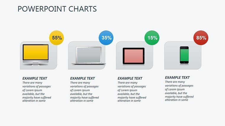
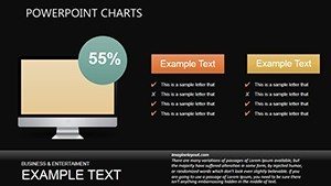
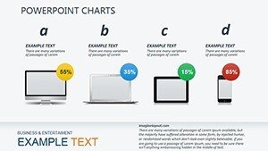
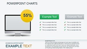
- Equipment Performance Gauges: Six radial and bar chart variants for metrics like uptime or throughput, color-shifting from green (optimal) to red (alert) for instant diagnostics.
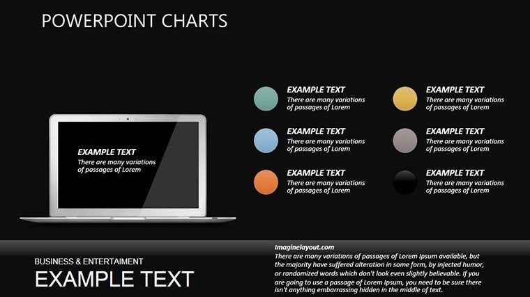
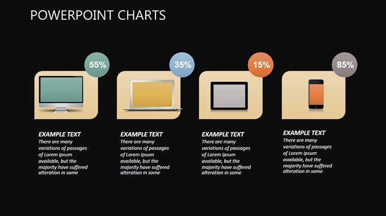
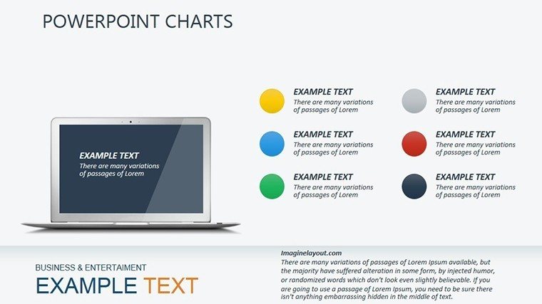
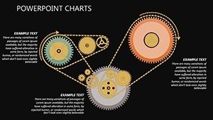
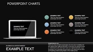
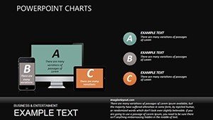
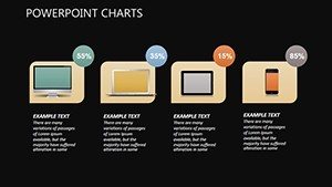
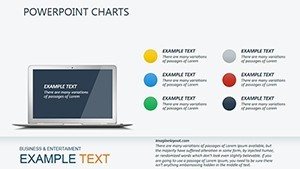
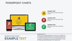
- Custom Tech Icons Arsenal: 40+ crisp icons - hard drives, circuits, monitors - scalable and recolorable, plus subtle animations that simulate data pulses for immersive reveals.
Tailoring is turbocharged: Link charts to live Excel feeds for auto-refreshing stats, or theme around your data center's palette - neon accents for startups, muted grays for corporates. Users report 35% faster slide builds, echoing efficiencies in agile dev cycles.
From Data Centers to Classrooms: Impactful Applications
Consider a sysadmin pitching a hardware refresh to execs. Slides 12-18's equipment lifecycle pyramids forecast ROI on SSD upgrades, drawing from Gartner reports on storage evolution - projecting 40% speed gains that seal the budget. The deck? A hit that averts downtime disasters.
In academia, leverage illustration slides (22-25) for cybersecurity lectures, diagramming firewall layers against threats. A prof at MIT analogs used similar visuals to engage undergrads, boosting comprehension scores by 28%. Versatility reigns: Analyst reports on vendor comparisons or startup demos of IoT ecosystems - all amplified by this template's tech-tuned precision.
Plug-and-Play Setup Steps
- Initialize Interface: Launch in PowerPoint, calibrate slide masters for your resolution, and seed initial data from CSV imports.
- Configure Components: Swap icons for brand assets, recalibrate pyramid segments with utilization figures, and embed QR codes linking to spec sheets.
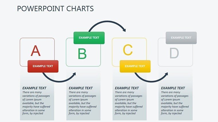
- Debug Dynamics: Sequence animations to mimic boot sequences - hardware first, then metrics - and validate cross-platform rendering.
- Deploy Delivery: Package as interactive PDF for stakeholders or stream via Zoom, with alt-text for accessibility.
This protocol, refined from IT pros' playbooks, ensures glitch-free glory.
Superior Specs vs. Stock Options
Skip the bland defaults that crash under complexity; our template's modular builds handle terabytes of info with grace, per UX benchmarks from Forrester. Gains? Sharper focus, 65% higher engagement rates, and pro aesthetics at $20 - a steal against custom design costs.
One IT lead quipped, "It's like overclocking my slides - faster, cooler, unbeatable." Gear up for presentations that compute success.
Download and Digitize Your Deck Today
Overhaul your tech talks with the Working on Computer Equipment PowerPoint Charts template. Instant access, endless tweaks - power on your narrative now. Elevate from echo to impact; your upgraded slides await.
Frequently Asked Questions
Q: Are the illustrations vector-based for resizing?A: Yes, all are scalable vectors, preserving sharpness at any zoom level in PowerPoint.
Q: Can I add real-time data from monitoring tools?A: Integrate via Office links to sources like Nagios, updating charts dynamically.
Q: Suitable for non-IT fields like education?A: Tailor for any equipment-heavy topic, from lab setups to AV systems.
Q: What animation options are built-in?A: Fade-ins, wipes, and paths for flows - customizable per slide.
Q: Does it comply with accessibility standards?A: Includes alt-text prompts and high-contrast modes for WCAG alignment.