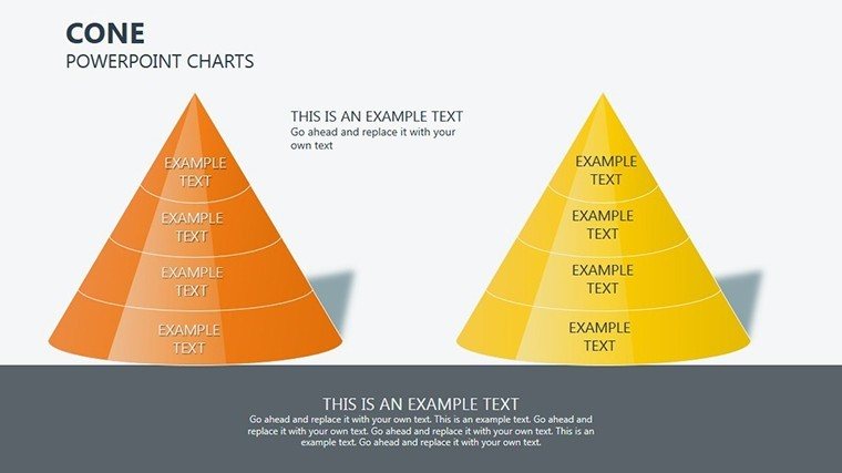
Cone PowerPoint Charts Template: Visualize Data with Depth and Precision


Type: PowerPoint Charts template
Category: Pyramids
Sources Available: .pptx
Product ID: PC00286
Template incl.: 16 editable slides
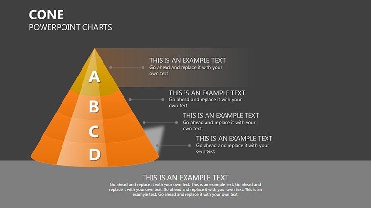
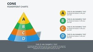
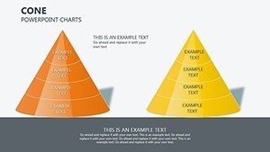
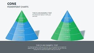
When it comes to presenting hierarchical or proportional data, nothing captures attention like a well-crafted cone chart. Our Cone PowerPoint Charts Template provides 16 editable slides tailored for professionals who need to display sales funnels, market shares, or project breakdowns in a visually compelling way. Designed with pyramid-like structures in mind, this PPTX resource helps you transform raw numbers into stories that resonate, whether in boardrooms or classrooms. It's more than slides - it's a strategic tool for clearer communication and better decision-making.
The Power of Cone Charts in Modern Presentations
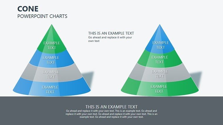
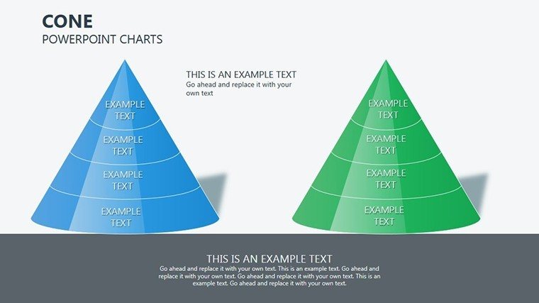
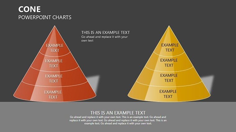
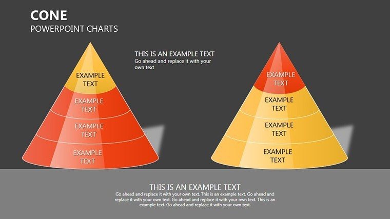
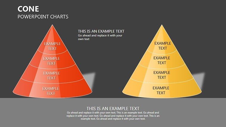
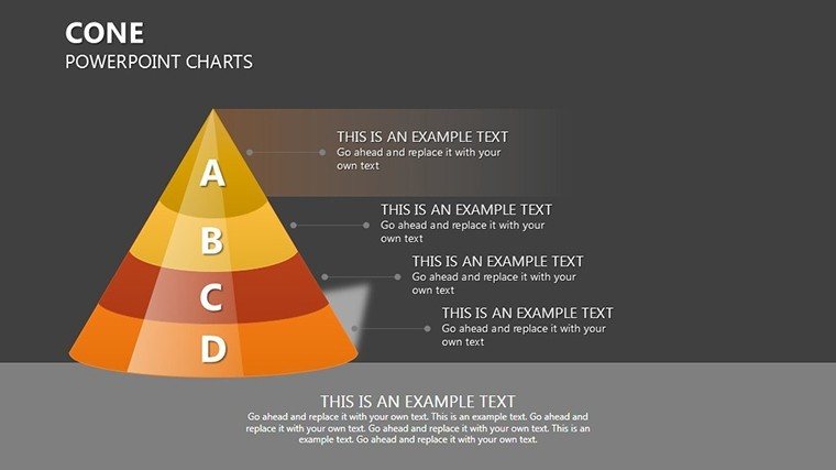
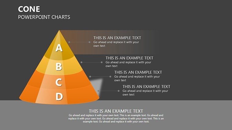
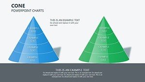
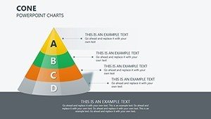
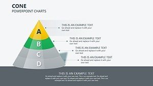
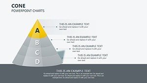
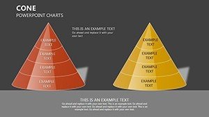
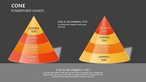
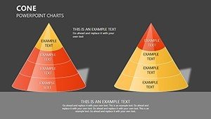
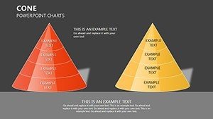
Cone charts excel at showing layered information, where broader bases represent larger quantities tapering to precise points. This template embraces that with diverse designs, from basic cones for quick overviews to intricate multi-level ones for detailed analyses. Color palettes are thoughtfully chosen - gradients that mimic depth, ensuring your data pops without overwhelming. Fonts pair elegance with readability, ideal for high-stakes environments.
The real advantage? Effortless adaptation. Skip the hassle of building from PowerPoint's limited defaults; start with these and refine. For a sales team, a cone might illustrate lead conversion stages, with customizable segments showing drop-off rates - backed by data from tools like Salesforce, where visual funnels have boosted close rates by 15% in case studies.
Standout Features for Professional Edge
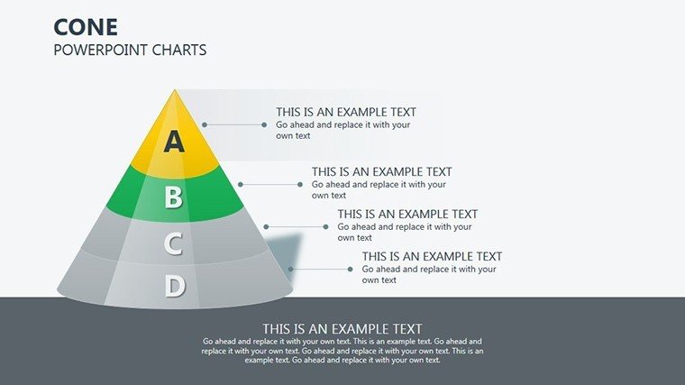
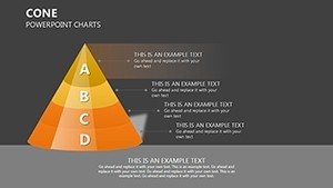
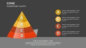
- Diverse Cone Variations: 16 slides including segmented, layered, and annotated cones for various data complexities.
- Easy Customization: Alter dimensions, colors, labels, and even add icons to match your narrative.
- Visual Enhancements: Built-in shadows and gradients for a 3D feel, enhancing perceived professionalism.
- Seamless Integration: Compatible with PowerPoint and other tools, no reformatting needed.
- Data Placeholders: Quick-insert spots for metrics, supporting dynamic updates.
Animations can be added to reveal layers progressively, building suspense in your storytelling.
Practical Use Cases with Impactful Examples
In marketing, use a cone chart to depict customer journey funnels. Customize Slide 5 with stages from awareness to loyalty, integrating stats like conversion percentages. This mirrors strategies at companies like HubSpot, where funnel visualizations have optimized campaigns, increasing ROI as per their annual reports.
For project managers, cones map resource allocation, with base layers for broad teams tapering to key deliverables. A real-world application: In agile methodologies, as outlined by the Project Management Institute, such visuals aid sprint planning, reducing miscommunications by 25%.
Educators can simplify concepts like ecological pyramids, using illustrations to show energy flow in ecosystems. Aligning with NGSS standards, this engages students visually, improving comprehension per educational research from Harvard's Graduate School of Education.
Optimizing Your Presentation Workflow
- Define Your Data Hierarchy: Outline levels, e.g., market segments from largest to niche.
- Pick and Personalize: Select a cone slide, input data, tweak aesthetics for brand fit.
- Add Context: Use annotations for insights, ensuring clarity.
- Test Interactivity: Rehearse with clicks to reveal segments.
- Present Confidently: Focus on narrative, letting visuals support your points.
This streamlines creation, freeing time for refinement.
Tips from Design Pros for Maximum Effect
Incorporate LSI elements like "funnel diagrams" naturally. Compare to standard charts: Cones add dimension, making data more intuitive than flat bars. For accessibility, add alt texts like "Cone chart showing sales funnel stages."
End strong: This template turns data into decisions. Customize now and lead with visuals that matter.
Frequently Asked Questions
How do I customize the cone shapes?
Simply select the shape in PowerPoint and adjust via the format pane for size, color, and effects.
Is it suitable for non-business uses?
Yes, great for educational hierarchies or personal goal tracking.
What if I need more slides?
Duplicate existing ones and modify for expansion.
Does it support data import from Excel?
Absolutely, link charts to Excel for automatic updates.