Exchange Rate Charts - Instant Download


Type: PowerPoint Charts template
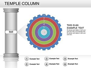
Category: Relationship, Arrows
Sources Available: .pptx
Product ID: PC00267
Template incl.: 16 editable slides
X Slides, Y Color Schemes: What You Get
16 slides arrive in PPTX format.
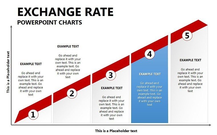
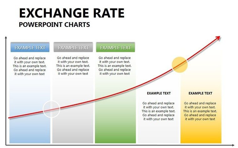
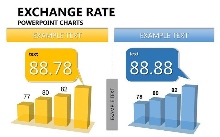
The diagrams support global market analysis by turning currency flux into actionable visuals.
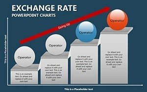
This template works best for financial reporting because flow direction connects rate changes more effectively than architecture-focused sets.
Editing Capabilities at a Glance
| Feature | Details |
|---|---|
| Slides included | 16 editable charts |
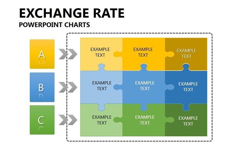
| Editable shapes | segments resize independently |
| Icon layers | replaceable without layout shift |
| Color theme adjustments | master palette applies instantly |
| Diagram connectors | weight and direction adjustable |
| Export options | PPTX or PDF |
From Download to Final Deck
Editing difficulty is moderate.
- Open the .pptx in PowerPoint (1 minute)
- Replace text placeholders (3 minutes)
- Apply brand colors (2 minutes)
- Adjust rate labels and arrows (4 minutes)
- Export (1 minute)
Three Situations Where This Pays Off
Financial Analyst in Banking
A financial analyst in investment banking reused the exchange rate charts for three client reports by updating data and saved two hours per deck.
Economist in Research Firm
An economist adapted the file for five quarterly briefings maintaining consistent flow direction and avoided manual graph rebuilding.
Download the template now
Compared to Starting From Zero
Creating similar forex visuals manually requires advanced skill and four hours.
Typical issues include misaligned connectors that confuse audiences.
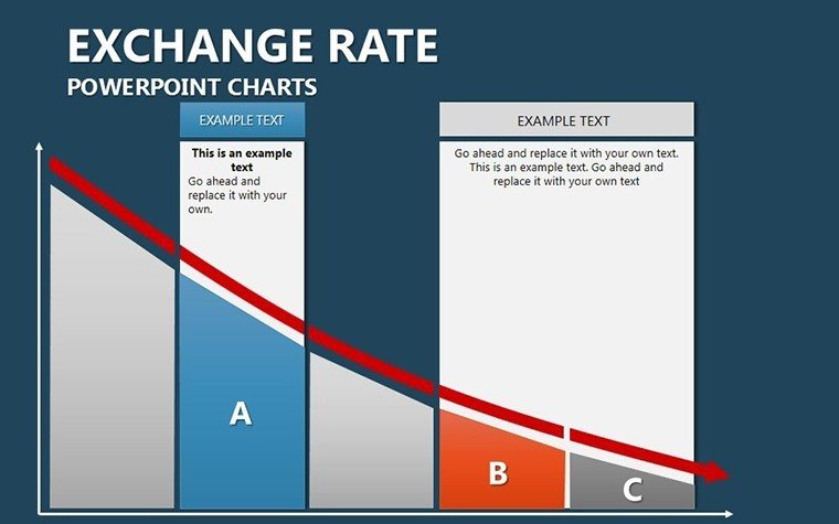
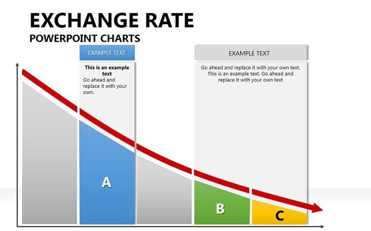
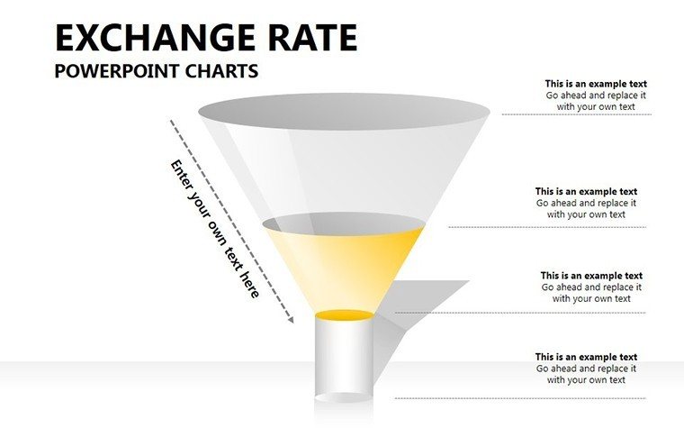
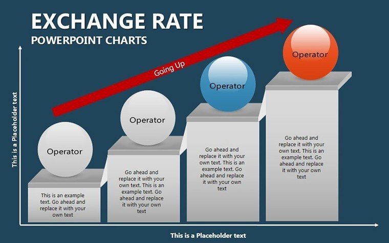
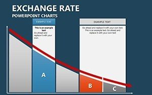
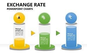
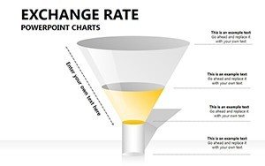
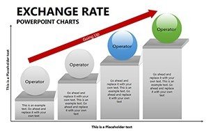
This layout keeps labels outside shapes for projection readability.
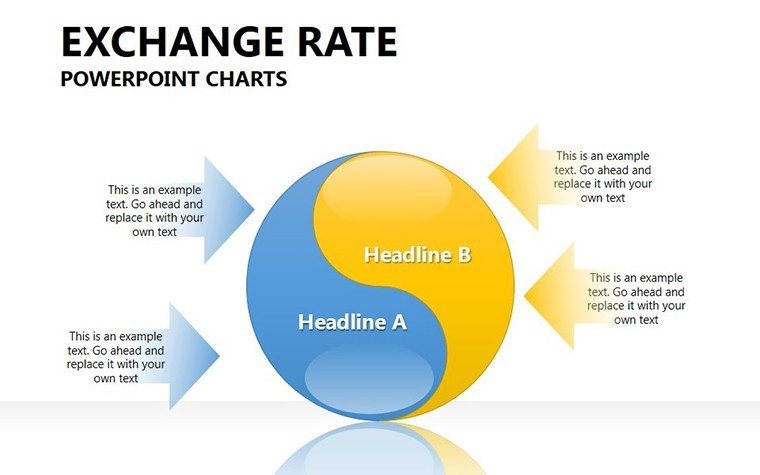
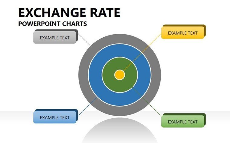
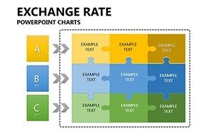
Colors segment market phases rather than decorate randomly.
Get the Exchange Rate Charts Template
Which PowerPoint versions open the file?
The PPTX format works in PowerPoint 2016, 2019, 365 on Windows and Mac. Earlier versions may require conversion but lose no core editable shapes. Test in your installed version before the meeting. Compatibility remains high across current Microsoft Office releases.
How do I change the color scheme?
Open the slide master view in PowerPoint. Select the theme colors section and update the palette. All 16 diagrams update automatically through color theme adjustments. Save the file and return to normal view. The process takes under two minutes.
What does the license allow?
Internal company use and paid client work are permitted. Resale or sublicensing of the original file is prohibited. You may export PDFs or images for presentations. The license covers unlimited projects within your organization.
Are free and paid versions different?
The paid version includes the complete 16 editable slides. No free tier details appear on the page. All connectors and placeholders remain available in the purchased file.
What software opens the file?
PowerPoint opens the PPTX directly. Keynote can import it with minor layout adjustments. PDF export works for distribution. No additional software is required for editing. The format compatibility covers current presentation tools.
Is animation supported?
No animation support is indicated on the page. Static diagrams focus on visual hierarchy and information spacing. You can add entrance effects manually in PowerPoint if needed. Removal of any added animation remains simple.