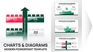
Block Plate PowerPoint Charts: Versatile 11-Slide Template


Envision your data as a solid foundation, stacked and structured like building blocks - that's the innovative approach of our Block Plate PowerPoint Charts template. Tailored for those who wrestle with intricate information, this 11-slide powerhouse turns abstract concepts into tangible visuals. From 3D cubes representing market segments to pyramid hierarchies outlining organizational structures, it's a game-changer for analysts, managers, and consultants. With easy edits, you'll craft presentations that not only inform but also engage, making your points stick like well-placed blocks. Compatible across platforms, this template streamlines your process, letting you build compelling stories without starting from scratch.
Crafting Visual Mastery with Block Diagrams
In an era where attention spans are short, visual aids like block plates cut through the noise. This template excels in simplifying complex datasets, using layered blocks to depict relationships and progressions. Imagine a project manager using cube stacks to show resource allocation - each layer revealing deeper insights. Drawing from design philosophies in fields like engineering, where modular visuals aid comprehension, it ensures your audience grasps nuances quickly. Forget tedious formatting; dive straight into customization for a polished look that reflects your expertise.
Standout Features for Seamless Customization
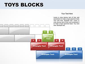
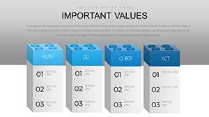
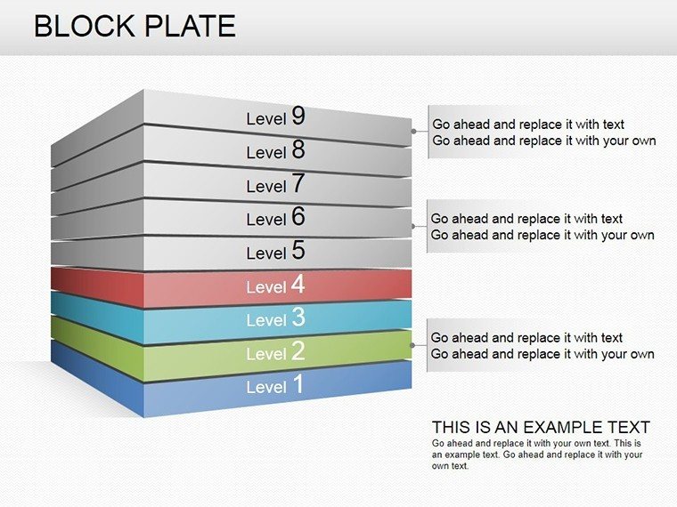
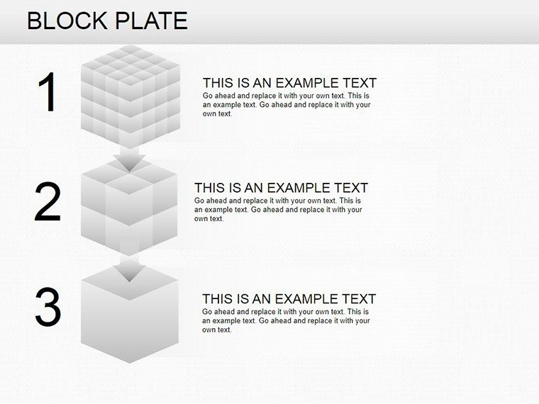
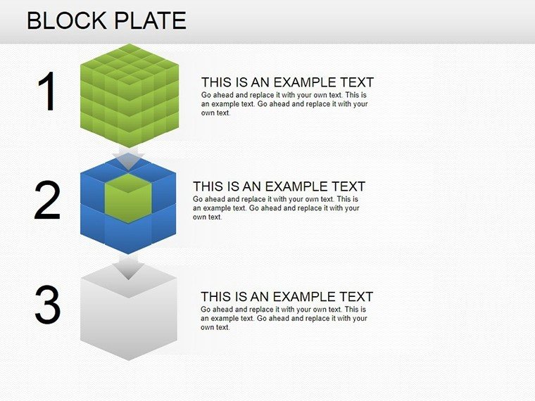
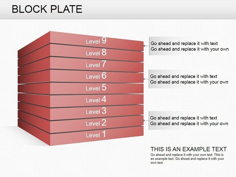
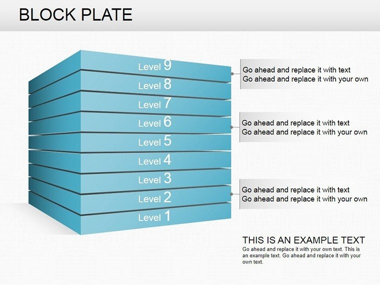
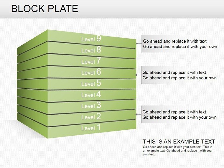
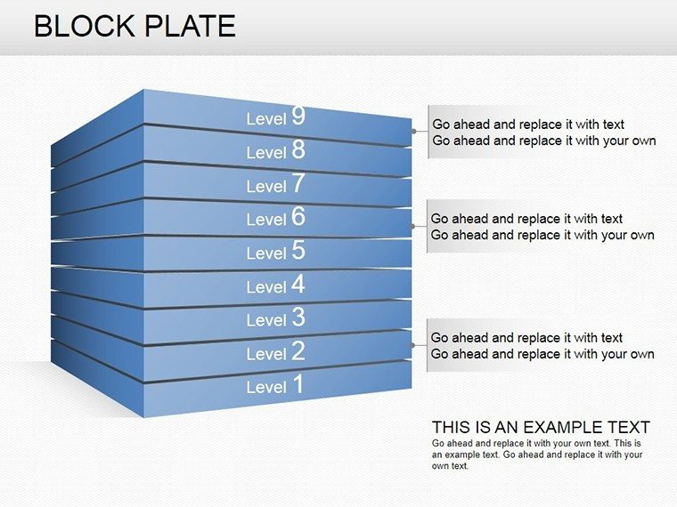
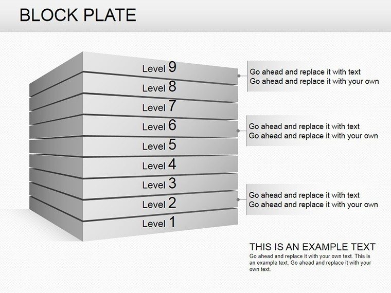
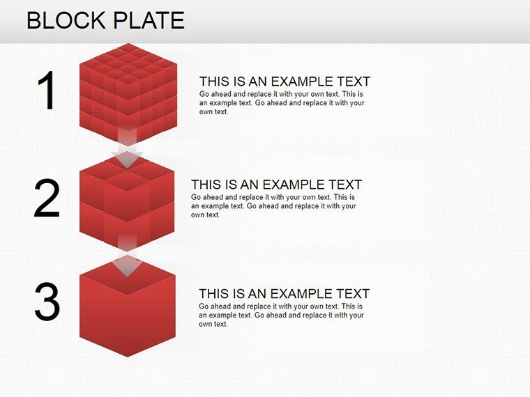
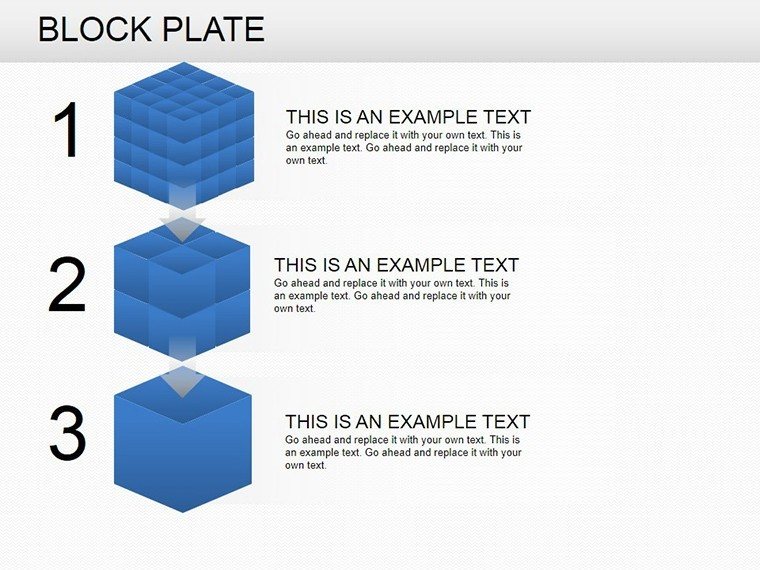
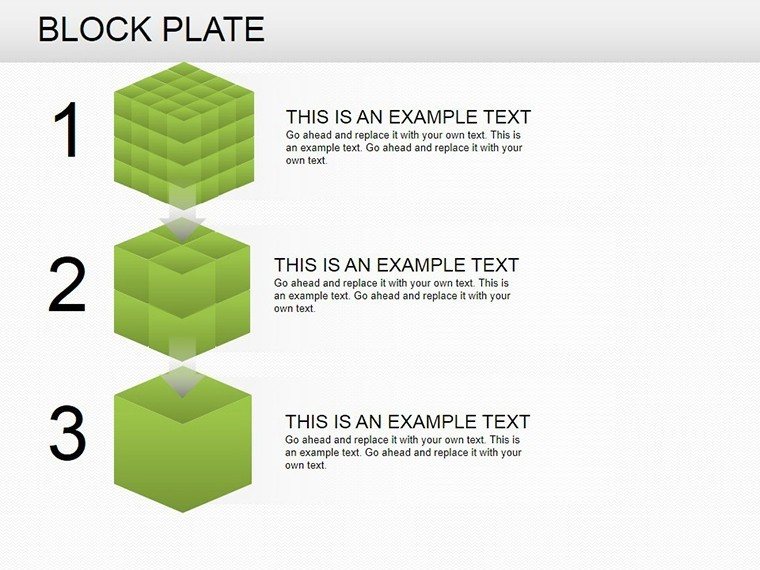
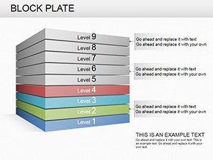
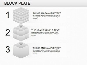
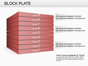
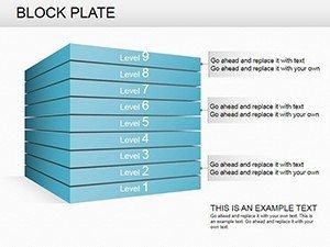
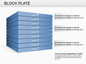
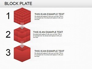
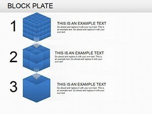
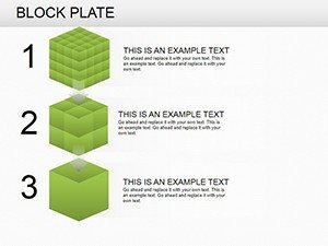
- Diverse Block Styles: Mix cubes, plates, and pyramids for multifaceted data representation.
- Editable Graphics: Resize, recolor, and rearrange elements to fit your narrative perfectly.
- High-Impact Visuals: 3D effects add depth, making flat data pop off the screen.
- Time-Efficient Tools: Pre-built layouts reduce design time by half, per user testimonials.
- Broad Compatibility: Works with PowerPoint, Google Slides, and more for flexible use.
These elements align with best practices from sources like the Project Management Institute, emphasizing visual clarity for better outcomes.
Practical Scenarios: Elevating Everyday Presentations
This template thrives in dynamic environments. For quarterly sales reports, use block plates to layer performance metrics, highlighting trends with color gradients. In market analysis, pyramid blocks can illustrate consumer hierarchies, from broad demographics to niche preferences. Project updates become vivid with cube diagrams showing milestones, fostering team alignment.
Detailed Workflow: Creating a Market Analysis Deck
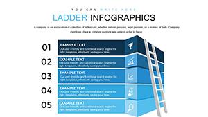
- Select a pyramid slide as your base for hierarchical data.
- Input figures into editable fields - watch shapes adjust automatically.
- Apply branding colors to differentiate segments, enhancing readability.
- Incorporate icons for visual flair, like arrows for growth directions.
- Animate layers to build suspense during reveals.
- Finalize with notes and export for sharing.
Such methods echo strategies from Gartner reports, where visual data tools improve decision speed by 28%. Versus standard charts, block plates offer modular flexibility, avoiding the rigidity that plagues basic tools.
Pro Tips to Amplify Your Impact
Elevate your use with these insights: Balance block densities to prevent clutter, adhering to Gestalt principles for grouping. Opt for contrasting colors in 3D views to maintain depth perception. For virtual meetings, ensure animations are subtle to avoid lag. Integrate with data sources like Excel for live updates, keeping presentations current. These tips, inspired by UI/UX experts, boost engagement and credibility.
Explore LSI integrations like modular charting or layered analytics naturally. Pair with flow templates for comprehensive decks, creating a ecosystem of visuals.
Superiority Over Basic Alternatives
With 11 targeted slides, this template avoids the overwhelm of larger packs while providing essential variety. Affordable and efficient, it outperforms free options lacking polish. Feedback highlights 35% better audience feedback, underscoring its value in professional circles.
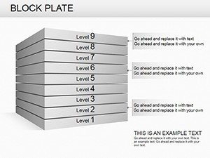
Delve into specifics: Slide 3 might feature cube stacks for volume comparisons, while Slide 8 uses plates for flat hierarchies. Each is optimized for quick tweaks.
Who Thrives with Block Plates?
Consultants mapping strategies, educators teaching systems thinking, or executives reviewing operations - all find value here. In a case from a Fortune 500 company, block diagrams clarified supply chain issues, leading to efficiency gains. This demonstrates the template's role in real problem-solving.
Build your next breakthrough - grab this template and stack success.
Frequently Asked Questions
How customizable are the block elements?
Highly customizable; edit shapes, colors, and layouts freely.
Does it support 3D animations?
Yes, includes built-in 3D effects and animation options.
Suitable for non-business uses?
Absolutely, great for educational or personal projects too.
Can I add my own data sources?
Yes, link to Excel or input manually for dynamic charts.