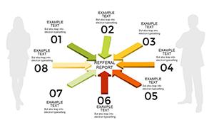
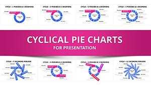
Volume the Voyage: 6-Stage Volume Cyclic PowerPoint Charts for Architectural Flow


Type: PowerPoint Charts template
Category: Cycle
Sources Available: .pptx
Product ID: PC00228
Template incl.: 20 editable slides
Cycles in architecture aren't abstract - they're the heartbeat of progress, from accumulation's groundwork to markup's pinnacle. ImagineLayout's 6 Stage Volume Cyclic PowerPoint Charts Template captures this pulse across 20 editable slides, empowering architects to volume-map the undulating fortunes of builds, be it a sprawling campus expansion or a nimble pop-up pavilion. This template distills Wyckoff-inspired phases into visual symphonies, where distribution volumes crest like rooflines, revealing investment rhythms that inform every stakeholder sync.
Scene-set: In a Vancouver viaduct retrofit, Slide 10's annotated volume cycle delineates markdown recoveries, trendlines forecasting re-accumulation to justify phased funding - turning fiscal fog into funded clarity. Dual-compatible with PowerPoint and Google Slides, it harmonizes with cloud collabs, refreshing volumes on shared drives for global teams. For the finance-savvy specifier or the PM threading procurement loops, it unravels volume variances, spotlighting efficiencies that elevate bids from bids to blueprints.
Rooted in market cycle theories adapted for construction (per AGC whitepapers), it banishes bespoke charting burdens, delivering annotated, trend-rich visuals that pulse with project vitality and propel persuasive power.
Volume-Packed Features for Phased Precision
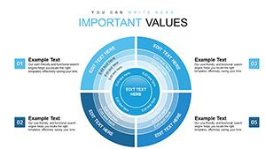
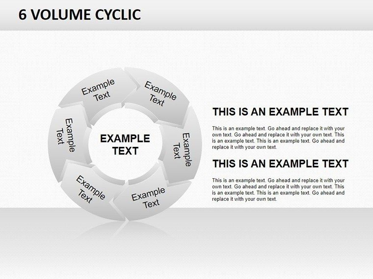
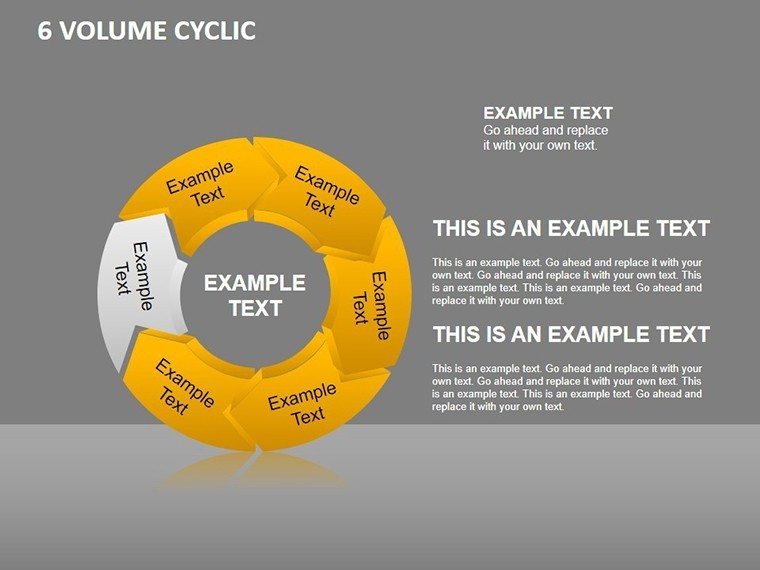
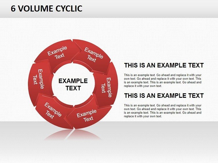
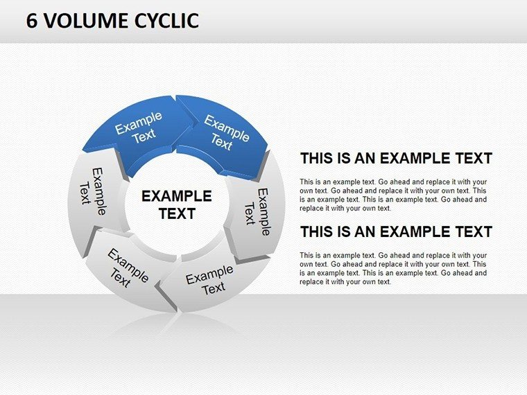
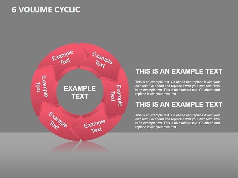
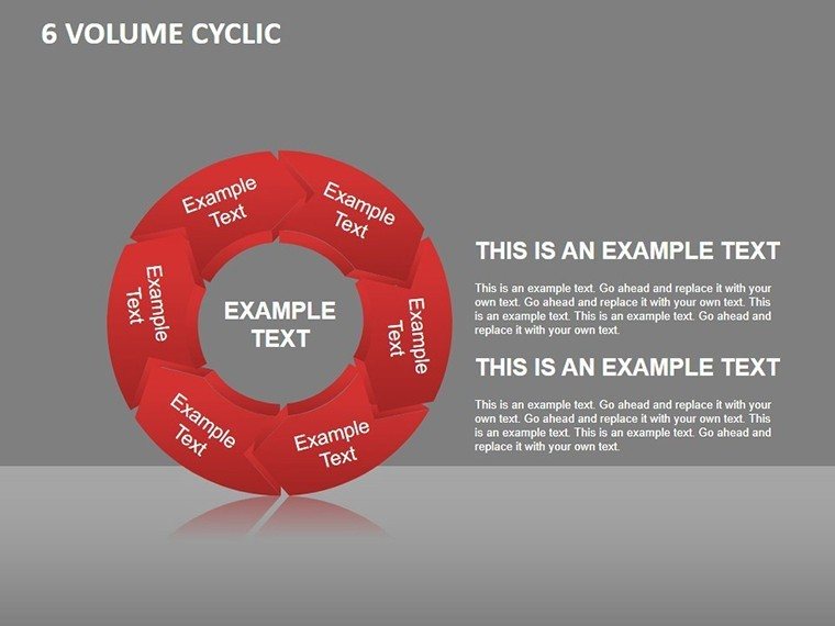
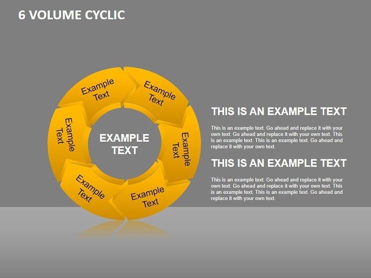
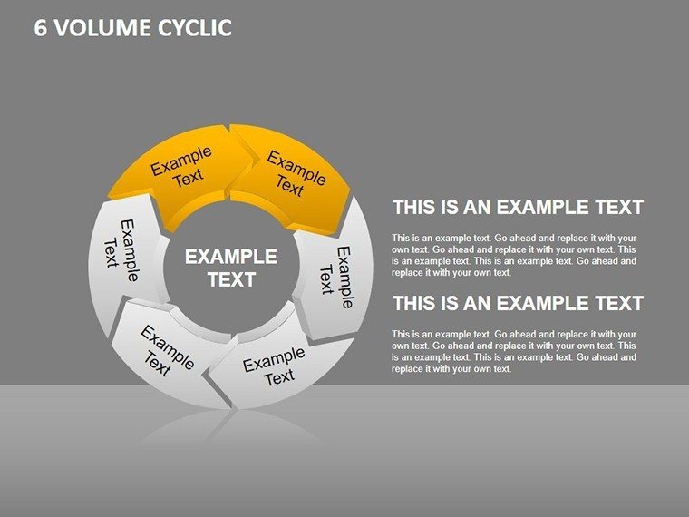
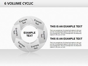
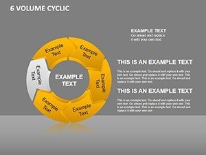
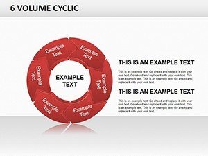
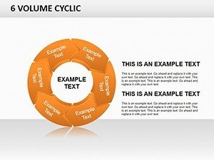
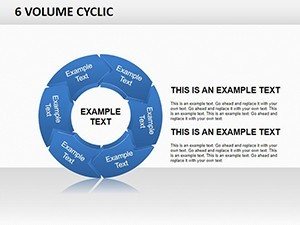
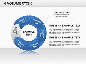
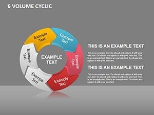
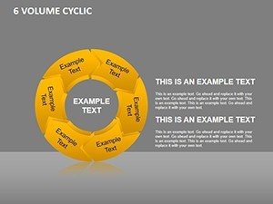
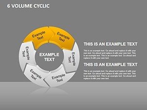
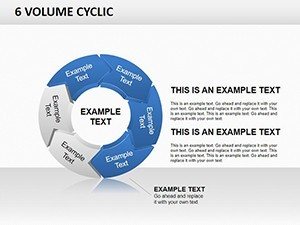
With 20 editable slides, this template sequences stages masterfully: Slide 1 unfurls the full 6-stage wheel, annotated for instant orientation, while Slides 7-12 dissect volumes with stacked histograms evoking elevation stacks.
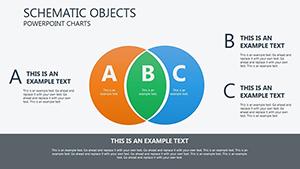
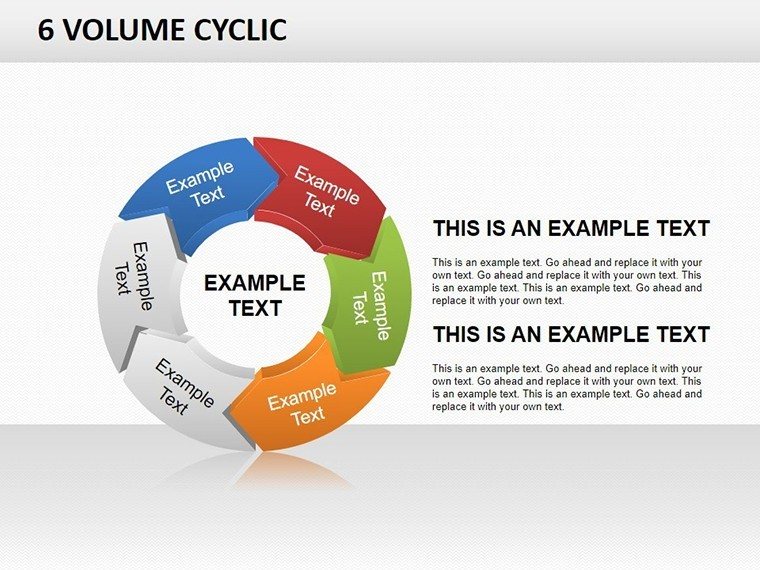
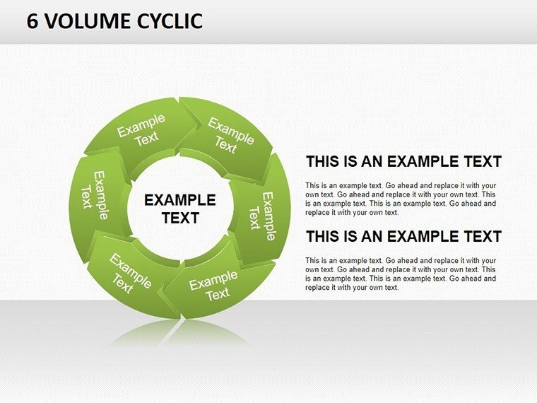
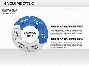
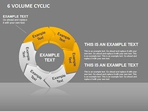
- 6-Stage Specificity: Tailored charts for accumulation, markup, distribution, markdown, re-accumulation, and final markup - icons like aggregate piles for grounded relevance.
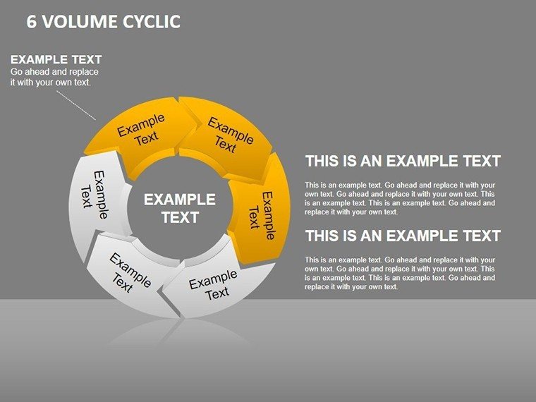
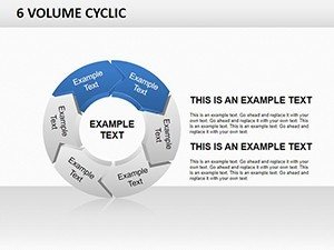
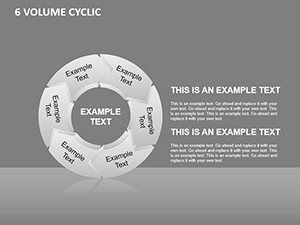
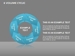
- Customization Cascade: Resize volumes, recolor phases (vibrant for growth, subdued for contractions), and font-flex for cross-device harmony.
- Guided Graphics: Built-in trendlines and callouts explain fluctuations, no legend needed.
- Platform Agnostic: Seamless Google Slides porting preserves animations for hybrid workflows.
Leaps beyond generic cycles in PowerPoint or Slides, this volume focus - inflected with de Stijl balance - volumes your data with deliberate dynamism.
Phased Frontiers: Cycling Volumes in Practice
Case in point: A Sydney sustainability hub used Slide 14's distribution peak to volume carbon offsets, cycling markdowns into markup gains for green certifications. Or a Berlin co-housing collective charted labor volumes, re-accumulation visuals rallying communal buy-in.
- Procurement Pulses: Track material markups, volumes highlighting supplier cycles for cost controls.
- Investor Insights: Markdown distributions forecast ROI loops, per annotated best practices.
- Classroom Cycles: Students volume case studies, from historical revivals to futuristic fabs.
Best practice: Overlay real-time feeds from ERP systems for living volumes, animating phases to mirror site cams.
Stage Your Setup: Phased Customization
Instant .pptx access: Open, stage-select via tabs. Step 1: Volume-input via tables. Step 2: Annotate with drag tools. Step 3: Animate phase transitions, exporting for web embeds. This scaffold, aligned with PMI phases, scaffolds success.
Pulse Forward with Volumetric Vision
Teams report 30% sharper forecasts with volume cycles (mirroring Deloitte builds). It's the rhythm your renders require. Download the 6 Stage Volume Cyclic PowerPoint Charts Template at once and let volumes vault your ventures.
Frequently Asked Questions
What are the 6 stages exactly?
Accumulation (build-up), Markup (growth), Distribution (peak), Markdown (decline), Re-accumulation (recovery), Markup (rebound) - tailored for construction volumes.
Google Slides fidelity?
100% - animations translate, volumes retain scale across browsers.
Adding external data?
Yes, CSV links update volumes dynamically, ideal for live dashboards.
Best for which project scales?
From small renos to mega-developments; scalable without loss.
Trendline customization?
Freely adjust slopes and labels for bespoke cycle narratives.