Conceptual Plan PowerPoint Charts - Strategic Framework Templates for Architects & Consultants | Instant Download


Conceptual plan PowerPoint charts transform abstract strategic concepts into visual frameworks that boards, review committees, and stakeholders can evaluate before detailed execution begins. When presenting architectural masterplan concepts, strategic business frameworks, or program planning visions, text-heavy slides obscure the hierarchical relationships and interdependencies that drive decision-making. This 10-slide template provides specialized pyramid and puzzle chart structures designed for architects, strategic planners, management consultants, and innovation teams who present early-stage concepts where visual clarity matters more than final specifications.
When Conceptual Charts Drive Strategic Approvals
Use conceptual plan charts when securing approval for strategic direction before investing in detailed execution. Architects deploy these in preliminary design reviews where conceptual approaches need validation before technical drawings begin. A commercial developer presented a mixed-use site concept to planning commissioners using the three-tier pyramid structure - foundational site analysis supporting strategic design principles that deliver community impact outcomes. The visual hierarchy helped non-technical commissioners understand that aspirational benefits depend on foundational design integrity, securing preliminary concept approval.
Strategic consultants rely on pyramid and puzzle charts when presenting framework recommendations to executives. The puzzle-piece format demonstrates how disparate initiatives - digital transformation, organizational restructuring, customer experience improvement - must integrate into coherent strategy. During a healthcare strategic planning engagement, we used the interlocking puzzle layout to show board members how clinical expansion, technology investments, facility improvements, and workforce development interconnect. The visual stopped piecemeal funding discussions by making strategic interdependencies obvious.
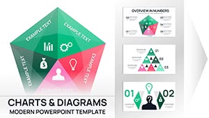
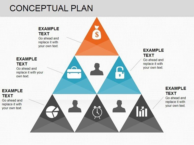
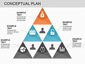
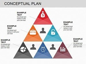
Pyramid Structures: Hierarchical Concept Communication
Pyramid charts organize concepts into foundational, strategic, and aspirational tiers. Foundational elements - market research, regulatory framework, site analysis - form the base. Strategic initiatives - design principles, partnership structures, phasing strategy - occupy the middle tier. Aspirational outcomes - financial returns, sustainability certifications, community impact - cap the pyramid. This visual hierarchy instantly communicates that upper-tier objectives depend entirely on solid foundational work.
During university board presentations, pyramid layouts explain why preliminary research budgets matter before program design begins. The bottom tier shows student needs assessment and accreditation requirements. The middle tier presents academic program structure and teaching methodology. The top tier displays expected learning outcomes and career placement metrics. Board members who questioned upfront research costs immediately understood the dependency chain when seeing the pyramid structure.
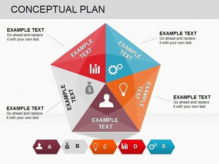
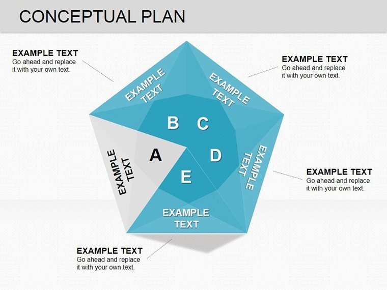
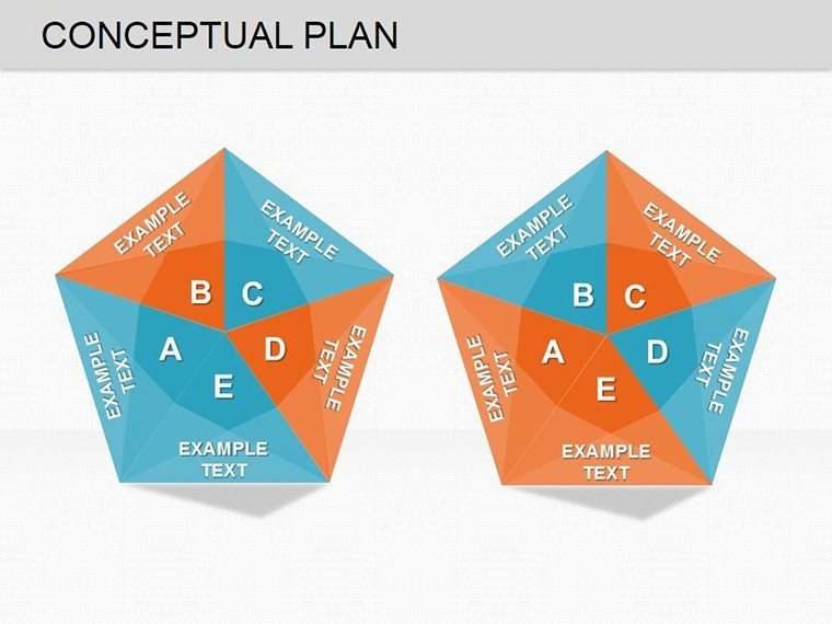
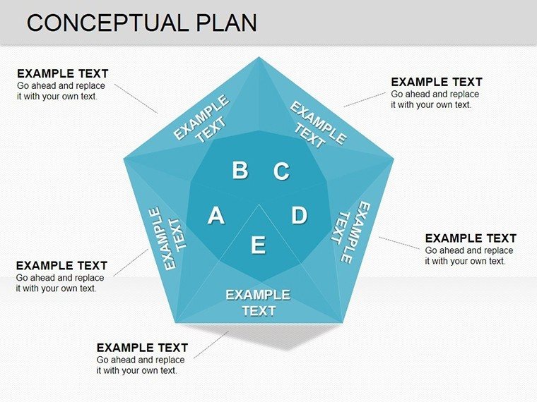
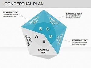
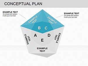
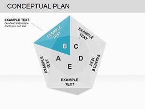
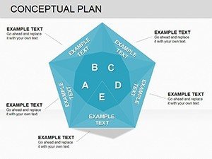
Puzzle Configurations: Strategic Integration Visuals
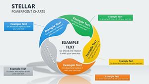
Puzzle-piece layouts demonstrate conceptual integration across distinct strategic components. Each puzzle segment represents an independent element - in campus masterplans: academic programs, student life facilities, sustainability systems, expansion capacity, transportation infrastructure, community engagement. The interlocking visual shows stakeholders that all elements must fit coherently; removing one piece affects the entire system.
A regional transit authority used the puzzle configuration to present corridor concepts to community groups. Puzzle pieces represented route alignment options, station development, multimodal connections, funding strategies, environmental mitigation, and community benefits. The visual showed how route decisions affected development potential and funding viability. Community members understood route alignment tradeoffs without the authority appearing to hide constraints behind a predetermined recommendation.
Editing Workflow in PowerPoint 2016+
All chart elements are fully editable vector shapes. Click any pyramid tier or puzzle piece to modify text labels, resize sections to emphasize priority areas, or adjust colors to match brand guidelines. Charts use PowerPoint's grouping feature - ungroup elements (Ctrl+Shift+G) to move individual pieces independently, then regroup for consistent alignment. For concepts requiring additional tiers, duplicate existing pyramid layers and adjust sizing to maintain visual proportion.
Color coding is strategic: use brand primary color for core concepts, secondary colors for supporting elements, neutral grays for contextual factors. For client presentations, use PowerPoint's Morph transition to animate concept evolution. Create duplicate slides showing the same pyramid structure with different tier content representing refinement stages. Apply Morph transition; PowerPoint automatically animates the transformation, creating fluid visual narrative of how stakeholder feedback shaped the final concept.
Cross-Platform Compatibility: PowerPoint, Google Slides, Keynote
The template works seamlessly across PowerPoint 2016+ on Windows and Mac. Google Slides compatibility is reliable after .pptx upload, though verify that overlapping puzzle pieces maintain correct z-order (right-click - Order - Bring to Front/Send to Back). Google Slides' collaboration features enable simultaneous editing during concept development workshops where multiple team members work on different strategic elements then integrate them into unified frameworks.
Keynote users can import successfully by accepting format conversion prompts. Most pyramid and puzzle structures transfer cleanly, but verify gradient fills if using sophisticated color treatments. For Mac-based firms, maintaining the master file in PowerPoint Online provides cross-platform compatibility without conversion issues during collaborative concept development.
Professional Applications Across Industries
Architecture & Urban Planning: Present conceptual masterplans, preliminary design frameworks, site planning strategies, sustainability concepts. Use pyramids to show how site analysis informs design principles that deliver project objectives. Puzzle pieces represent programmatic elements that must integrate spatially and functionally.
Management Consulting & Strategy: Visualize strategic frameworks, transformation roadmaps, organizational design concepts, innovation strategies. Pyramid tiers represent strategic maturity levels or capability development stages. Puzzle pieces show how functional strategies interconnect within enterprise strategy.
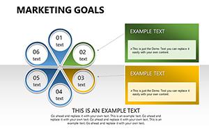
Healthcare & Academic Institutions: Communicate program planning concepts, service line strategies, campus development visions, interdisciplinary initiatives. Radial wheels map stakeholder requirements converging on central program design.
Technology & Product Development: Present platform architectures, product strategy frameworks, ecosystem concepts. Puzzle pieces represent technology components requiring seamless integration. Pyramids illustrate technology stack layers or capability maturity models.
Download the Conceptual Plan PowerPoint Charts Template now to transform how you present strategic concepts and early-stage ideas. Perfect for securing approvals before detailed execution begins.
Frequently Asked Questions
When should I use pyramid charts versus puzzle charts for strategic presentations?
Use pyramid charts when your concept has clear hierarchical structure where foundational elements must exist before higher-tier strategies can succeed. Pyramids work best for maturity models, capability frameworks, phased strategies, or concepts where lower levels enable upper levels. Use puzzle charts when your concept involves distinct but interdependent strategic components that must integrate without inherent hierarchy. Puzzle visuals emphasize interconnection; pyramids emphasize dependency. If strategic elements could be executed in any order but must integrate, choose puzzles. If some elements must precede others, choose pyramids.
How do I present concept evolution using this template?
Create multiple slides showing the same chart structure with different content representing concept stages. Slide 1: initial rough concept with placeholder tier labels. Slide 2: refined concept with validated tier content. Slide 3: final concept incorporating stakeholder feedback. Use PowerPoint's Morph transition between slides to animate the transformation. This visual progression demonstrates responsive concept development rather than static idea presentation. Label each iteration clearly: "Preliminary Concept," "Refined Based on Market Research," "Final Concept Incorporating Community Feedback."
Can these charts work for technical architectural details or only high-level concepts?
These charts are optimized for conceptual and strategic communication, not technical specifications. Use them when audiences need to understand organizing logic, strategic approach, or conceptual framework - not dimensional accuracy, material specifications, or code compliance. Appropriate for schematic design presentations, strategic masterplan concepts, preliminary feasibility studies, design philosophy explanations. Not appropriate for construction documentation, engineering coordination, building permit applications, or presentations where technical precision is the primary requirement.
Should I include detailed data within conceptual charts or keep them clean?
Keep conceptual charts visually clean with minimal text. These charts communicate strategic structure and relationships, not detailed evidence. Each pyramid tier or puzzle piece should contain only a brief label (2-5 words) and optionally one supporting metric. Detailed market analysis, financial projections, competitive research belongs in appendix slides. Show the clean conceptual chart first to establish strategic framework, then advance to supporting slides only if stakeholders request detail. This maintains focus on strategic logic during main presentation, with evidence available for Q&A.
Can I animate these charts to reveal tiers progressively during presentations?
Yes, and strategic reveals significantly improve comprehension for complex concepts. For pyramid charts, select each tier and apply entrance animation (Fade, Appear, Grow) starting from the foundation tier and building upward. Set timing to "On Click" so you can explain foundational elements before revealing dependent strategic tiers. This bottom-up reveal mirrors how strategies logically develop and prevents audiences from jumping to aspirational outcomes before understanding foundational requirements. For puzzle charts, animate pieces in logical assembly order to control information flow.