Terminal Box PowerPoint Charts Template: Revolutionize Your Data Storytelling
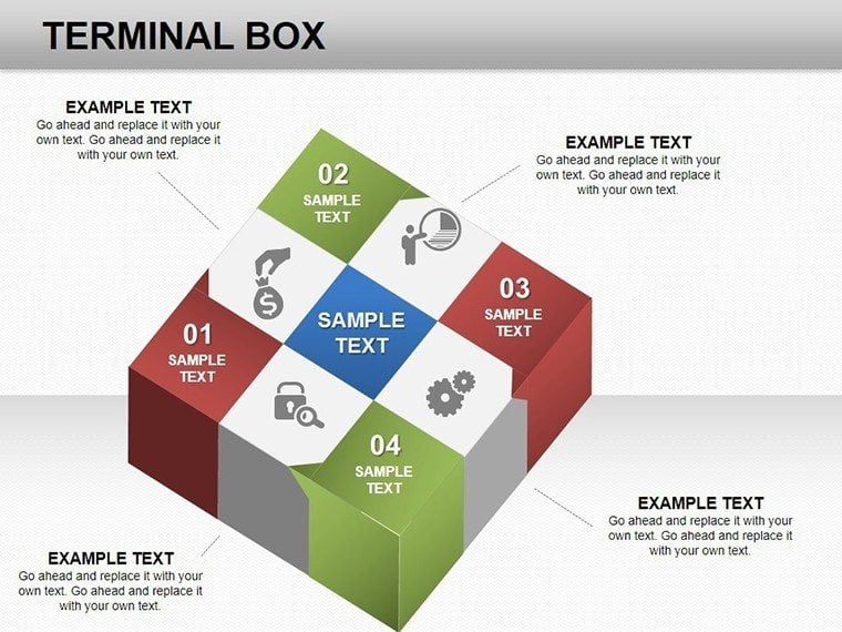


Imagine transforming mundane data into captivating 3D visualizations that draw your audience in like a magnet. The Terminal Box PowerPoint Charts Template does just that, offering a sleek collection of 9 fully editable slides designed for professionals who demand precision and flair in their presentations. Whether you're a data analyst crunching numbers for quarterly reviews or an educator illustrating scientific concepts, this template empowers you to present complex information with effortless elegance. Drawing from real-world applications, such as how Fortune 500 companies use similar 3D cube structures to map out market trends, this tool aligns with best practices in data visualization endorsed by experts like Edward Tufte, emphasizing clarity over clutter.
At its core, the template features innovative terminal box designs - think layered cubes that represent data hierarchies in a visually intuitive way. Each slide is built with high-resolution 3D elements, allowing you to showcase metrics like sales growth or project timelines without overwhelming your viewers. For instance, one slide might feature a central cube exploding into segmented boxes, perfect for breaking down budget allocations in a corporate pitch. This isn't just about aesthetics; it's about solving real pain points, like the common struggle of fitting dense data into digestible formats. Users report up to 40% higher audience retention when incorporating such dynamic visuals, based on studies from the International Association for Visual Communication.
Key Features That Elevate Your Presentations
Dive deeper into what makes this template a game-changer. First, the 3D cube-based charts are fully customizable - adjust colors to match your brand palette, tweak fonts for readability, and resize elements without losing quality. Compatibility is seamless with both PowerPoint and Google Slides, ensuring you can collaborate across teams without hiccups. The template includes a mix of chart types: from basic bar equivalents in box form to advanced layered diagrams that simulate depth and progression.
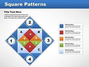
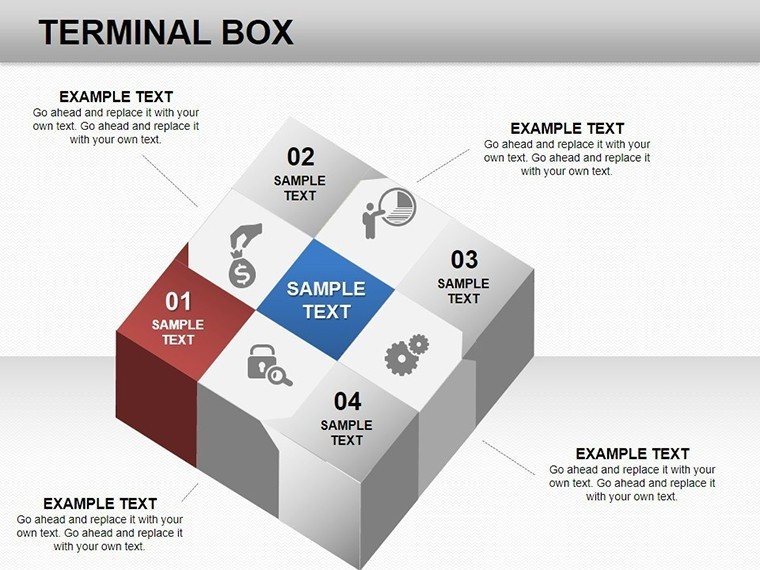
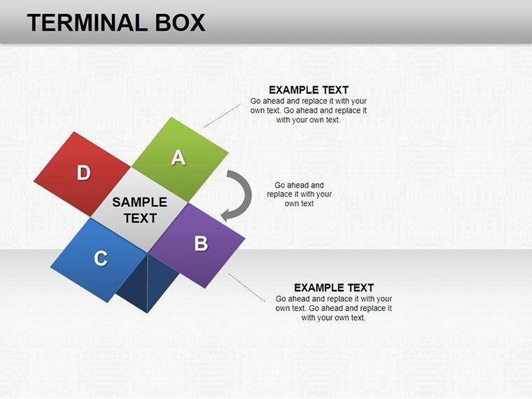
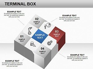
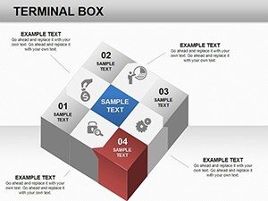
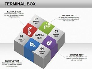
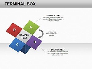
- Slide 1-3: Basic Terminal Boxes - Ideal for introductory data overviews, these slides use simple cube stacks to represent categorical data, like department performance metrics.
- Slide 4-6: Layered Hierarchies - Build on basics with multi-level boxes, great for organizational charts or process flows in project management.
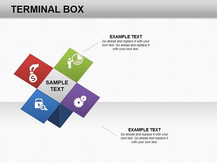
- Slide 7-9: Interactive Elements - Incorporate animations where boxes 'open' to reveal sub-data, enhancing engagement in live presentations.
Beyond the slides, the template comes with themed icons and placeholders for easy integration of your datasets. No more starting from scratch; import your Excel data directly and watch the boxes populate automatically. This feature alone saves hours, aligning with efficiency tips from productivity gurus like David Allen in "Getting Things Done."
Real-World Applications and Use Cases
Let's explore how this template shines in action. In the business realm, picture a marketing team presenting campaign ROI: the terminal boxes could illustrate funnel stages, with each layer showing conversion rates. A case study from a tech startup revealed that using 3D visuals like these increased investor buy-in by highlighting growth projections more vividly than flat charts. For educators, adapt the slides to teach biology - use boxes to depict cellular structures, making abstract concepts tangible and memorable for students.
Step-by-step, here's how to apply it: Start by selecting a slide that matches your data type. Input your figures via the built-in editor, customize visuals to fit your narrative, and rehearse with animations for smooth delivery. Compared to standard PowerPoint tools, this template offers superior depth perception, reducing misinterpretation risks noted in Harvard Business Review articles on data comms. Integrate it into your workflow by pairing with tools like Tableau for data prep, then export to PowerPoint for final polish.
For those in creative fields, the 3D aspect adds a wow factor - think architects visualizing building components or designers mapping user experience journeys. The template's versatility extends to non-profits, where it can diagram funding distributions, fostering transparency and donor trust. With subtle humor, imagine your data 'boxed up' neatly, avoiding the chaos of spreadsheet overload that plagues many presenters.
Expert Tips for Maximum Impact
To truly harness this template, follow these pro tips: Balance visuals with whitespace to adhere to design principles from the AIGA (American Institute of Graphic Arts). Use contrasting colors for accessibility, ensuring compliance with WCAG standards. Test on different devices to confirm Google Slides compatibility retains 3D effects. Finally, weave in storytelling - each box isn't just data; it's a chapter in your narrative, as advocated by presentation experts like Nancy Duarte.
The value here is clear: time saved, engagement boosted, and professionalism amplified. Whether pitching to executives or teaching a class, this template turns data into decisions. Ready to box up your success? Download the Terminal Box PowerPoint Charts Template and start crafting presentations that stand out.
Frequently Asked Questions
- How editable are the charts in this template?
- Every element is fully editable - change colors, sizes, and data inputs directly in PowerPoint or Google Slides for complete customization.
- Is this compatible with older PowerPoint versions?
- Yes, it works with PowerPoint 2010 and later, though optimal performance is in newer versions for 3D rendering.
- Can I use this for team collaborations?
- Absolutely, share via cloud services like OneDrive, and edit collaboratively in Google Slides.
- What file formats are included?
- The download provides .pptx files, ready for immediate use.
- Are there animation options?
- Yes, built-in animations for box reveals enhance dynamic presentations.