Arrows Puzzle Time PowerPoint Charts: Unlock Dynamic Timeline Visuals
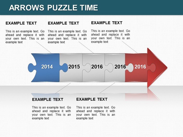
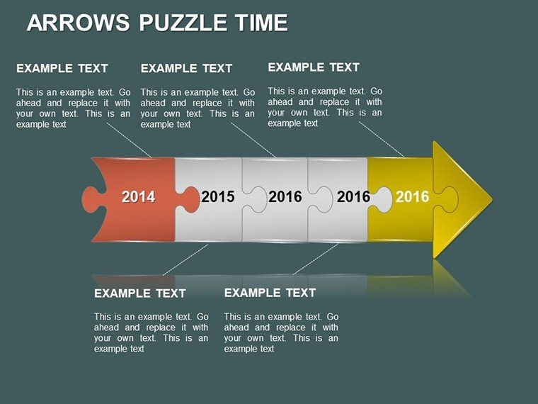


Envision your next presentation where timelines unfold like an intriguing puzzle, guiding your audience through complex sequences with ease and excitement. The Arrows Puzzle Time PowerPoint Charts Template brings this vision to life with 14 meticulously crafted editable slides, blending arrow directions with puzzle motifs to create compelling narratives. Tailored for dynamic professionals like consultants mapping client strategies or teachers breaking down historical events, this template draws on proven design principles from sources like the Project Management Institute (PMI), where visual timelines enhance comprehension and retention in agile methodologies.
The essence of this template lies in its fusion of arrows and puzzles - arrows propel the story forward, while puzzle pieces symbolize interconnected ideas. This design choice addresses common challenges, such as disjointed timelines in reports, by providing a cohesive flow. A real-world example: marketing agencies use similar structures to depict campaign phases, resulting in clearer stakeholder alignment, as highlighted in case studies from HubSpot's content strategy guides.
Standout Features for Seamless Customization
What sets this apart? Start with the versatile arrow-puzzle hybrids: each slide allows for color adjustments, font variations, and layout tweaks to fit your unique voice. Full compatibility with PowerPoint, Google Slides, and even Keynote ensures no barriers in your creative process. The charts range from simple linear arrows to intricate puzzle networks, accommodating everything from short-term plans to long-term visions.
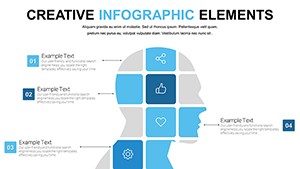
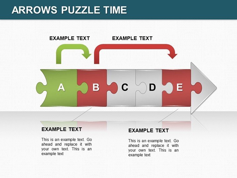
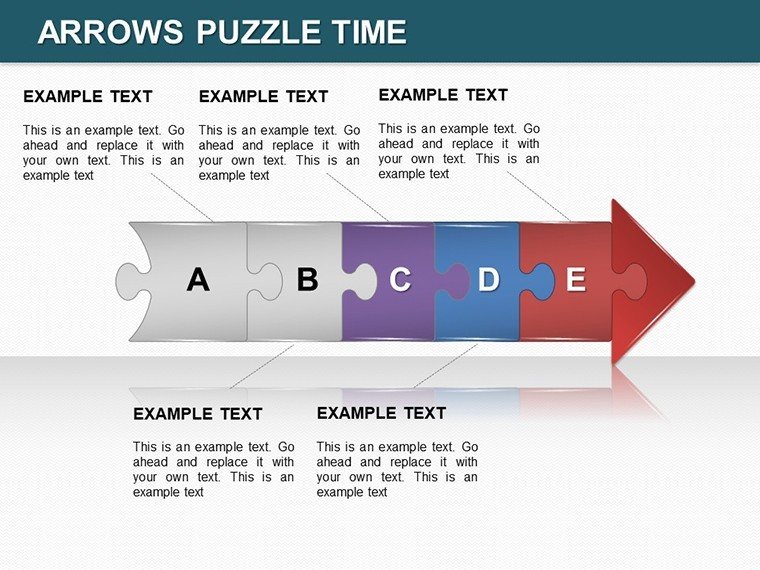
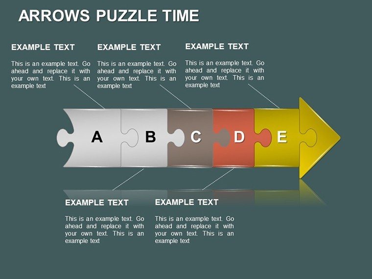
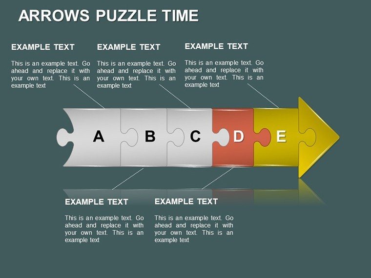
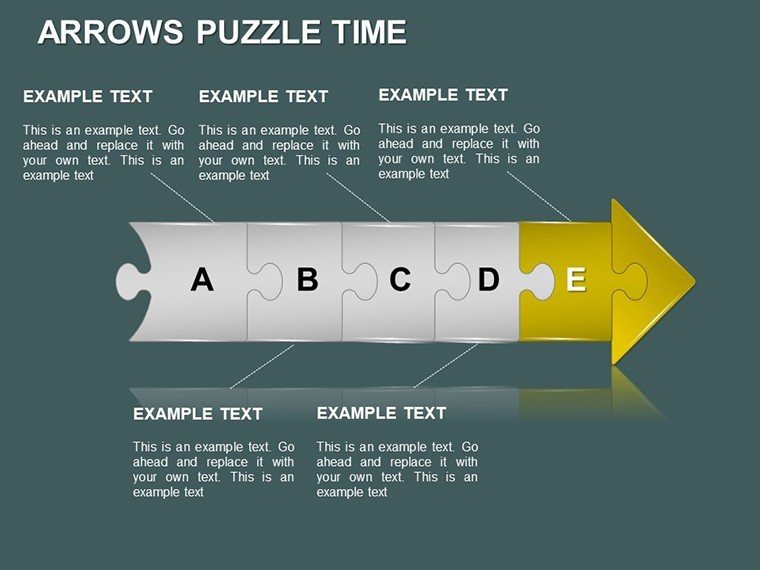
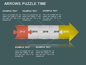
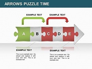
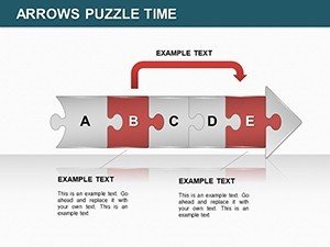
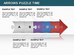
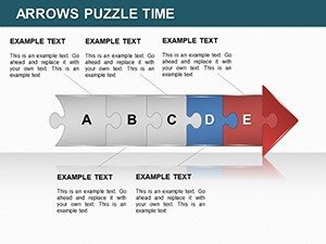
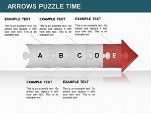
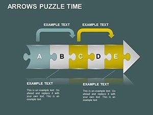
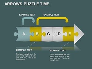
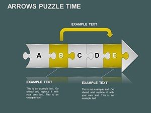
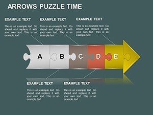
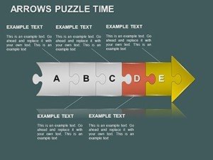
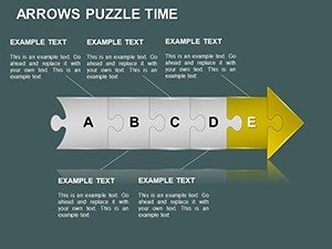
- Slides 1-4: Linear Arrow Puzzles - Perfect for straightforward timelines, like product launch sequences.
- Slides 5-9: Branched Puzzle Arrows - Handle decision trees or multi-path processes, ideal for risk assessments.
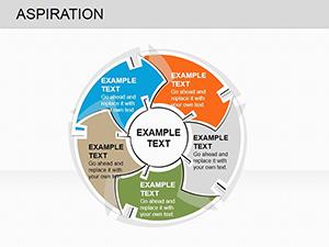
- Slides 10-14: Cyclic and Interactive Puzzles - For recurring cycles, with animation-ready elements to simulate time progression.
Incorporate your data effortlessly - placeholders support direct imports from tools like Microsoft Project. This not only saves time but aligns with efficiency best practices from Lean Six Sigma, reducing rework in presentation prep.
Practical Use Cases Across Industries
In practice, this template excels in diverse scenarios. For creatives, use it to outline storyboards, where puzzle pieces represent plot twists, fostering innovative brainstorming as per Adobe's creative workflow recommendations. Consultants might deploy it for change management, visualizing transitions with arrows that 'connect the dots,' mirroring strategies from McKinsey Quarterly articles.
Step-by-step integration: Choose a slide based on your timeline complexity, populate with milestones, customize aesthetics for brand consistency, and add transitions for a polished delivery. Versus basic arrow tools in PowerPoint, this offers puzzle interactivity, boosting engagement as noted in UX design studies from Nielsen Norman Group. Workflow tip: Pair with mind-mapping software like MindMeister for initial planning, then refine in the template.
Educators can lighten the load with humorous takes - imagine 'puzzling' through history, making lessons stickier. In business, it transforms sales forecasts into engaging stories, helping teams spot patterns quickly. The template's value? It turns abstract time concepts into tangible, memorable visuals, building trust through clear communication.
Pro Tips to Maximize Your Puzzle Power
Elevate further with these insights: Use consistent arrow directions for logical flow, per Gestalt principles in design. Ensure accessibility with alt text on images and high-contrast colors. Test animations in Google Slides to maintain puzzle effects across platforms. Storytell around the puzzles - each piece a milestone, as inspired by TED Talk structures from speakers like Simon Sinek.
Ultimately, this template isn't just slides; it's a catalyst for clearer thinking and stronger connections. Puzzle together your next big idea - download the Arrows Puzzle Time PowerPoint Charts Template now and time your success.
Frequently Asked Questions
- What makes the puzzle elements customizable?
- You can resize, recolor, and rearrange pieces to fit your narrative, all within PowerPoint's intuitive interface.
- Does it support Keynote?
- Yes, import .pptx files seamlessly into Keynote for Mac users.
- How do animations work with arrows?
- Built-in options let arrows 'draw' paths or puzzles assemble, adding temporal dynamism.
- Is it suitable for large datasets?
- Absolutely, scalable designs handle extensive timelines without clutter.
- Can I add my own icons?
- Yes, integrate custom graphics to enhance puzzle themes.
- What if I need more slides?
- Duplicate and modify existing ones for endless expansion.