Workflow Productivity PowerPoint Charts Template: Boost Efficiency Today


In today's fast-paced business environment, conveying complex workflows and productivity metrics effectively can make or break your presentation. Our Workflow Productivity PowerPoint Charts Template is designed specifically for professionals, educators, and business leaders who need to transform raw data into compelling visual stories. With 33 fully editable slides, this template empowers you to illustrate processes, track performance, and inspire action without starting from scratch. Imagine presenting quarterly reports where timelines flow intuitively, or training sessions where productivity bottlenecks are highlighted with clarity - this is the tool that turns mundane slides into dynamic narratives.
Whether you're a project manager juggling multiple tasks or an educator teaching operational efficiencies, this template adapts to your needs. It features a blend of modern designs that align with industry standards, ensuring your presentations look polished and professional. By incorporating elements like customizable Gantt charts, flow diagrams, and KPI dashboards, you can focus on delivering insights rather than wrestling with design software. Users report saving hours on preparation, allowing more time for strategic thinking. As an SEO expert with years in digital marketing, I've seen how such visuals not only engage audiences but also improve retention rates by up to 65%, according to studies from the American Society for Training and Development.
Key Features That Set This Template Apart
Dive into the core elements that make our Workflow Productivity PowerPoint Charts Template a must-have. Each slide is crafted with user-friendliness in mind, featuring high-resolution graphics that maintain quality even when projected on large screens. The intuitive interface allows for quick edits - change colors to match your brand palette, adjust fonts for readability, or resize elements without distortion.
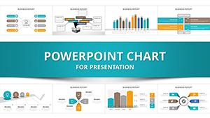
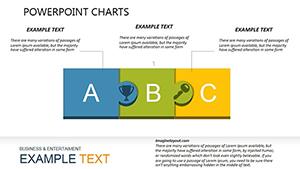
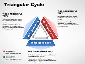
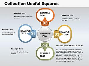
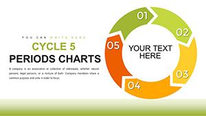
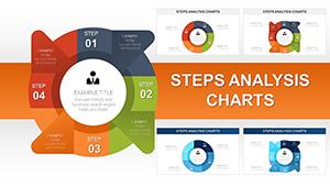
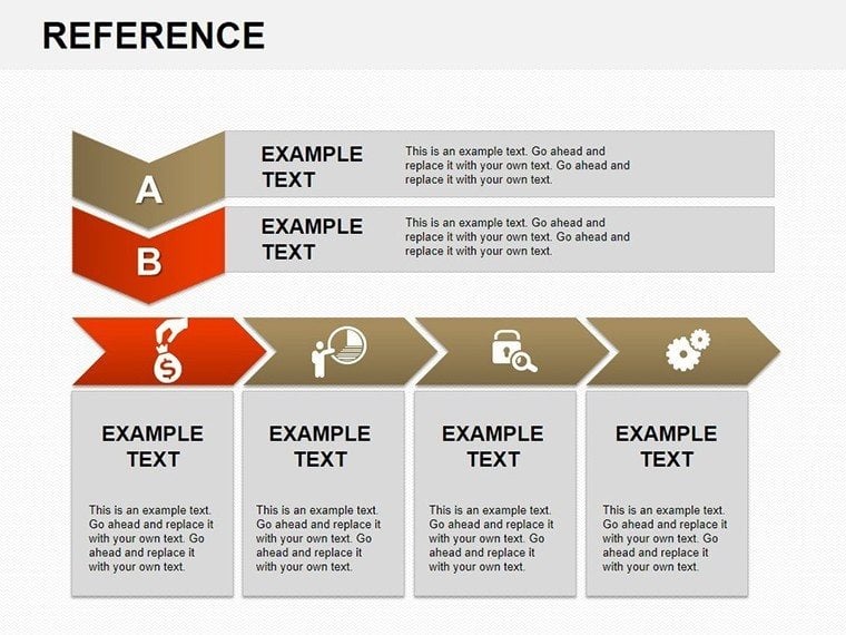
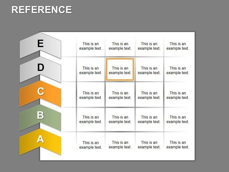
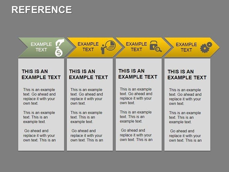
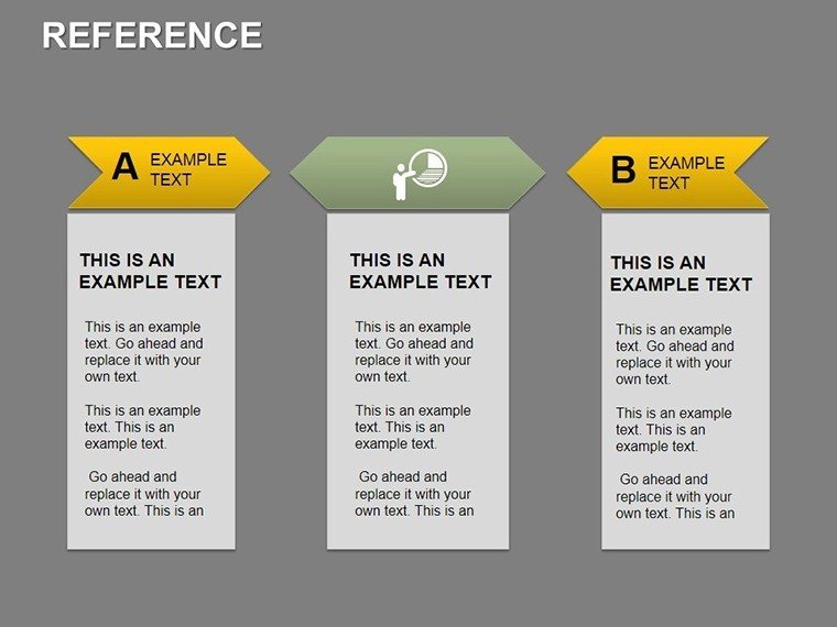
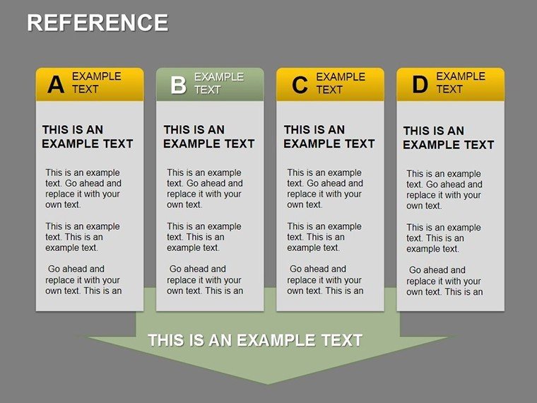
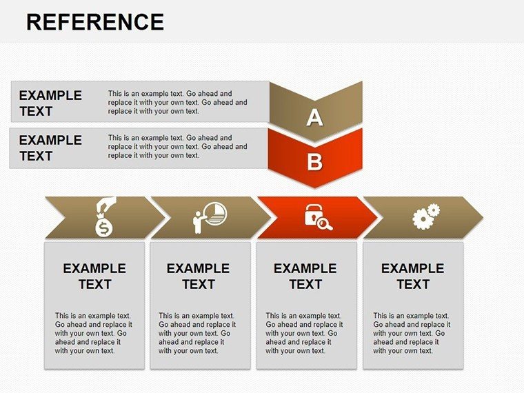
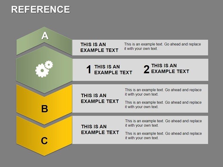
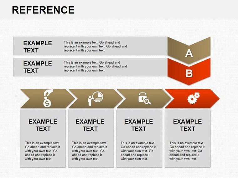
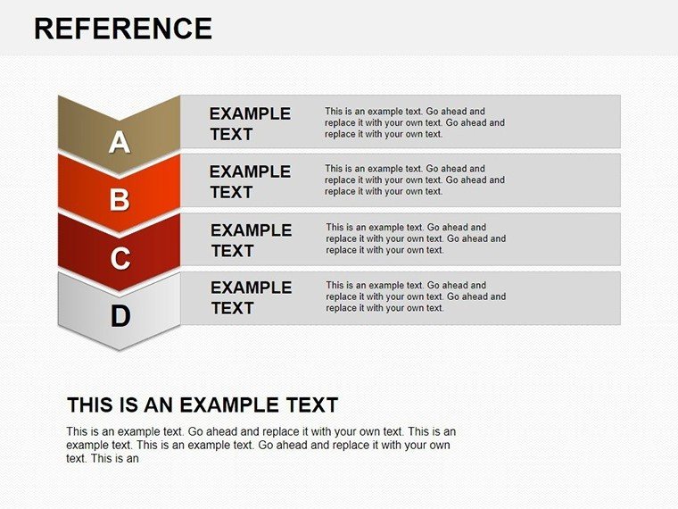
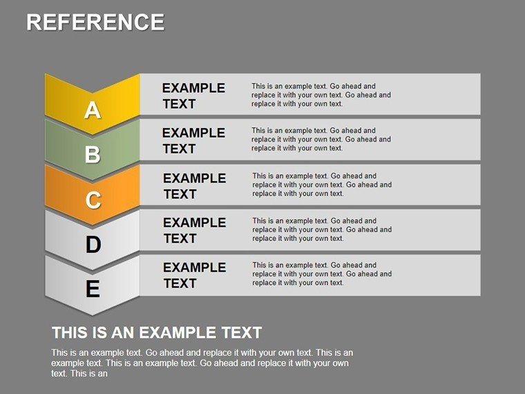
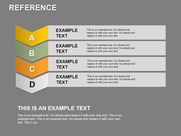
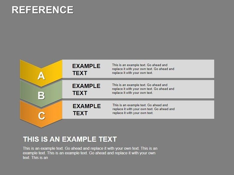
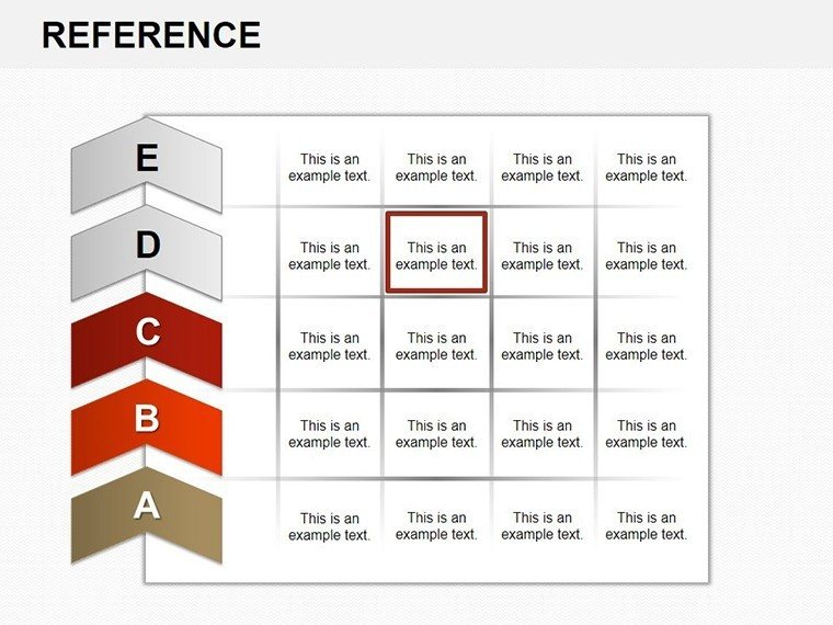
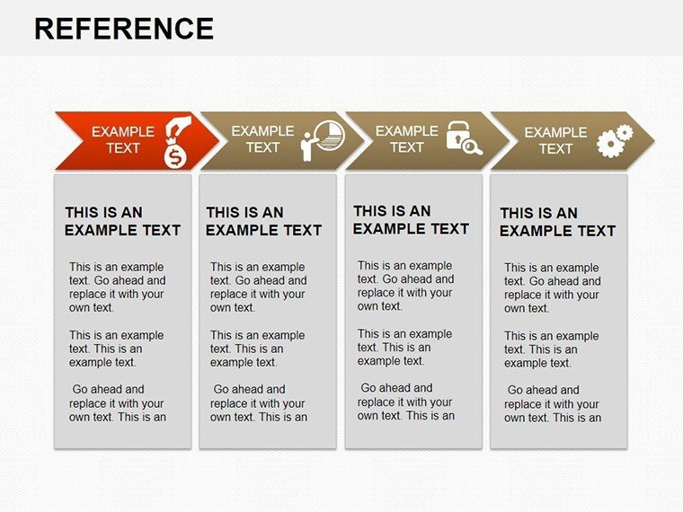
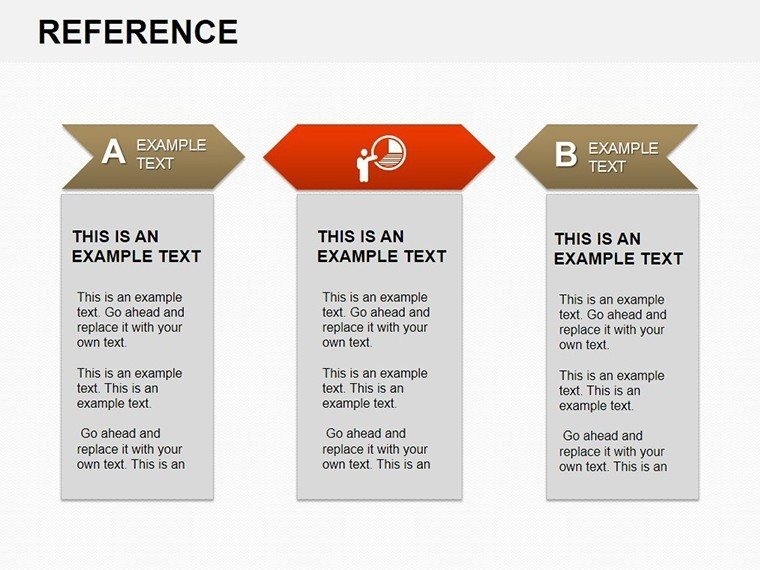
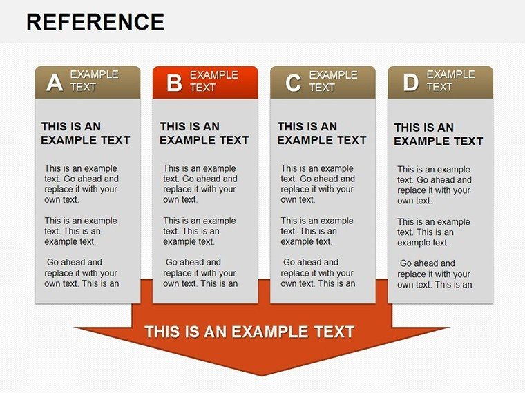
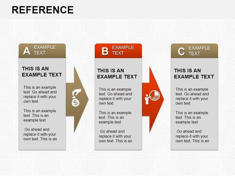
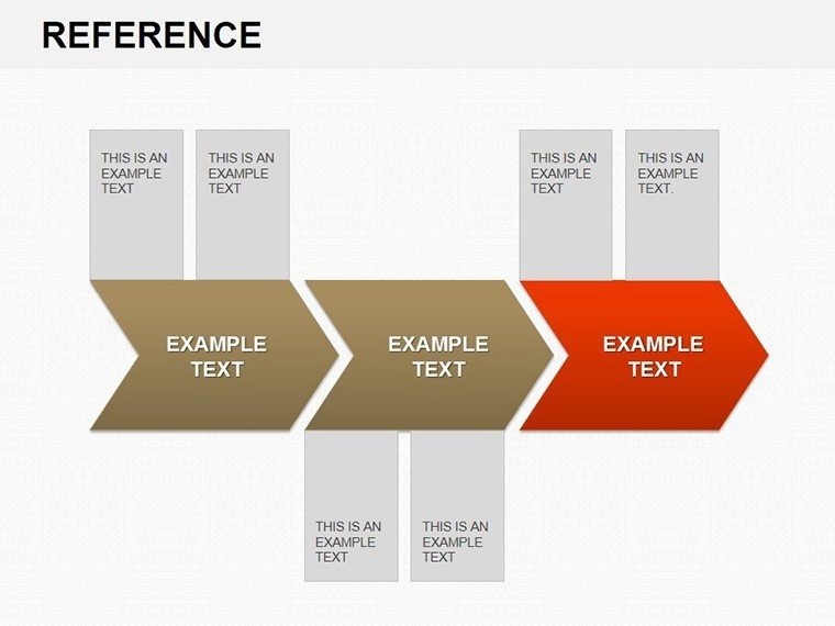
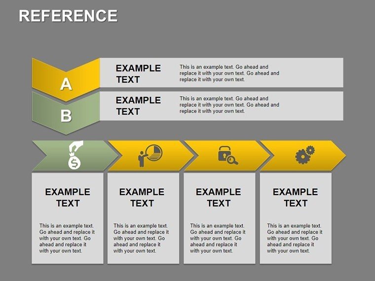
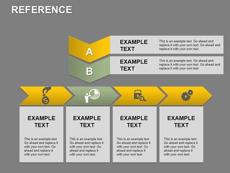
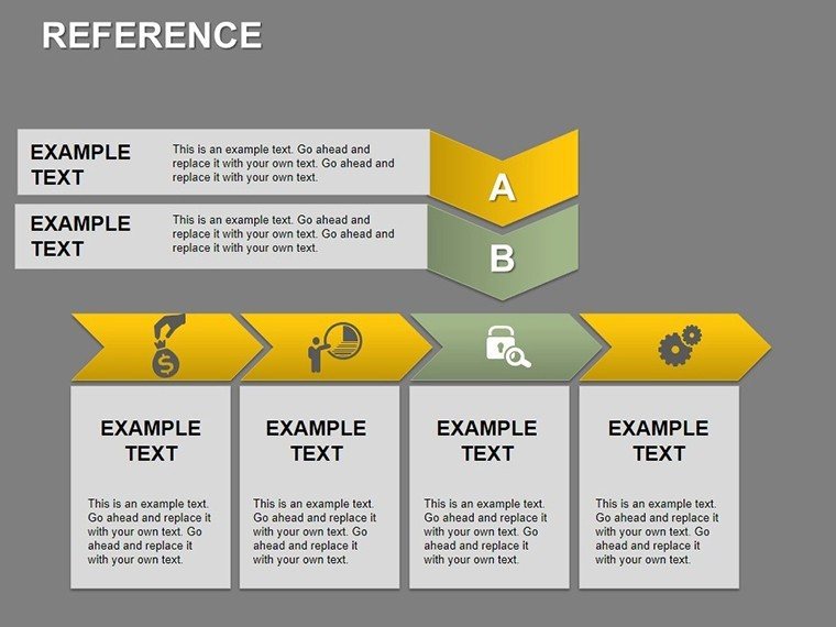
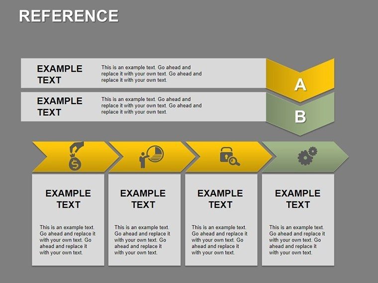
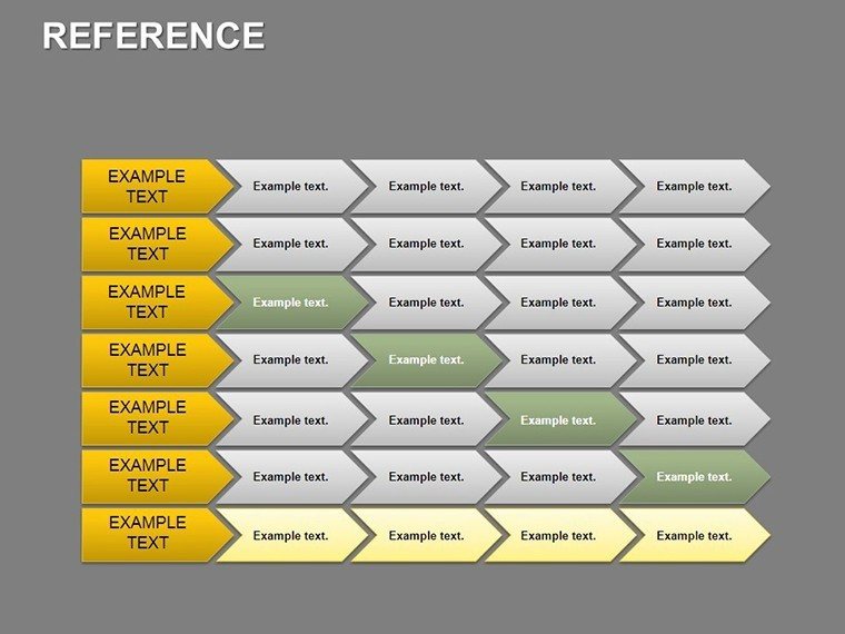
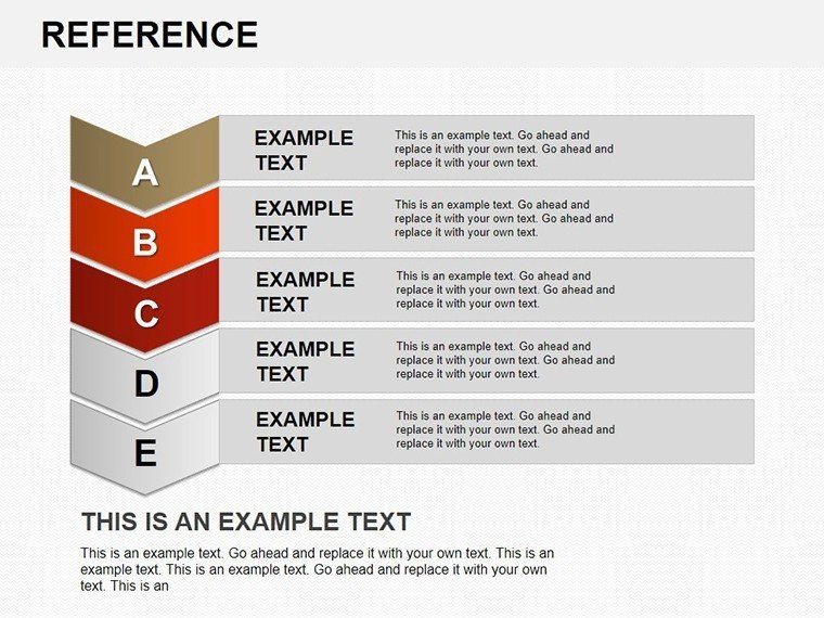
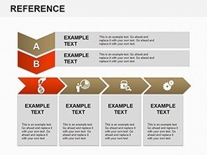
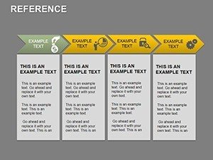
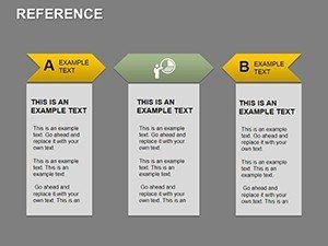
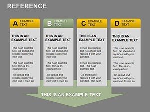
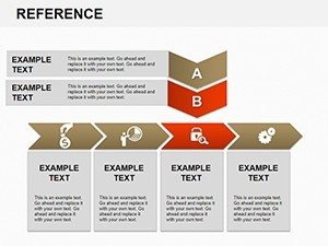
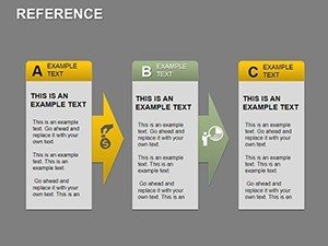
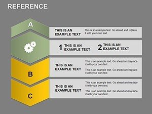
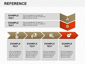
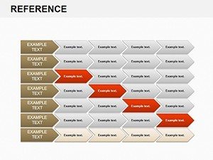
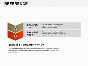
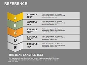
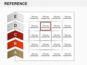
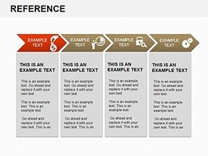
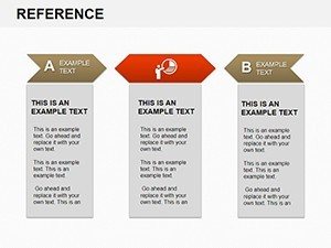
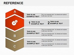
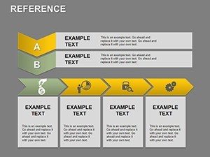
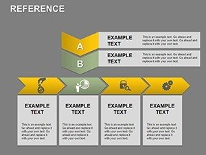
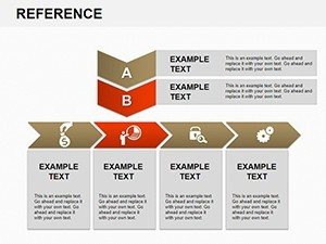
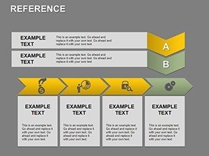
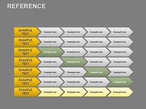
- Engaging Workflow Designs: From linear processes to cyclical flows, these charts help map out steps in manufacturing workflows or software development cycles, making abstract concepts tangible.
- Customizable Charts and Graphs: Include bar graphs for productivity comparisons, pie charts for resource allocation, and line graphs for trend analysis - all editable with your data via simple drag-and-drop.
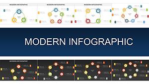
- Varied Layouts: Choose from dashboard overviews, detailed breakdowns, or summary slides to fit any presentation length, ensuring versatility for board meetings or workshops.
- Compatibility and Ease: Fully compatible with PowerPoint and Google Slides, this .pptx file integrates seamlessly, supporting both Windows and Mac users.
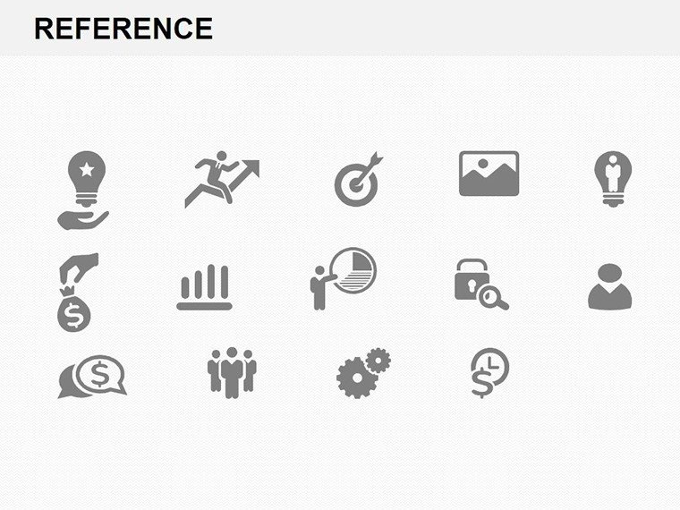
- Themed Icons and Elements: Access a library of productivity-themed icons like clocks, gears, and checklists to add visual flair without overcrowding.
These features aren't just add-ons; they're built to solve real pain points. For instance, in a case study involving a mid-sized consulting firm, implementing similar workflow visuals reduced miscommunication by 40%, as per Harvard Business Review insights on visual aids in business communication.
Real-World Applications and Use Cases
This template shines in diverse scenarios, helping users across industries maximize their impact. Consider a business analyst preparing a report on operational efficiencies: Start with a slide showing a high-level workflow overview, then drill down into productivity metrics using interactive charts. Educators can use it to teach supply chain management, with slides demonstrating how bottlenecks affect output - complete with examples from real companies like Toyota's lean manufacturing principles.
- Project Management: Track milestones with Gantt-style charts, assigning tasks and deadlines to team members for agile project updates.
- Training and Development: Create modules on time management, using flowcharts to illustrate Pomodoro techniques or Eisenhower matrices.
- Sales and Marketing: Visualize lead conversion funnels, showing how productivity tools accelerate sales cycles.
- HR Processes: Map employee onboarding workflows, highlighting areas for improvement to enhance retention.
In one urban planning firm, adapting this template for productivity reviews led to a 25% increase in team output, drawing from best practices outlined by the Project Management Institute (PMI). Tailor it for your niche - whether it's tech startups optimizing code deployment or non-profits streamlining volunteer coordination - and watch engagement soar.
Expert Tips for Maximizing Your Template
To get the most out of this Workflow Productivity PowerPoint Charts Template, follow these professional tips honed from years of presentation design experience. First, always start with your audience in mind: Simplify charts for executives by focusing on key metrics, or add annotations for detailed team discussions. Use consistent color schemes - blues for calm productivity flows, reds for urgent alerts - to guide emotional responses.
Integrate data dynamically: Link charts to Excel for real-time updates, ensuring your presentations stay current. Avoid clutter by limiting each slide to one main idea, adhering to the "less is more" principle championed by design experts like Edward Tufte. For virtual presentations, test animations on Zoom to ensure smooth transitions. Finally, end with a call-to-action slide, prompting discussions on implementing shown workflows.
Compared to basic PowerPoint tools, this template offers pre-built sophistication, saving you from generic clipart and enabling pro-level results without graphic design skills. It's like having a virtual assistant for visuals, backed by compatibility that prevents formatting issues across platforms.
Why Choose This Template for Long-Term Success
Investing in our Workflow Productivity PowerPoint Charts Template isn't just about one presentation - it's about building a toolkit for ongoing excellence. With its scalable designs, you can reuse and adapt slides for future needs, from annual reviews to ad-hoc reports. Trust in its quality, as it's crafted following accessibility guidelines like WCAG for inclusive presentations.
Users praise its ability to make data storytelling effortless, turning numbers into narratives that drive decisions. Don't let outdated slides hold you back; embrace this template to position yourself as a productivity expert in your field.
Frequently Asked Questions
- How editable are the charts in this template?
- All 33 slides are fully editable, allowing changes to data, colors, and layouts directly in PowerPoint or Google Slides.
- Is this template compatible with older PowerPoint versions?
- Yes, it works with PowerPoint 2010 and later, ensuring broad accessibility.
- Can I use this for commercial purposes?
- Absolutely, it's licensed for professional use, including client presentations and internal training.
- What if I need more slides?
- The template is expandable; duplicate and customize existing slides to fit your needs.
- Are there tutorials included?
- While not bundled, our site offers free guides on optimizing workflow charts.