Packaging Process Flowchart Template PowerPoint - Fully Editable


Type: PowerPoint Charts template
Category: Process
Sources Available: .pptx
Product ID: PC00197
Template incl.: 23 editable slides
This Packaging Process PowerPoint Template is designed for operations managers, logistics directors, and supply chain analysts who need to visualize complex workflows clearly and professionally. Whether you are mapping out a new fulfillment center layout, presenting quarterly throughput data, or documenting ISO standard operating procedures, this template provides the precise tools to communicate your strategy.
Streamline Your Operations Presentations
Avoid the frustration of building complex diagrams from scratch. This comprehensive slide deck includes:
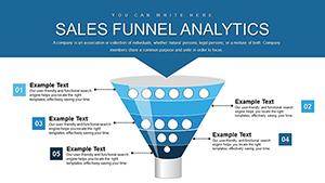
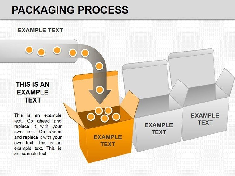
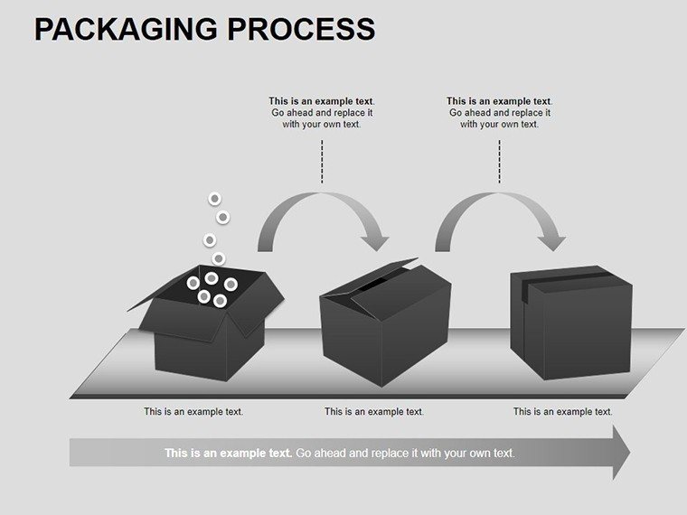
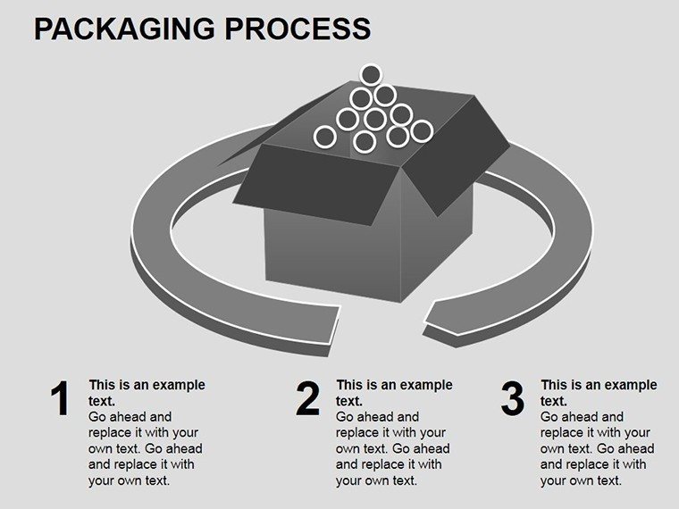
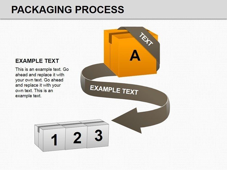
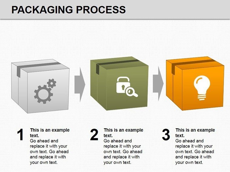
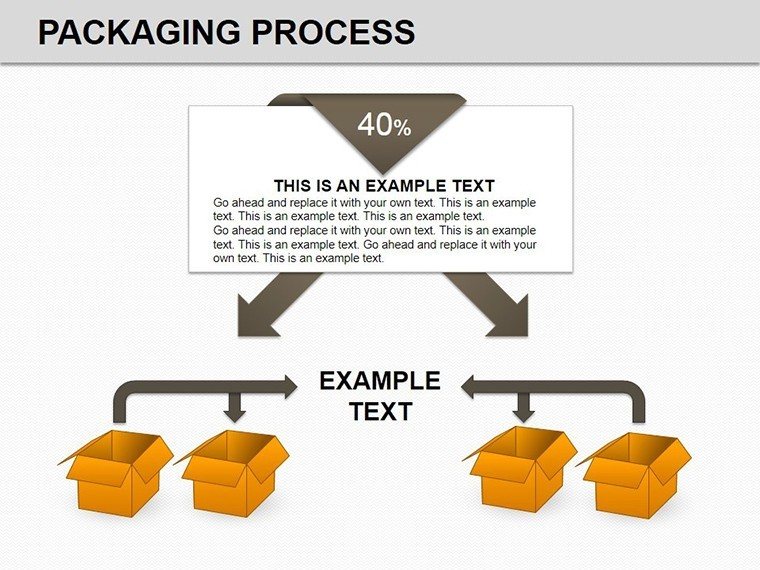
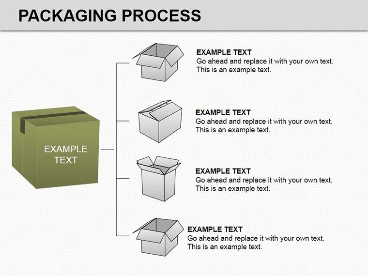
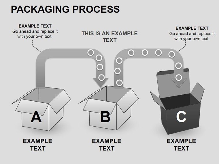
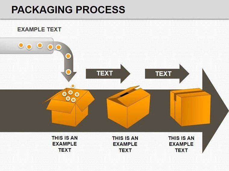
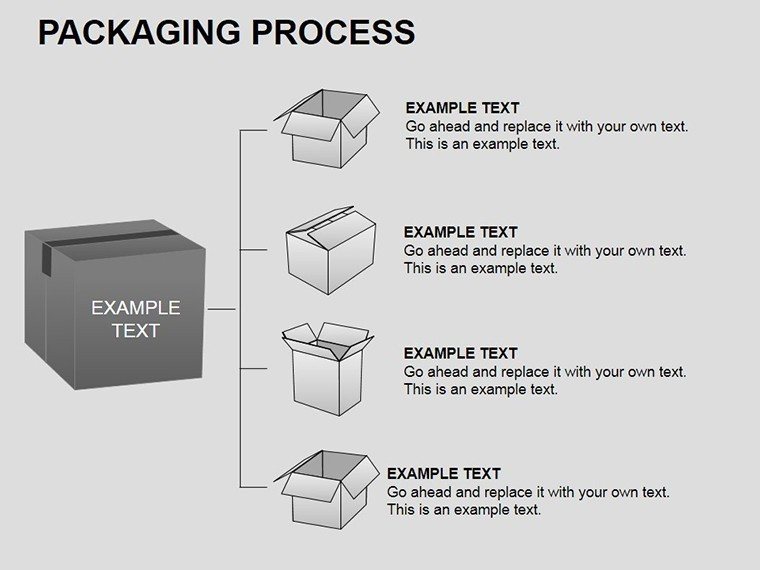
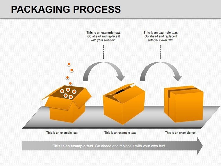
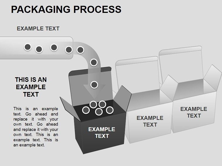
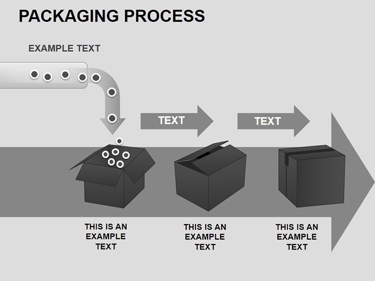
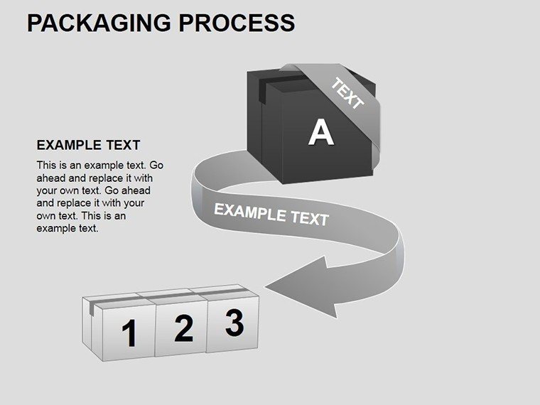
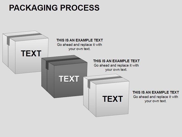
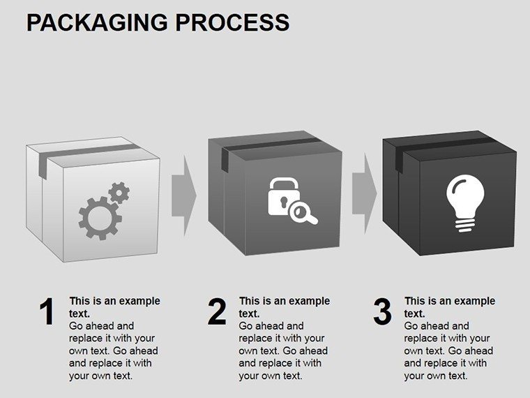
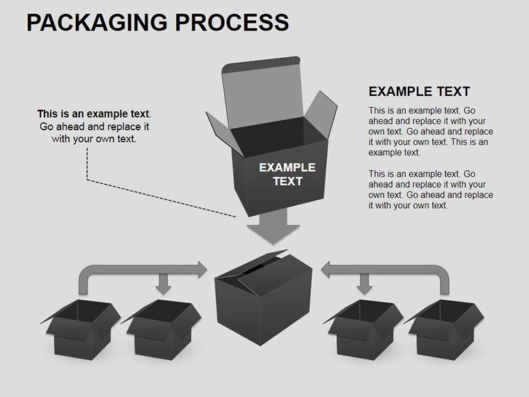
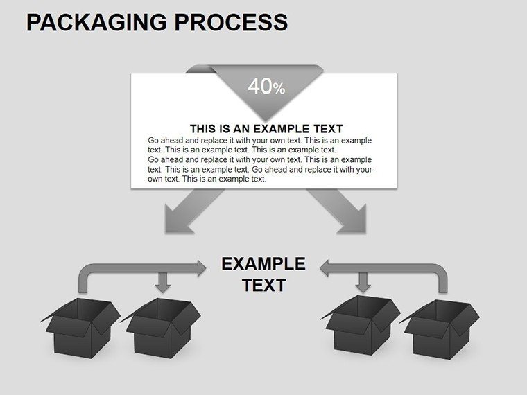
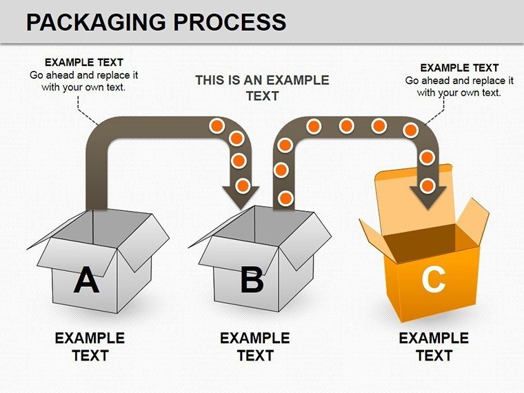
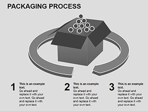
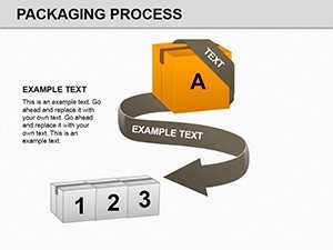
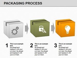
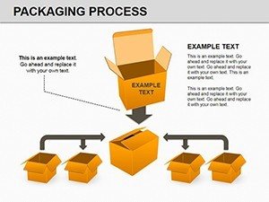
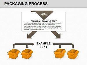
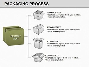
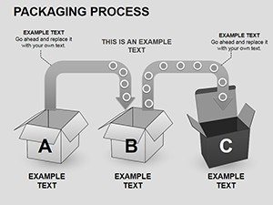
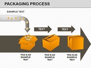
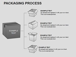
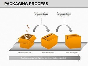
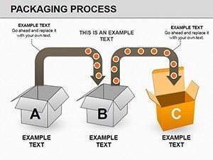
- End-to-End Process Maps: Visualize every step from raw material intake and quality assurance to final packaging and dispatch.
- Gantt Charts & Timelines: Perfect for shift planning, production scheduling, and identifying bottlenecks in your supply chain.
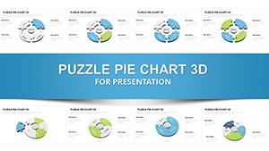
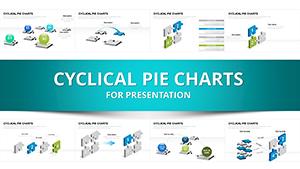
- Resource Allocation Diagrams: Use pie and bar charts to demonstrate labor distribution, material costs, and equipment utilization.
Real-World Professional Use Cases
1. Warehouse Optimization Projects Use the pre-built flowcharts to audit your current packaging line. Highlight inefficiencies (red) and proposed improvements (green) to secure executive buy-in for new equipment or layout changes.
2. Client & Stakeholder Reporting Translate raw logistics data into easy-to-read visuals. The clean, professional design ensures your presentation looks polished, helping you communicate delivery timelines and capacity planning with confidence.
3. Standard Operating Procedures (SOPs) Create clear, visual training materials for warehouse staff. Replace dense text manuals with intuitive process flows that reduce errors and improve onboarding speed.
All 23 slides are 100% editable. You can change colors, resize shapes, and modify text without losing quality. The template uses standard PowerPoint vectors, ensuring crisp printing for handouts and large-screen projection.
Can I customize the flowchart steps for my specific business?
Yes, absolutely. Every shape, arrow, and text box is a native PowerPoint object. You can ungroup elements, add new steps, delete unnecessary ones, and change the connectors to match your exact operational workflow.
Is this template compatible with Google Slides?
Yes. While designed for PowerPoint, you can upload the .pptx file directly to Google Slides. The vector shapes and text will remain editable, allowing you to collaborate with your team online.
Does the template include data-driven charts?
Yes, the included Gantt charts, pie charts, and bar graphs can be linked to Excel data for accurate reporting. However, the process flowcharts are diagrammatic and are edited directly on the slide.
What aspect ratio are the slides?
The template comes in the standard 16:9 widescreen format, which is perfect for modern monitors, projectors, and laptop screens.