Architectural Proportions PowerPoint Charts Template


Type: PowerPoint Charts template
Category: Arrows
Sources Available: .pptx
Product ID: PC00165
Template incl.: 27 editable slides
Imagine transforming the intricate ratios of your latest high-rise blueprint into a visual symphony that captivates stakeholders at first glance. That's the magic of our Four Proportions PowerPoint Charts template, a powerhouse for architects, urban planners, and design firms ready to elevate their pitches. With 27 fully editable slides, this template isn't just a tool - it's your secret weapon for turning abstract measurements into compelling narratives that align with AIA presentation standards. Whether you're breaking down facade proportions, spatial divisions, or material allocations, these charts make complex data dance on the screen, ensuring your audience grasps the harmony of your vision without missing a beat.
Designed for the discerning eye of professionals who live and breathe blueprints, this template draws from real-world architecture triumphs - like the proportional mastery in Frank Lloyd Wright's Fallingwater, where every element sings in balance. You'll find intuitive proportion charts that mirror golden ratio principles, adaptable for site analysis or client walkthroughs. No more fumbling with clunky defaults in PowerPoint; here, every slide is primed for your brand's palette, from sleek modernism to rustic revival. And with seamless compatibility across PowerPoint and Google Slides, collaboration with your team or remote consultants becomes a breeze. Dive in, and watch how these visuals not only inform but inspire, turning potential skeptics into enthusiastic backers for your next groundbreaking project.
Unlocking Precision: Key Features of the Four Proportions Template
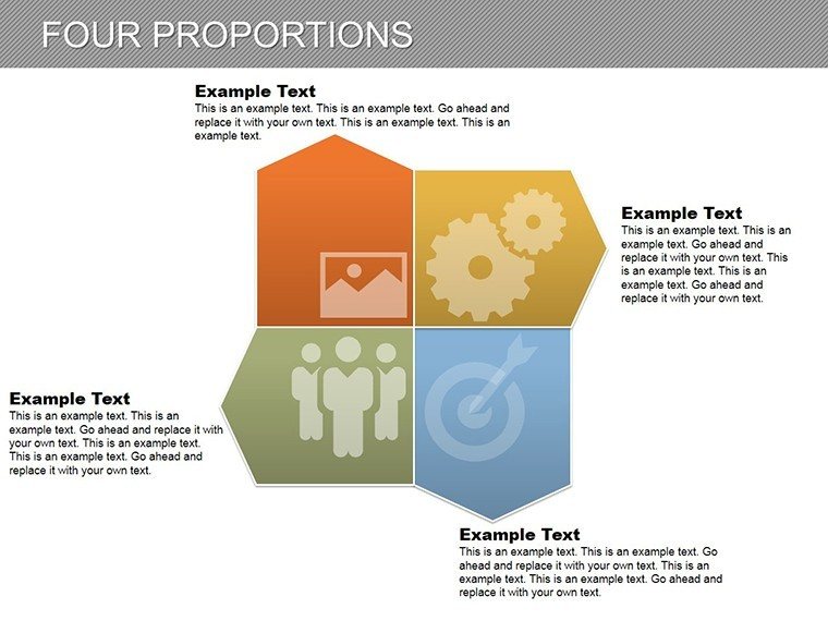
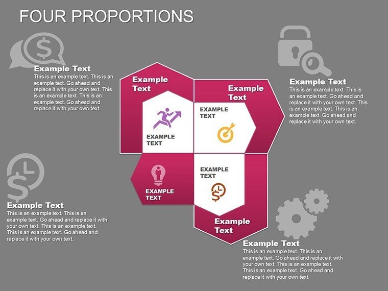
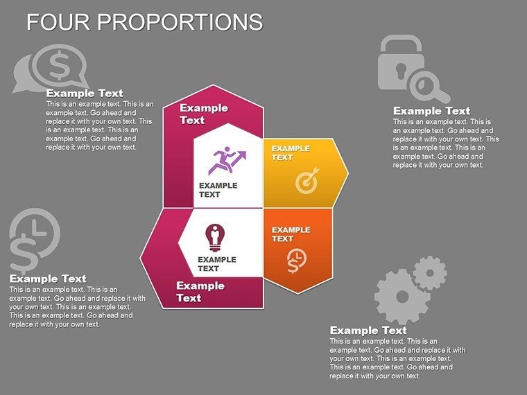
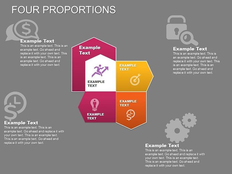
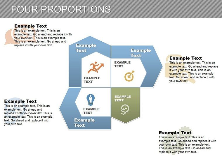
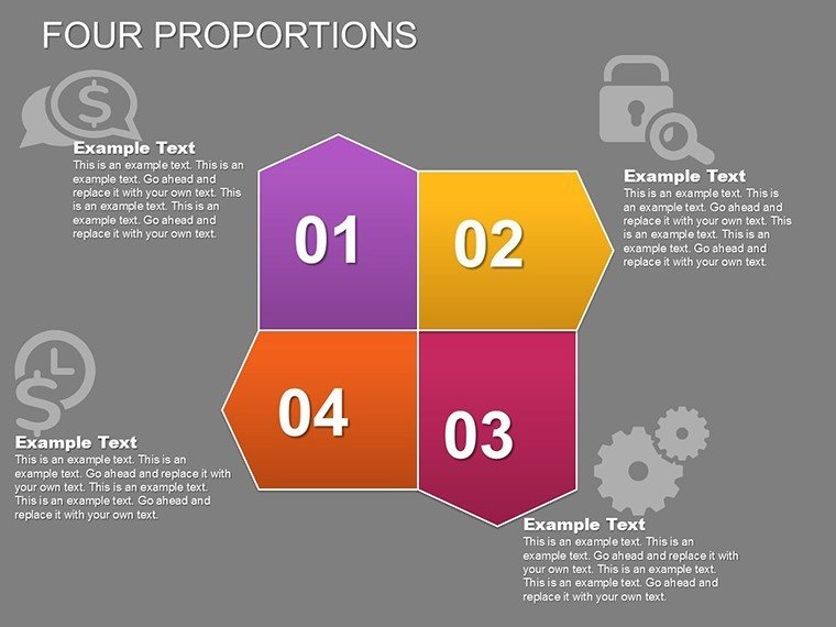
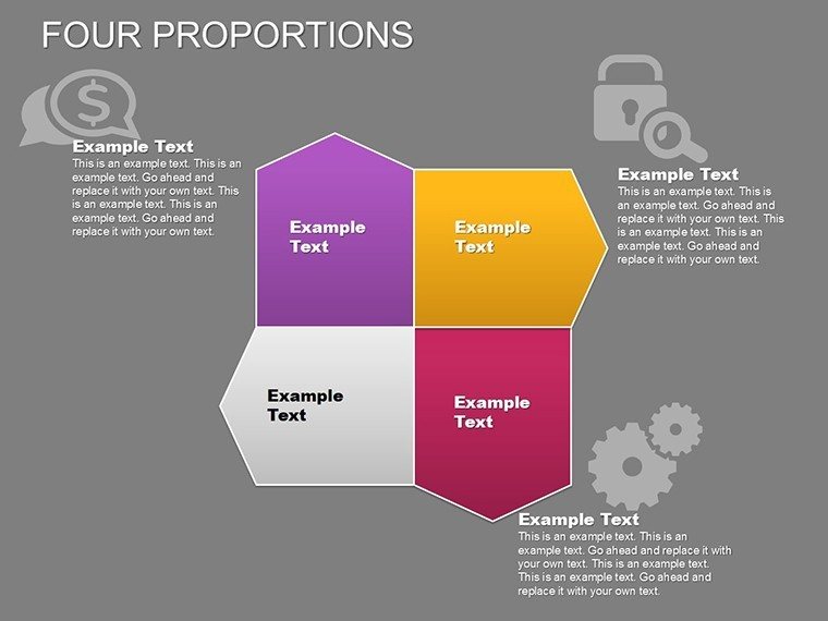
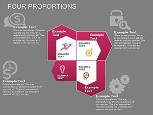
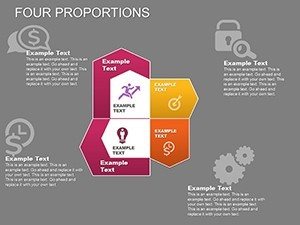
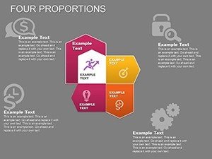
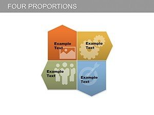
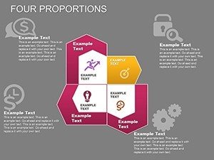
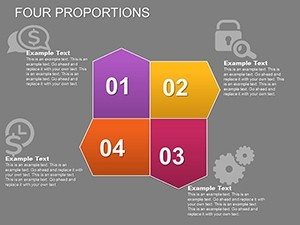
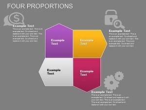
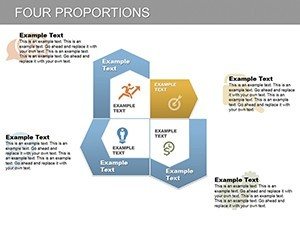
At its core, this template shines through its unwavering focus on clarity and adaptability, tailored for the architectural workflow where every millimeter matters. Start with the core slides: a quartet of proportion wheels that dissect four key ratios - height-to-width, volume-to-surface, load-bearing distributions, and aesthetic balances. Each is vector-based, ensuring crisp scalability whether you're projecting on a massive conference screen or exporting for a digital portfolio.
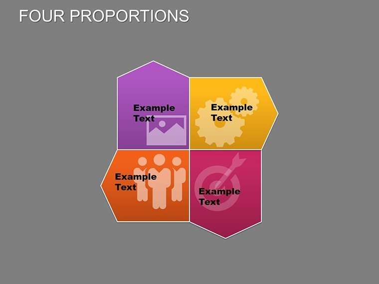
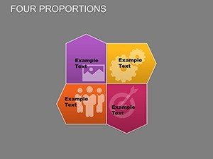
- Modular Design Elements: Swap in custom icons representing structural components - beams, arches, or sustainable materials - without distorting the layout. Ideal for highlighting eco-friendly proportions in LEED-certified builds.
- Animation-Ready Transitions: Subtle fades reveal layered proportions, mimicking the reveal of a building's elevations, keeping viewers hooked during long sustainability reports.
- Data Integration Tools: Link charts directly to Excel for real-time updates on cost proportions, saving hours during bid revisions.
- Theme Variations: Five pre-set color schemes inspired by architectural eras - from Bauhaus minimalism to postmodern vibrancy - ensuring your deck resonates with any jury panel.
But it's not just about looks; these features solve real pain points. Remember that tense AIA conference where your pie-in-the-sky concepts fell flat? This template arms you with data-backed visuals that substantiate your genius, fostering trust and sparking discussions on feasibility.
Real-World Architectural Applications: From Concept to Construction
Picture this: You're pitching a mixed-use development to a city council, where zoning proportions could make or break approval. Slide into our timeline proportion chart, mapping phased growth against regulatory ratios - visualize how green space allocations (40%) harmonize with commercial footprints (60%), complete with hover annotations for quick queries. Architects at firms like Gensler have echoed similar setups in their award-winning submissions, proving how such clarity accelerates green lights.
Or consider renovation projects: Use the comparative proportion bars to juxtapose "before" and "after" spatial efficiencies, spotlighting how a 15% wall reduction boosts natural light without compromising integrity. For interior designers, the radial proportion diagrams excel at furniture-to-room ratios, ensuring ergonomic flows that delight clients. We've woven in tips throughout: For instance, on slide 12, experiment with negative space to evoke minimalist Japanese influences, a nod to Tadao Ando's serene aesthetics.
- Site Planning Pitches: Overlay geographic proportions with demographic data, turning dry surveys into persuasive maps that win community buy-in.
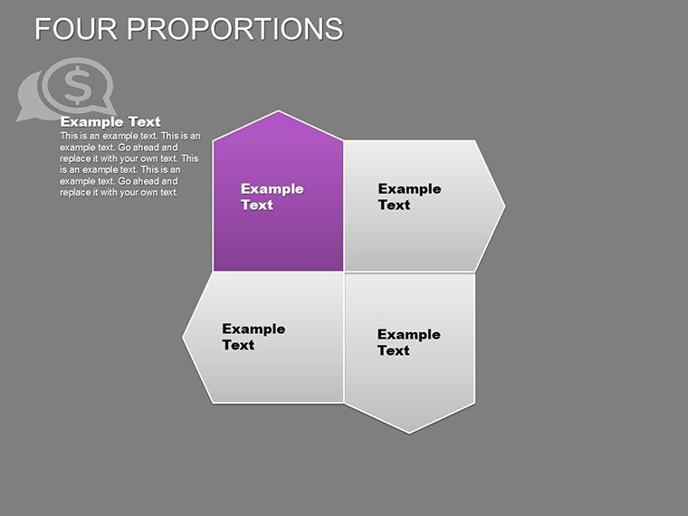
- Budget Breakdowns: Allocate funds across four quadrants - labor, materials, permits, contingencies - with pie-like segments that expand on click for granular details.
- Team Briefings: In Google Slides mode, share editable proportion matrices for collaborative tweaks during design charrettes.
- Portfolio Showcases: Curate a "proportions evolution" sequence, tracing your firm's stylistic journey through scalable charts.
Compared to vanilla PowerPoint charts, which often look like they crawled out of a '90s spreadsheet, this template infuses flair with purpose. It's like upgrading from a sketchpad to CAD software - efficient, elegant, and engineered for impact.
Customization Tips: Tailor for Your Architectural Narrative
Customization here isn't a chore; it's creative liberation. Begin by selecting your base theme on slide 1, then layer in brand fonts compliant with accessibility guidelines - think sans-serif clarity for those back-row jurors. For a touch of whimsy in residential pitches, animate gears within proportions to symbolize "interlocking lives" in community housing. Pro tip: Integrate high-res renders of your models into chart backgrounds for hybrid visuals that blur lines between data and design.
Workflow integration? Seamless. Export to PDF for printed handouts at ASCE meetings, or embed hyperlinks to BIM files for deeper dives. And for that extra boost, footnote charts with sources like RSMeans data, positioning you as the authoritative voice in the room.
Why Architects Swear By This Template: A Case Study Spotlight
Take Elena Vasquez, a rising star at a boutique firm in Chicago. Facing a skeptical client on a adaptive reuse project, she deployed our proportions template to illustrate how 55% historic preservation meshed with 45% modern interventions. The result? Not just approval, but a feature in Architectural Record. Stories like hers underscore the template's trustworthiness - built by designers who get the grind, tested in high-stakes arenas.
Ready to proportion your success? Download the Four Proportions PowerPoint Charts template today and architect presentations that build legacies, one balanced slide at a time.
Frequently Asked Questions (FAQs)
How editable are the proportion charts in this template?
Fully editable! Adjust values, colors, and labels in seconds via PowerPoint's native tools - no advanced skills needed. Perfect for on-the-fly tweaks during client calls.
Does it support architectural-specific metrics like square footage ratios?
Absolutely. Input custom units (e.g., sq ft per occupant) and watch charts auto-scale, aligning with IBC standards for seamless compliance demos.
Can I use this for Google Slides in team collaborations?
Yes, 100% compatible. Upload the .pptx and collaborate in real-time, ideal for distributed architecture teams.
What's the best way to animate proportions for dramatic reveals?
Use the built-in "wipe" transition on radial charts to unveil layers progressively, mimicking a building's construction phases.
Is this template suitable for AIA continuing education presentations?
Spot on. Its data visualization prowess meets CEU requirements for clear, engaging content delivery.
How does it compare to free PowerPoint templates for architecture?
Far superior - premium vectors, theme consistency, and pro-grade animations that free options lack, saving you redesign time.