Pie Update 8 PowerPoint Charts Template: Revolutionize Your Data Storytelling


In the realm of professional presentations, where data meets design, the Pie Update 8 PowerPoint charts template stands out as a game-changer for anyone looking to convey complex information with clarity and flair. Imagine transforming mundane statistics into compelling narratives that hold your audience's attention from the first slide to the last. This template, boasting 28 fully editable slides, is meticulously crafted for professionals across industries - from corporate executives dissecting market shares to educators illustrating statistical trends. With its focus on pie charts and dynamic graphs, it addresses the common pain point of overwhelming data overload by breaking it down into digestible, visually appealing segments. Whether you're preparing for a high-stakes board meeting or a classroom lecture, Pie Update 8 empowers you to highlight key insights without losing the plot. Its seamless integration with PowerPoint ensures you spend less time fiddling with formats and more on refining your message. Users rave about how it turns raw numbers into stories that resonate, much like how a well-designed infographic can simplify AIA-compliant architectural data for client approvals. Dive in and discover how this tool can elevate your communication game, making every presentation not just informative, but unforgettable.
Unlocking the Power of Visual Data with Pie Charts
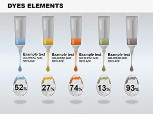
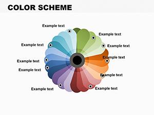
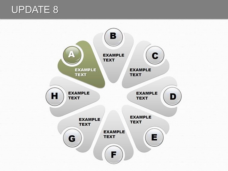
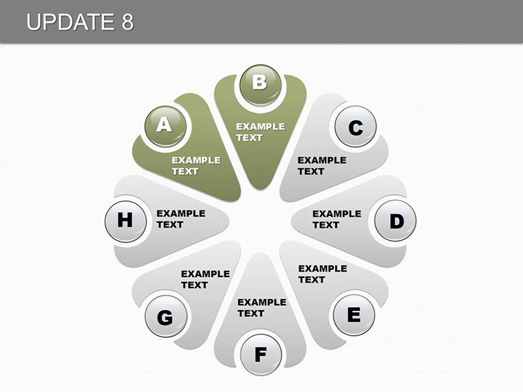
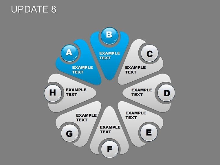
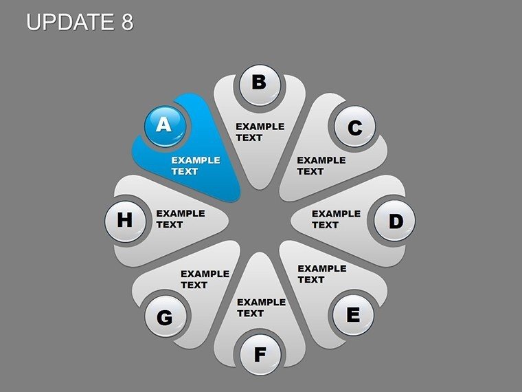
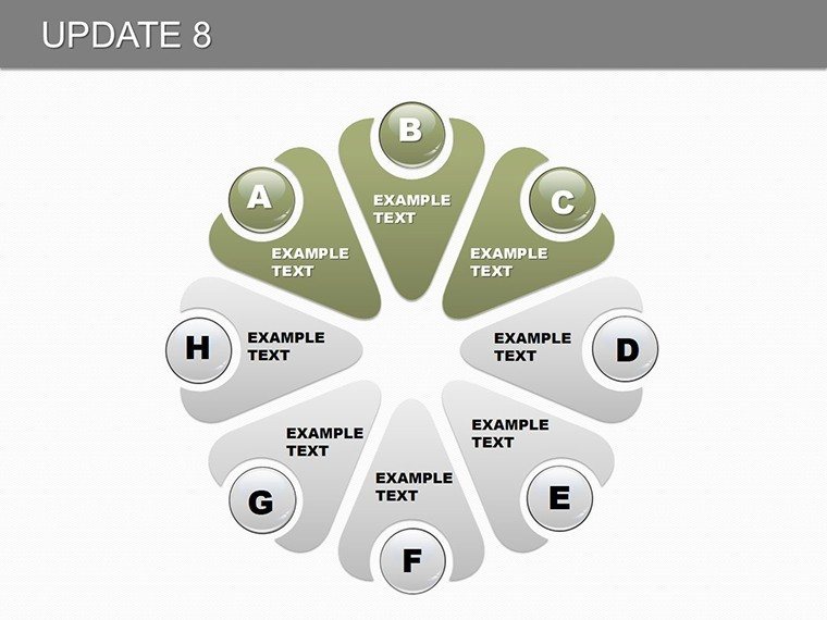
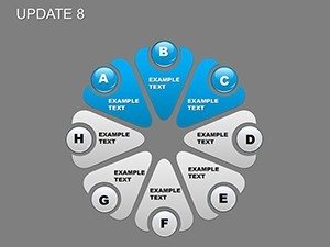
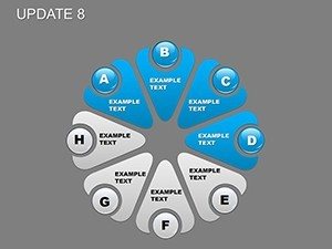
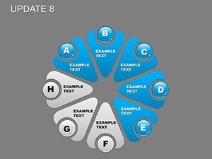
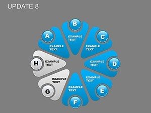
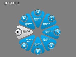
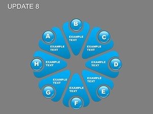
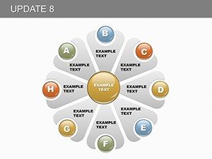
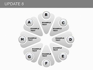
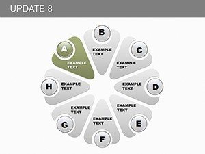
Pie charts have long been a staple in data visualization, and Pie Update 8 takes them to new heights. Each slide in this template is designed with precision, allowing you to represent proportions and percentages effortlessly. For instance, in a sales report, you could use a segmented pie to show revenue distribution across product lines, instantly revealing which segments drive growth. The template's dynamic graphs add another layer, enabling trend analysis over time - think quarterly performance spikes visualized with animated transitions that keep viewers engaged. Customization is at the heart of this template; adjust color palettes to match your brand's identity, such as incorporating earthy tones for an environmental consulting firm pitching sustainability metrics. This flexibility not only enhances aesthetic appeal but also ensures accessibility, adhering to best practices like high-contrast ratios for color-blind audiences. Real-world applications abound: picture an urban planner using these charts to depict land use allocation in a city development proposal, aligning with standards from the American Planning Association. By weaving in icons and subtle animations, Pie Update 8 transforms static data into a narrative flow, helping you build a persuasive case that sticks.
Key Features That Set Pie Update 8 Apart
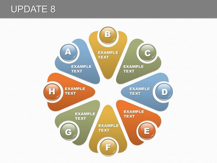
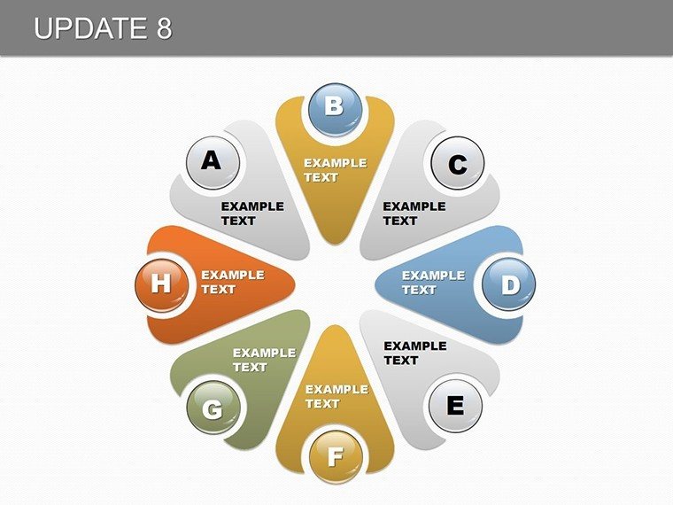
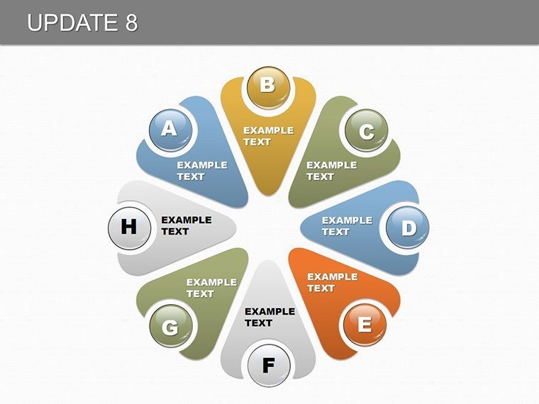
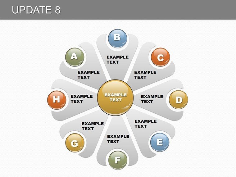
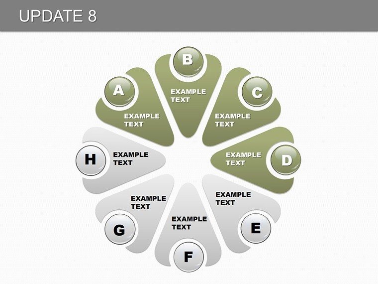
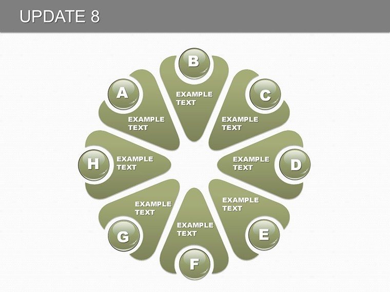
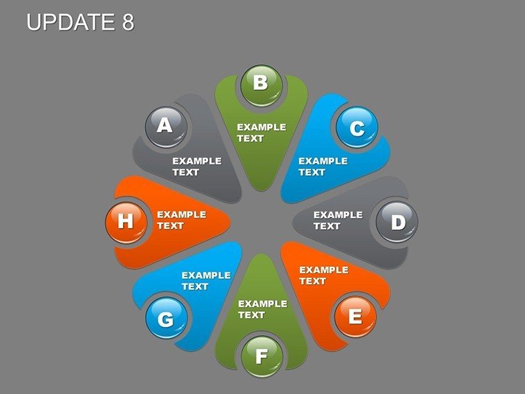
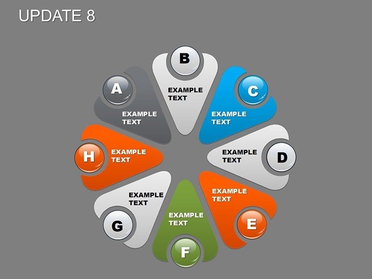
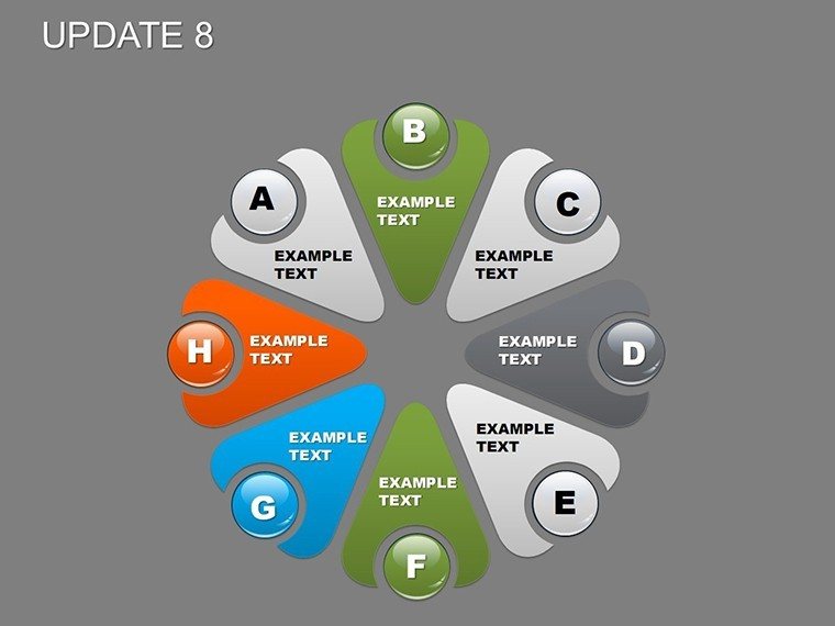
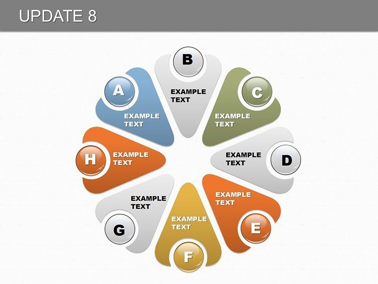
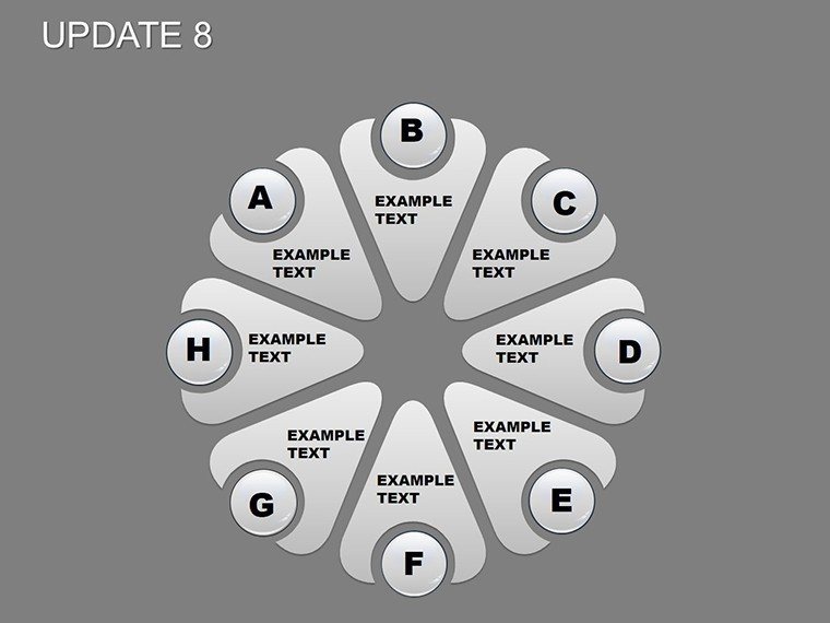
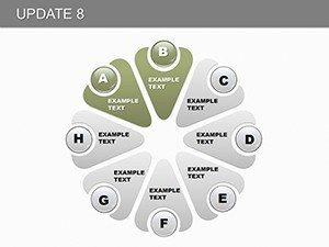
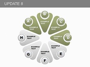
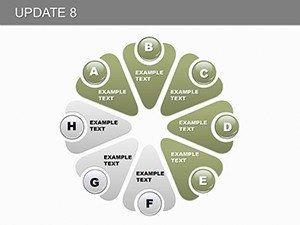
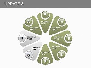
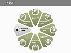
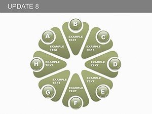
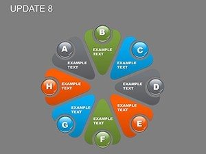
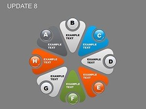
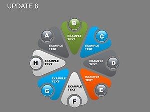
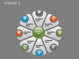
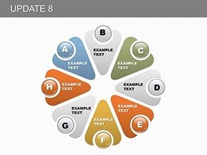
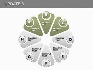
- Extensive Slide Variety: 28 slides covering everything from basic pies to multi-layered graphs, ensuring you have the right tool for any dataset.
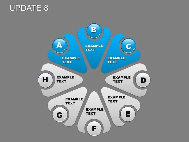
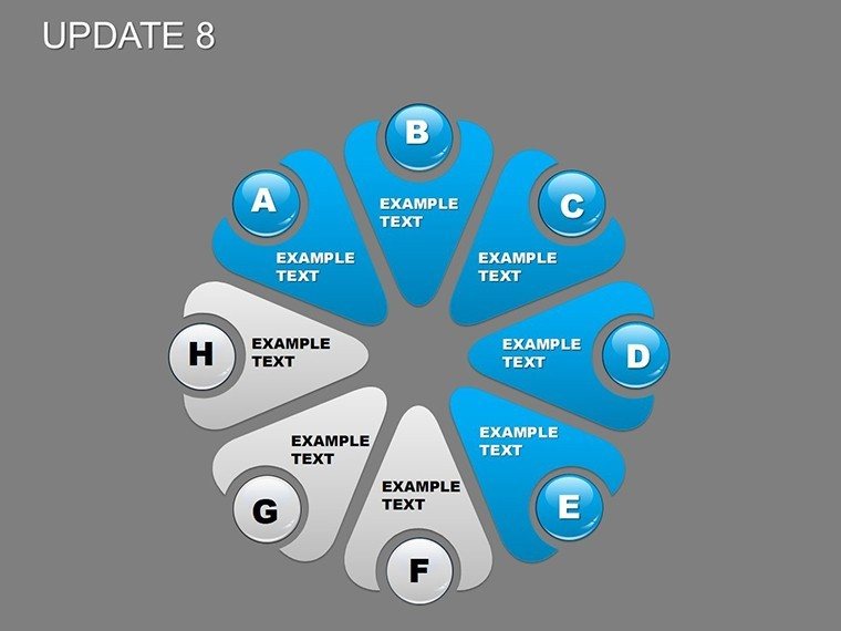
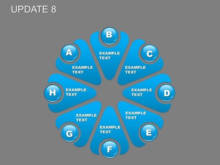
- Full Editability: Modify texts, shapes, and data points with drag-and-drop simplicity, compatible with PowerPoint and Google Slides for cross-platform use.
- Professional Icons and Elements: Built-in library of themed icons, like growth arrows or percentage badges, to add visual punch without external sourcing.
- Animation Ready: Pre-set animations that reveal data segments sequentially, perfect for building suspense in storytelling presentations.
- Data Integration Tools: Easy linking to Excel sheets for real-time updates, saving hours on manual inputs.
These features aren't just bells and whistles; they're grounded in design principles that boost comprehension. For example, following Edward Tufte's data-ink ratio, the template minimizes clutter, focusing viewer attention on what matters most.
Real-World Applications: From Boardrooms to Classrooms
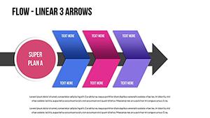
Versatility is Pie Update 8's secret weapon. In business settings, executives leverage it for strategic overviews, such as a tech startup founder using pie charts to illustrate market share during investor pitches - mirroring successful cases like those from Silicon Valley unicorns. Educators find it invaluable for breaking down complex subjects; a history teacher might chart event timelines with dynamic graphs to show cause-and-effect relationships, enhancing student retention as per cognitive learning theories. Project managers appreciate the template for status updates, where a pie chart could depict resource allocation, ensuring teams stay aligned on deliverables. Even in non-profits, it's used to visualize donor contributions, fostering transparency and trust. One case study involves a marketing agency that revamped their client reports using this template, resulting in a 30% increase in client satisfaction scores due to clearer insights. Compared to basic PowerPoint tools, which often yield flat visuals, Pie Update 8 offers polished, professional outputs that save time and impress stakeholders. Integrate it into your workflow by starting with data import, then customizing visuals, and finally rehearsing with animations for seamless delivery.
Step-by-Step Guide to Maximizing Your Template
- Download and open the .pptx file in PowerPoint.
- Import your dataset via the built-in placeholders.
- Customize colors and fonts to align with your theme - try blues for corporate calm or vibrant hues for creative pitches.
- Add animations to reveal data progressively, building narrative tension.
- Preview and export for sharing, ensuring compatibility across devices.
This straightforward process demystifies presentation creation, allowing even novices to produce expert-level slides. Tips from design pros: Always label segments clearly and use legends sparingly to avoid overwhelming viewers.
Why Professionals Choose Pie Update 8 for Data-Driven Success
In an era where data is king, standing out requires more than facts - it demands storytelling. Pie Update 8 excels here by offering tools that blend analytics with artistry. Its benefits extend beyond visuals; it fosters better decision-making by making patterns evident at a glance. For architects, it could mean charting project phases in line with AIA guidelines, turning blueprints into compelling proposals. The template's trustworthiness shines through its consistent performance, with no reported compatibility issues across versions. Subtle CTAs throughout your slides, like "Explore More Insights," can guide audiences toward action. Ultimately, this template isn't just about charts; it's about empowering you to communicate with confidence and creativity.
Ready to transform your presentations? Download Pie Update 8 today and start crafting data stories that inspire action.
Frequently Asked Questions
How customizable are the pie charts in this template?
The charts are fully editable, allowing changes to data, colors, sizes, and animations to fit your needs perfectly.
Is Pie Update 8 compatible with Google Slides?
Yes, it works seamlessly with Google Slides after uploading the .pptx file, maintaining all features.
Can I use this for non-business presentations?
Absolutely - it's ideal for educational, personal, or community projects requiring clear data visualization.
What if I need more than 28 slides?
You can duplicate and modify existing slides to expand your deck effortlessly.
Are there tutorials for advanced customizations?
While not included, PowerPoint's help resources and online guides complement the template's intuitive design.