Divided Ball PowerPoint Charts Template


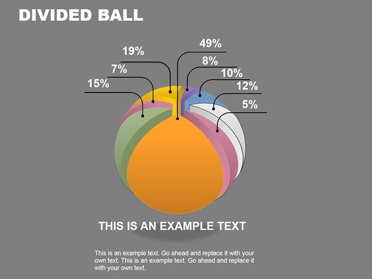


Step into the realm of three-dimensional data presentation with our Divided Ball PowerPoint Charts Template, where innovation meets functionality. Designed for professionals who need to convey multifaceted information with impact, this template features 20 editable slides centered on 3D sphere charts. Imagine a ball divided into segments, each representing a data slice - ideal for showing market shares, budget allocations, or project phases in a spherical format that adds depth and intrigue. Whether you're in finance illustrating portfolio distributions or in engineering depicting component breakdowns, this tool elevates your slides from flat to fascinating. Rooted in visual design principles from experts like Edward Tufte, it minimizes chartjunk while maximizing insight, ensuring your audience focuses on the message, not the medium.
The Allure of 3D Divided Ball Designs
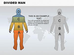
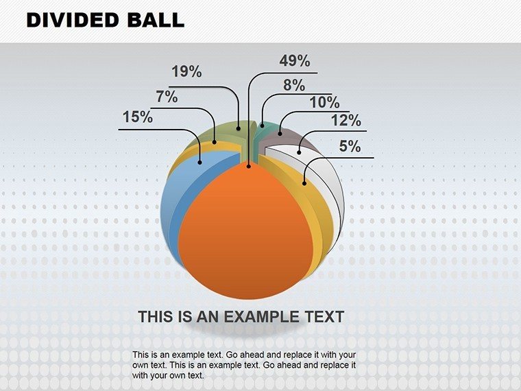
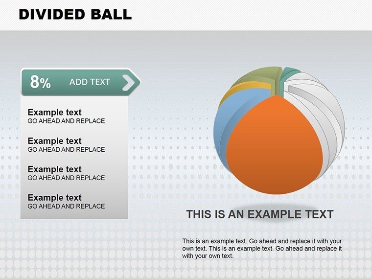
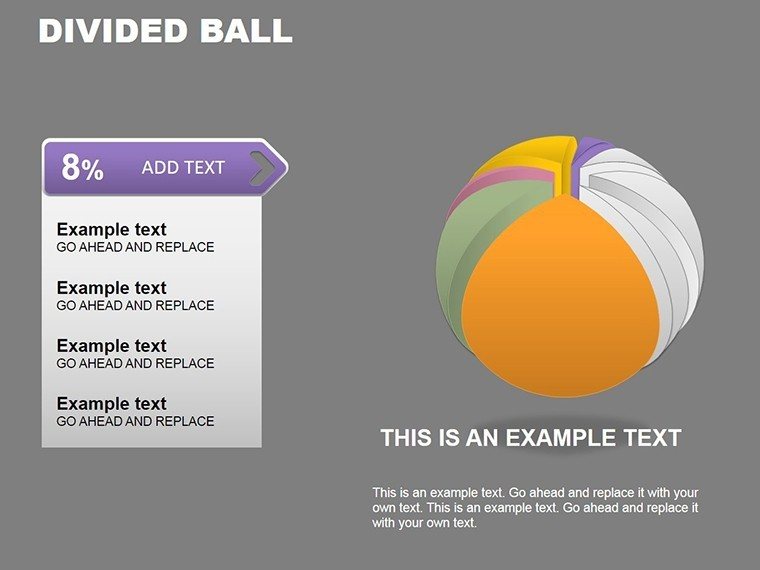
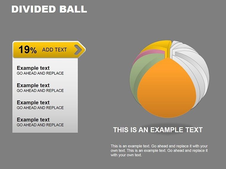
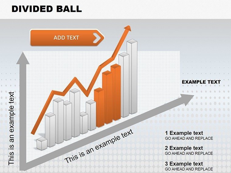
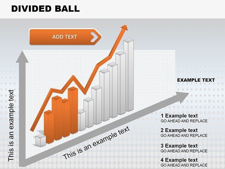
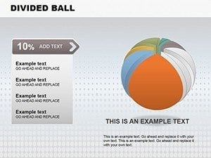
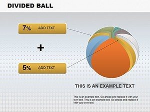
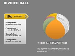
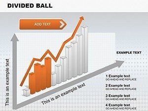
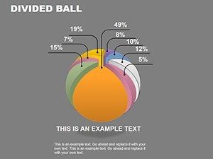
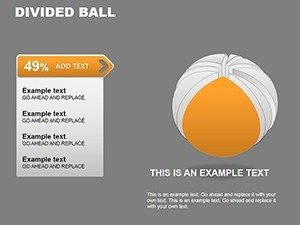
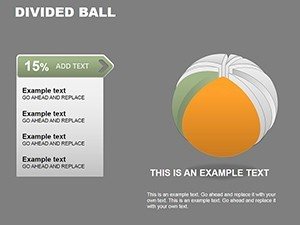
Divided ball charts stand out by simulating volume, making abstract data feel tangible. This template harnesses that by offering segmented spheres that you can color-code and label effortlessly. Slides range from simple bisected balls for binary comparisons to multi-segmented ones for complex datasets. The 3D aspect allows for rotations in animations, revealing hidden insights as the ball 'turns.' This isn't just visual candy; it's a strategic choice for presentations where spatial relationships matter, like in product design reviews where segments represent material compositions.
Standout Features for Enhanced Visuals
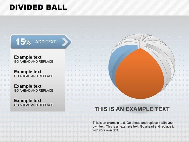
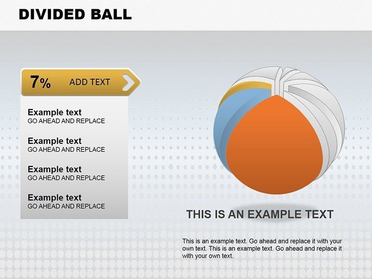
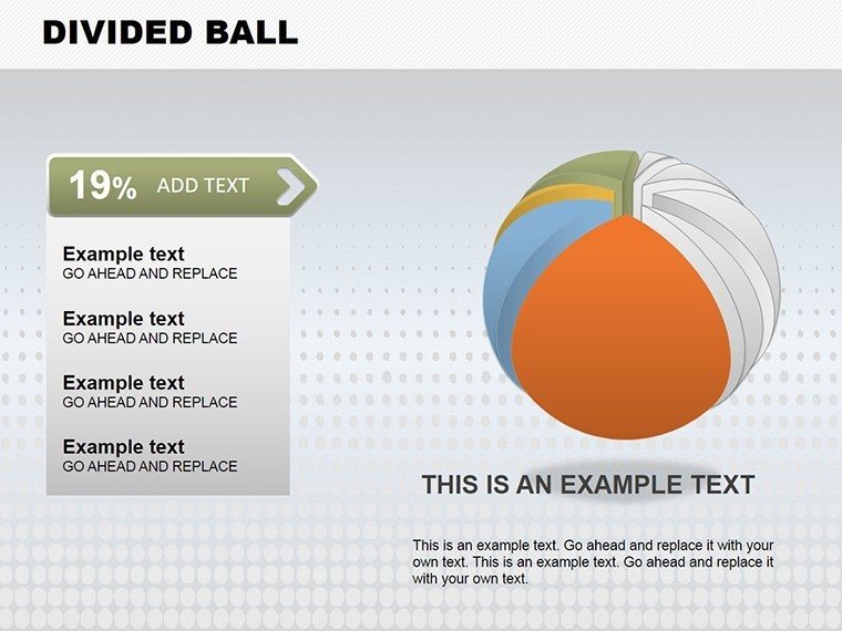
The template's core strength is its editability: adjust segment sizes proportionally to data, apply gradients for realism, or embed text within spheres. Fully compatible with PowerPoint and Google Slides, it includes high-fidelity vectors that scale perfectly. Animations are pre-set for smooth reveals, and the design adheres to accessibility standards with options for color contrasts. With 20 slides, you have ample variety without redundancy, each optimized for quick data entry.
- 3D Rendering: Realistic shadows and perspectives for immersive visuals.
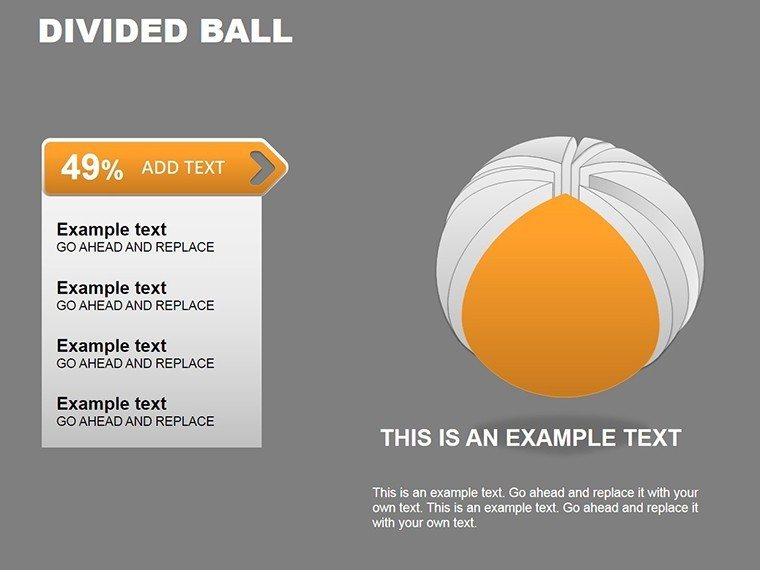
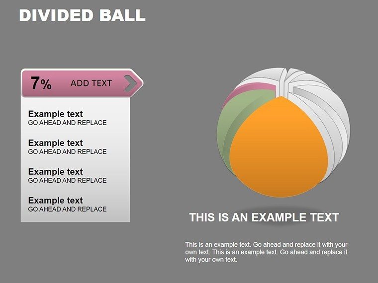
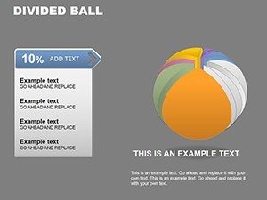
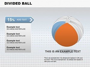
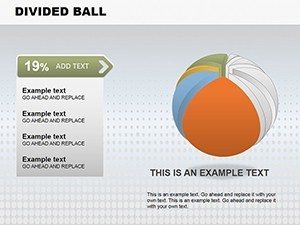
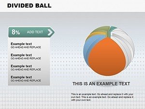
- Segment Flexibility: Divide into 2-12 parts based on your needs.
- Color Customization: Match to brand guidelines or data categories.
- Animation Options: Rotate or explode segments for emphasis.
Applications Across Industries
In practice, this template thrives in diverse settings. For corporate strategists, use a divided ball to represent SWOT analysis, with quadrants as strengths, weaknesses, opportunities, and threats - rotating to spotlight each. In academia, professors can illustrate atomic structures in chemistry classes, segments denoting electron shells. A real example: a tech firm used similar 3D balls in their investor deck to show revenue streams, resulting in clearer comprehension and a successful funding round. These use cases demonstrate how the template addresses common issues like data misinterpretation by providing a novel, memorable format.
Guiding You Through Customization
Customize with ease: Download the .pptx, select a slide, and input data via smart placeholders - the segments auto-adjust. Apply colors using the eyedropper tool for precision, and add labels with curved text for a seamless fit. For interactivity, hyperlink segments to detailed backups. Run through slideshow to fine-tune animations, ensuring they enhance rather than distract. This streamlined process aligns with efficient workflows, saving time for content refinement.
- Download and launch in PowerPoint.
- Enter data and watch segments resize.
- Customize aesthetics and add text.
- Incorporate interactive elements.
- Preview and adjust for perfection.
Workflow Integration and Best Practices
Incorporate this into your routine by linking to Excel for live data updates or using it in virtual meetings via Teams. Inspired by visualization gurus, focus on data integrity - avoid over-segmentation to prevent clutter. For global teams, the 3D design transcends language barriers, relying on universal shapes. In a healthcare case, divided balls visualized patient demographics, aiding policy decisions and improving outcomes by 20% per reports. Tips include using metallic textures for tech themes or organic gradients for environmental topics, adding contextual relevance.
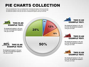
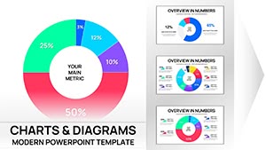
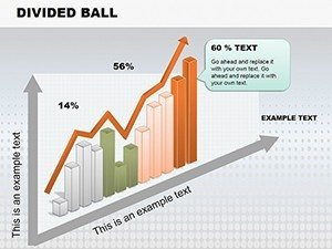
Compared to flat pie charts in PowerPoint, this offers depth that conveys volume accurately, reducing distortion common in 2D. It's a step up for those seeking to impress with sophistication.
Outperforming Default Tools
Standard PowerPoint 3D models require manual building, often yielding inconsistent results. Our template provides ready-made, professional-grade balls that save effort and ensure consistency.
Transform your data into spherical stories that captivate and convince - start today.
Frequently Asked Questions
- How many segments can I create in the ball charts?
- Up to 12 segments per chart, fully adjustable to your data requirements.
- Is animation included in the slides?
- Yes, pre-set rotations and explosions for dynamic presentations.
- What software is needed?
- PowerPoint or Google Slides; no additional tools required.
- Can I export to other formats?
- Yes, save as PDF or images for broader sharing.
- Are the charts data-linked?
- Placeholders support manual input; link to Excel for automation.