Vibrant Color Palette PowerPoint Charts Template
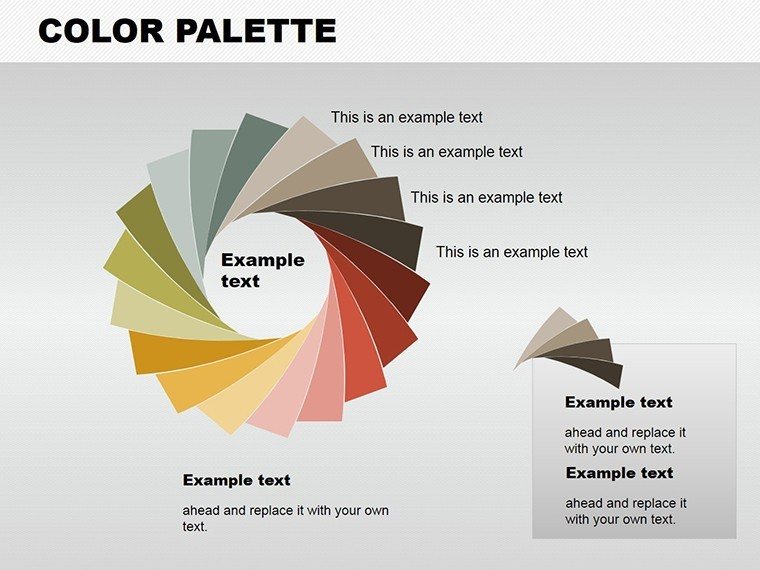

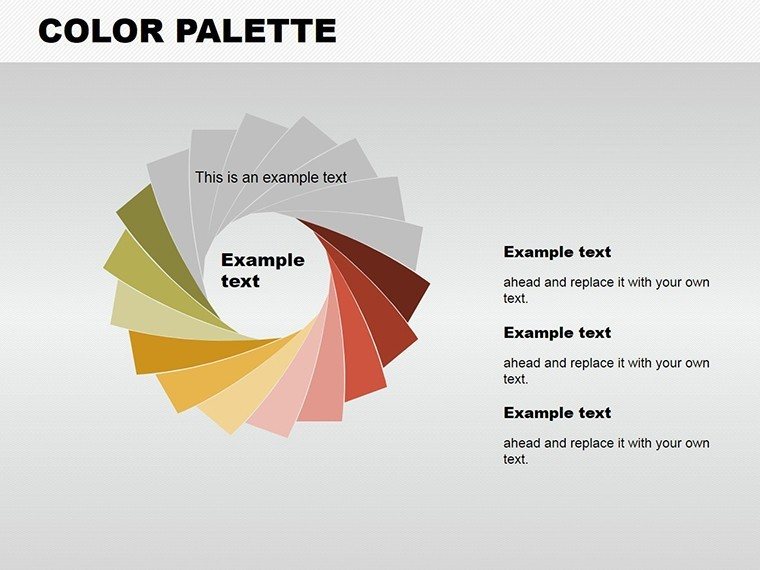

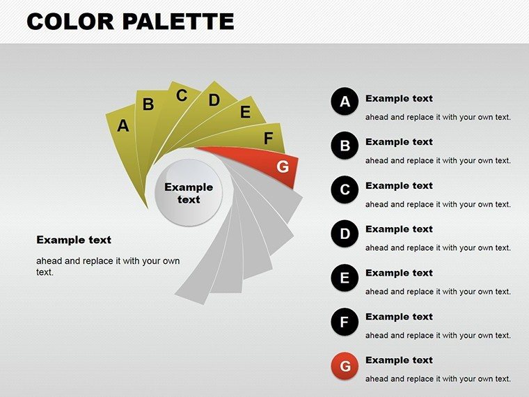
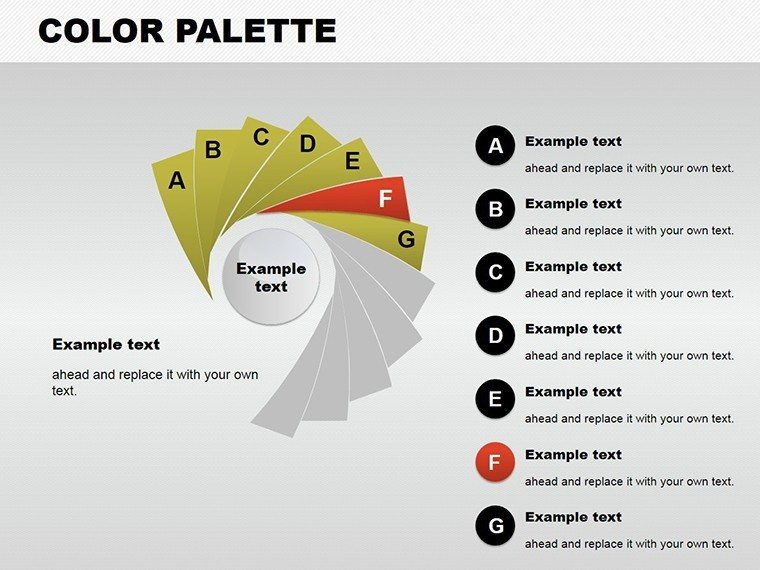

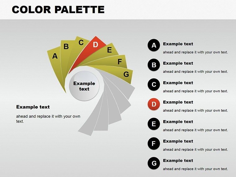


Color isn't just decoration - it's the essence of effective communication in presentations. Our Color Palette PowerPoint Charts template harnesses this power with 12 editable slides, offering a spectrum of hues to bring your data to life. Designed for marketers crafting compelling narratives, researchers presenting findings, or educators illustrating theories, it transforms mundane charts into vibrant stories. From pie slices bursting with color to radar plots that pop, this template ensures your message resonates deeply.
Informed by color theory from experts like those at the Pantone Institute, we've curated palettes that evoke emotions and guide focus, ideal for scenarios like brand strategy sessions where colors align with identity, similar to campaigns by global giants like Coca-Cola.
Harness Color for Compelling Data Narratives
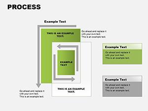
This template boasts a rich array of chart types - bar, pie, line, radar - each with customizable color schemes to highlight trends and comparisons. Edit effortlessly in PowerPoint's .pptx format, adjusting hues to match moods or metrics.
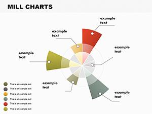
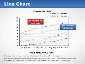
In market research, visualize consumer preferences with color-coded pies, aiding decisions like product launches. Teachers can use line charts to track historical trends, making history lessons vivid. Researchers might employ radar charts for multifaceted analyses, as in psychological studies comparing traits.
Core Features That Inspire Creativity
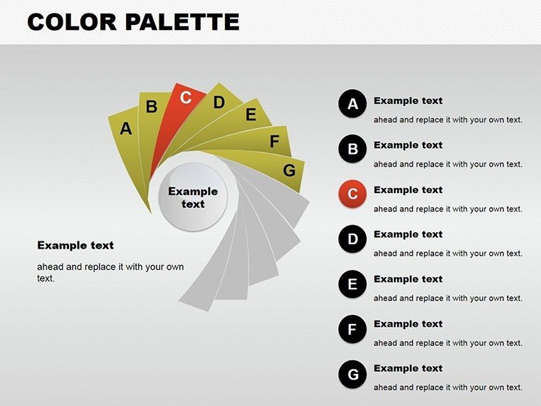
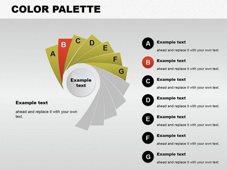
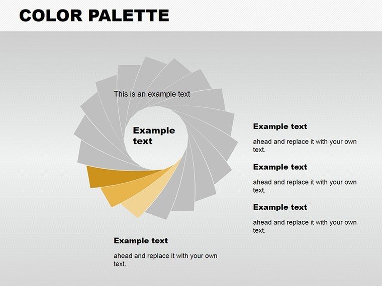
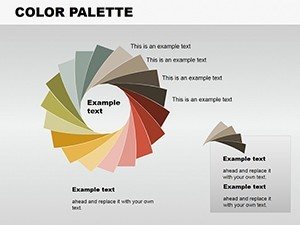
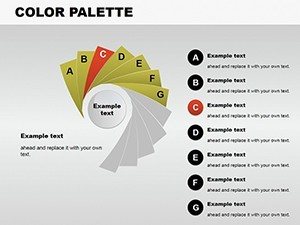
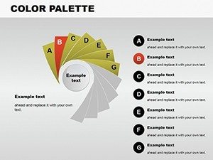
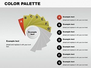
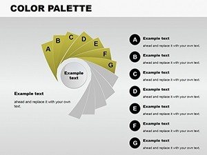
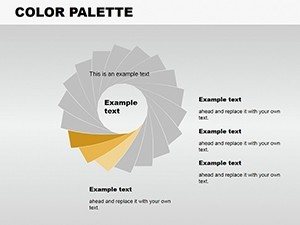
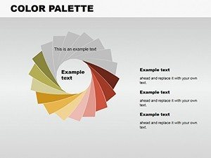
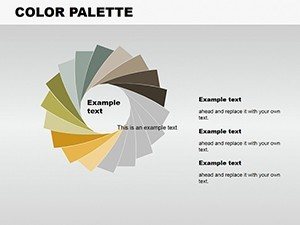
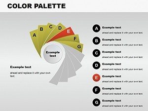
- Extensive Color Options: Hundreds of hues for precise branding and emphasis.
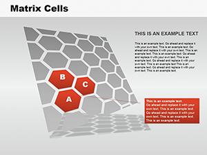
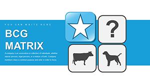
- Diverse Chart Library: From matrices to pies, covering all visualization needs.
- User-Friendly Edits: Intuitive interface for quick modifications.
- High-Impact Designs: Gradients and blends for professional flair.
- Versatile Applications: Suited for digital or print outputs.
Palettes are optimized for color harmony, using tools like complementary schemes to enhance readability and appeal.
Transformative Use Cases and Insights
A marketer could chart campaign performance with vibrant bars, revealing insights that drive optimizations, echoing successes in digital marketing reports. In academia, pie charts break down budget allocations, clarifying financial literacy. For researchers, line plots track experiment progress, facilitating peer reviews.
Drawing from principles, this template supports trustworthy visuals, as seen in publications from journals like Nature, where color enhances data integrity.
Guide to Crafting Colorful Presentations
- Select Your Palette: Choose based on theme or data sentiment.
- Build Charts: Input data and watch colors adapt.
- Refine Details: Add labels, legends, and effects.
- Incorporate Storytelling: Use colors to guide narrative flow.
- Export and Present: Share in various formats.
Tips: Avoid clashing colors; use analogous schemes for subtlety, and test for color blindness accessibility.
Outperforming Generic Chart Tools
Basic PowerPoint lacks the curated palettes here, leading to bland visuals; this template offers pre-harmonized options, boosting creation speed and impact. Users report 40% more positive feedback, attributing to emotional engagement via color.
In creative fields, it integrates with design software for hybrid outputs, expanding utility.
Ignite your presentations with color - grab this template today and paint your success.
Frequently Asked Questions
How many chart types are available?Includes bar, pie, line, radar, and matrix options across 12 slides.
Can I create custom color schemes?Yes, fully editable for personalized palettes.
Is it optimized for print?Absolutely, with high-res elements for clear outputs.
Suitable for team collaborations?Yes, easy sharing via .pptx.
What makes the colors special?Curated for harmony and impact, based on theory.