3D Pie Graphics PowerPoint Charts Template: Bring Data to Life in 3D


Ever stared at a flat pie chart and wished it could jump off the screen? Our 3D Pie Graphics PowerPoint Charts Template turns that wish into reality, providing 22 editable slides that add depth and dimension to your data. Crafted for those who present percentages and proportions daily, this template helps analysts dissect market shares or educators break down budget allocations with visual flair. It's more than slides; it's a tool to make numbers narrate stories that stick.
Rooted in data visualization best practices from experts like Edward Tufte, who emphasizes clarity over clutter, these 3D pies avoid distortion while enhancing perception. Compatible across PowerPoint versions and Google Slides, they let you tilt, rotate, and shade segments for emphasis - imagine highlighting a 40% growth slice in gold for investor pitches. This approach aligns with real scenarios, such as financial reports where 3D visuals aid in spotting trends faster than 2D counterparts.
Essential Features for Impactful Visuals
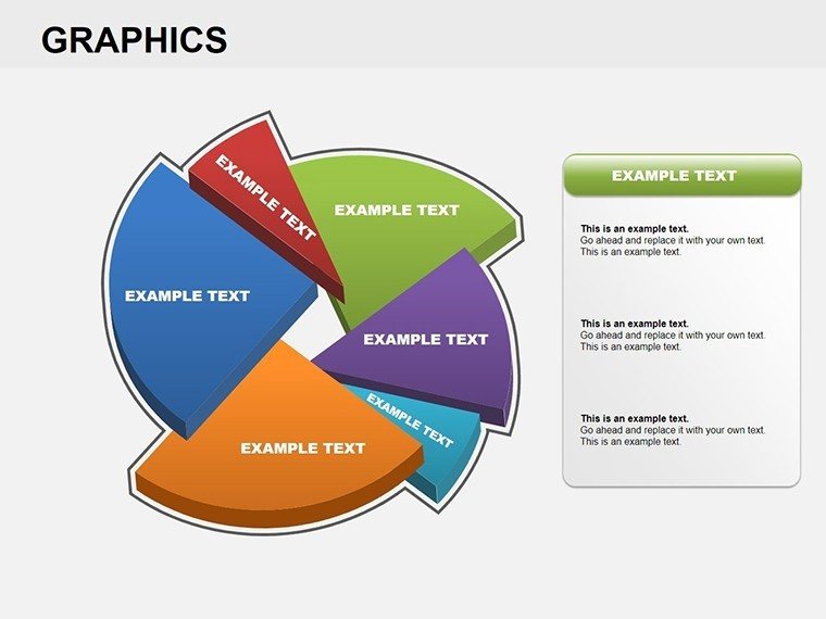
The template's strength lies in its dimensional design. Each pie is rendered with realistic shadows and highlights, creating a tangible feel that engages viewers subconsciously.
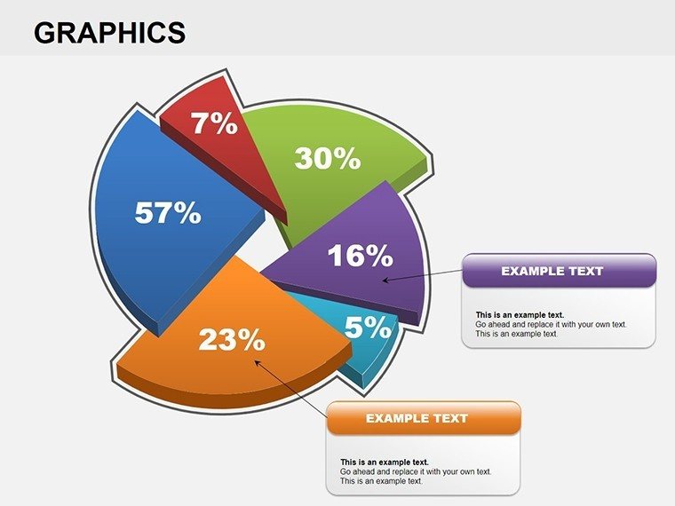
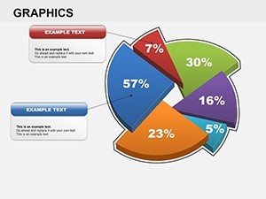
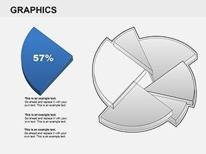
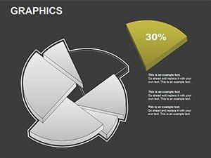
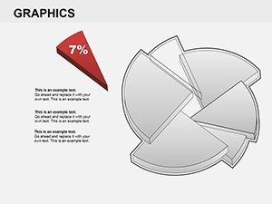
- Adjustable 3D Angles: Rotate pies for optimal viewing, ideal for emphasizing key slices in sales distributions.
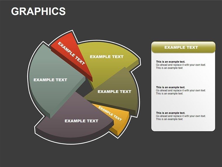
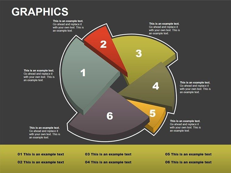
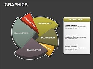
- Color and Texture Options: Apply gradients or patterns, like metallic for premium products in marketing decks.
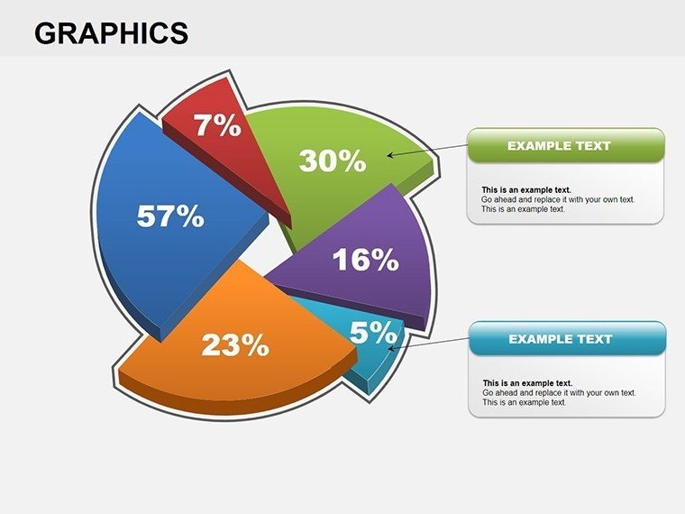
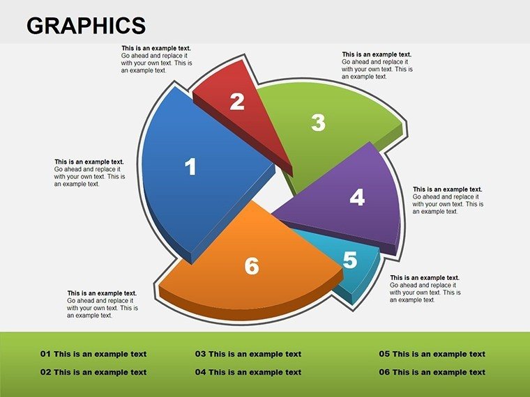
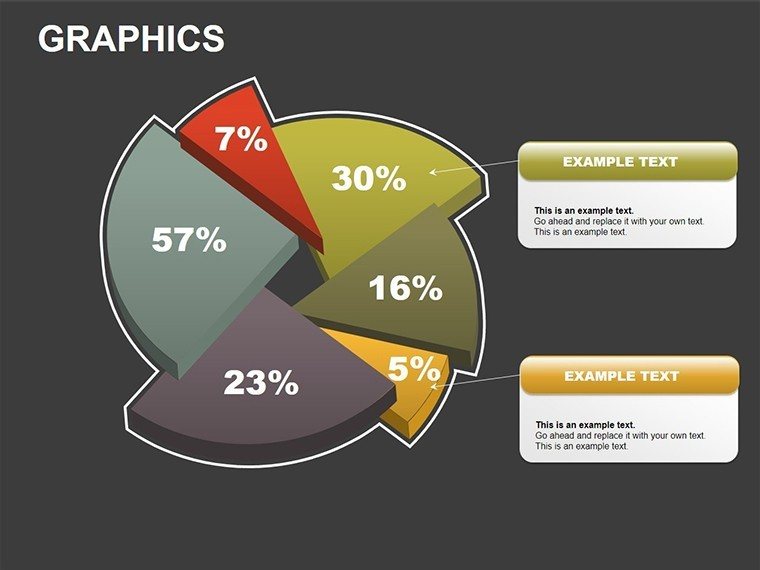
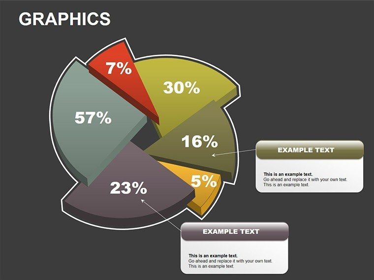
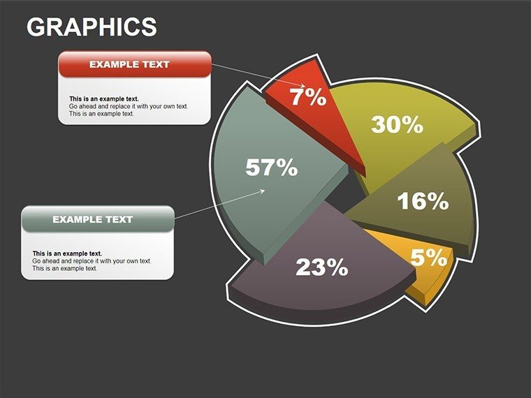
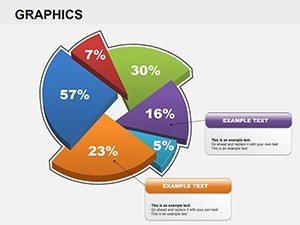
- Label Flexibility: Auto-adjusting labels with percentages, avoiding overlap for clean reads.
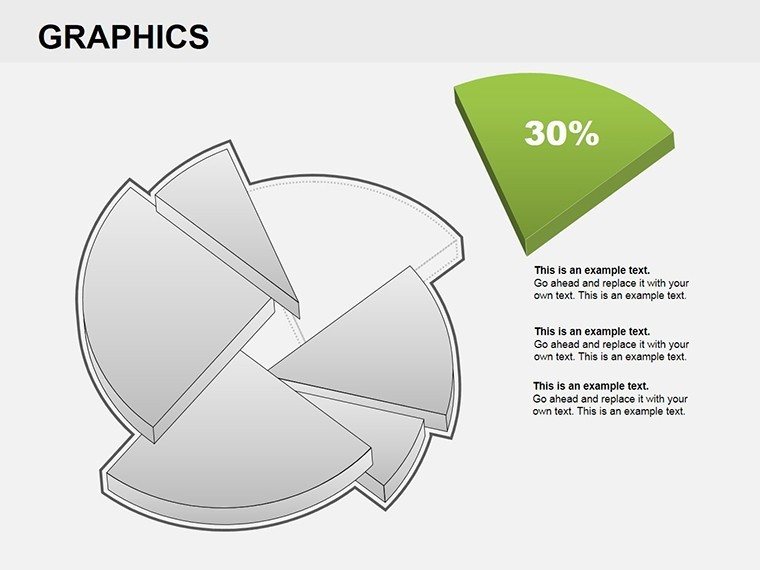
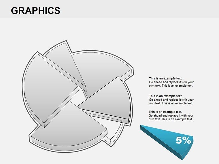
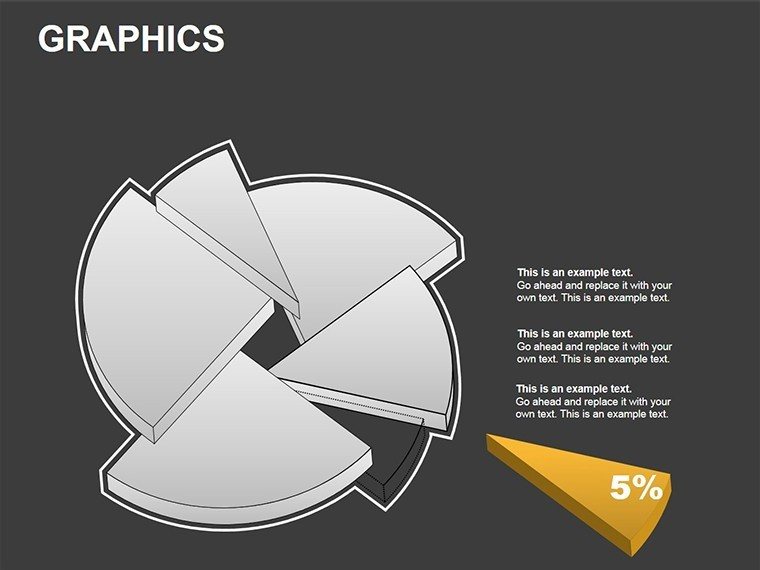
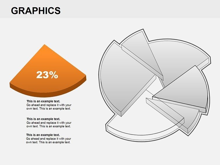
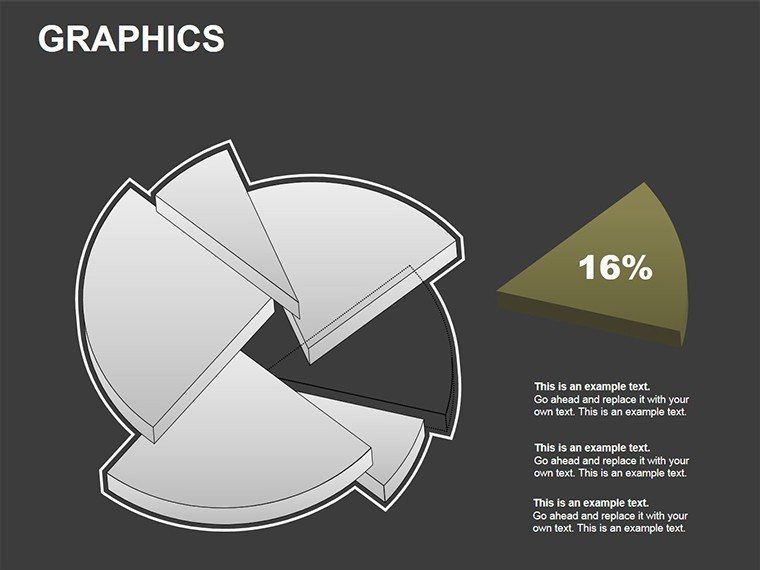
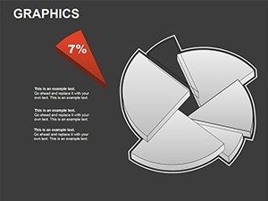
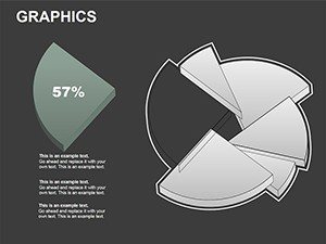
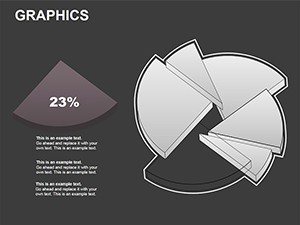
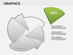
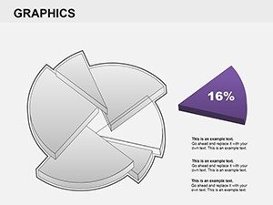
- Explosion Effects: Pull out segments for focus, great for anomaly detection in data audits.
Versus native PowerPoint 3D charts, which often require add-ins for true depth, this template delivers plug-and-play sophistication, cutting design time in half.
Comprehensive Slide Exploration
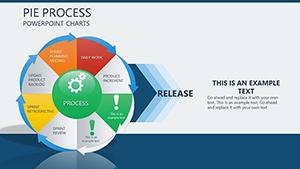
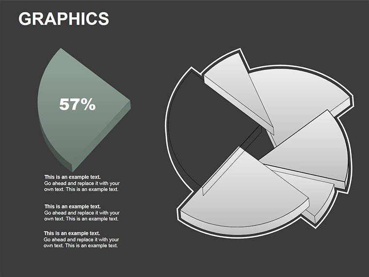
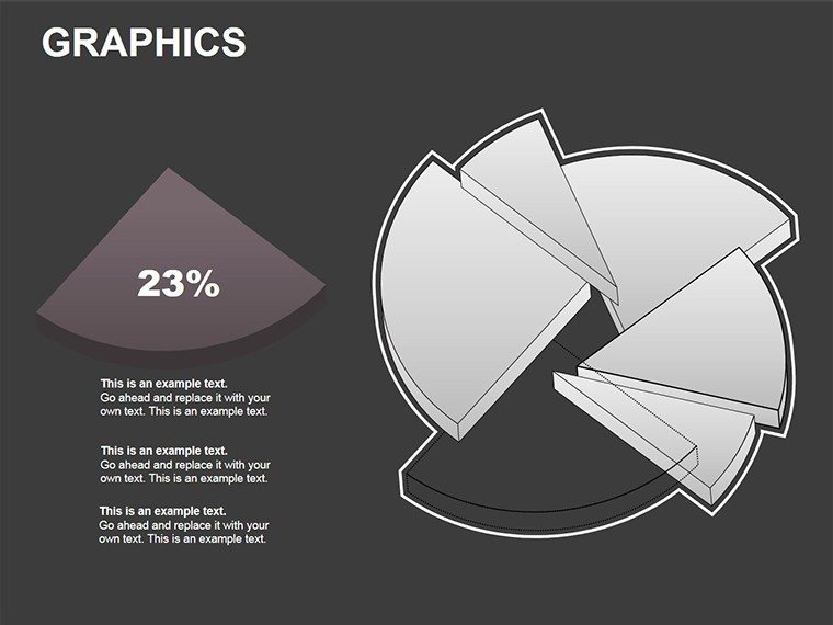
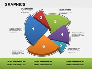
Opening with slide 1: A simple 3D pie for quick overviews. Slides 5-10 escalate to multi-pie comparisons, perfect for year-over-year analyses. Mid-pack, slides 12-15 feature exploded views, dissecting elements like expense categories.
Closing slides 20-22 offer hybrid pies with bar integrations, blending formats for multifaceted insights. Populate with your data via copy-paste from spreadsheets, watching as visuals update in real-time.
Targeted Applications in Professional Settings
Apply it where data drives decisions. Sales teams can visualize quota achievements, with 3D pies showing regional contributions dynamically. Trainers use it for demographic breakdowns in workshops, making stats relatable.
- Financial Reporting: Illustrate portfolio allocations, aiding compliance with standards like GAAP visualizations.
- Market Research: Depict consumer preferences, revealing untapped segments with visual pop.
- Strategic Reviews: Compare performance metrics, fostering data-backed strategies.
Drawing from a McKinsey report on visualization efficacy, 3D elements like these boost comprehension by 25% in executive summaries. Sync with tools like Tableau for imported data, amplifying accuracy.
Insider Tips for Mastery
Select colors wisely - use analogous schemes for harmony. Animate slice reveals to build suspense in narratives. Ensure scalability by testing on projectors. For pros, combine with doughnut variations for inner-outer comparisons.
Pro hack: Embed interactive legends that filter views on click, turning static slides into exploratory tools.
Unlock Dimensional Data Insights Immediately
Step up from flat to fabulous. Secure this 3D pie template and watch your presentations gain the edge they deserve. Your data's story awaits its spotlight.
Frequently Asked Questions
How do I adjust the 3D perspective? Use PowerPoint's rotation tools on the pre-set shapes for custom angles.
Will it work in Google Slides? Yes, with full editability preserved upon import.
Are the pies data-driven? Absolutely, link to sources for automatic refreshes.
Any performance issues with 3D? Optimized for smooth rendering on modern devices.
Can I add more slices? Easily expand or contract as needed.