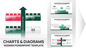
Editable Toys Blocks PowerPoint Charts - 14 Slides for Board Meetings Reports


Building block PowerPoint charts transform dense data into visual narratives that executives actually remember. When you're preparing quarterly reviews or project roadmaps, these 14 editable slides give you modular components that stakeholders can follow intuitively. I've used block-based layouts in board decks where traditional pie charts failed - directors engaged more when they could see priorities literally stacked by importance.
This template works when you need hierarchical clarity. Financial teams use it for budget allocations, showing departments as stackable blocks sized by spending. Product managers demonstrate feature rollouts as sequential builds. The metaphor is immediate: blocks represent building something, whether that's revenue growth, team structure, or process workflows.
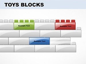
What's Inside These 14 Chart Slides
You get pyramid charts for priority frameworks, puzzle pieces for interdependent strategies, and cube arrangements for comparing options. Each slide is pre-designed but completely unlocked - change colors to match brand guidelines, resize blocks to emphasize key metrics, add your data labels directly. The .potx format means it integrates cleanly into existing PowerPoint decks without reformatting headaches.
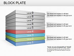
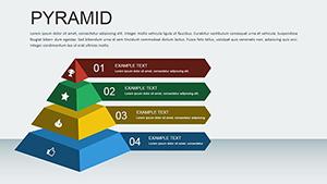
Practical scenario: A CFO presenting cost-saving initiatives used the pyramid layout with largest block at base showing operational efficiency (60% of savings), mid-tier blocks for vendor negotiations (30%), top block for technology upgrades (10%). The visual weight matched the financial impact - no spreadsheet required during the presentation.
Professional Use Cases Across Industries
Marketing directors build campaign timelines where each block represents a launch phase. HR teams visualize organizational restructuring with blocks showing new reporting lines. Engineering groups map project dependencies using puzzle-piece connections. The template adapts because blocks are universal metaphors - everyone understands foundation, layers, and assembly.
When NOT to use this: real-time data dashboards requiring live updates, dense statistical comparisons needing precise axis labels, or scenarios where minimalist text-only slides better serve the message. These blocks excel at conceptual frameworks, not granular analytics.
Editing Workflow: PowerPoint to Google Slides
Download the .potx file and open in PowerPoint. Click any block shape - it's a native PowerPoint object, not an image. Use Format menu to change fill colors, outline weights, and shadow effects. Copy your edited slides, upload to Google Drive, and open in Google Slides for cloud collaboration. Formatting survives the conversion because the template uses standard shapes.
Team workflow example: Project manager customizes blocks in PowerPoint with team names and deliverables, shares via Google Slides for remote feedback, presents from Keynote on Mac during client meeting. Cross-platform compatibility means your prep work travels with you.
Real-World Presentation Scenarios
Board meeting: Use the stacked blocks chart to show strategic pillars supporting annual goals. Each block labeled with initiative, colored by department ownership, sized by budget allocation. Directors see enterprise strategy as intentional architecture, not scattered projects.
Investor update: Demonstrate product roadmap with sequential block builds across quarters. Q1 foundation features, Q2 adds integration blocks, Q3 completes with analytics layer. Investors visualize incremental value delivery, not just Gantt chart dates.
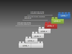
Team workshop: Facilitate priority-setting using the pyramid - team members vote on which initiatives deserve base-layer positioning vs. nice-to-have top-tier. The template becomes an interactive decision framework.
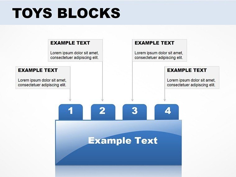
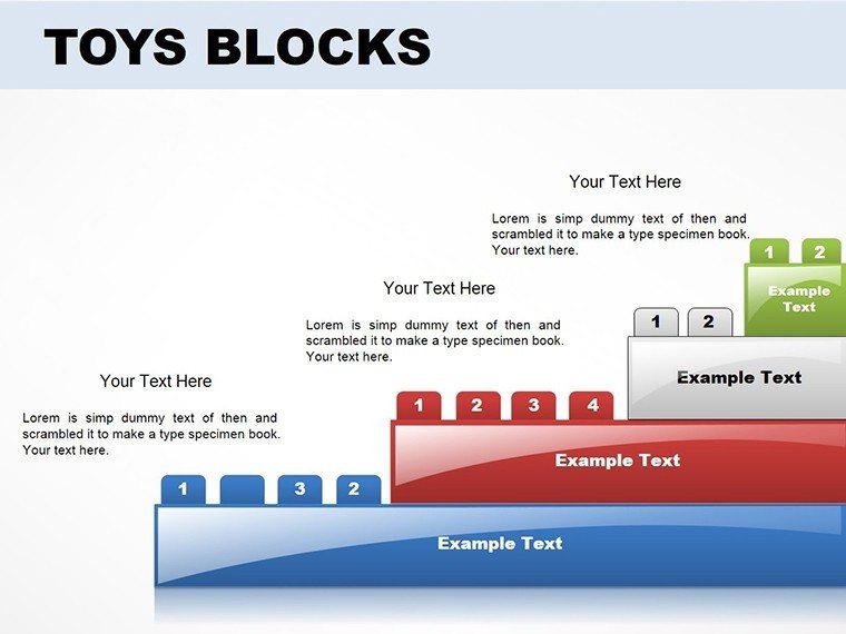
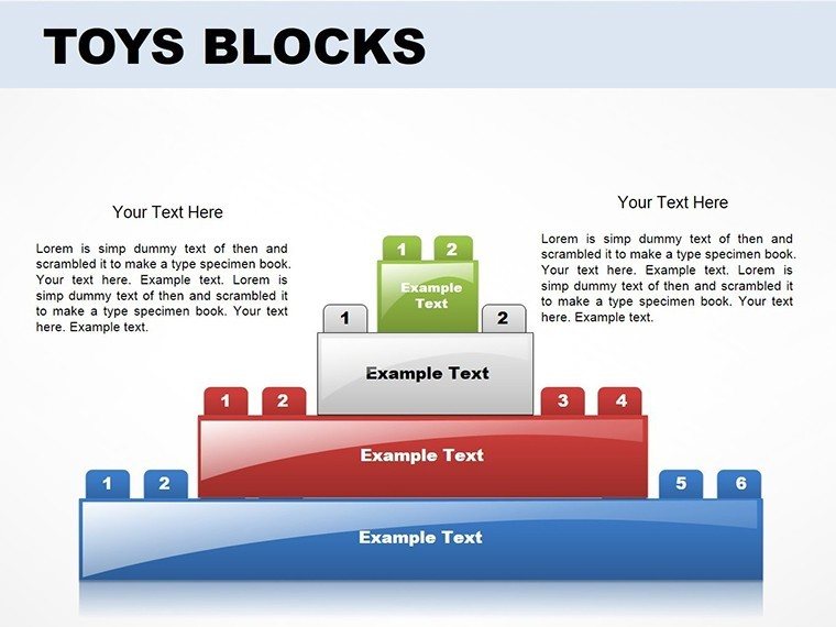
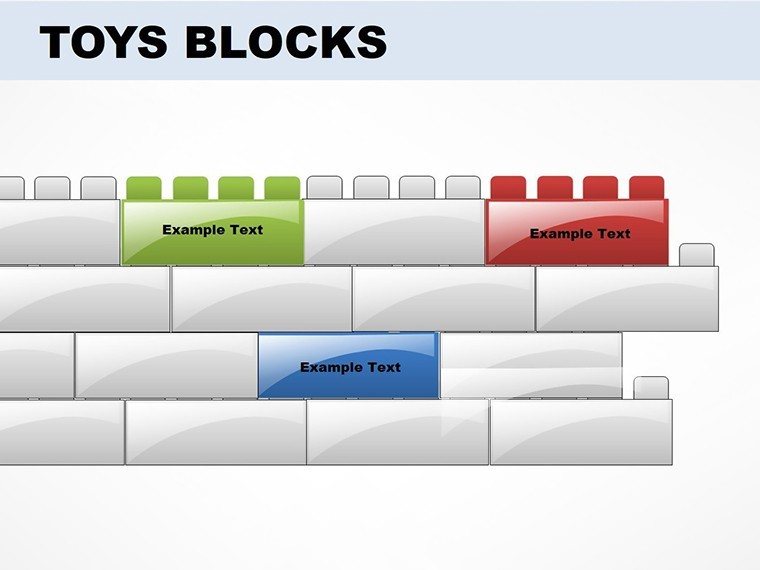
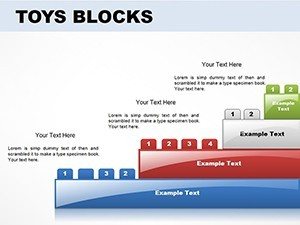
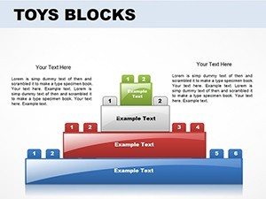
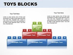
Slide Types and Best Applications
| Slide Type | Best For | Typical Audience |
|---|---|---|
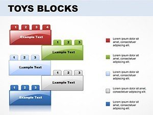
| Pyramid Chart | Priority ranking, hierarchical needs | Executives, strategic planning sessions |
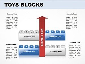
| Puzzle Blocks | Interdependent processes, team collaboration | Cross-functional teams, operations |
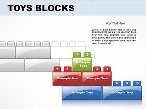
| Stacked Cubes | Component breakdowns, budget allocation | Finance, resource planning |
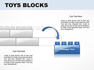
| Sequence Blocks | Timelines, phase rollouts | Project stakeholders, clients |
Industry Applications
Consulting firms use these for client capability assessments - maturity models shown as ascending block levels. Construction companies map project phases with foundation-to-completion block sequences. Education administrators show curriculum development as building blocks of competency. Nonprofits visualize program impact with blocks sized by community reach.
The blocks metaphor crosses industries because it's fundamentally about construction and progression. If your message involves building, growing, assembling, or prioritizing, these charts reinforce that narrative visually.
Ready to present with clarity? Download these editable building block charts and turn your next deck into a visual story that stakeholders remember.
Frequently Asked Questions
When should I use block charts instead of traditional bar or pie charts?
Use block charts when presenting conceptual frameworks, strategic priorities, or process flows where the "building" metaphor reinforces your message. Traditional charts work better for precise data comparisons, trend analysis, or when stakeholders expect standard business chart formats. If your board typically sees quarterly financials in bar charts, stick with that for continuity - use blocks when introducing new strategic initiatives that benefit from visual metaphor.
Can I add my company logo and brand colors to these blocks?
Yes, every block is a fully editable PowerPoint shape. Right-click any block, select Format Shape, and change fill colors to your brand palette. Insert your logo using Insert > Pictures and position it on slide masters for consistency across all 14 slides. The .potx format preserves all customizations when you reuse the template for future presentations.
Will executives take block-based charts seriously in board meetings?
Block charts work when they serve a clear purpose. I've presented to boards where pyramid layouts effectively communicated strategic priorities - executives appreciated the immediate visual hierarchy. The key is professional execution: use your company's color scheme, keep labeling crisp, and choose blocks only when the building/layering metaphor adds clarity. Avoid them in financial deep-dives where traditional charts set expectations, but leverage them for strategic frameworks where conceptual thinking matters more than decimal-point precision.
How do I import these slides into an existing PowerPoint presentation?
Open your existing presentation in PowerPoint. Click File > Open and select the downloaded .potx template file. It opens as a separate window. Select the slides you want (hold Ctrl to select multiple), right-click, choose Copy, then switch to your main presentation and Paste. PowerPoint imports the slides with all formatting intact. You may need to adjust theme colors if your main deck uses different color schemes - use Format > Replace Fonts for quick global updates.
Do these templates work on Mac Keynote and Google Slides?
The .potx file is PowerPoint native, but transfers to both platforms. For Keynote: Open the .potx file in PowerPoint for Mac first, do your initial customizations, then File > Export as Keynote. Most formatting survives, though complex shadows may simplify. For Google Slides: Upload the .potx file to Google Drive, right-click > Open with Google Slides. Shapes convert cleanly, but verify fonts match your Google Fonts library and double-check alignment on master slides before presenting.