Porter's Diamond PowerPoint Template - Fully Editable & Instant Download
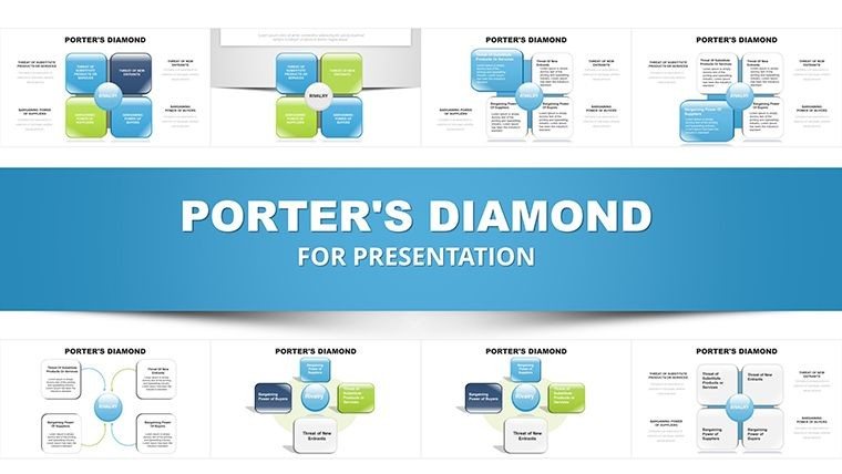


Analyze Competitive Advantage with Porter's Diamond Model
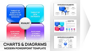
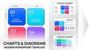
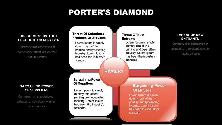
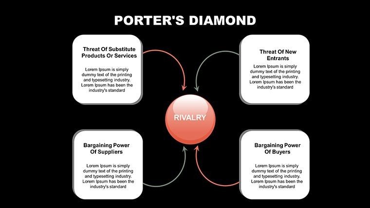
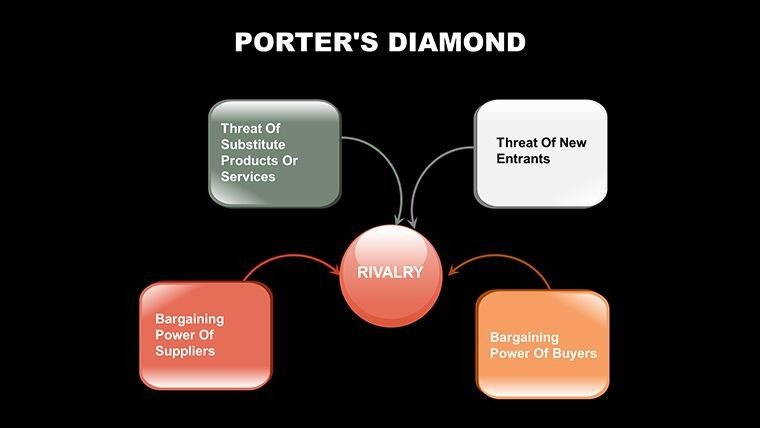
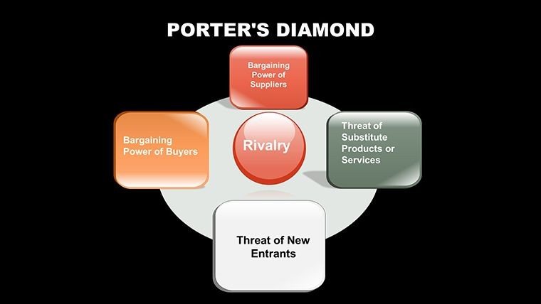
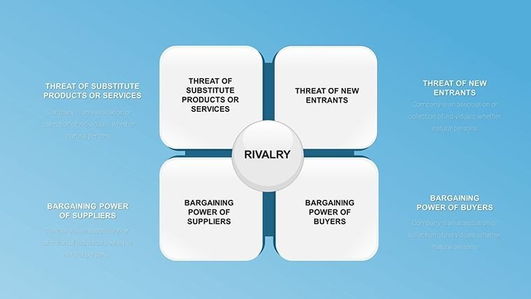
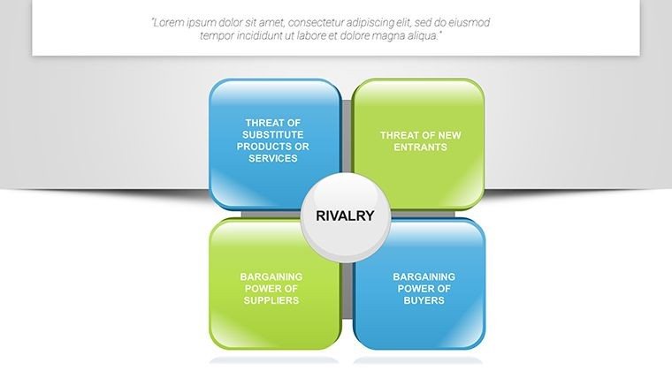
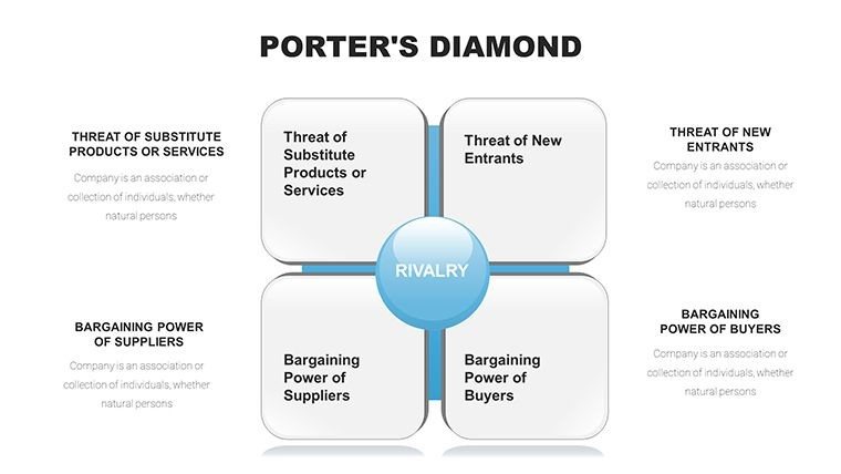
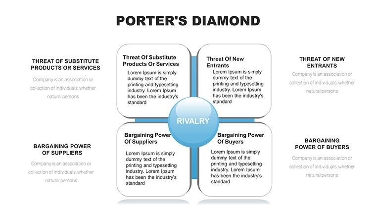
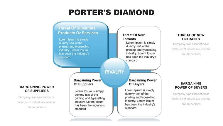
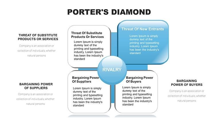
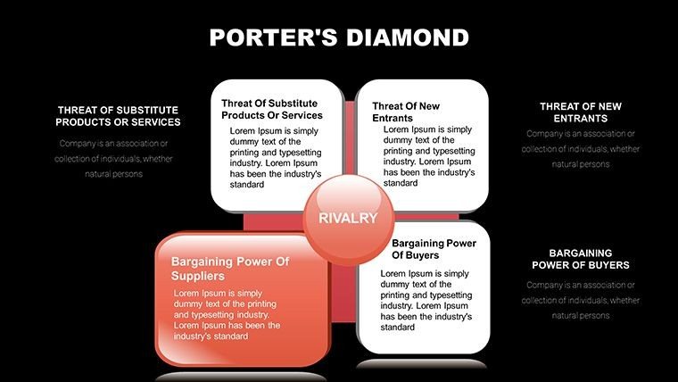
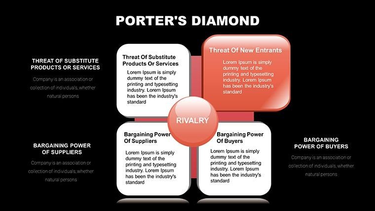
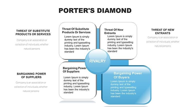
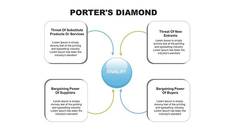
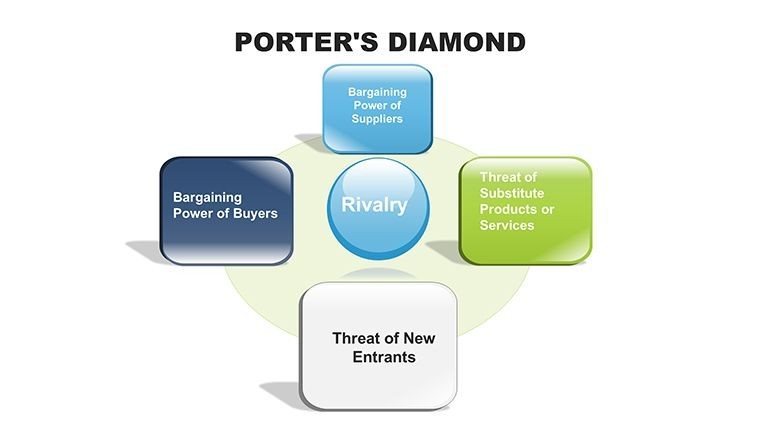
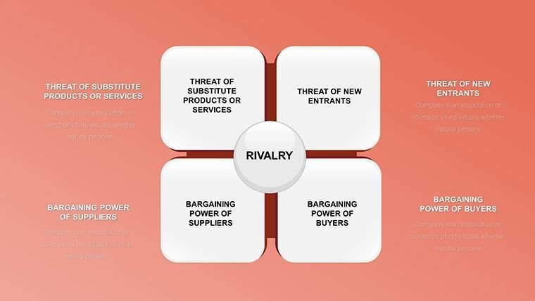
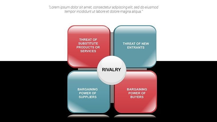
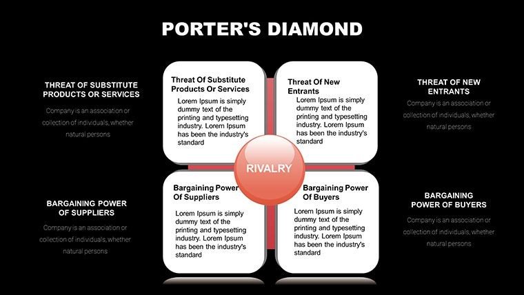
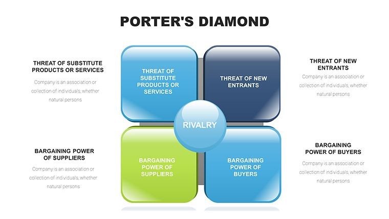
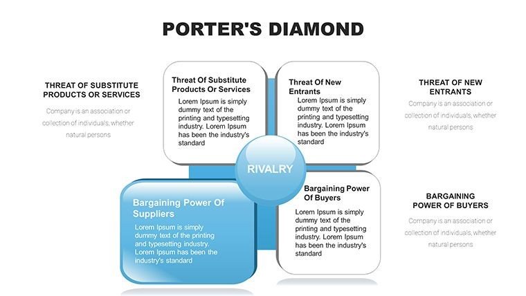
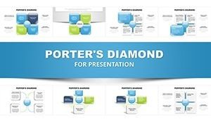
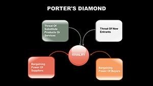
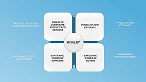
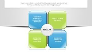
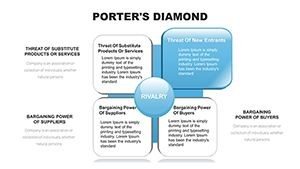
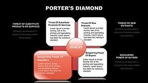
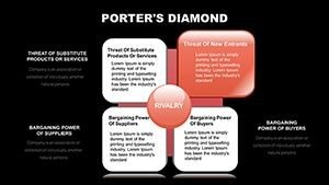
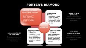
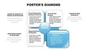
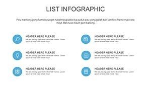
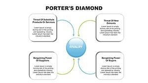
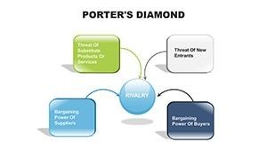
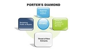
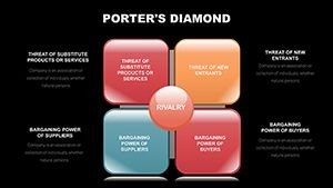
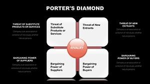
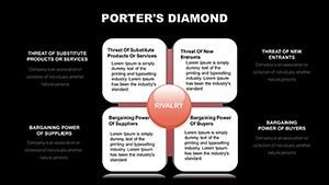
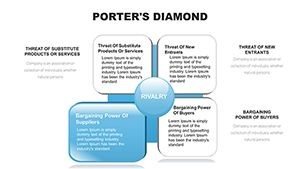
Understanding national or industry competitiveness requires a structured framework that highlights key influencing factors. This Porter's Diamond PowerPoint template delivers 27 detailed slides featuring clear diamond diagrams that cover factor conditions, demand conditions, related industries, and firm strategy, structure, and rivalry. Strategy professionals use these visuals to present thorough analyses that inform decision-making.
The template helps translate Michael Porter's theory into actionable insights, making complex evaluations accessible during executive discussions or academic presentations.
Key Features
- 27 unique slides with multiple variations of the diamond model
- Fully editable diagrams, text, and supporting graphics
- Professional layout optimized for strategic analysis
- Compatible with PowerPoint and Google Slides
How to Use This Template
Open the downloaded file and customize each diamond factor with your research data. Modify colors to emphasize specific elements or add supporting charts. The organized structure supports step-by-step explanations of your competitive analysis.
Professional Applications
Consultants present country or industry competitiveness assessments to clients. Executives evaluate strategic positioning in board meetings. MBA students illustrate Porter's model in case studies, while policy analysts use it for economic development reports.
Download now to strengthen your strategy presentations.
Frequently Asked Questions
What software is required to edit?
The template works with Microsoft PowerPoint and Google Slides.
How many slides are included?
The template includes 27 fully editable slides focused on Porter's Diamond model.
Are the diamond diagrams customizable?
Yes, all components—including labels, colors, and layout—are fully editable.
Is commercial use allowed?
Yes, the template can be used for business, consulting, education, and commercial projects.
Is the download instant?
Yes, immediate access is provided after purchase.