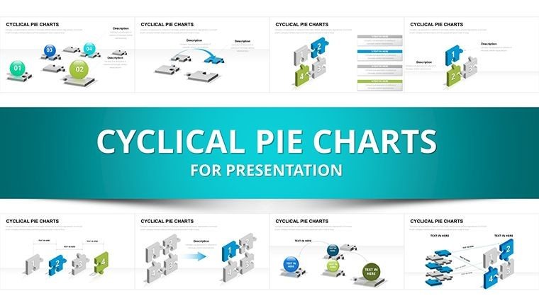
3D Cyclical Puzzle Charts PowerPoint Template


In high-stakes board reviews or investor updates, explaining recurring processes like feedback cycles or continuous improvement loops often falls flat with basic arrows or flat diagrams. This cyclical puzzle charts PowerPoint template changes that by using interlocking 3D puzzle pieces and spheres to visually represent how phases connect, repeat, and build on each other.
I've built dozens of decks for enterprise leadership teams where these exact layouts helped executives instantly grasp iterative strategies, from risk mitigation cycles to sustainability loops. The 31 slides provide ready-to-use variations that turn abstract repetition into tangible, memorable flows.
Professionals rely on this template because it adds depth and professionalism without requiring advanced design skills, ensuring your message about ongoing dynamics lands clearly every time.
Exploring the Core Layouts in This Cyclical Puzzle Collection
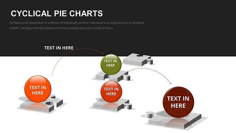
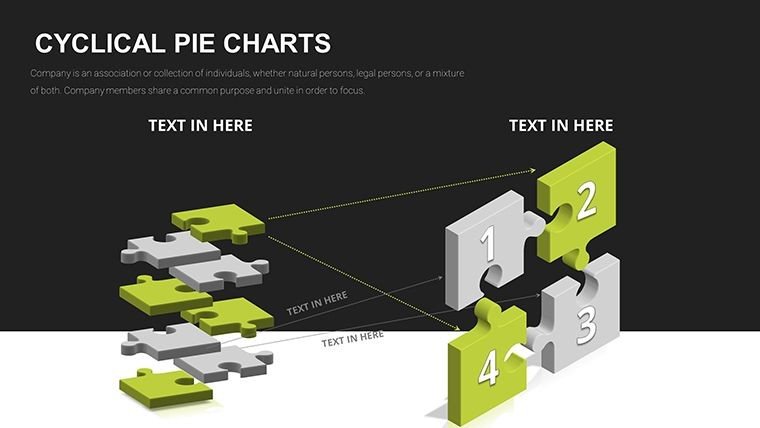
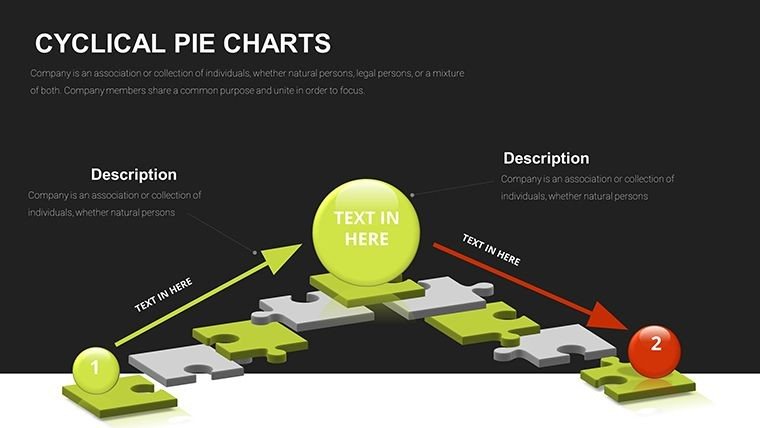
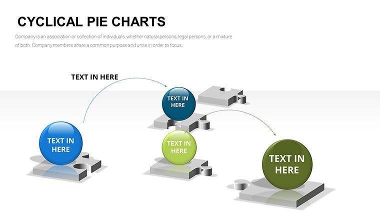
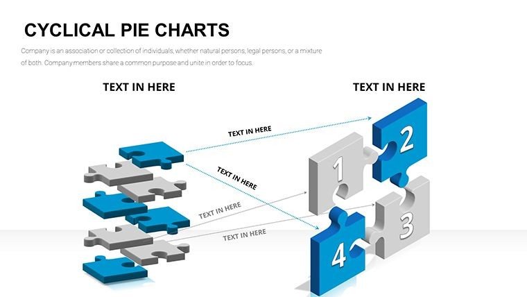
Each slide centers on puzzle elements that emphasize interconnection and recurrence, with options ranging from simple rings to multi-layered 3D assemblies.
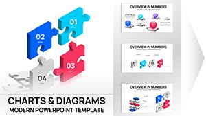
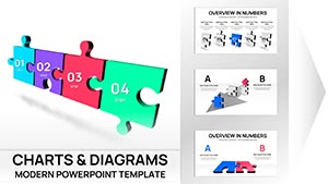
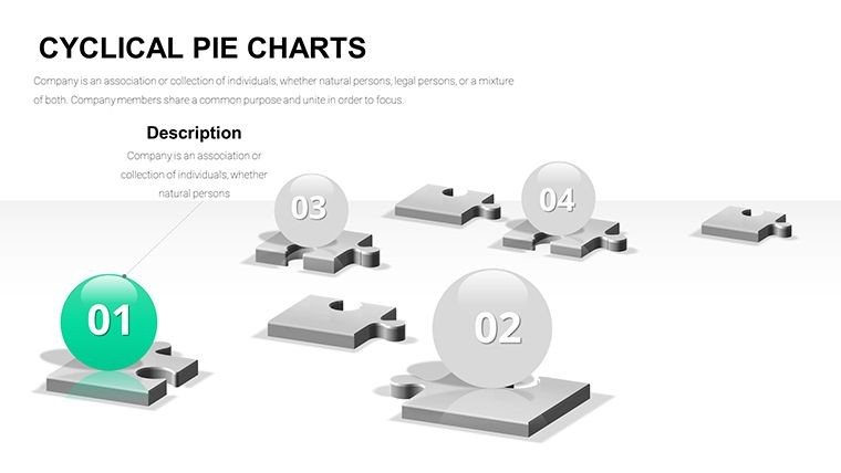
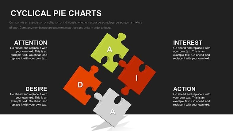
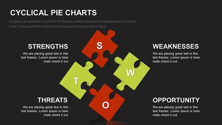
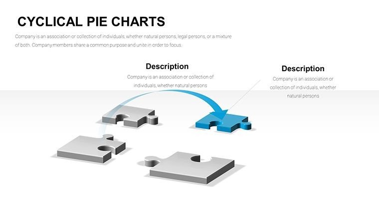
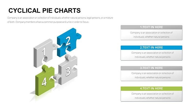
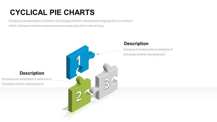
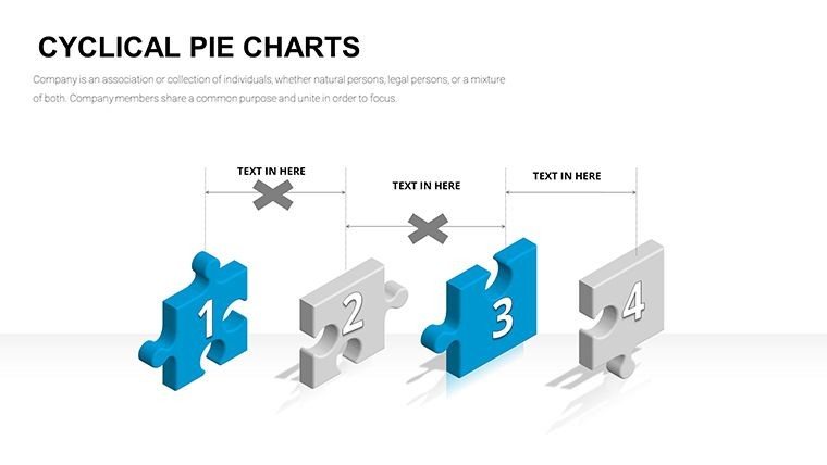
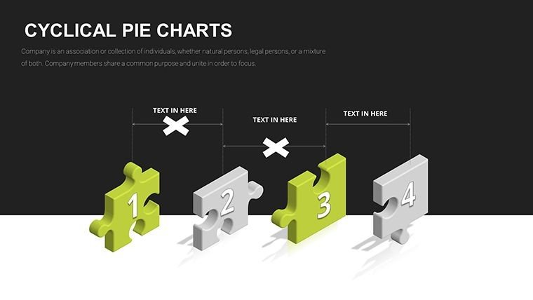
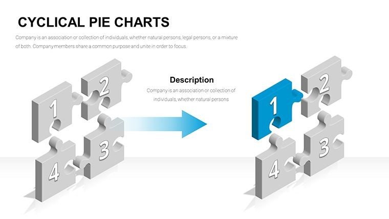
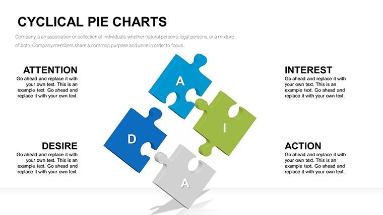
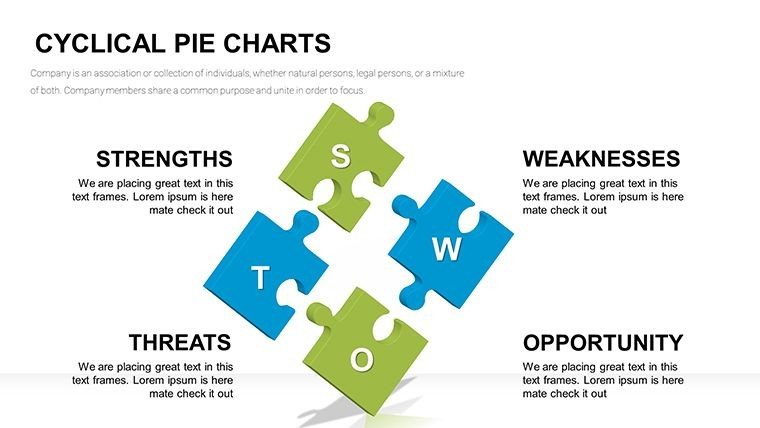
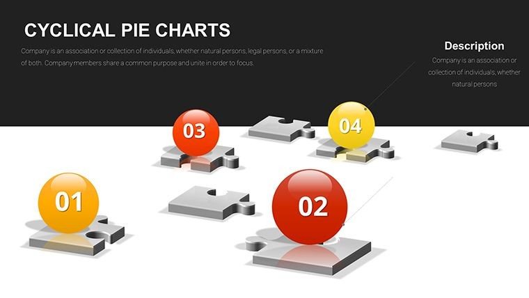
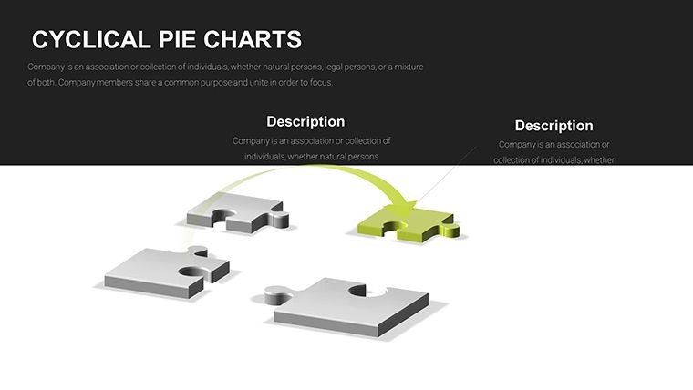
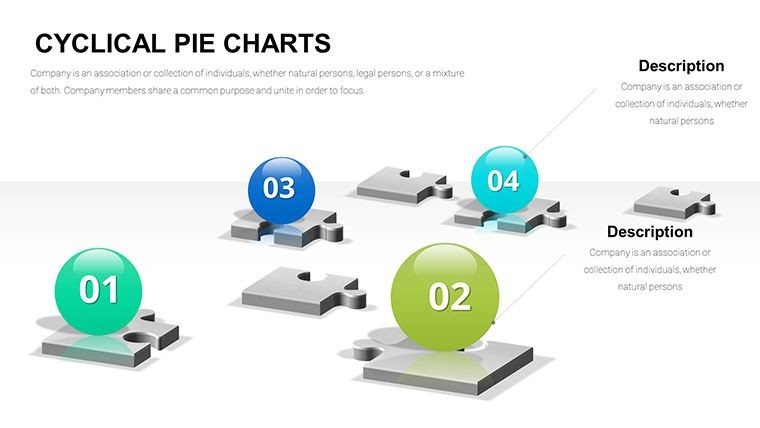
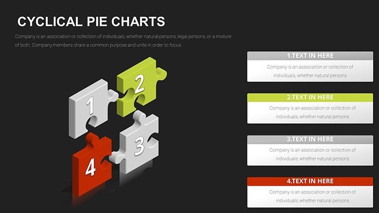
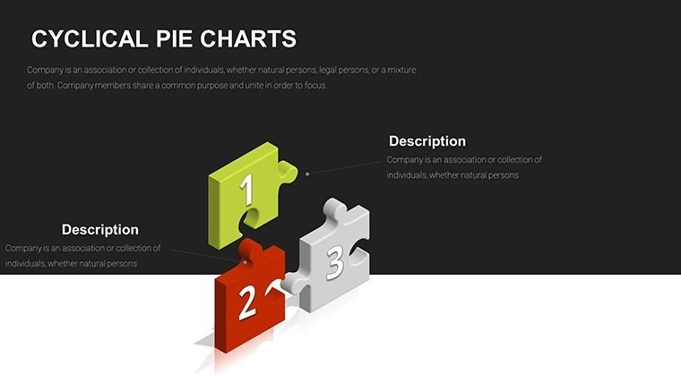
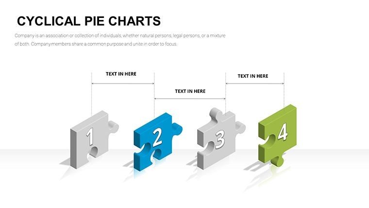
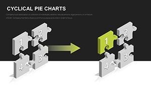
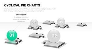
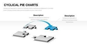
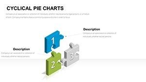
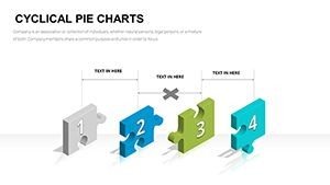
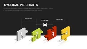
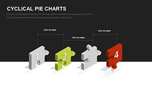
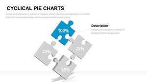
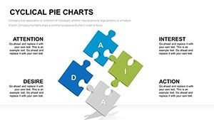
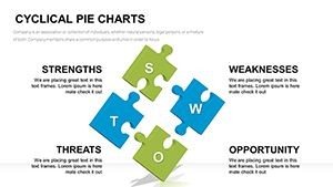
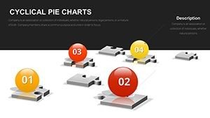
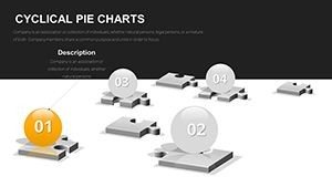
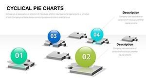
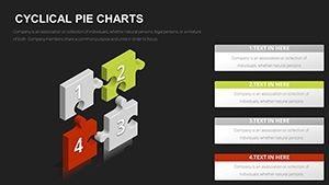
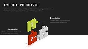
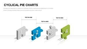
- Basic cyclical rings: Four to eight interlocking puzzle segments arranged in a circle, ideal for placing phase titles and brief descriptions in each piece while arrows highlight the looping direction.
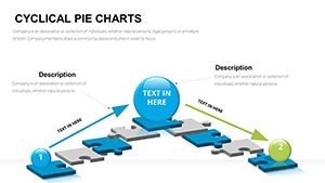
- 3D sphere integrations: Central spheres surrounded by orbiting puzzle bands, perfect for showing core objectives influenced by repeating external factors.
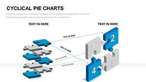
- Layered puzzle builds: Stacked or nested cycles demonstrating inner and outer loops, such as short-term tactics within long-term strategic repetitions.
- Feedback emphasis variants: Designs with return arrows cutting across puzzle connections to illustrate adjustment points in ongoing processes.
All elements are vector-based, allowing seamless resizing, color shifts to match your branding, and text updates that maintain alignment automatically.
Bringing Iterative Concepts to Life in Professional Settings
When presenting quarterly risk assessments to a Fortune 500 board, these cyclical puzzle charts clearly mapped how mitigation steps fed back into monitoring phases, keeping directors engaged throughout the discussion.
In consulting deliveries for manufacturing clients, the layouts illustrated lean improvement cycles, showing how each iteration refined operations and reduced waste over time.
Government agencies use similar designs in policy reviews to depict regulatory feedback loops, ensuring stakeholders see how inputs continually shape outcomes.
Educators in professional training workshops deploy the templates to explain adaptive learning models, where student performance cycles back to adjust teaching approaches.
Seamless Integration into Your Existing Presentation Workflow
Drop these slides directly into ongoing decks without disrupting flow - they adapt to your master slide themes instantly.
Editing takes minutes: select a puzzle segment, update labels, adjust colors via the theme palette, and add pre-built animations for phased reveals that emphasize the cyclical motion.
Fully compatible with PowerPoint 2016 and later, Keynote via import, and Google Slides for cloud collaboration. The one-time purchase grants lifetime access and unlimited use across projects.
This approach saves hours compared to manually constructing interconnected elements, letting you focus on refining the narrative rather than fighting formatting.
Real-World Applications from Client Decks I've Delivered
A tech startup founder used the multi-layered sphere layout in their Series B pitch to demonstrate product development iterations, helping secure funding by clearly showing continuous refinement based on user feedback.
During enterprise sales training sessions, managers mapped customer journey feedback loops, enabling teams to visualize how post-sale insights repeatedly improved acquisition strategies.
In academic conference talks, researchers presented ecological system cycles, with puzzle interconnections highlighting how environmental factors perpetually influenced outcomes.
Analysts in financial services quarterly reports employed the designs to outline market volatility response cycles, providing leadership with clear views of ongoing adjustment mechanisms.
Advantages Over Common Alternatives
| Aspect | This Cyclical Puzzle Template | Default PowerPoint Tools | Building from Scratch | Generic Online Options |
|---|---|---|---|---|
| Visual Depth for Cycles | 3D interlocking puzzles and spheres naturally convey repetition and connection | Flat arrows or basic SmartArt lacking dimension | Hours aligning custom shapes manually | Often linear or unrelated designs |
| 31 specialized cyclical variations | Limited built-in cycle options | Repetitive manual duplication | Fewer focused layouts | |
| Drag-and-drop edits with preserved alignments | Basic but frequent reformatting needed | Extensive time investment | Variable quality and compatibility | |
| Elevates perceived expertise in iterative topics | Functional but uninspiring | Inconsistent results | Often generic appearance |
Cyclical Visualizations Across Key Sectors
In finance, these charts map economic indicator response cycles during portfolio reviews.
Technology teams illustrate agile sprint feedback loops in roadmap presentations.
Healthcare professionals depict patient care continuity models in quality improvement sessions.
Educational institutions show curriculum development iterations for accreditation reports.
Marketing departments outline campaign optimization cycles based on performance data.
Consultants deliver strategy refinement loops in long-term client engagements.
Ready to transform how you present recurring processes? Download the cyclical puzzle charts PowerPoint template today and deliver clearer, more impactful iterations in your next deck.
Frequently Asked Questions
How do I customize the puzzle piece colors to match my company branding?
Select any puzzle segment or sphere, then use PowerPoint's shape fill options to apply your exact brand hex codes. All connected elements update consistently, and theme colors can be set globally for instant alignment across the 31 slides.
Can these cyclical puzzle charts include animations for phased reveals?
Yes, pre-built entrance and motion path animations are included on most layouts. Customize them further in the animation pane to rotate pieces or highlight loops sequentially during your presentation.
Are the layouts suitable for showing nested or parallel cycles?
Multiple slides feature nested spheres and parallel rings specifically for inner/outer or simultaneous cycles. Duplicate and modify segments easily to fit complex iterative structures.
Will this template work smoothly in Google Slides?
Upload the .pptx file directly to Google Slides - all vector elements and layouts import cleanly, with full editing capabilities for text, colors, and positioning.
How many phases can one cyclical puzzle chart effectively display?
Layouts support four to twelve segments clearly. For more phases, use multi-slide progressions or layered designs to maintain readability on screen or in print.
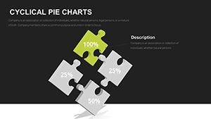
Is it possible to add icons or data values inside the puzzle pieces?
Absolutely - each segment contains placeholder text boxes and icon areas. Insert your own icons or numerical data, which scales automatically with the puzzle elements.