Conceptual Plan PowerPoint Charts - 29 Strategic Framework Slides for Executive Presentations | Fully Editable


Conceptual plan PowerPoint charts solve the fundamental challenge of transforming abstract strategic concepts into visual frameworks that executives, boards, and review committees can evaluate before detailed implementation begins. When presenting architectural masterplan concepts, strategic business frameworks, innovation roadmaps, or program planning visions to stakeholders who need to approve direction without getting lost in premature details, this 29-slide template provides comprehensive pyramid, puzzle, and radial chart structures. Designed for architects, strategic consultants, urban planners, and innovation teams, these charts excel at communicating hierarchical dependencies, strategic integration points, and multi-stakeholder requirements during the conceptual phase where visual clarity drives decision-making.
Strategic Presentation Scenarios: When Conceptual Frameworks Drive Approvals
Use conceptual plan charts when the presentation goal is securing approval for strategic direction before investing in detailed execution plans. Architects deploy these in early design review presentations where conceptual approaches need validation from planning commissions, community boards, or client steering committees before technical drawings commence. A residential developer used the three-tier pyramid to present a neighborhood revitalization concept to city council - the visual structure helped elected officials understand how site analysis and community input (foundation tier) informed walkability and green space design principles (middle tier) that would deliver affordable housing and economic development outcomes (top tier).
Strategic consultants rely on these charts when presenting framework recommendations to C-suite executives who need to grasp strategic architecture without premature operational details. During a financial services transformation engagement, we used the eight-piece puzzle configuration to show the executive committee how branch modernization, digital banking, process automation, talent development, risk management, customer experience, regulatory compliance, and technology infrastructure formed an integrated transformation strategy. The interlocking visual immediately stopped siloed budget discussions - executives recognized that funding only technology without corresponding talent development would fail to deliver transformation outcomes.
Comprehensive Chart Variety: 29 Slides Covering Multiple Strategic Structures
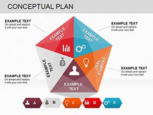
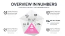
This expanded template includes three primary chart architectures across 29 professional slides. Hierarchical pyramid layouts (12 slides) organize concepts into foundational, strategic, and aspirational tiers - ideal for capability maturity models, phased development strategies, or any framework where upper-tier objectives depend on foundational elements. Interlocking puzzle configurations (10 slides) demonstrate strategic integration across distinct but interdependent components - perfect for ecosystem strategies, program planning with multiple stakeholder requirements, or transformation initiatives requiring coordinated execution across functions.
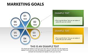
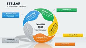
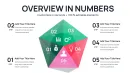
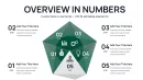
Radial concept wheels (7 slides) position a central strategic thesis at the core with 6-10 concept drivers radiating outward - site context, program requirements, sustainability objectives, budget parameters, regulatory constraints, stakeholder priorities. Each spoke extends to secondary detail callouts, creating visual hierarchy that mirrors how strategic concepts actually develop from core principles. During a mixed-use development presentation to a planning commission, the radial structure showed how zoning requirements, transit access, environmental considerations, and community input all influenced the central design concept without forcing artificial hierarchy among equal considerations.
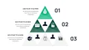
Pyramid Structures: Communicating Hierarchical Strategic Dependencies
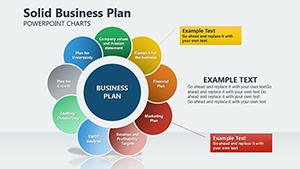
The pyramid charts communicate foundational dependencies critical for strategic approval. Foundational elements - market research, regulatory frameworks, site analysis, stakeholder requirements - form the base, visually supporting strategic initiatives in the middle tier - design principles, partnership structures, phasing strategies, resource allocation plans. Aspirational outcomes - financial returns, sustainability certifications, community impact, competitive advantage - cap the pyramid. This visual hierarchy prevents common stakeholder misconceptions that aspirational outcomes can be achieved without investing in foundational work.
A university presenting an interdisciplinary research center concept to the provost council used the five-tier pyramid to demonstrate why preliminary faculty hiring and equipment investments (foundation) were prerequisites for grant applications (middle tier) that would ultimately deliver research publications and industry partnerships (top tier). The pyramid structure transformed a budget conversation from "why spend money before we have grants" to "what foundational investments enable grant competitiveness."
Puzzle Layouts: Visualizing Strategic Integration Requirements
Puzzle-piece configurations show stakeholders that strategic components must integrate coherently - removing or underfunding one piece affects the entire system. Each puzzle segment represents an independent strategic element that nevertheless depends on connections with adjacent elements. A hospital system presenting a patient experience improvement strategy used the six-piece puzzle to show how clinical quality, facility design, staff training, technology systems, communication protocols, and billing processes all interconnected. Board members who initially wanted to fund only facility improvements recognized that without corresponding staff training and technology upgrades, renovated spaces wouldn't deliver improved patient satisfaction.
The puzzle layouts include variations from simple four-piece configurations for straightforward integration concepts to complex ten-piece structures for sophisticated strategic systems. During a municipal smart city initiative presentation, we used the complex puzzle layout to show how transportation systems, energy management, public safety, waste management, communication infrastructure, data analytics, citizen engagement, and regulatory frameworks formed an integrated smart city ecosystem. The visual prevented the common mistake of treating smart city as purely a technology initiative rather than a multi-system transformation.
Editing Workflow: Customization in PowerPoint, Google Slides, Keynote
All 29 slides use fully editable vector shapes. Click any pyramid tier, puzzle piece, or radial spoke to modify text labels, resize sections to emphasize priority areas, or adjust colors to match organizational brand guidelines. The charts leverage PowerPoint's grouping feature - ungroup elements (Ctrl+Shift+G) to reposition individual pieces independently, then regroup for consistent alignment across slides. For strategic frameworks requiring additional tiers or puzzle pieces, duplicate existing elements and adjust sizing to maintain visual proportion and professional appearance.
Color coding should be strategic: use organizational primary brand color for core strategic concepts, secondary brand colors for supporting strategic elements, and neutral grays for contextual or environmental factors. For executive presentations, configure the master template with your standard strategic planning methodology already mapped to the appropriate chart structure - this preserves terminology consistency and reduces preparation time across multiple client engagements or annual planning cycles.
Cross-Platform Compatibility and Animation Techniques
The template works seamlessly in PowerPoint 2016+ on Windows and Mac platforms. Google Slides compatibility is reliable after .pptx upload - verify that overlapping elements in puzzle charts maintain correct z-order (right-click - Order - Bring to Front/Send to Back). Google Slides' real-time collaboration features enable simultaneous editing during virtual concept development workshops where geographically distributed team members work on different strategic elements then integrate them into unified frameworks.
For dynamic presentations, use PowerPoint's Morph transition to animate concept evolution. Create duplicate slides showing the same chart structure with different content representing concept refinement stages - preliminary concept, refined concept after stakeholder input, final concept. Apply Morph transition; PowerPoint automatically animates the transformation, creating fluid visual narrative of how iterative thinking and stakeholder feedback shaped the strategic direction. This technique is highly effective when presenting to review boards who want transparency about how their earlier input influenced final recommendations.
For pyramid charts, apply progressive reveal animations starting from foundation tiers and building upward. Select each tier and apply entrance animation (Fade, Grow, Appear) with "On Click" timing. This bottom-up reveal mirrors how strategies logically develop and prevents audiences from jumping to aspirational outcomes before understanding foundational requirements. During a venture capital pitch for a healthcare technology startup, this animation sequence helped investors understand why the founding team was investing heavily in clinical validation studies (foundation) before scaling marketing (top tier) - the visual sequence made the strategic logic obvious.
Professional Applications Across Strategic Contexts
Architecture & Urban Planning: Present conceptual masterplans, preliminary design frameworks, site development strategies, sustainability concepts, mixed-use planning visions. Use pyramid structures to show how site analysis and regulatory requirements inform design principles that deliver community outcomes. Puzzle pieces represent programmatic elements - residential, commercial, civic space, infrastructure, green systems - that must integrate spatially, financially, and functionally.
Management Consulting & Corporate Strategy: Visualize strategic frameworks, digital transformation roadmaps, organizational design concepts, innovation strategies, market expansion plans. Pyramid tiers represent strategic maturity levels, capability development stages, or phased market entry approaches. Puzzle pieces demonstrate how functional strategies - operations, technology, talent, customer experience, financial management - must interconnect within enterprise strategy.
Healthcare & Academic Institutions: Communicate program planning concepts, service line expansion strategies, campus development visions, interdisciplinary research initiatives, accreditation frameworks. Radial wheels map diverse stakeholder requirements (clinical departments, administration, accreditors, community partners, funding sources) converging on central program design decisions.
Technology & Product Development: Present platform architectures, product strategy frameworks, ecosystem development concepts, innovation portfolio strategies, technology roadmaps. Puzzle pieces represent distinct technology components requiring seamless integration. Pyramids illustrate technology stack layers, from infrastructure foundation through application tier to user experience outcomes.
Public Sector & Infrastructure: Visualize policy frameworks, infrastructure development strategies, community development plans, regional planning concepts, public-private partnership structures. Puzzle layouts show how transportation, utilities, housing, economic development, and social services must integrate within comprehensive regional strategies.
Download the 29-slide Conceptual Plan PowerPoint Charts Template now for comprehensive strategic framework visualization. Perfect for securing executive approvals and stakeholder alignment before detailed implementation planning begins.
Frequently Asked Questions
How do I select the right chart structure from 29 slides for my specific strategic concept?
Start by analyzing your concept's fundamental structure. Use pyramid charts when your concept has clear hierarchical dependencies where foundational work must precede strategic initiatives that enable outcome achievement. Choose puzzle layouts when presenting distinct but interdependent strategic components that must integrate without inherent hierarchy - for example, functional strategies that are equally important but must coordinate. Select radial wheels when presenting strategic concepts influenced by multiple equal-weight stakeholder requirements or environmental factors converging on a central decision. For complex strategies involving both hierarchy and integration, the hybrid slides combine pyramid and puzzle elements.
Can I customize the number of pyramid tiers or puzzle pieces to match my strategic framework?
Yes, all chart elements are fully editable vector shapes. To add pyramid tiers, duplicate an existing tier, resize it proportionally, and position it in the hierarchy. Maintain visual proportion - each ascending tier should be approximately 70-80% the width of the tier below it for professional appearance. To add puzzle pieces, duplicate an existing piece, rotate it to fit the available space, and adjust connector edges to create seamless interlocking appearance. Use PowerPoint's Align and Distribute tools to maintain consistent spacing. Save your customized configuration as a .potx template file for reuse across multiple presentations.
How should I balance visual simplicity with comprehensive strategic content across 29 slides?
Not every presentation requires all 29 slides. Select only the chart structures that directly serve your strategic narrative. For executive presentations requiring rapid comprehension, use 3-5 slides showing the highest-level strategic architecture. For detailed stakeholder working sessions requiring comprehensive concept exploration, use 10-15 slides covering primary strategy, supporting initiatives, and integration points. Keep individual charts visually clean - each pyramid tier or puzzle piece should contain only 2-5 word labels plus optionally one key metric. Detailed supporting evidence, financial projections, and implementation timelines belong in separate appendix slides, not embedded in conceptual framework charts.
What presentation mistakes should I avoid when using conceptual framework charts?
Avoid overcrowding charts with excessive text - conceptual charts communicate structure and relationships through visual hierarchy, not detailed content. Don't use conceptual charts for operational details, implementation timelines, or performance metrics - these require different visualization formats like Gantt charts or dashboards. Don't present final technical specifications using conceptual frameworks - they're designed for strategic approval, not execution documentation. Avoid inconsistent terminology across slides - if you label a pyramid tier "Strategic Initiatives" on slide 3, use identical language on subsequent slides rather than switching to "Key Programs." Don't advance to detailed slides before stakeholders have grasped the high-level conceptual structure.
How do I effectively present iterative concept refinement to demonstrate responsive stakeholder engagement?
Create a sequence of slides using the same chart structure but different content representing concept evolution stages. First slide: preliminary concept with initial assumptions. Second slide: refined concept incorporating market research or technical feasibility analysis. Third slide: final concept reflecting stakeholder feedback integration. Use PowerPoint's Morph transition between these slides to animate the transformation smoothly. During presentation, explicitly label what changed between iterations and why. This transparency demonstrates that stakeholder input materially influenced the strategic direction rather than being collected and ignored. Document the rationale for changes in slide notes for future reference and project documentation.
Should I use animation to progressively reveal chart elements or show complete charts immediately?
For complex strategic concepts, progressive reveal significantly improves comprehension. For pyramid charts presenting to audiences unfamiliar with the strategic framework, animate foundation tiers first, pause for explanation, then reveal strategic and aspirational tiers. This prevents audiences from jumping to outcome discussions before understanding foundational dependencies. For puzzle charts, reveal pieces in logical assembly order that mirrors how the strategic elements actually integrate. However, for audiences who have seen previous iterations or are already familiar with the framework, show complete charts immediately to avoid appearing condescending. Match animation strategy to audience sophistication and time constraints.