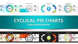
Cyclical Pie Chart PowerPoint Template


Visualizing Perpetual Motion in Business Data
Most presentation charts treat information as static snapshots frozen in time. Revenue numbers sit motionless in columns. Market share percentages occupy fixed pie slices. Process diagrams move left-to-right then stop. But real business operations rarely behave this way. Manufacturing runs repeat endlessly. Customer journeys loop through retention cycles. Quality improvement methodologies demand ongoing iteration. Product development spirals through testing and refinement phases continuously.
This 34-slide cyclical pie chart collection addresses the fundamental challenge of representing perpetual motion within presentation software designed for stillness. CFOs explaining reinvestment strategies where profits fund expansion which generates returns that fuel further investment need visual frameworks showing this self-sustaining rhythm. Operations managers presenting Kaizen continuous improvement methodologies require charts demonstrating how measurement leads to analysis, which drives improvements, which necessitate new measurement in endless cycles. Traditional static pie charts fail these scenarios completely.
The template functions seamlessly across PowerPoint 2016 and newer versions, maintaining complete compatibility with both Windows and macOS platforms. Every arrow, sphere element, and pie segment exists as fully editable vector shapes, enabling precise customization matching corporate visual identity guidelines. Google Slides users can import the file directly with all formatting preserved, though some advanced animation effects may require manual adjustment for optimal display.
Template Architecture and Design Components
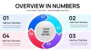
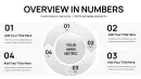
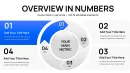
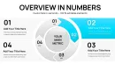
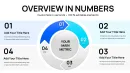
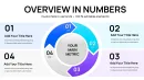
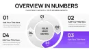
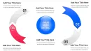
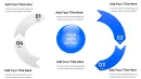
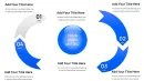
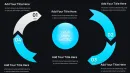
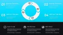
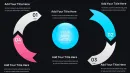
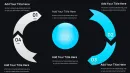
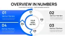
This collection provides 34 distinct slide configurations addressing different cyclical data scenarios. Four-segment circular pie arrangements work effectively for quarterly business cycles, fiscal period rotations, or seasonal pattern analysis. Six-component versions suit comprehensive operational reviews covering multiple concurrent process loops. Eight-section cyclical charts accommodate detailed workflow visualizations where numerous interdependent activities repeat continuously.
Directional arrow elements distinguish these templates from conventional pie charts. Curved arrows wrapping around pie perimeters create visual momentum suggesting continuous flow rather than fixed states. Supply chain consultants presenting circular economy business models use these arrows to illustrate how waste from one process becomes input for another in closed-loop systems. Training directors explaining adult learning cycles leverage the arrow elements to show how experience generates reflection, which produces abstract conceptualization, leading to active experimentation, returning to new experiences.
Sphere integration adds dimensional depth beyond flat circular designs. When presenting global resource allocation across regional markets that feed back into corporate headquarters, spherical elements suggest worldwide scope while maintaining the cyclical narrative. Technology companies explaining agile development sprints use sphere-enhanced cycles to represent how teams progress through planning, execution, review, and retrospective phases repeatedly across multiple product iterations.
Color gradient applications within pie segments enable sophisticated storytelling about progression intensity. Manufacturing efficiency presentations might show darker shades representing higher maturity phases within Six Sigma DMAIC cycles. Healthcare quality improvement specialists use color progression to indicate advancement through clinical protocol implementation stages that repeat across different patient care units.
Professional Implementation Scenarios Across Business Functions
Revenue operations directors presenting subscription business metrics face the specific challenge of illustrating customer lifecycle economics. Cyclical pie charts effectively decompose annual recurring revenue into acquisition, expansion, retention, and churn segments, with arrows showing how each phase flows into the next. SaaS companies pitching to venture capital investors use these visualizations to demonstrate unit economics health. Private equity portfolio managers reviewing software holdings leverage identical formats during quarterly business reviews, comparing lifecycle efficiency across multiple portfolio companies simultaneously.
Sustainability officers reporting environmental impact face unique visualization requirements around circular economy principles. Traditional linear charts imply one-directional resource consumption. Cyclical pie formats accurately represent closed-loop material flows where manufacturing byproducts become raw material inputs for subsequent production runs. One consumer packaged goods manufacturer used these charts during sustainability certification presentations, demonstrating how their packaging waste reduction program feeds materials back into production processes. Certification auditors responded positively to this visual honesty about ongoing rather than completed sustainability achievements.
Human resources business partners explaining talent development pathways struggle with linear career ladder metaphors that poorly represent modern career progression reality. Cyclical charts show how employees rotate through technical roles, project leadership, mentoring responsibilities, and skill development phases multiple times throughout careers rather than climbing single-track ladders. Recruitment teams closing senior executives find this representation resonates with candidates who value continuous learning over hierarchical advancement, particularly in technology and consulting sectors where expertise development follows iterative rather than linear trajectories.
Project management offices standardizing on agile methodologies require visual representations of sprint cycles for stakeholder education. Cyclical pie charts display sprint components: planning, daily standups, development work, sprint review, and retrospective as segments that repeat every two weeks. Portfolio management teams overseeing dozens of agile teams use these charts showing multiple concurrent sprint cycles operating across different products. Executive steering committees appreciate this visualization as it clearly communicates the iterative nature of agile delivery versus traditional waterfall approaches.
Workflow Integration and Efficiency Gains
Creating equivalent cyclical visualizations from PowerPoint's default tools requires substantial manual effort. Building curved arrow paths around custom pie segments, ensuring proper alignment, matching colors across disconnected shape objects, and creating smooth transitions between segments typically consumes 60-90 minutes for design-focused professionals. This template reduces that investment to 10-15 minutes: select appropriate cyclical layout, input data values, adjust segment labels, apply brand colors.
The template integrates naturally into standard presentation development workflows without requiring process changes. Strategy consultants typically begin client deliverables with analysis workstreams, synthesizing findings before design work commences. When analysis concludes and presentation construction begins, they populate pre-built cyclical templates rather than designing custom visuals. This separation of analytical and design work accelerates overall project completion, particularly valuable when proposal deadlines compress timelines unexpectedly.
Version control advantages emerge when distributed teams collaborate on presentation development. Marketing departments building annual planning decks might assign customer acquisition analysis to one team member, retention strategies to another, and expansion initiatives to a third contributor. When all use standardized cyclical chart formats, the consolidated presentation maintains visual consistency despite multiple authors. This design uniformity signals professionalism and attention to detail that audiences interpret as indicating content quality and team coordination.
Cross-platform functionality extends beyond PowerPoint. Keynote users on Mac systems import the template file with minimal formatting adjustments needed, though some animation timing may require recalibration. Google Slides environments support the template through direct file upload, maintaining shapes, colors, and basic animations. This flexibility matters for organizations with heterogeneous technology environments or consulting practices serving clients with varied platform preferences.
Cyclical Visualization Advantages Over Linear Chart Formats
Standard business charts excel at specific communication tasks. Bar graphs compare discrete quantities across categories. Line charts show trends progressing through time periods. Traditional pie charts display proportional breakdowns at single points in time. None of these formats effectively communicate continuous recurring patterns that characterize many business phenomena.
Consider product development cycle presentations. Gantt charts show development phases sequentially from concept through launch, implying process completion. This works for one-time projects but misrepresents ongoing product evolution where launched products immediately enter continuous improvement cycles. Cyclical pie charts accurately show how market feedback informs design updates, which require engineering development, leading to quality testing, enabling new market releases, generating fresh feedback. Product managers explaining this iterative reality to executive sponsors find cyclical formats create more accurate mental models than linear alternatives.
Budget planning presentations face similar challenges. Traditional annual budget charts present fiscal years as independent periods with distinct starting and ending points. This representation ignores how organizational learning from one fiscal year directly shapes planning assumptions for subsequent periods. Finance teams presenting multi-year strategic plans use cyclical formats showing how actual results from one year inform revised forecasts for following years, which drive adjusted resource allocations, producing new actual results that restart the cycle. CFOs report this representation helps board members understand why budgets evolve rather than remain static across planning horizons.
Detailed Comparison Across Visualization Methodologies
| Chart Method | Design Time Required | Cyclical Pattern Clarity | Customization Options | Optimal Use Case |
|---|---|---|---|---|
| Cyclical Pie Charts | 10-15 minutes with template | Excellent for repeating patterns | Complete shape, color, text, animation control | Recurring processes, continuous cycles, feedback loops |
| Standard Pie Charts | 5-10 minutes | None, shows single time point only | Basic segment modification | One-time proportional breakdowns |
| Process Flow Diagrams | 30-45 minutes manual creation | Good for linear flows, poor for loops | Flexible but time-intensive | Sequential processes with clear endpoints |
| Circular Infographics | 90-120 minutes with design software | Excellent but requires expertise | Unlimited with graphic design skills | Marketing materials, annual reports |
| Animation Sequences | 45-75 minutes | Can show cycles through motion | Limited by animation complexity | Video presentations, digital displays |
Industry-Specific Application Examples
Pharmaceutical companies presenting drug development pipelines to regulatory bodies need to demonstrate ongoing pharmacovigilance monitoring cycles. Cyclical charts show how post-market surveillance generates safety signals, which trigger investigation protocols, leading to risk assessments, potentially requiring label modifications, necessitating updated surveillance parameters that restart monitoring cycles. Regulatory affairs teams report this visualization helps FDA reviewers understand that safety monitoring represents continuous commitment rather than one-time obligation, strengthening approval confidence.
Agricultural cooperatives explaining crop rotation strategies to member farmers face education challenges around multi-year planting cycles. Cyclical pie charts display how nitrogen-fixing legumes in year one support heavy-feeding corn in year two, followed by soil-building cover crops in year three, returning to legumes in year four. Cooperative extension agents use these visualizations during winter planning meetings, helping farmers understand rotation benefits beyond single growing seasons. Adoption rates for recommended rotation patterns increased measurably after introducing these cyclical visual aids.
Property management firms presenting preventive maintenance programs to commercial real estate investors must justify ongoing expenditures for building systems that appear functional. Cyclical charts demonstrate how regular inspection reveals minor issues, enabling cost-effective repairs, preventing major failures, extending asset life, justifying inspection investments that restart the cycle. One property management company credited these visualizations with reducing investor resistance to maintenance budget increases, as the cyclical format clearly communicated how deferred maintenance creates exponentially larger future expenses.
Educational institutions explaining competency-based learning models to accreditation bodies require visual frameworks showing how assessment, instruction, re-assessment, and advancement form continuous cycles rather than one-time sequential events. Cyclical pie charts display this recurring pattern clearly. Academic program directors presenting these models during accreditation site visits report that reviewers grasp competency-based approaches more quickly when seeing cyclical representations versus traditional linear curriculum maps. Several institutions received commendations for clarity of their competency framework explanations directly attributing this to their cyclical visualizations.
Advanced Animation Techniques for Cyclical Storytelling
PowerPoint animation capabilities combine with cyclical pie templates enabling sophisticated sequential information disclosure. Rather than displaying complete cycles immediately, presenters can introduce segments progressively, building audience understanding incrementally while maintaining engagement throughout explanations.
The rotation animation approach works exceptionally well for process cycle presentations. Begin with a single highlighted pie segment representing cycle entry point. Animate clockwise rotation bringing successive segments into focus while narrating each phase. Final animation shows complete cycle with all segments visible, emphasizing perpetual nature. Operations consultants presenting lean manufacturing implementations report this progressive disclosure prevents overwhelming plant managers new to continuous improvement concepts, building comprehension systematically.
Pulse animation effects apply effectively to cyclical charts representing business rhythms with varying intensities. Segments can pulse larger during peak activity periods then shrink during lower intensity phases. Retail executives presenting seasonal business patterns use pulse animations showing how holiday quarter segments expand while off-season segments contract, visualizing both cyclical nature and intensity variation simultaneously. Board members report this dynamic representation creates more intuitive understanding of seasonal working capital requirements than static charts achieve.
Frequently Asked Questions
How do cyclical pie charts differ from standard circular process diagrams?
Cyclical pie charts specifically emphasize proportional distribution across recurring phases while maintaining continuous flow visualization. Standard process diagrams show sequential steps but rarely convey proportional time or resource allocation across phases. This template combines quantitative proportion communication with qualitative process flow indication, making it uniquely valuable when both aspects matter simultaneously. Financial services firms find this dual purpose particularly useful for client reporting where understanding both phase duration and resource commitment importance.
Can I animate individual pie segments independently for phased disclosure during presentations?
Yes, each pie segment and arrow element functions as an independent PowerPoint shape object enabling granular animation control. You can sequence entrance animations to reveal segments one at a time, add emphasis animations to highlight specific phases during narration, or create exit animations removing segments to simplify complex cycles for different audience segments. This animation flexibility proves essential when presenting the same cyclical framework to both technical teams requiring full detail and executive audiences needing simplified summaries.
What data scenarios work best with cyclical versus linear chart formats?
Cyclical formats excel when representing phenomena where end states feed back into beginning states creating self-perpetuating patterns: customer retention programs, quality improvement methodologies, seasonal business rhythms, agile development sprints, or closed-loop supply chains. Linear formats suit phenomena with clear start and end points: project timelines, historical trends, or sequential manufacturing processes. The decision criterion centers on whether the process genuinely repeats or terminates. Misrepresenting linear processes as cyclical or cycles as linear both create audience confusion undermining message credibility.
How do I maintain visual clarity when presenting cyclical charts with eight or more segments?
Several techniques preserve readability in complex cyclical visualizations. First, use high-contrast color schemes alternating between light and dark segments improving boundary distinction. Second, increase segment label font sizes to maintain readability at projection distances. Third, consider splitting highly complex cycles across multiple slides showing subsets with context indicators. Fourth, leverage animation revealing segments progressively rather than simultaneously. One management consulting firm standardized on maximum six-segment cycles for executive presentations while permitting eight-segment versions for technical working sessions where audiences tolerate higher information density.
Are these templates appropriate for academic research presentations or primarily business contexts?
Academic researchers increasingly adopt cyclical visualizations for conference presentations and journal articles. Iterative research methodologies, feedback loops in social systems, cyclical natural phenomena, or recurring experimental protocols all benefit from cyclical representation. One ecology researcher used these templates showing seasonal migration patterns during species conservation presentations, earning specific positive feedback from peer reviewers about visualization clarity. The key requirement remains authentic cyclical behavior in the subject matter rather than presentation context. Scientific rigor demands accurate visual representation whether presenting to academic colleagues or business stakeholders.
How frequently should organizations update cyclical chart templates to reflect evolving visual design standards?
Visual design trends evolve continuously but cyclical chart fundamentals remain stable. Major updates every 18-24 months keep templates contemporary without constant revision. Focus updates on color palettes reflecting current preferences, font selections matching modern readability standards, and subtle refinements to arrow styling or sphere rendering. However, resist dramatic redesigns disrupting organizational visual consistency unless rebranding initiatives demand comprehensive change. One Fortune 500 company maintains three-year template lifecycles balancing contemporary aesthetics with institutional visual identity preservation, updating only when design elements appear notably dated compared to external communications materials.