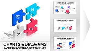
3D Puzzle Charts Template for PowerPoint - 48 Editable Slides


Type: PowerPoint Charts template
Category: Process, Relationship, 3D, Puzzles
Sources Available: .pptx
Product ID: PC01077
Template incl.: 48 editable slides
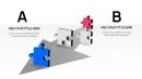
Transform Complex Relationships into Visual Clarity
When your quarterly review demands more than flat bar graphs, when stakeholder relationships need untangling, or when project dependencies require explanation without confusion, dimensional puzzle charts become essential presentation artillery. This 48-slide collection addresses a persistent challenge: illustrating how distinct business elements interconnect to form complete operational pictures.
Corporate strategy directors consistently face situations where linear explanations fail. Consider merger integration scenarios where legal, operational, financial, and cultural workstreams must align simultaneously. Traditional slides present these as separate bullet points. Puzzle-based visualization reveals them as interdependent components, each critical to overall success. Finance teams mapping capital allocation across divisions, product managers demonstrating feature dependencies for sprint planning, or consultants explaining organizational change initiatives all benefit from this spatial approach to information architecture.
The template works seamlessly with PowerPoint 2016 and later versions, maintaining full editability across Windows and Mac platforms. Each puzzle piece functions as an independent shape object, allowing precise color matching to corporate style guides, custom text insertion, and animation sequencing that reveals information progressively during live presentations.
Complete Slide Architecture and Customization Framework
This collection provides 48 distinct layouts addressing various analytical requirements. Four-piece configurations suit quarterly business reviews where operations, finance, marketing, and technology converge. Six-component arrangements work for complex project portfolios spanning multiple departments. Eight-section puzzles accommodate enterprise-wide initiatives requiring granular breakdown.
Spherical puzzle arrangements distinguish this template from standard flat designs. When presenting global market penetration strategies, spherical formats naturally suggest worldwide reach. Pharmaceutical companies demonstrating clinical trial phases across continents, logistics firms mapping distribution networks, or SaaS providers showing regional deployment sequences leverage this three-dimensional perspective for geographical storytelling.
Vertical stacking configurations enable process visualization where sequential dependencies matter. Manufacturing workflow optimization, software development lifecycle presentations, or academic curriculum design benefit from this top-to-bottom progression. Each piece contains dedicated text areas for labeling, icon placeholders for visual reinforcement, and connector elements showing information flow between stages.
Color customization extends beyond simple fills. The template supports gradient applications, transparency adjustments for layering effects, and shadow modifications creating depth perception. When corporate branding requires specific Pantone equivalents, PowerPoint's advanced color picker accommodates precise matching. Puzzle edges remain crisp even when projected at large scales, utilizing vector graphics principles that prevent pixelation.
Strategic Applications Across Business Functions
Financial analysts preparing investment committee presentations use puzzle charts to deconstruct complex valuation methodologies. Rather than presenting discounted cash flow components as spreadsheet rows, each calculation element becomes a visible puzzle piece showing its contribution to final enterprise value. Private equity firms explaining portfolio company value creation plans, corporate development teams justifying acquisition synergies, or treasury departments outlining hedging strategies find this visual decomposition reduces technical barriers for non-financial stakeholders.
Healthcare administrators managing hospital system integration post-acquisition face overwhelming operational complexity. Puzzle visualizations break this into manageable segments: electronic health record unification, credentialing standardization, supply chain consolidation, and culture integration. Each piece carries specific timelines, responsible parties, and success metrics. During board presentations, administrators animate piece assembly demonstrating how completing preliminary phases enables subsequent work, creating visual logic that earns approval for multi-year transformation budgets.
Technology vendors explaining software architecture to non-technical buyers struggle with abstraction. Puzzle templates convert system components into tangible elements: user interface layer, business logic engine, database infrastructure, security framework, and third-party integrations. Prospects grasp how pieces interact without understanding underlying code. Value-added resellers closing enterprise deals, CTOs presenting to boards, or implementation consultants scoping projects leverage this translation layer between technical reality and business comprehension.
Academic program directors designing interdisciplinary curricula use puzzle slides to show course relationships. A data science degree program might display mathematics foundation, programming skills, statistical theory, machine learning applications, and domain expertise as interconnected puzzle pieces. Faculty committees evaluating proposals see course dependencies clearly. Accreditation bodies reviewing program coherence appreciate this structural transparency. Student recruitment materials adapted from these slides help prospective enrollees understand learning pathways.
Workflow Integration and Time Efficiency Analysis
Creating equivalent visualizations from scratch requires significant design investment. Basic PowerPoint tools force manual shape creation, alignment, color matching, and text positioning for each puzzle piece. Design-focused professionals report spending 45-90 minutes achieving comparable results. This template reduces that investment to 8-15 minutes: select appropriate layout, input text, adjust colors, add data.
The template functions within existing presentation development workflows without disruption. Consultants building client deliverables typically start with content outlines, gathering data before design work begins. When analysis completes, they populate pre-built templates rather than constructing visuals from blank slides. This separation of content development and visual execution accelerates deck completion, particularly valuable during compressed proposal timelines.
Version control benefits emerge when multiple team members contribute to presentations. Standardized puzzle layouts ensure consistency even when different people handle various sections. A proposal team might assign one member to competitive analysis, another to solution architecture, and a third to implementation planning. When all use identical puzzle formats, the final deck maintains visual cohesion despite distributed authorship.
Compatibility extends beyond PowerPoint. Google Slides users upload the template file directly, with shapes, text, and animations transferring intact. Keynote users on Mac systems import the file with minimal formatting adjustments required. This cross-platform flexibility matters for organizations with mixed technology environments or consultants serving diverse client bases.
Dimensional Visualization Versus Traditional Charting Methods
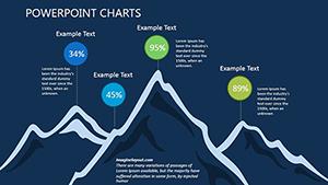
Standard PowerPoint charts excel at quantitative comparisons: bar graphs show revenue trends, line charts track metrics over time, pie segments display market share. Puzzle visualizations address qualitative relationships and structural dependencies that numerical charts cannot capture effectively.
Consider risk assessment presentations. Traditional approaches list risks in text bullets or plot them on probability-impact matrices. Puzzle formats show how risk mitigation strategies interconnect: addressing one regulatory compliance risk simultaneously reduces operational and reputational exposure. Each puzzle piece represents a risk category, with interlocking edges illustrating cascading mitigation effects. Risk committees grasp these systemic relationships more intuitively than matrix presentations allow.
Strategic planning sessions require balancing multiple objectives simultaneously: revenue growth, margin improvement, market expansion, and talent development. Linear roadmaps present these sequentially, implying one precedes another. Puzzle visualizations display them as concurrent priorities requiring coordinated execution. Leadership teams see resource allocation challenges more clearly when all strategic components appear together rather than in series.
Comparative Evaluation Against Alternative Approaches
| Presentation Method | Development Time | Relationship Clarity | Customization Flexibility | Best Use Case |
|---|---|---|---|---|
| Dimensional Puzzle Charts | 10-15 minutes with template | Excellent for interdependencies | Full color, text, animation control | Process integration, system architecture, strategic frameworks |
| Standard PowerPoint Shapes | 60-90 minutes manual creation | Moderate if well-executed | Complete but time-intensive | Custom one-off visualizations |
| Text Bullet Lists | 5 minutes | Poor for complex relationships | Limited to font and spacing | Simple enumeration without connections |
| SmartArt Graphics | 15-20 minutes | Good for hierarchies, weak for interdependencies | Constrained by SmartArt templates | Organizational charts, simple process flows |
| Third-Party Design Software | 120+ minutes including export | Excellent but requires expertise | Maximum but demands design skills | Marketing materials, publication graphics |
Industry-Specific Implementation Scenarios
Management consulting firms preparing diagnostic presentations for troubled companies use puzzle charts to illustrate operational breakdowns. When a manufacturing client faces margin erosion, consultants identify contributing factors: raw material costs, labor efficiency, quality issues, and overhead allocation. Each puzzle piece represents one factor. Missing or damaged puzzle imagery shows problem areas requiring intervention. Executives immediately grasp which operational elements need fixing versus which function adequately.
Real estate developers presenting mixed-use projects to municipal planning boards face complex approval processes. Puzzle visualizations break developments into components: retail space, residential units, parking infrastructure, green space, and community amenities. Each piece shows how it satisfies specific zoning requirements. Planning commissioners see how pieces combine creating compliant, value-generating developments. Approval rates improve when commissioners understand project complexity without feeling overwhelmed.
Corporate training departments designing learning pathways for technical roles map skill acquisition sequences. Entry-level employees need foundational knowledge before advanced techniques make sense. Puzzle pieces represent skill modules: basic product knowledge, customer interaction protocols, technical troubleshooting, escalation procedures, and quality standards. Trainees see their progression path. Managers track completion across teams. HR departments demonstrate training program coherence to auditors.
Research institutions seeking grant funding must demonstrate how proposed studies address specific knowledge gaps. Puzzle visualizations show existing research as incomplete pictures with missing pieces. Proposed investigations fill those gaps. Funding committees immediately understand research significance and how new work builds on established foundations. Principal investigators report this approach resonates particularly well with reviewers lacking deep domain expertise.
Animation Sequencing for Progressive Information Disclosure
PowerPoint animation tools combine with puzzle templates enabling strategic information revelation. Rather than overwhelming audiences with complete pictures immediately, presenters introduce pieces sequentially, building understanding incrementally.
Sales presentations benefit from this approach when explaining solution components. Start with customer pain points as empty puzzle outlines. Introduce solution elements one piece at a time, showing how each addresses specific challenges. Final assembled puzzle demonstrates comprehensive problem resolution. Prospects follow solution logic naturally rather than receiving everything simultaneously.
Change management presentations announcing organizational restructuring use animation to reduce anxiety. Begin with current structure as completed puzzle. Animate transition showing pieces moving to new positions. End with new organization as reassembled puzzle emphasizing continuity despite changes. Employees see familiar elements in new arrangements rather than perceiving wholesale replacement.
Frequently Asked Questions
Can I modify individual puzzle pieces independently without affecting connected elements?
Yes, each puzzle component functions as a separate PowerPoint shape object. You can change colors, resize, rotate, or reposition any piece without impacting adjacent elements. Text boxes within pieces are also independent, allowing custom labeling for each component. This modularity enables precise customization matching your specific content requirements while maintaining the overall puzzle metaphor.
How do these slides perform when presenting via web conferencing platforms like Zoom or Teams?
The template maintains visual clarity during screen sharing across all major platforms. Vector-based graphics ensure shapes remain crisp even when bandwidth compression occurs. We recommend using PowerPoint's presenter mode rather than sharing your entire desktop, as this optimizes resolution. Animation sequences play smoothly during web presentations, though you may want to slightly slow transition speeds compared to in-person delivery to account for potential latency.
What skill level is required to customize these templates effectively?
Basic PowerPoint proficiency suffices for most customization tasks. If you can change text, adjust colors using the format menu, and copy-paste shapes, you possess adequate skills. Advanced users can leverage master slide editing for organization-wide branding consistency, but this remains optional. No graphic design background or external software expertise is necessary. Most professionals complete their first customized deck within 20 minutes of downloading the template.
Are the puzzle metaphors appropriate for formal board-level presentations or primarily for internal working sessions?
These visualizations work effectively at all organizational levels. Fortune 500 boards regularly review presentations using puzzle charts for strategic initiatives, M&A integration planning, and enterprise risk management. The key lies in maintaining professional color schemes and avoiding overly playful styling. For executive audiences, use corporate colors, minimize animation effects, and focus on substantive content. The puzzle format itself conveys sophisticated thinking about interconnected systems rather than suggesting simplistic approaches.
Can I combine these puzzle slides with quantitative data charts in the same presentation?
Absolutely, and we recommend this approach for comprehensive presentations. Use puzzle visualizations to establish conceptual frameworks and relationships, then follow with traditional charts showing quantitative evidence. For example, a strategy presentation might open with puzzle slides showing how business units interconnect, then present bar graphs with revenue data for each unit, followed by puzzle slides demonstrating proposed integration plans. This qualitative-quantitative-qualitative flow creates powerful narratives.
Do color choices significantly impact how audiences interpret the puzzle relationships?
Color selection matters considerably for visual communication effectiveness. Related puzzle pieces should share color families, while distinct functional areas warrant contrasting colors. Warm colors typically suggest active or priority elements, while cool colors indicate supporting or secondary components. For global audiences, research cultural color associations relevant to your market. The template's flexibility allows A/B testing different color schemes during rehearsal to determine which resonates most effectively with your specific stakeholders.