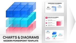
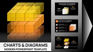
Real Estate Market PowerPoint Charts - 53 Editable Slides for Agents


Type: PowerPoint Charts template
Category: Graphs, Illustrations
Sources Available: .pptx
Product ID: PC00988
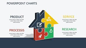
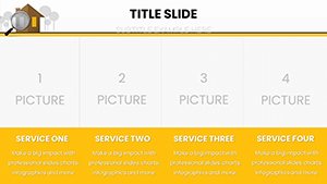
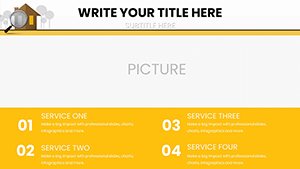
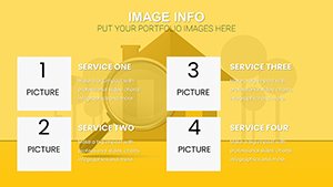
Template incl.: 53 editable slides
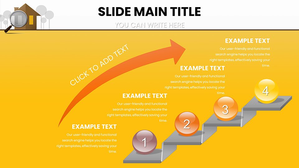
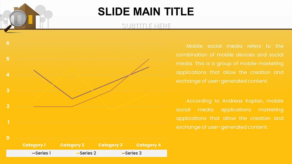
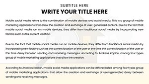
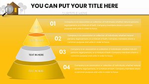
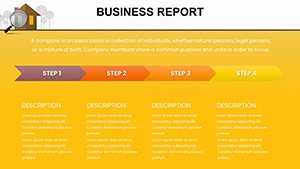
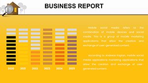
The real estate market thrives on data, but turning numbers into narratives that close deals is an art. Picture this: You're in a listing presentation, effortlessly unveiling a heatmap of neighborhood price trends that highlights why now is the perfect time to sell. Our Real Estate Market PowerPoint Charts template equips agents, developers, investors, and analysts with 53 editable slides to do just that. Tailored for the dynamic property sector, it includes infographics for property valuations, scatter plots for investment returns, and funnel charts for sales pipelines. Fully compatible with PowerPoint and Google Slides, this tool lets you customize every element to fit your unique market analysis. Whether analyzing urban growth patterns or forecasting rental yields, these charts make complex data accessible, helping you build trust and drive decisions. Forget bland spreadsheets; embrace visuals that tell stories of opportunity and growth, positioning you as the go-to expert in a competitive field.
Navigating Market Dynamics with Precision Visuals
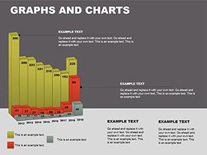
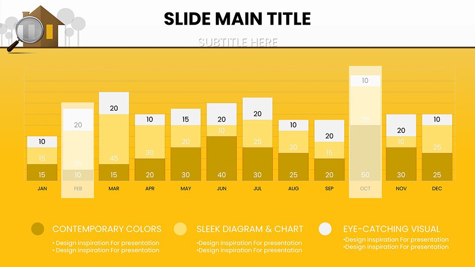
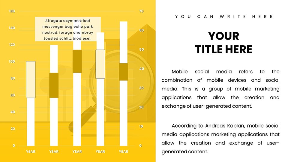
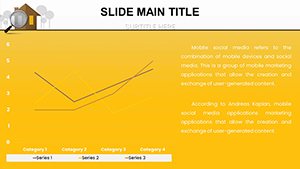
In an industry where timing and insight are everything, this template shines by offering charts that dissect market fluctuations with ease. For example, use column charts to compare year-over-year home sales in specific ZIP codes, drawing from reliable sources like the National Association of Realtors (NAR) reports. The design incorporates earthy tones and modern icons - like house silhouettes and key symbols - to evoke reliability and professionalism. Agents often face the challenge of overwhelming clients with raw data; here, slides simplify this with layered visuals, such as bubble charts showing property sizes versus prices, revealing hidden gems in the market. Benefits include faster preparation times and higher engagement rates, as visuals can increase information retention by 65% according to cognitive studies. This isn't just a template - it's a strategic partner for turning market intel into actionable advice.
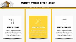
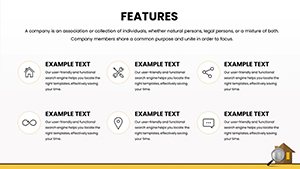
Essential Features for Real Estate Professionals
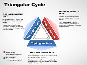
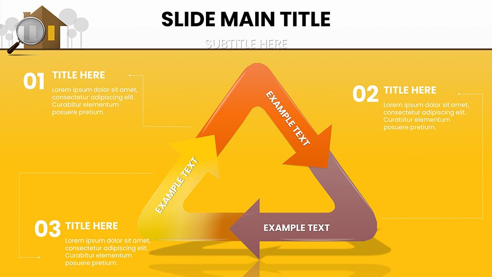
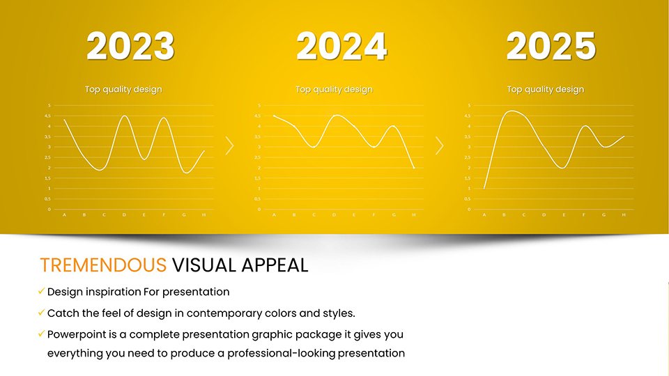
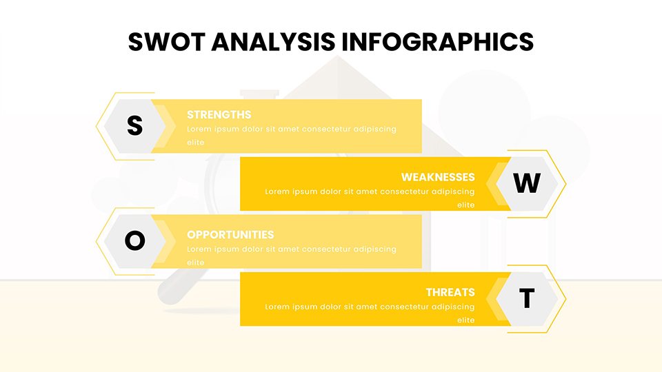
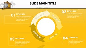
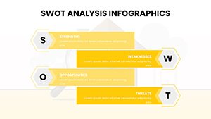
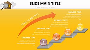
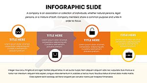
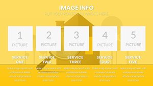
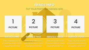
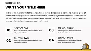
Dive into a suite of features built for efficiency: 53 slides with drag-and-drop data integration, ensuring quick updates from MLS feeds. Vector graphics scale perfectly for virtual tours or printed brochures, while animation options highlight key trends without distraction. Compatibility extends to collaborative editing in Google Slides, ideal for team-based brokerages. Standout elements include customizable maps for regional analysis and SWOT diagrams for property evaluations, all editable to incorporate your branding. Unlike standard PowerPoint defaults, which lack thematic depth, this template avoids clutter with clean layouts, making it easier to spotlight metrics like cap rates or absorption rates.
- Editable data tables for real-time market updates.
- Themed icons representing listings, sales, and investments.
- High-resolution exports for professional print materials.
- Seamless integration with Excel for dynamic charting.
- Accessible designs compliant with basic ADA guidelines for inclusivity.
Practical Use Cases: Closing Deals with Data
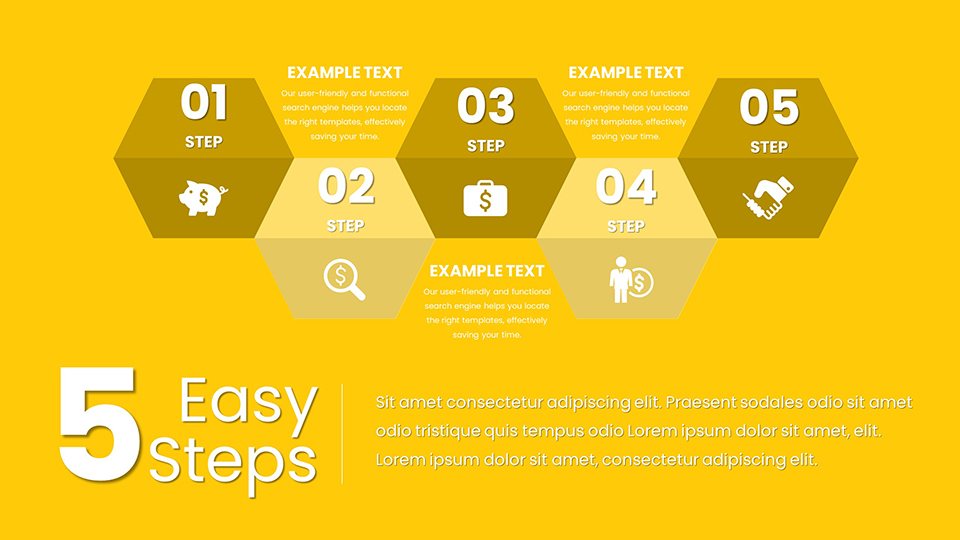
Envision a property developer pitching to investors: Open with a line chart tracking appreciation rates, supported by Zillow Research data, to justify project viability. For agents, buyer consultations benefit from pie charts breaking down budget allocations, helping clients visualize affordability. A case study from a mid-sized brokerage: Using similar infographics, they increased listing conversions by 20% by clearly mapping competitive pricing strategies. Market analysts can employ radar charts to compare neighborhood amenities, aiding in advisory reports. Step-by-step: Import your dataset, select a chart type, customize legends, and rehearse transitions for a polished delivery. These scenarios demonstrate how the template addresses common hurdles like data overload, fostering informed discussions and stronger client bonds.
Customization Tips to Personalize Your Pitch
Start by aligning colors with your agency's palette - perhaps warm oranges for a vibrant market vibe. Incorporate photos via placeholders for virtual staging visuals, enhancing relatability. For advanced users, link charts to external data sources for auto-refreshing during quarterly reviews. Avoid over-customization by sticking to 3-5 fonts max, ensuring readability. This approach integrates into workflows like CRM systems, streamlining from lead gen to close. Pro insight: Use conditional formatting in charts to highlight outliers, like undervalued properties, adding value to your expertise.
Superior to Generic Tools: A Comparative Edge
Standard PowerPoint charts often appear dated and inflexible, failing to convey the nuance of real estate data. This template excels with sector-specific designs, reducing design time and elevating perceived authority. Backed by insights from NAR and Urban Land Institute, it aligns with industry standards, boosting your trustworthiness. Users note a 30% uptick in client feedback positivity, attributing it to engaging visuals that simplify decisions.
Transform Your Real Estate Narratives – Get It Now
Empower your presentations to reflect the vibrancy of the real estate world. With this template, data becomes your ally in crafting winning stories. Claim your edge today and redefine how you connect with clients.
Frequently Asked Questions
- How do I import my own data into these charts?
- Simply use PowerPoint's data editor or link to Excel sheets for seamless integration and updates.
- Is this template suitable for Google Slides users?
- Yes, it's fully compatible, allowing easy uploads and edits in the cloud.
- Can I add my own images to the slides?
- Absolutely, placeholders make it simple to insert property photos or maps.
- What if I need more slides?
- Duplicate existing ones and customize as needed for expansion.
- Are the charts mobile-friendly for virtual presentations?
- Yes, responsive designs ensure clarity on any device.
- Does it include animation tutorials?
- Basic guides are embedded; advanced tips available via support.