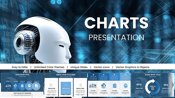
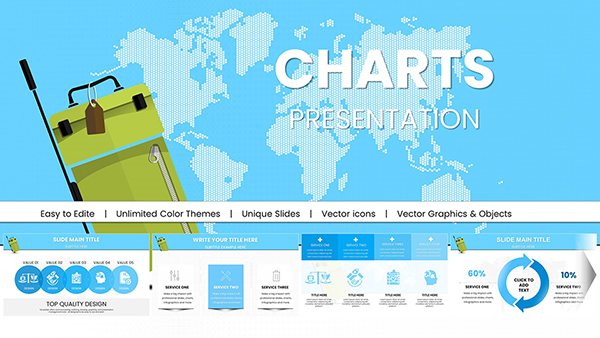
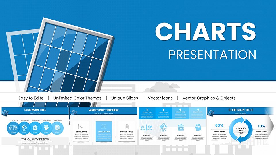
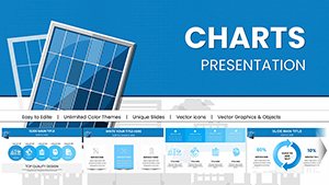
Solar Energy PowerPoint Charts: Renewable Data Visualization


Type: PowerPoint Charts template
Category: Illustrations
Sources Available: .pptx
Product ID: PC00966
Template incl.: 59 editable slides
Visualize the Future of Energy with Precision
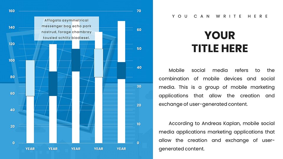
You face a specific challenge: communicating the complex ROI and technical efficiency of solar projects without overwhelming your stakeholders with dry spreadsheets. Whether you are a renewable energy consultant pitching a commercial installation or an environmental policy advocate illustrating carbon offsets, standard bar charts fail to capture the radiance of your data. This Solar Energy PowerPoint Charts template solves that friction by providing a specialized visual language for the photovoltaics industry.
Investors and board members do not just want to see numbers; they need to visualize the trajectory of energy savings and grid integration. By using these 59 professionally designed slides, you move beyond basic data dump to storytelling. You answer the implicit questions your audience has immediately: "Is this technology viable?" and "When do we see a return?" using visuals that look like they cost thousands in agency design fees.
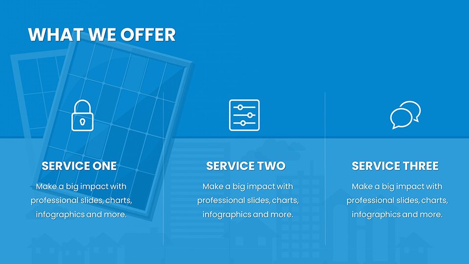
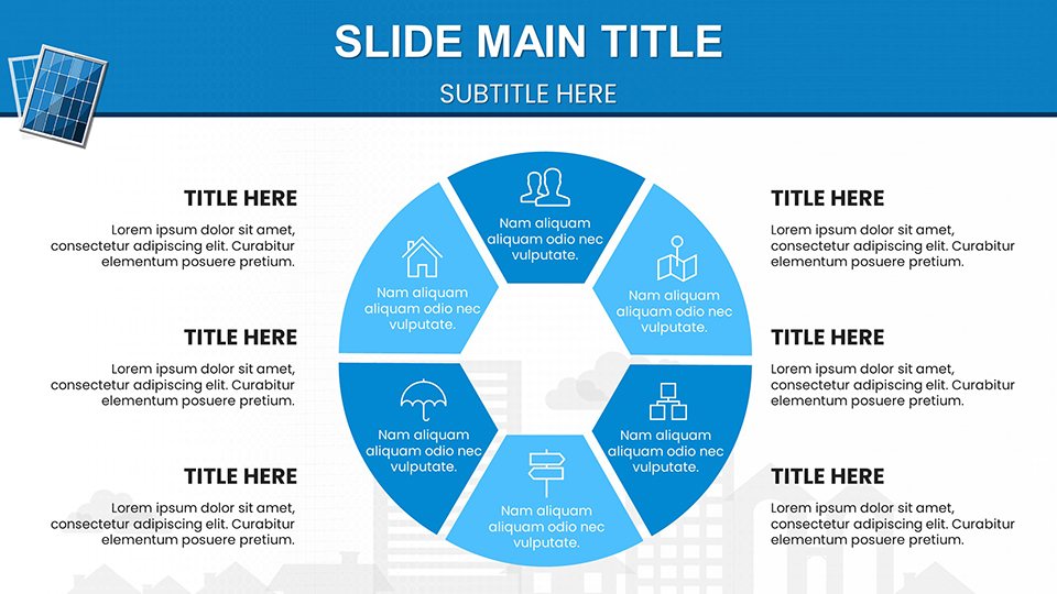
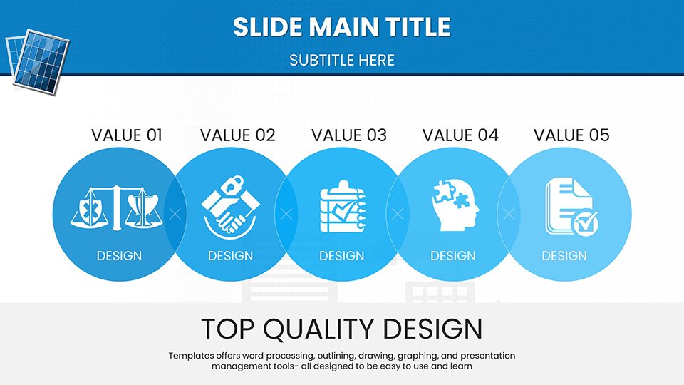
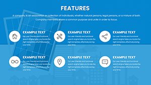
Core Features for Renewable Professionals
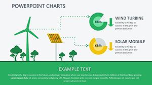
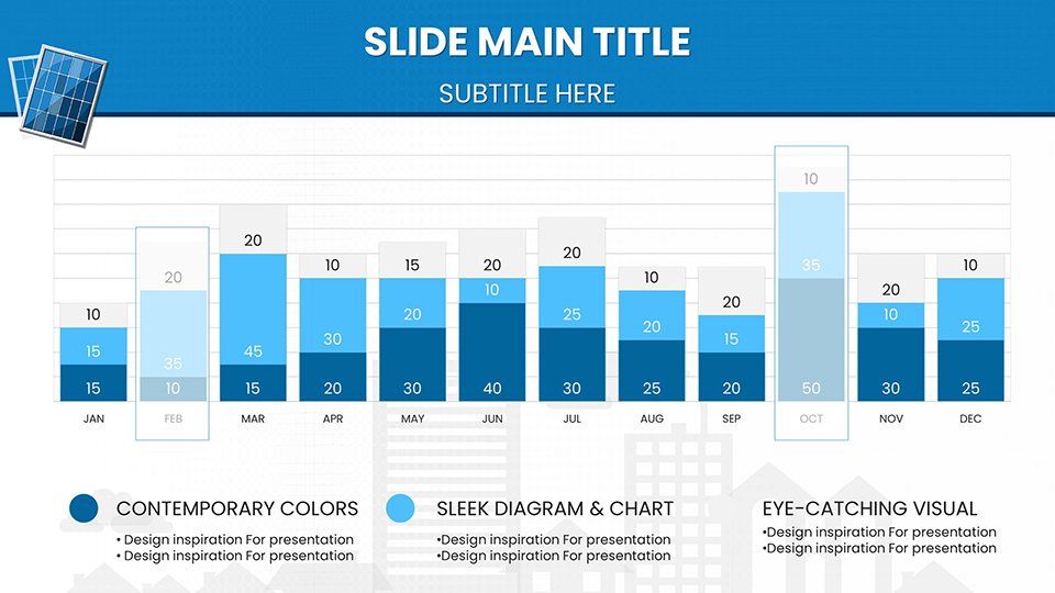
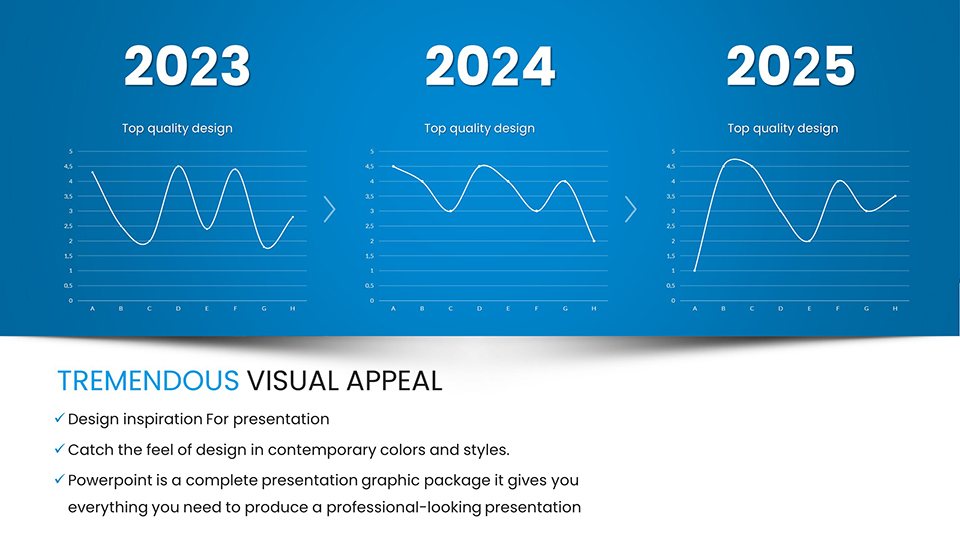
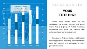
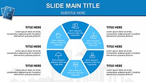
This is not a generic nature theme; it is a technical toolkit. The template includes specialized sunburst diagrams for visualizing energy distribution and area charts tailored for market growth projections. You can easily manipulate the data points to reflect local irradiance levels or specific hardware efficiency ratings.
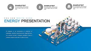
- Photovoltaic Specifics: Editable schematics that let you scale from residential rooftops to utility-scale solar farms.
- Policy Ready: Pre-formatted layouts to display regulatory incentives, tax credits, and net metering comparisons (like NEM 3.0).
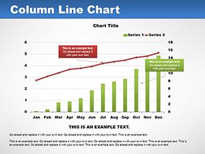
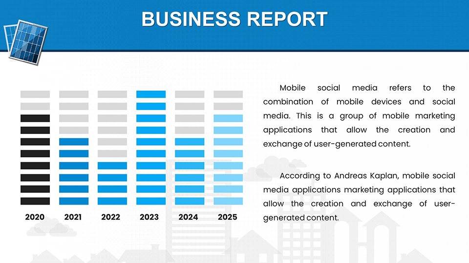
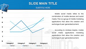
- Data Flexibility: Smoothed line graphs designed specifically to show battery storage leveling and output volatility.
Professional Use Cases
Investor Pitch Decks
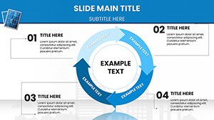
Use the ROI calculators and payback period timeline slides to demonstrate exactly when a project turns cash-positive. The crisp, clean aesthetic builds confidence in your financial modeling.
Technical Training & Implementation
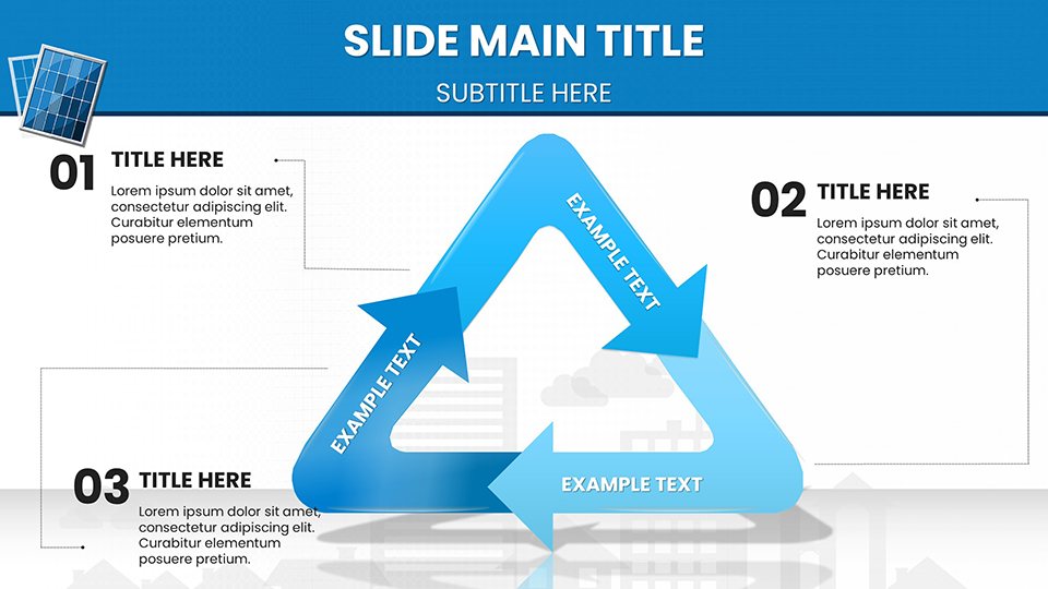
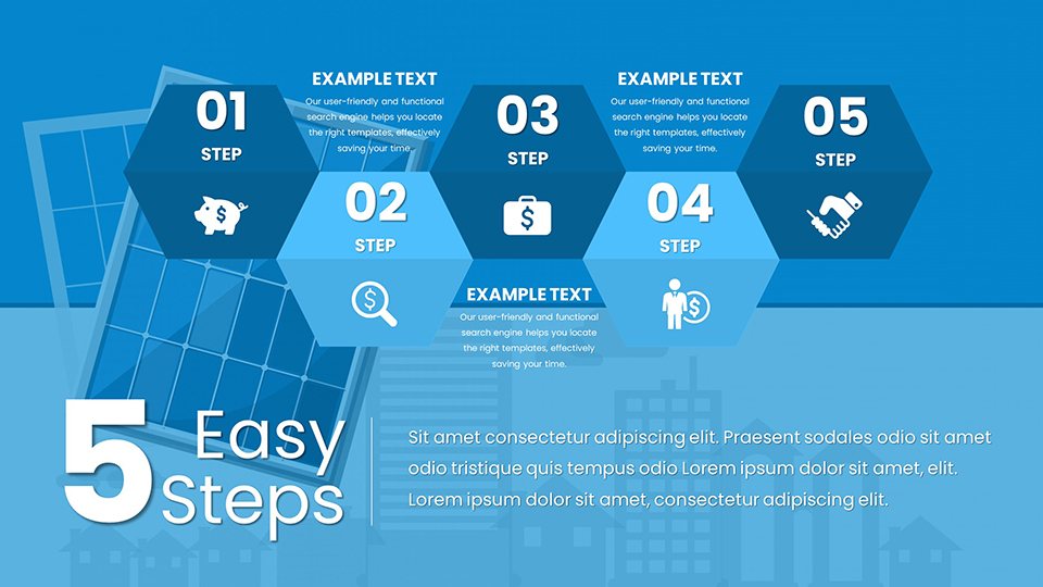
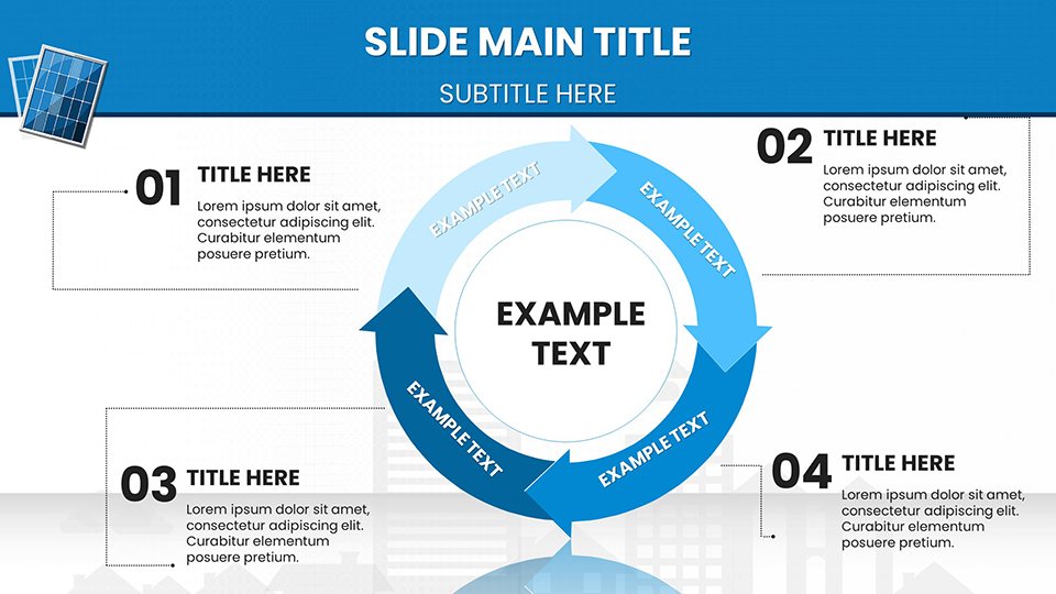
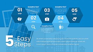
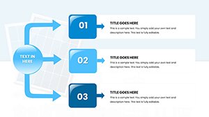
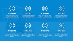
For operations managers, the installation process flows and maintenance schedules clarify the "how" behind the "why." Use the icon sets to map out wiring diagrams or safety protocols without needing external design software.
Sustainability Reporting
Corporate sustainability officers can utilize the before-and-after visualization slides to show carbon footprint reduction. The "Green City" layouts allow you to paint a picture of a solar-integrated future that aligns with ESG goals.
Workflow Integration
Stop fighting with Excel charts that break when you paste them. These slides are native PowerPoint objects. You can right-click any chart, select "Edit Data," and paste your specific kilowatt-hour (kWh) production figures directly from your engineering logs or PVWatts simulations. The color palette is pre-set to warm, energetic solar hues (oranges and yellows) but can be instantly rebranded to your corporate identity using the Slide Master.
Real-World Example: Commercial Retrofit Proposal
Imagine you are proposing a 500kW rooftop system for a manufacturing plant. Instead of a text-heavy slide listing benefits, you use Slide #12 to visually compare their current fossil-fuel consumption against the projected solar generation. You then follow up with the "Cost Trends" bubble plot to show how rising utility rates will widen their savings gap over 10 years. The result is not just a quote; it is a strategic business case.
Internal Comparison: Is This the Right Template?
| Scenario | Solar Energy Charts (This Template) | Standard Corporate Charts |
|---|---|---|
| Audience | Investors, Engineers, Policy Makers | General Management, HR |
| Data Type | Energy output, ROI curves, Environmental impact | Simple revenue, headcount |
| Outcome | Technical credibility & financial clarity | Generic overview |
Industry Applications beyond Solar
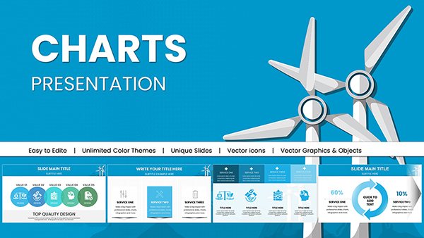
While optimized for solar, the renewable energy infographics here are highly adaptable for wind energy hybrid systems, battery energy storage systems (BESS), and smart grid technology presentations. The "Grid Integration" maps are particularly useful for utility companies explaining distributed energy resources (DERs).
Ready to illuminate your data? Download the Solar Energy Charts now and turn your metrics into a movement.