Comparative Data Chart Template for PowerPoint


Type: PowerPoint Charts template
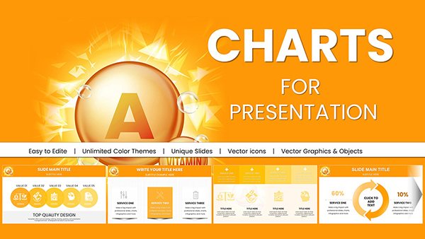
Category: Medicine - Pharma
Sources Available: .pptx
Product ID: PC00960
Template incl.: 59 editable slides
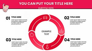
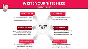
Turn Complex Numbers into Clear Insights
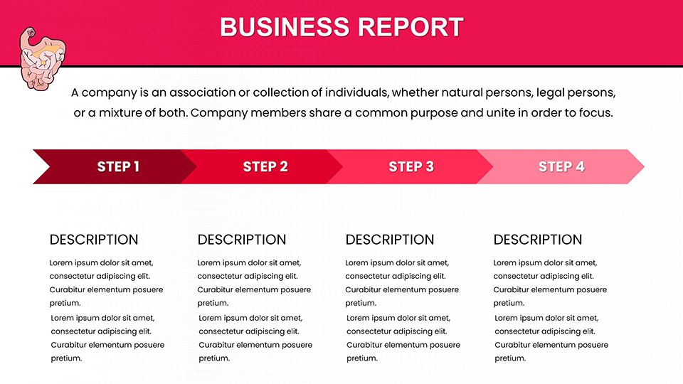
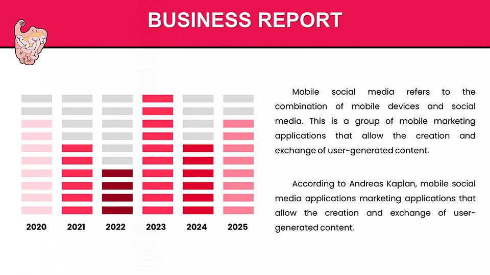
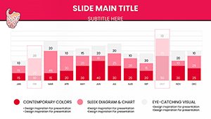
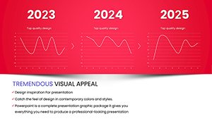
Data density often leads to cognitive overload in high-stakes meetings. When you need to compare performance metrics, year-over-year growth, or regional sales data, default slides rarely offer the necessary visual hierarchy. This Comparative Data Analysis PowerPoint Chart Template solves that problem by stripping away visual clutter and focusing the audience’s attention strictly on the variance between data sets.
Designed for financial analysts, sales directors, and strategy consultants, this layout allows you to present contrast effectively. It is not just about showing numbers; it is about showing the story behind the numbers. Use this template when the goal is to drive a decision based on performance gaps or competitive advantages.
Professional Use Cases for This Layout
This chart excels in scenarios where direct comparison is the primary objective. It prevents the "eye-scanning fatigue" common in dense spreadsheets.
- Quarterly Business Reviews (QBR): Clearly contrast current quarter performance against previous quarters or targets.
- Competitor Benchmarking: Visualize market share or feature sets against key industry rivals.
- Budget vs. Actuals: distinct visual indicators for over-performance or deficits.
Real-World Workflow & Compatibility
We understand that data changes up until the last minute. This template is fully integrated with PowerPoint’s native data engine (via Excel). You do not need to manually drag shapes. Simply right-click the chart, select "Edit Data," and paste your updated figures. The visual elements adjust automatically, preserving the professional spacing and design.
This file is optimized for seamless use in Microsoft PowerPoint, Google Slides, and Keynote. All colors are theme-linked, meaning if you paste this slide into your corporate master deck, it will instantly adapt to your brand's color palette.
Scenario Comparison: When to Use This Template
| Scenario | Target Audience | Outcome |
|---|---|---|
| Sales Variance | Sales Managers & VPs | Highlights underperforming regions immediately. |
| Revenue Growth | Investors / Board | Demonstrates trajectory without confusing details. |
| Cost Analysis | Internal Operations | Pinpoints specific areas for cost reduction. |
Industry Applications
While versatile, this comparative layout is particularly effective in FinTech, Retail Analytics, and SaaS Reporting, where granular data comparison is routine. It transforms dry statistics into compelling visual arguments.
Ready to elevate your data presentation? Download this template now to start editing instantly.
Frequently Asked Questions
Is the data linked to Excel?
Yes. This is a data-driven PowerPoint chart. You can edit the numbers via the embedded Excel sheet, ensuring 100% accuracy and easy updates.
Can I change the bar colors to match my brand?
Absolutely. The template uses theme colors. You can change the colors globally via the Design tab or individually select elements to apply specific hex codes.
Is this suitable for printed reports?
Yes. The high-contrast design ensures that the chart remains legible even when printed in grayscale for handouts or physical reports.