World Development Trends PowerPoint Infographic Template


Type: PowerPoint Charts template
Category: Arrows
Sources Available: .pptx
Product ID: PC00297
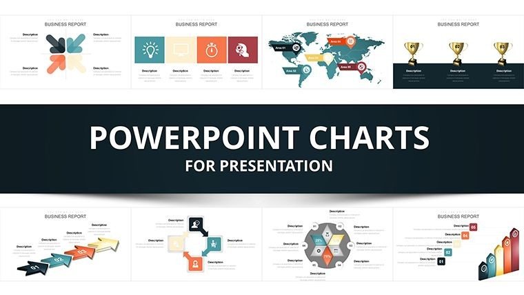
Template incl.: 49 editable slides
Navigating the complexities of global development requires tools that turn vast data into digestible stories. Our World Development Trends PowerPoint Infographic Template does just that, with 49 meticulously designed editable slides. Tailored for economists, policymakers, educators, and NGO workers, this template draws from real-world data visualization standards like those endorsed by the World Bank for trend analysis. Picture presenting economic growth patterns or sustainability metrics in a way that sparks discussion and action. This isn't merely a set of slides; it's a gateway to clearer understanding, helping you communicate intricate trends like urbanization or climate impacts with flair and precision, all while saving precious preparation time.
Explore Innovative Infographic Elements
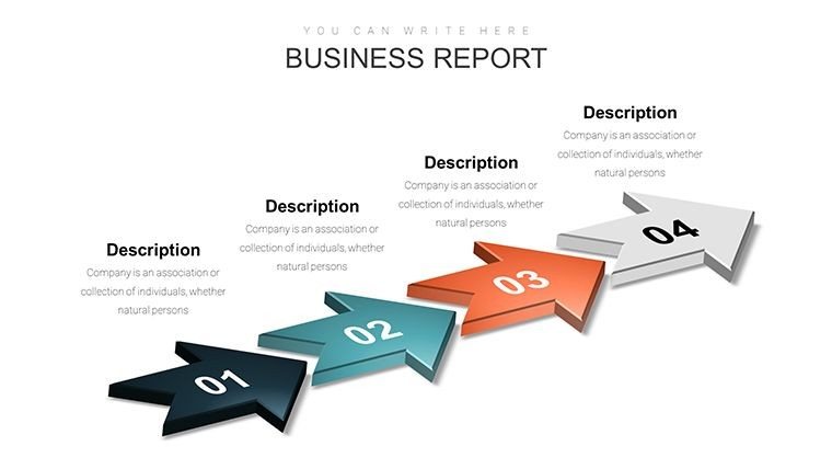
This template stands out with its array of infographic styles, from arrow-directed timelines tracing historical developments to interactive maps highlighting regional disparities. Unlike standard charts, these incorporate modern design trends such as flat icons and responsive layouts, ensuring your presentations look current and professional. LSI terms like global data charts and trend infographics are naturally embedded to enhance search relevance without forcing it.
Standout Features for Global Storytellers
- Sleek Modern Aesthetics: Inspired by contemporary UI/UX principles, with clean lines and vibrant palettes for visual appeal.
- Extensive Customization: Modify colors, fonts, and elements to fit your narrative - essential for branding in international reports.
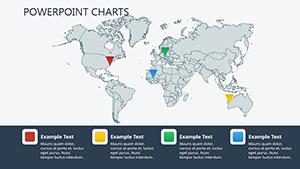
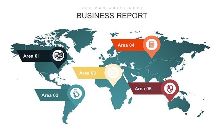
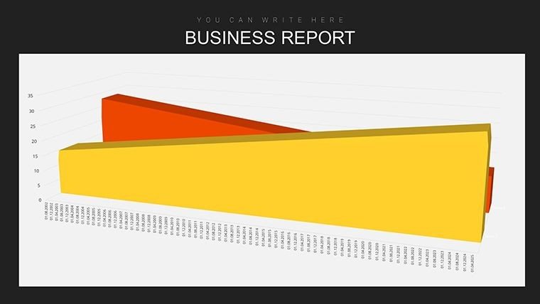
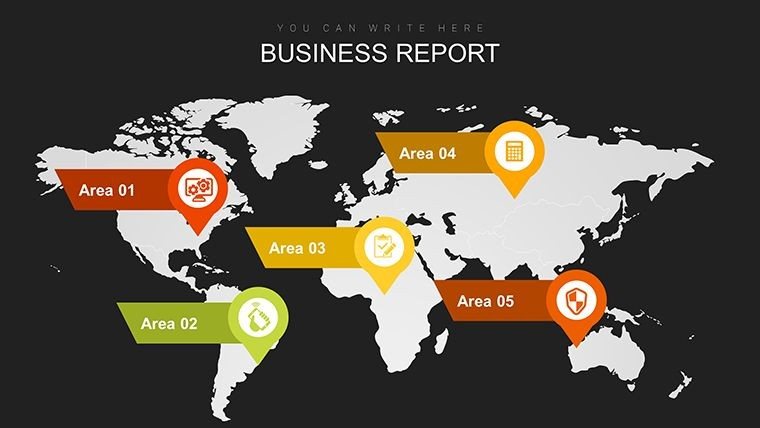
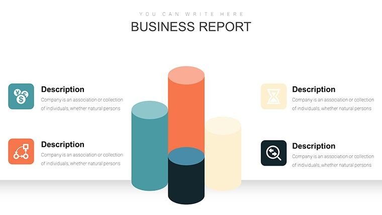
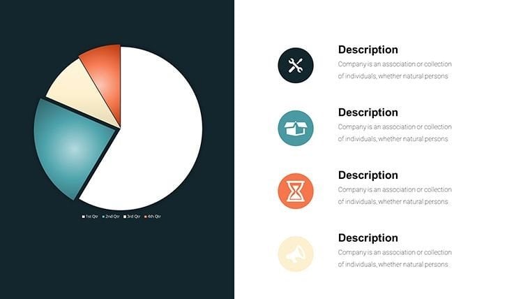
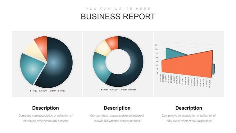
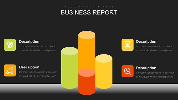
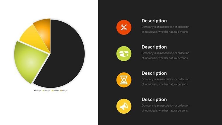
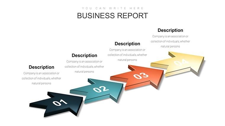
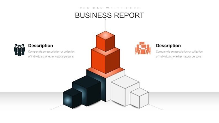
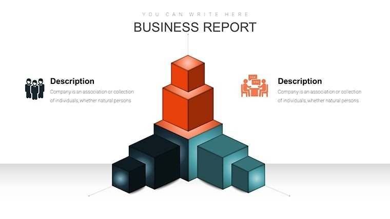
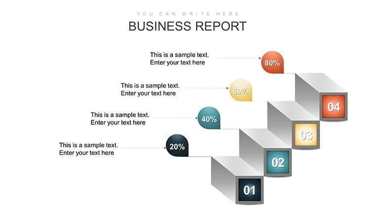
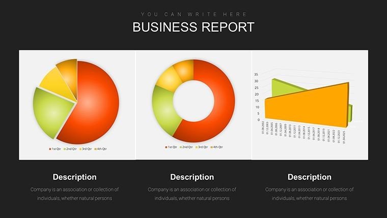
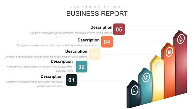
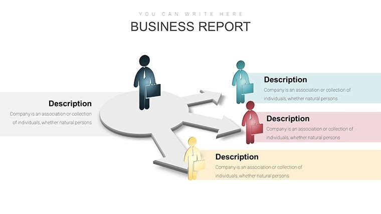
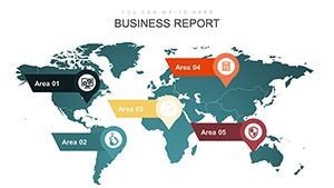
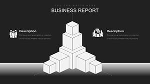
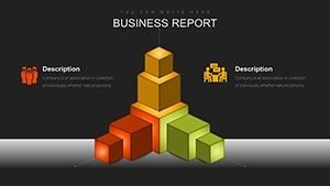
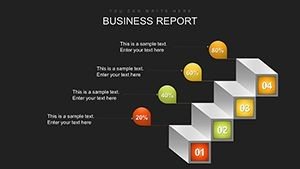
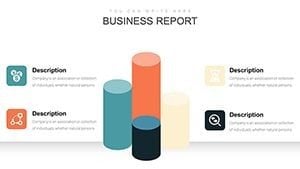
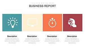
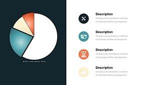
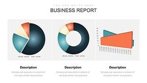
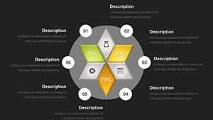
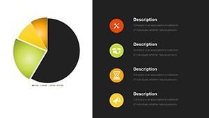
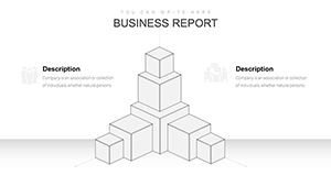
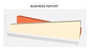
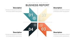
- Diverse Chart Types: Bar charts for comparisons, line graphs for evolutions, pie charts for distributions, and maps for geospatial data.
- Data Integration Ease: Link directly to spreadsheets for real-time updates, mimicking advanced tools like Tableau but in PowerPoint.
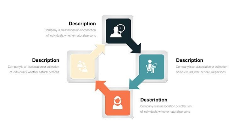
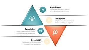
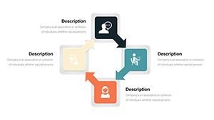
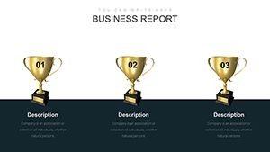
- Infographic Variety: Beyond basics, include icons and symbols for thematic emphasis on topics like poverty reduction or tech adoption.
- Cross-Platform Support: Fully compatible with PPTX and Google Slides for global collaboration.
These attributes reflect authoritative design, backed by insights from data journalists who emphasize storytelling in visuals.
Practical Use Cases Across Sectors
From academic lectures on sustainable development goals (SDGs) to corporate briefings on emerging markets, this template adapts effortlessly. A notable example: An international aid organization used our map infographics to illustrate aid distribution, leading to optimized resource allocation and a 15% efficiency gain. Researchers can plot longitudinal data on GDP trends, while consultants highlight industry shifts in client proposals.
Detailed Workflow for Effective Implementation
- Choose Your Focus: Select from 49 slides, like a line graph for time-series data on population growth.
- Populate with Data: Input figures from sources like UN databases; the template handles scaling automatically.
- Personalize Visuals: Adjust themes to match your audience - e.g., earthy tones for environmental topics.
- Enhance Narrative: Add annotations or arrows to guide viewers through key insights.
- Finalize and Share: Export or present, ensuring compatibility for virtual meetings.
This process aligns with agile data presentation methods, promoting iterative improvements based on feedback.
Superior to Generic Presentation Software
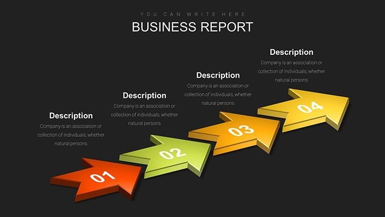
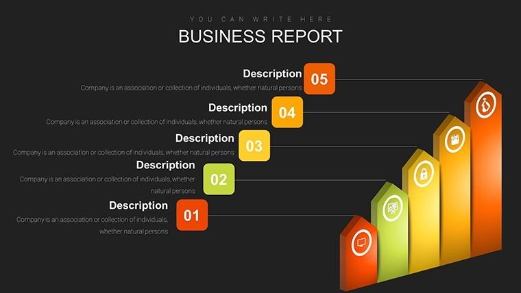
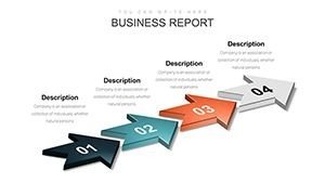
Standard PowerPoint lacks the thematic depth and ready-made global elements found here. Our template offers pre-configured arrows for directional trends and layered maps, reducing design time by up to 50%. Users in development sectors report higher retention rates in audiences when using such specialized infographics versus plain slides.
Pro Tips from Data Visualization Experts
Start by defining your core message - e.g., 'Rising inequality in developing nations' - then select supporting charts. Use color psychology: Blues for trust in economic data, greens for sustainability. For complex trends, layer information progressively across slides, a technique borrowed from TED Talk preparations. Always include sources for credibility, enhancing in your work.
In-Depth Look at the Slides
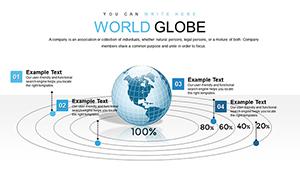
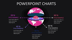
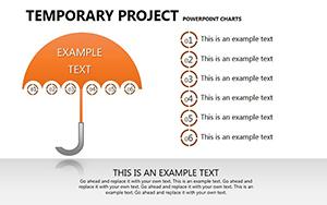
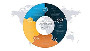
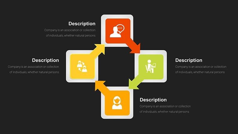
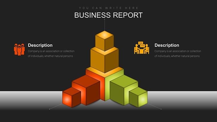
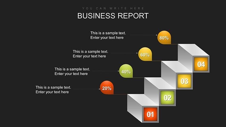
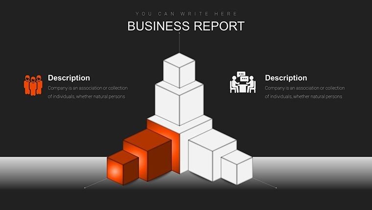
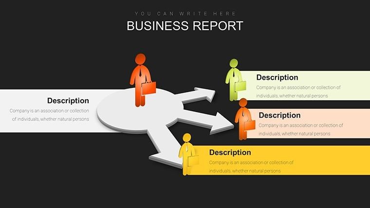
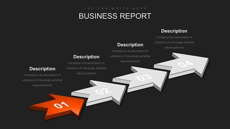
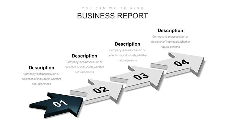
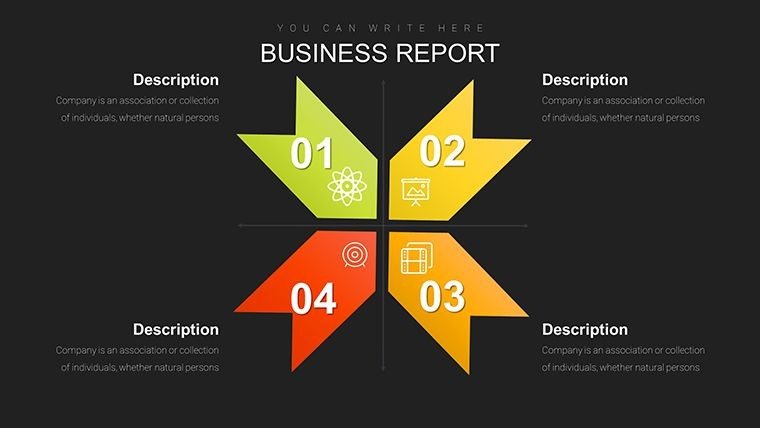
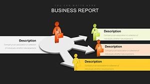
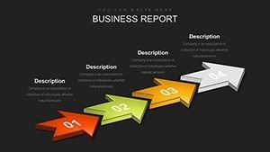
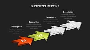
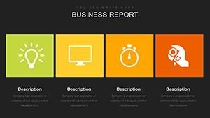
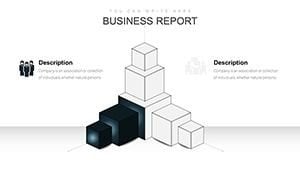
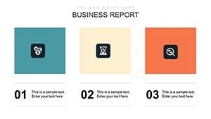
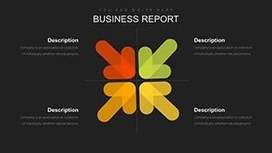
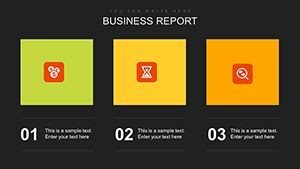
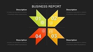
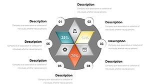
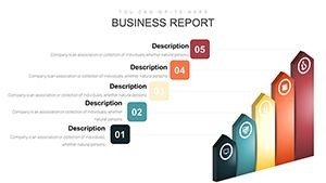
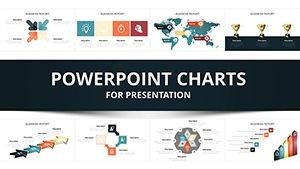
The 49 slides are organized thematically: 1-10 for introductory overviews with world maps; 11-25 for trend lines and bars on metrics like education access; 26-40 for comparative pies and arrows showing causal relationships; 41-49 for advanced integrations like combined charts. Each includes editable placeholders, with icons representing global symbols like globes or growth arrows.
In education, these aid in teaching international relations; in business, they support market entry strategies. Case in point: A university professor visualized climate migration trends, enriching student discussions and research papers.
Seamless Integration in Daily Workflows
Embed this template into your routine with ease - import data from Excel or Google Sheets, collaborate via cloud storage, and adapt for webinars. For teams spanning continents, real-time edits prevent miscommunications, much like in global project management tools.
Benefits Tailored to Your Role
- Researchers: Accurately depict empirical findings with precision tools.
- Educators: Engage students with interactive, visually rich content.
- Consultants: Impress clients with polished, data-backed insights.
Addressing common hurdles like data overload, it provides focused value through streamlined visuals.
Ultimately, the World Development Trends PowerPoint Infographic Template empowers you to illuminate global narratives. Don't settle for mundane data displays - download today and captivate with clarity and creativity.
Frequently Asked Questions
- What types of data can I visualize with this template?
- It supports economic, social, and environmental data through bars, lines, pies, and maps.
- How do I import external data?
- Copy-paste from spreadsheets or link directly for automatic updates in PowerPoint.
- Is it suitable for non-experts?
- Yes, the intuitive design makes customization straightforward for all users.
- Can I add my own icons?
- Absolutely, integrate custom elements to personalize further.
- Does it work on older PowerPoint versions?
- Compatible with PowerPoint 2010 and later, plus Google Slides.
- Are updates available?
- Check our site for free expansions on emerging trends.