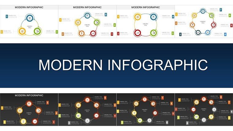
Modern Infographic Charts - Editable PPTX | ImagineLayout


Type: PowerPoint Charts template
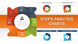
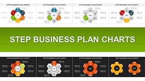
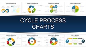
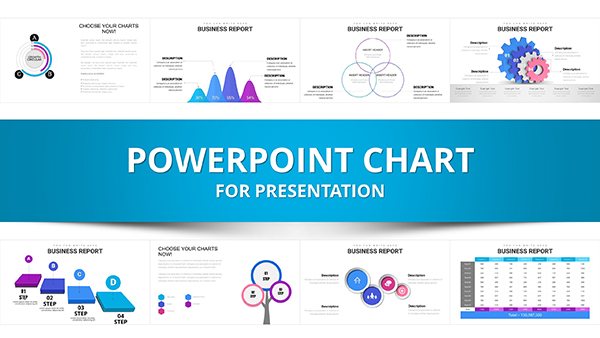
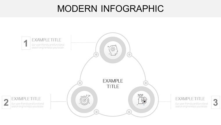
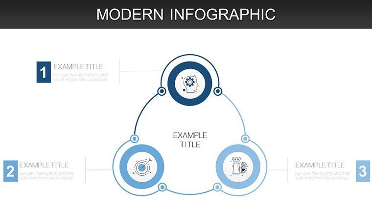
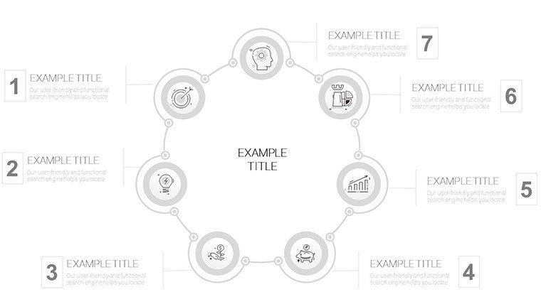
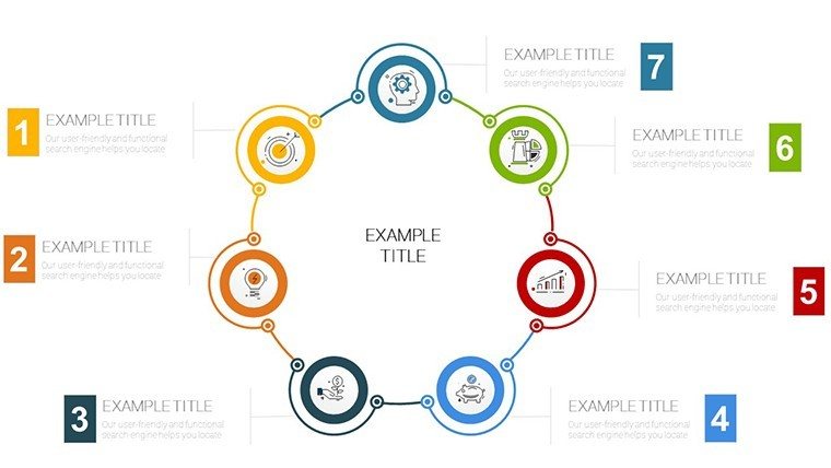
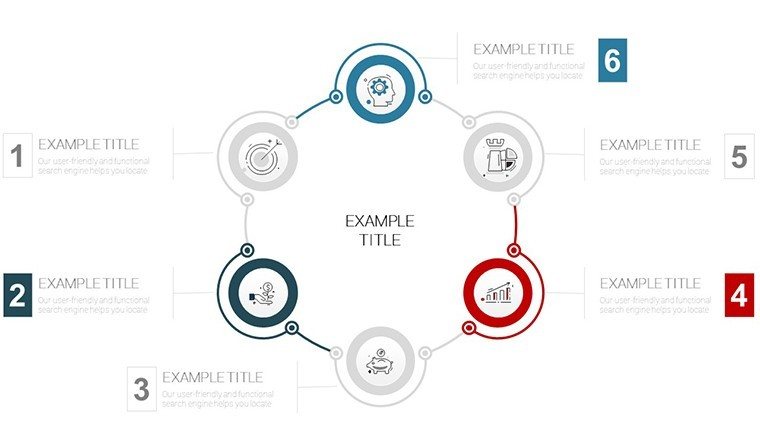
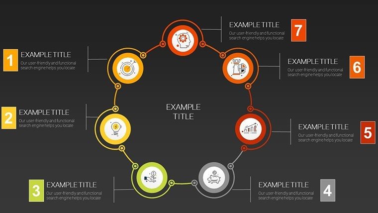
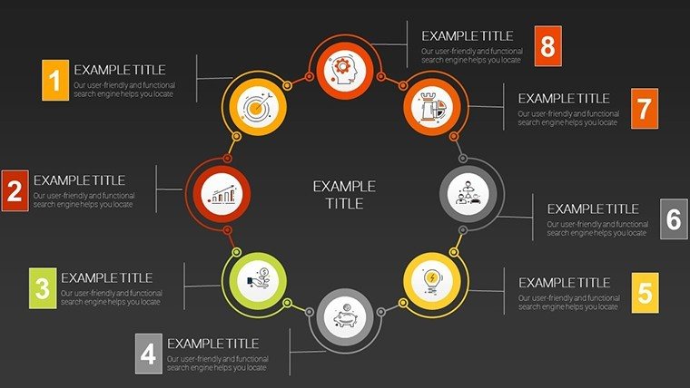
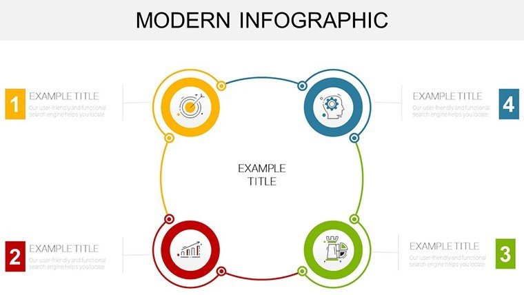
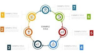
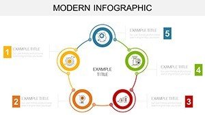
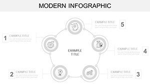
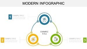
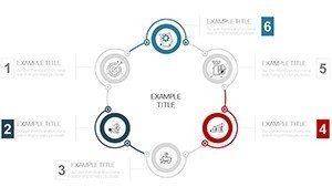
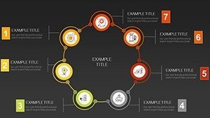
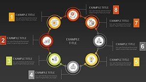
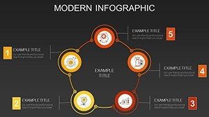
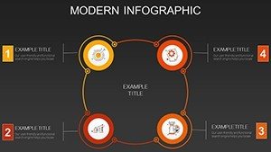
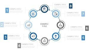
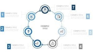
Category: Cycle
Sources Available: .pptx
Product ID: PC00913
Template incl.: 44 editable slides
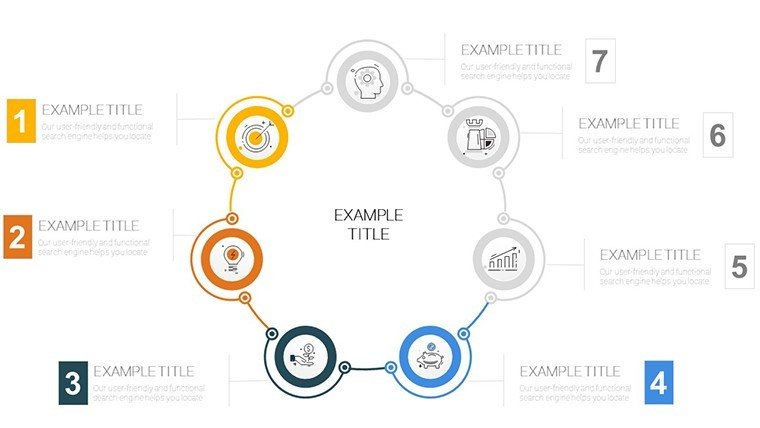
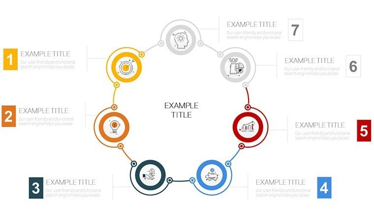
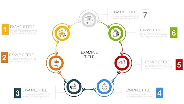
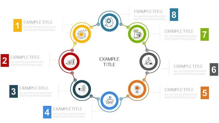
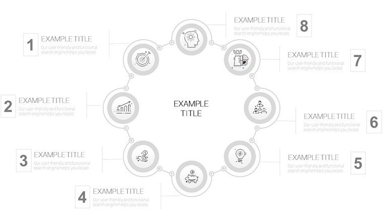
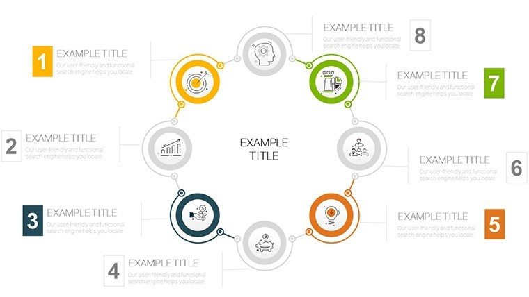
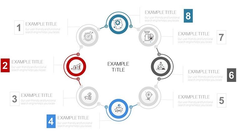
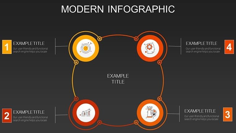
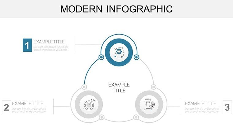
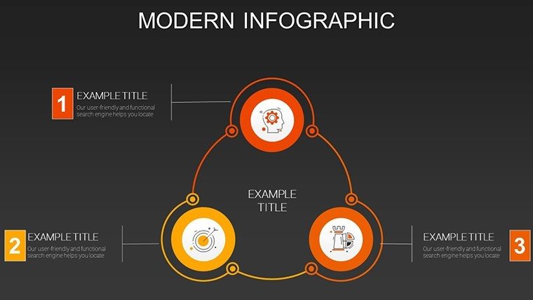
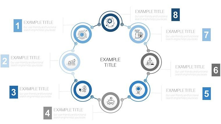
44 Slides, Multiple Infographic Types: Files and Formats Included
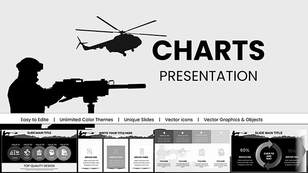
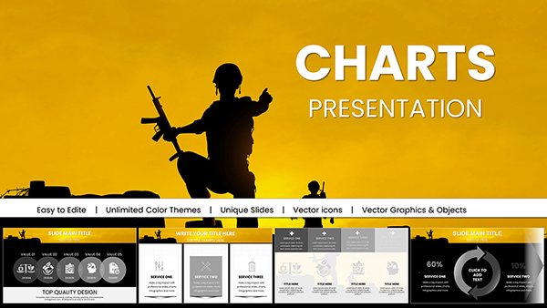
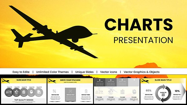
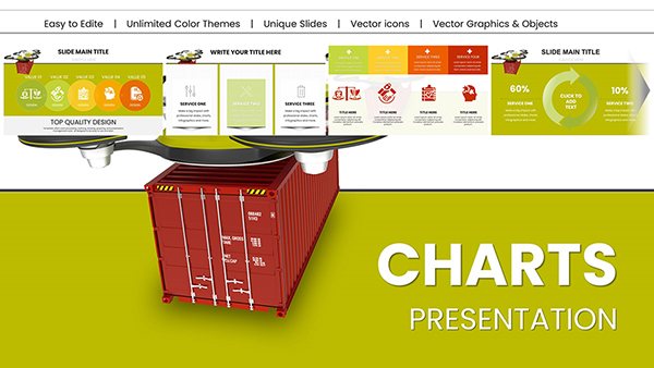
44 editable infographic diagrams arrive in the PPTX download.
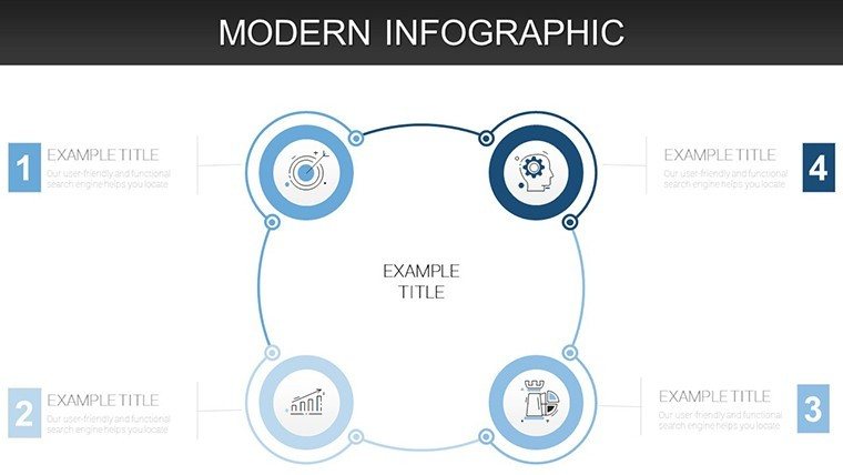
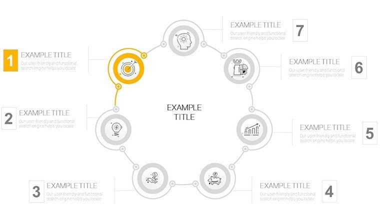
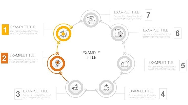
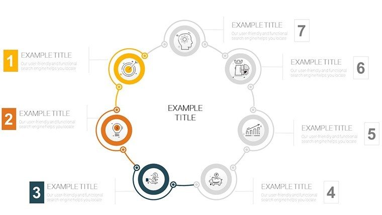
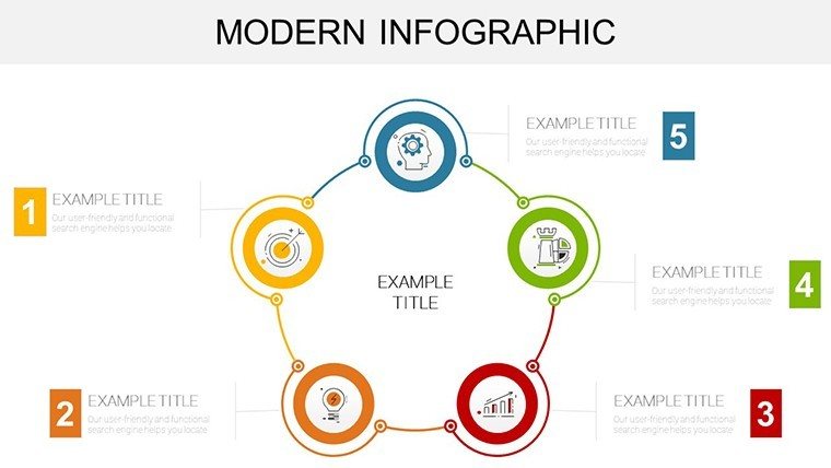
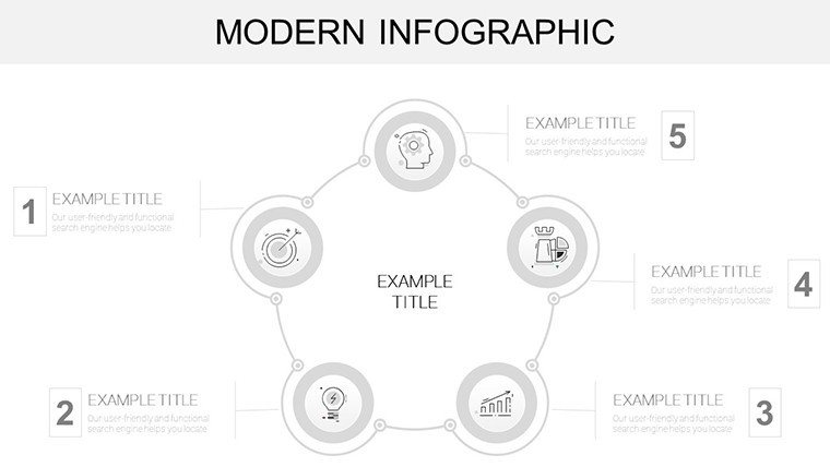
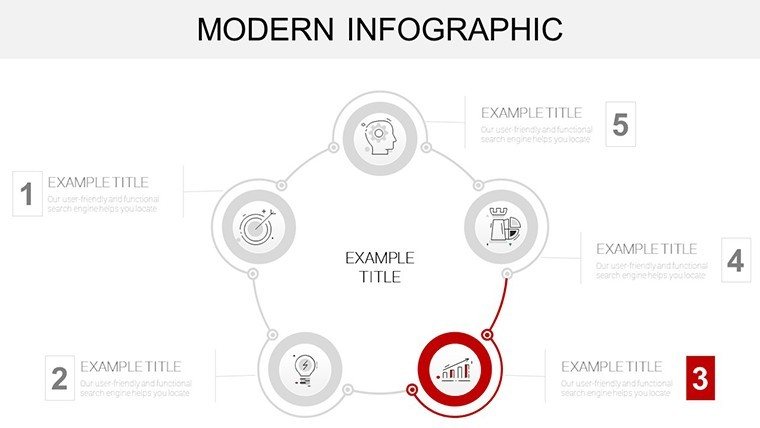
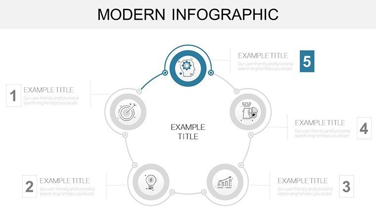
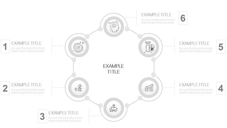
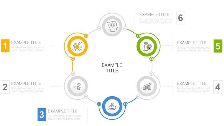
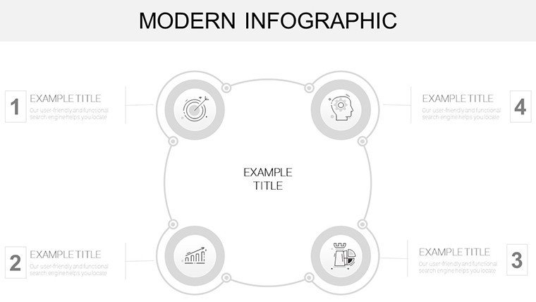
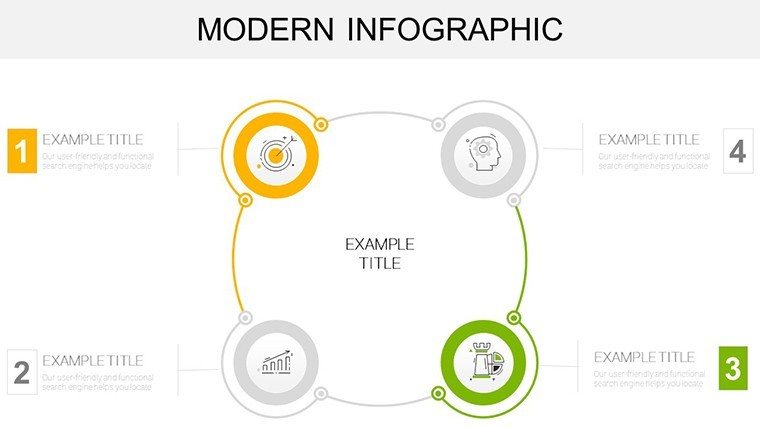
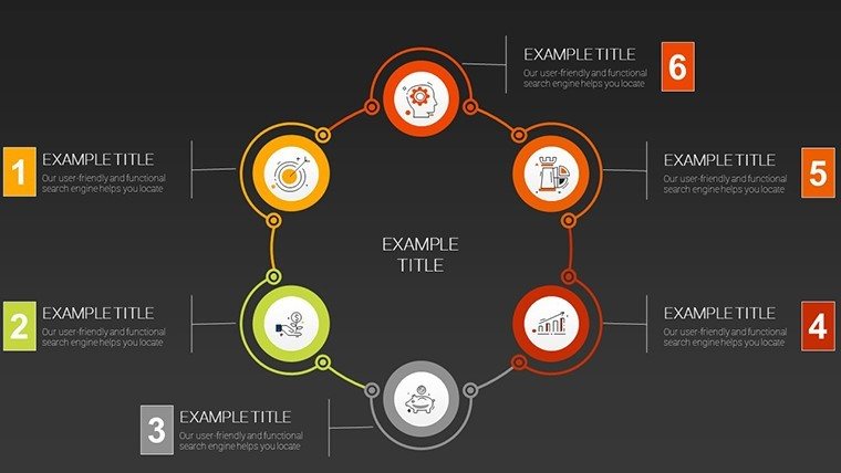
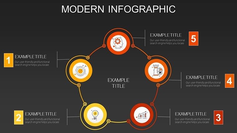
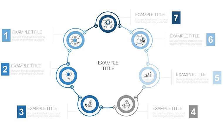
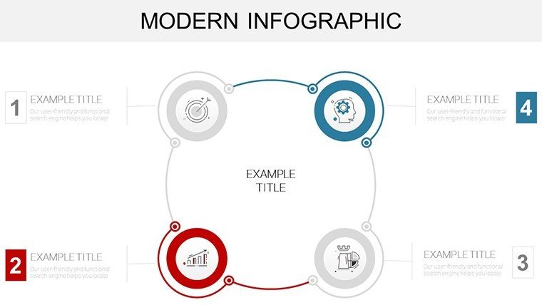
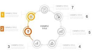
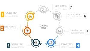
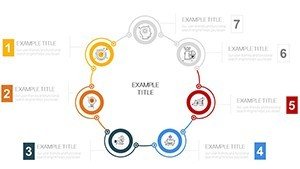
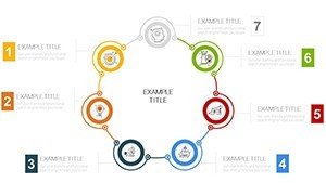
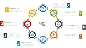
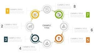
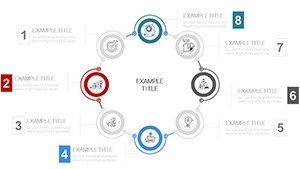
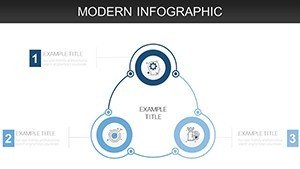
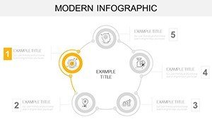
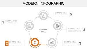
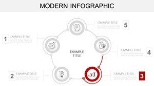
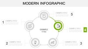
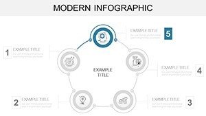
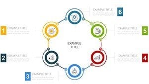
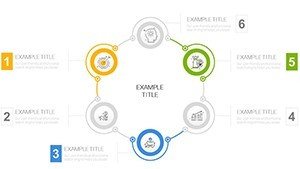
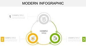
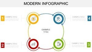
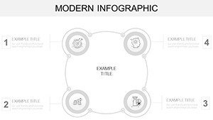
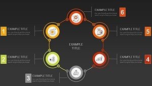
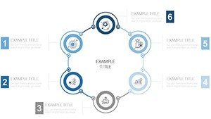
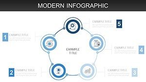
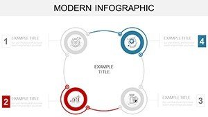
Layouts combine cycle timelines and comparison matrices to transform dense data into visual narratives through layout composition in business presentation contexts.
This template differs from static chart sets by integrating modern cycle and timeline elements with clean information spacing as one specific visual characteristic.
It excels at quarterly results storytelling in marketing because the flow direction and zone segmentation make data memorable without extra explanation.
The single purchase covers all 44 slides with full editing access.
At a Glance
| Feature | Details |
|---|---|
| Slides included | 44 infographic diagrams |
| Diagram categories | cycle timelines and matrices |
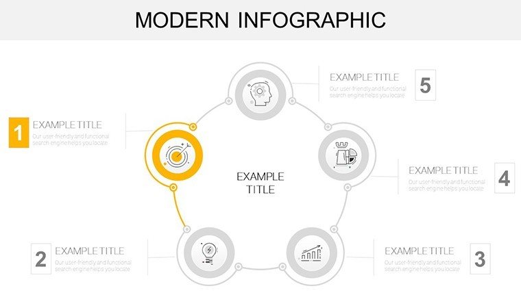
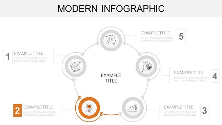
| Editable shapes | segments resize and recolor independently |
| Text placeholders | labels update without unlocking groups |
| Color theme adjustments | compatible with slide master palette |
| Diagram connectors | lines adjustable in direction and weight |
| Aspect ratio | 16:9 |
Customization in 5 Steps
Editing difficulty: Moderate.
1. Open the .pptx file in PowerPoint (1 minute).
2. Replace placeholder text with your content (3 minutes).
3. Adjust brand colors via the slide master (2 minutes).
4. Edit infographic labels and connectors (4 minutes).
5. Export as PPTX or PDF (1 minute).
Secure the full set of 44 infographic diagrams for your next data presentation.
From Strategy Decks to Boardroom Pitches
Marketing teams in agencies transform campaign data.
They reuse the infographics across client reports and reduce preparation from three hours to forty five minutes.
Financial analysts in corporate settings adapt the timelines for performance reviews and maintain flow direction when briefing executives in strategy workshops.
Professionals pair these with cycle process diagrams for workflow extensions.
Why This Template, Not a Blank Slide
Creating equivalent infographic slides manually takes two hours per slide for timeline alignment.
Intermediate design skill is required to achieve balanced layout composition.
Many presentations overload slides with text losing visual hierarchy on projection.
This layout uses external labels and segmented zones preserving readability during live meetings without added steps.
Teams reference cycle-powerpoint_chart-templates or step analysis layouts for further options.
Which PowerPoint versions does the template support?
The PPTX opens in PowerPoint 2016 and later versions including 2019 and Microsoft 365. Mac versions work as well. Earlier versions may need import but editable shapes and diagram connectors stay functional. Always verify compatibility on your system before large edits.
How do I change the color scheme?
Open the slide master view and update the theme colors once. All 44 diagrams receive the new palette through color theme adjustments automatically. No manual recoloring of each infographic element is required. The change takes under two minutes in any strategy meeting preparation.
What license terms apply for client work?
The single purchase permits use in paid client work and internal business presentation. You can modify diagrams for board briefing or investor deck needs. Resale of the file or diagrams as templates is not allowed. Sublicensing remains prohibited under the terms.
What file format is provided?
Only the PPTX format is included and opens directly in PowerPoint. No additional formats such as Keynote or JPG appear in the download. Export options remain available after edits via diagram connectors and text placeholders. The file size supports quick transfer for quarterly review preparation.
Does the template include animation support?
No built-in animations exist in the 44 slides. You can add standard PowerPoint entrance or emphasis effects to editable shapes afterward. Removal of any added animation requires only the animation pane. This keeps focus on visual hierarchy without extra complexity.
What differences exist between free and paid versions?
The page does not detail any free version. The paid purchase delivers the complete 44 editable slides in one PPTX file. Full access to all diagram categories and color theme adjustments becomes available immediately. No limited slide count or watermarks appear in the paid tier.