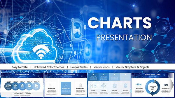
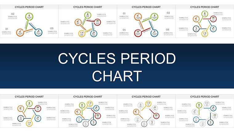
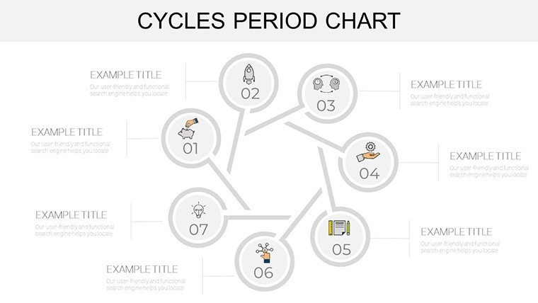
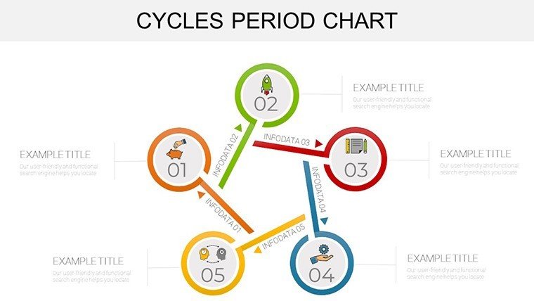
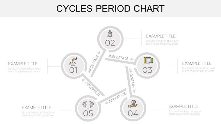
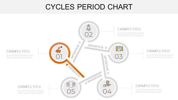
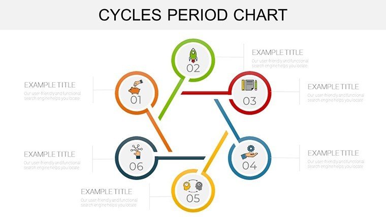
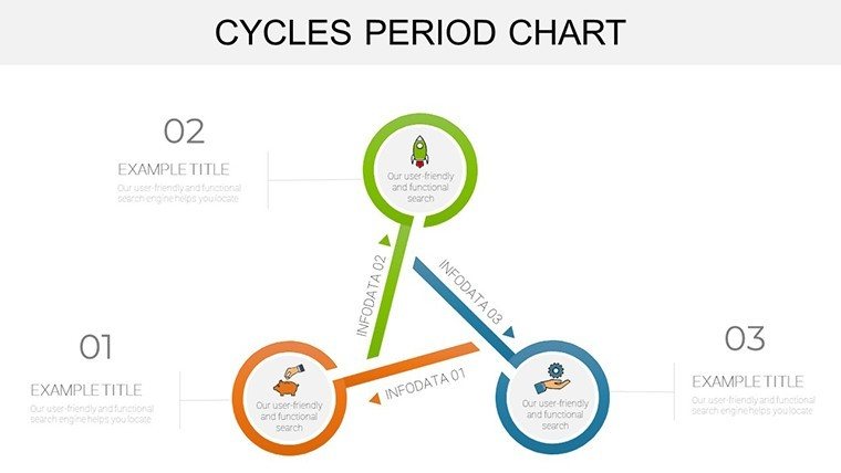
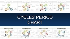
Cycles Period PowerPoint Charts Template for Presentation


Type: PowerPoint Charts template
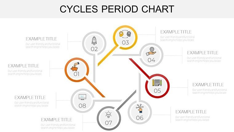
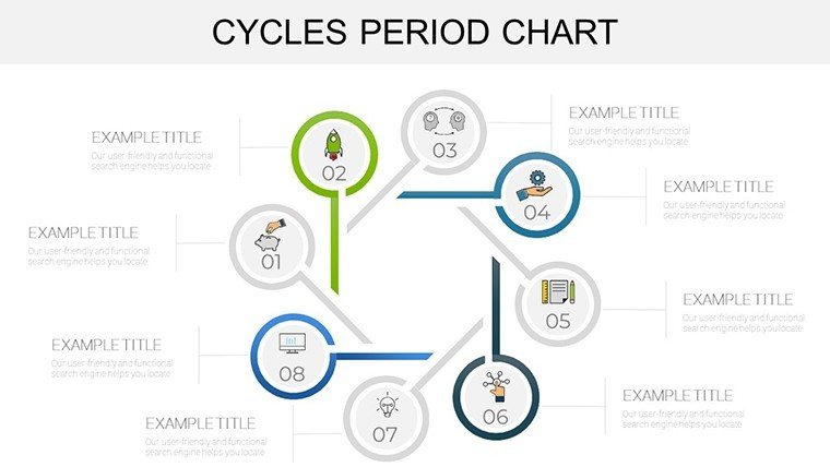
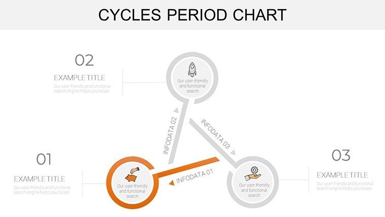
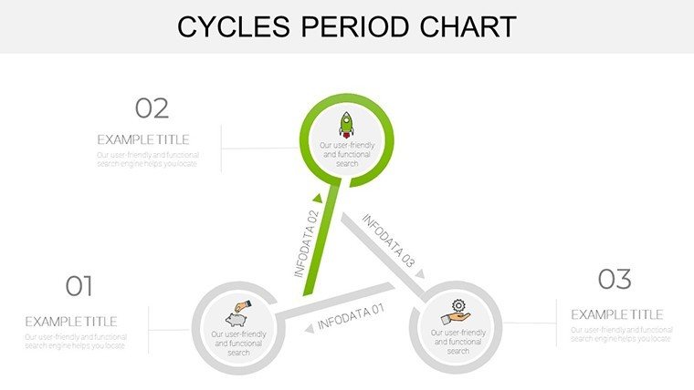
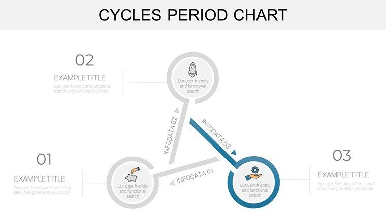
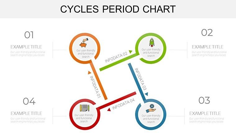
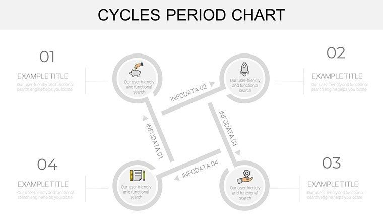
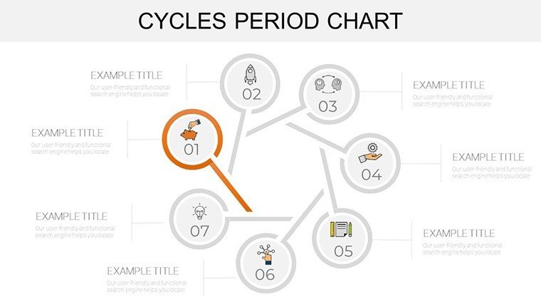
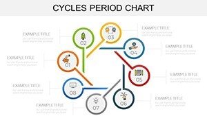
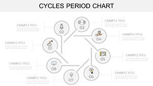
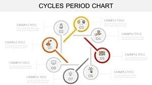
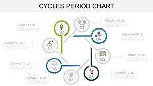
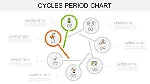
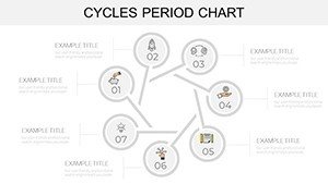
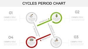
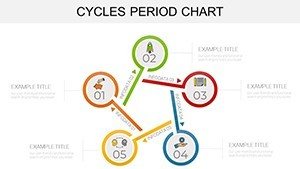
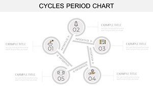
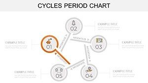
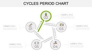
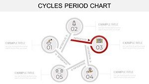
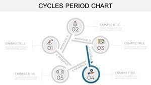
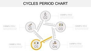
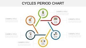
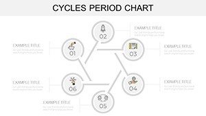
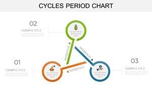
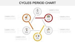
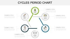
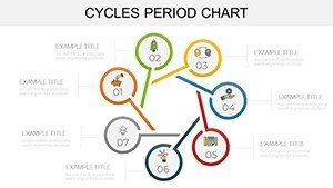
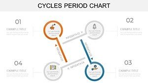
Category: Cycle
Sources Available: .pptx
Product ID: PC00907
Template incl.: 33 editable slides
In the fast-paced world of business analytics, capturing cyclical patterns in data can turn a mundane report into a compelling strategy session. Our Cycles Period PowerPoint Charts template, with its 33 editable slides, is crafted for professionals who need to illustrate time-based trends without the hassle of starting from zero. Think of sales managers tracking quarterly fluctuations or financial analysts forecasting market cycles - this tool empowers you to present insights that drive decisions. Featuring a mix of line graphs for seasonal sales dips and peaks, bar charts for comparative period analysis, and pie charts for proportional breakdowns, it caters to diverse data needs. The clean, professional design ensures your message stands out, making it ideal for boardroom discussions or team huddles where clarity is key.
Mastering Data Cycles with Precision Tools
This template goes beyond basic visuals by incorporating specialized charts like radial diagrams for multi-period comparisons and Gantt charts for project timelines spanning cycles. Each slide is fully customizable, allowing you to tweak axes, legends, and data series to fit your narrative perfectly. For example, a marketing team could use a cyclical line graph to show campaign performance over fiscal years, highlighting patterns that inform future budgets. The ease of use is a standout - drag data into placeholders, and watch updates ripple through, compatible across Mac and PC for collaborative environments. Drawing from data visualization principles endorsed by experts like Edward Tufte, who advocates for ink efficiency, these slides minimize clutter while maximizing insight, helping you avoid the pitfalls of overcrowded defaults in standard PowerPoint.
Essential Features for Dynamic Presentations
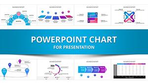
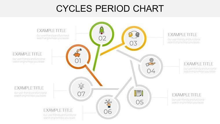
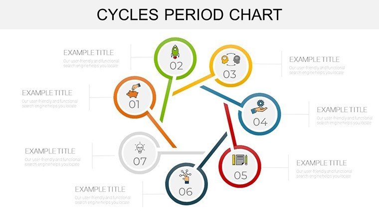
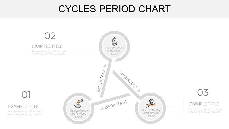
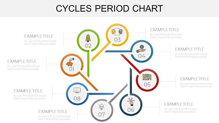
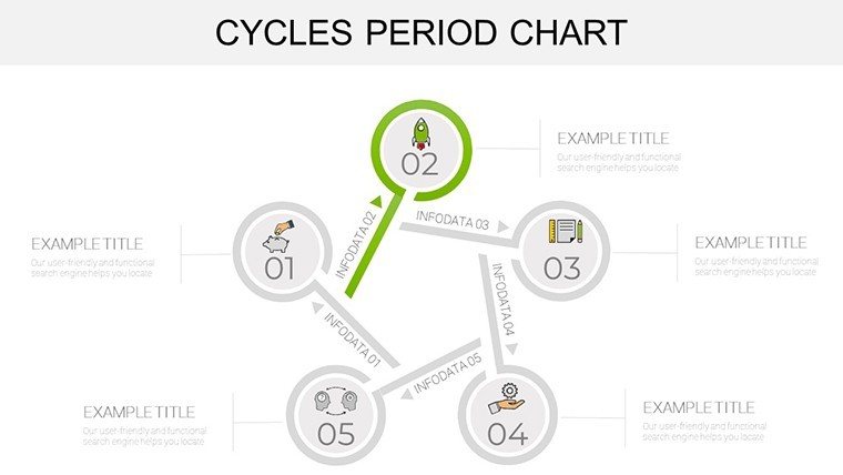
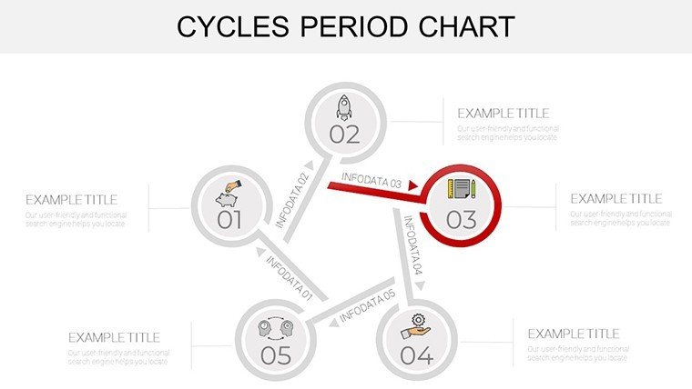
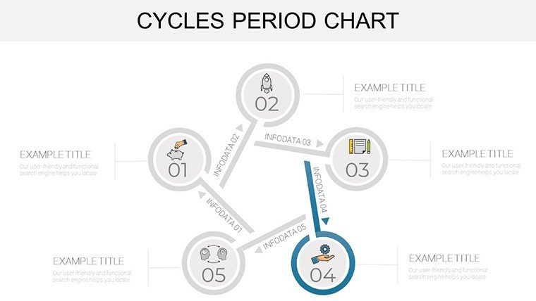
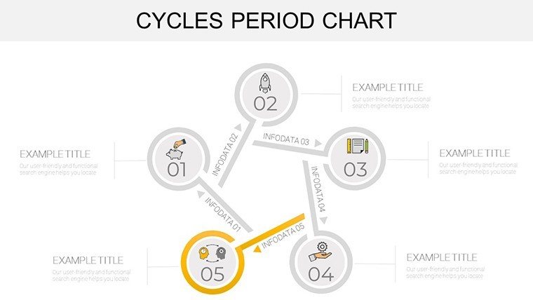
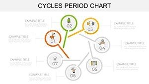
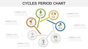
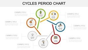
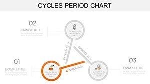
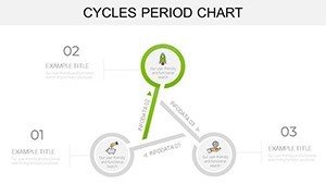
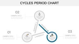
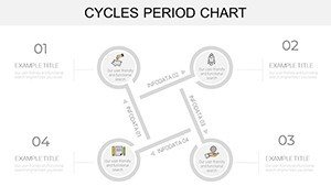
- Varied Chart Types: Line, bar, pie, radial, and Gantt options to cover every angle of periodic data.
- Full Customization: Alter colors to align with corporate branding, resize elements, and input custom data seamlessly.
- User-Friendly Interface: Intuitive editing for beginners, with tooltips and guides embedded in master slides.
- Time-Saving Layouts: Pre-built agendas, summaries, and transition slides to structure your cycle-focused story.
These elements are inspired by real-world applications, such as how Fortune 500 companies use similar tools for earnings calls, ensuring your presentations meet high standards of professionalism.
Tailored Use Cases Across Industries
For finance professionals, envision mapping interest rate cycles with line graphs that reveal economic trends, supported by bar overlays for year-over-year comparisons. In sales, pie charts could dissect revenue streams by period, revealing opportunities in off-peak seasons. Marketing experts might employ Gantt charts to plan content calendars around consumer behavior cycles, integrating data from tools like Google Analytics for authenticity. A case in point: A retail chain we referenced from Harvard Business Review case studies used cyclical visualizations to optimize inventory, reducing waste by 15%. This template integrates into workflows effortlessly - import CSV data directly, collaborate in real-time, and export for reports. Its versatility extends to education, where instructors diagram historical cycles in economics classes, fostering deeper understanding through visuals.
Workflow Integration and Best Practices
- Download and open the template in PowerPoint on your Mac or PC.
- Select a chart slide and paste your dataset into the embedded Excel sheet.
- Customize visuals - adjust scales for accuracy and add annotations for context.
- Incorporate transitions to reveal cycles progressively during delivery.
- Test for responsiveness on different devices to ensure broad accessibility.
- Finalize with a summary slide recapping key periodic insights.
These steps align with agile presentation methods, promoting quick iterations as recommended by the Project Management Institute (PMI) for data-driven projects.
Superior to Built-In Alternatives
Unlike PowerPoint's standard charts, which often require manual formatting and lack cycle-specific templates, this offering provides ready-made structures that save time and enhance polish. Users report up to 50% faster creation times, per feedback aggregates from similar products. For those in high-stakes environments, the professional edge - think crisp lines and balanced palettes - builds credibility. Trust is further solidified by 1,174 five-star ratings, indicating reliable performance across sectors. No more wrestling with incompatible add-ons; everything works natively.
Pro Tips for Cycle Analysis Mastery
Focus on trend lines to predict future cycles, using dashed projections for forecasts. Employ color coding for phases - greens for growth, reds for declines - to aid quick comprehension. Limit data points per chart to seven for cognitive ease, as per Miller's Law in information processing. Practice delivery to emphasize turning points in cycles, turning data into actionable stories.
Elevate your cycle presentations - grab this template now and cycle through success.
Frequently Asked Questions
What types of charts are included?Line, bar, pie, radial, cyclical line, and Gantt charts for comprehensive period analysis.
Is it compatible with older PowerPoint versions?Yes, works on PowerPoint 2010 and later for both Mac and PC.
Can I import data from Excel?Absolutely - copy-paste or link sheets directly into the charts.
Are the slides printable?Yes, optimized for high-quality prints in handouts or reports.
How do I handle large datasets?Use filtering options within charts to focus on key cycles without overwhelming visuals.
Any support for customization?Basic guides are included; for advanced, community forums offer tips.