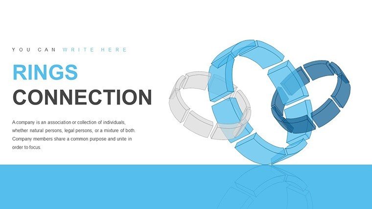
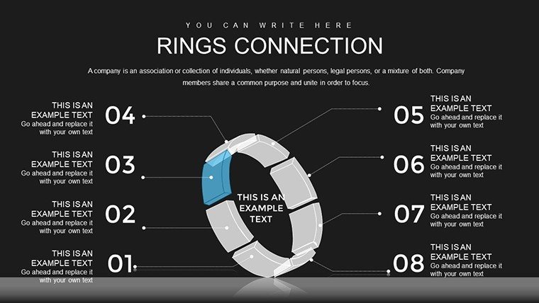
Rings Connection Charts - Editable PPTX | ImagineLayout


36 Editable Slides: Package Contents
36 editable rings connection diagrams arrive in the PPTX download.
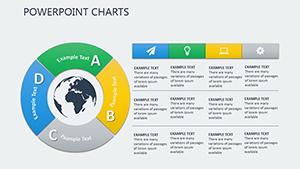
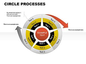
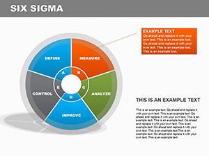
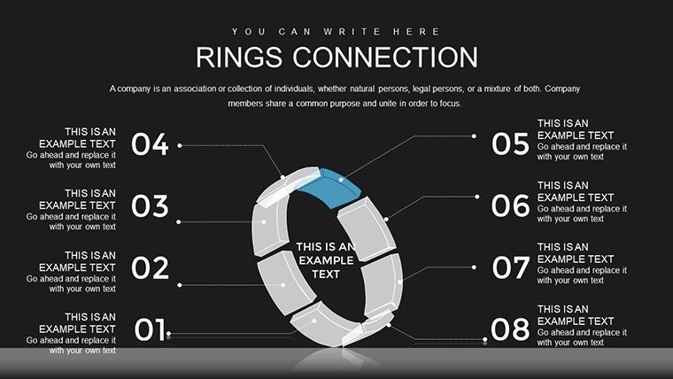
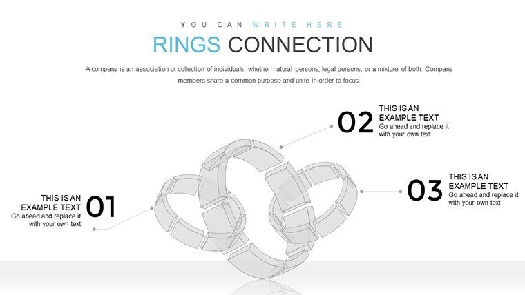
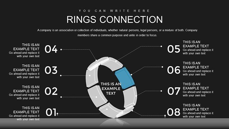
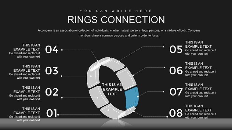
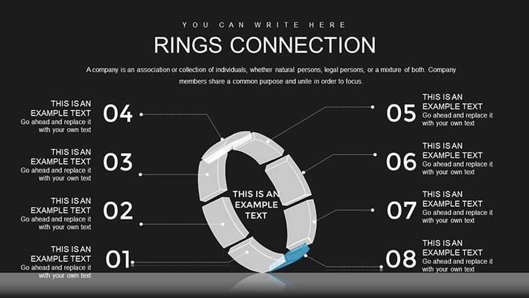
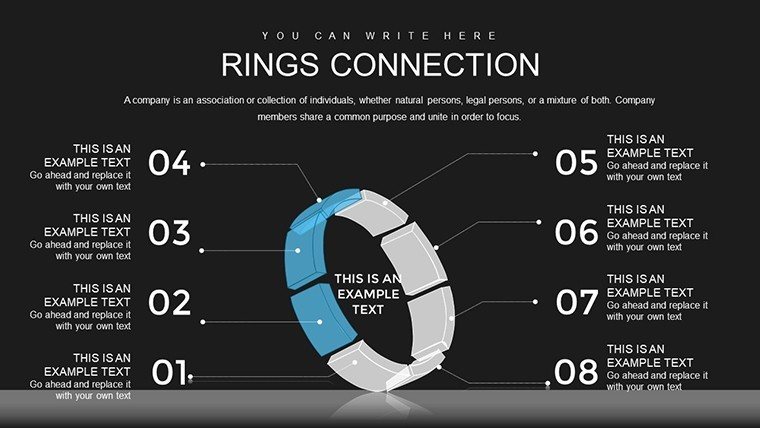
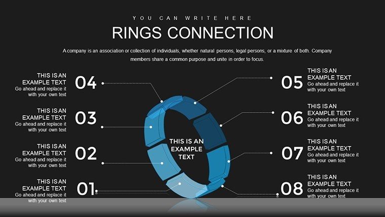
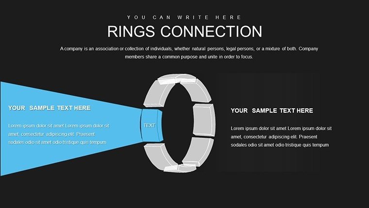
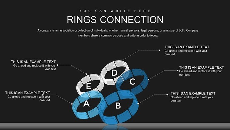
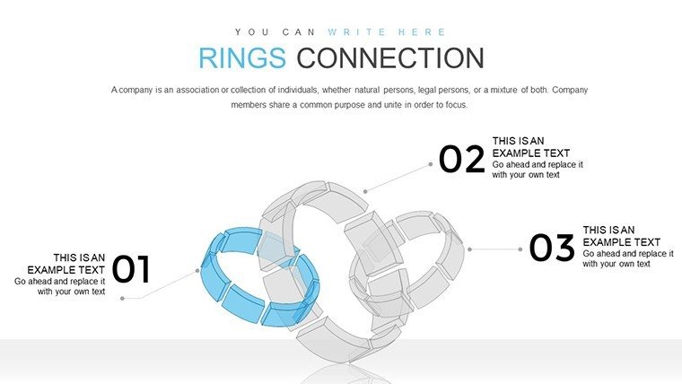
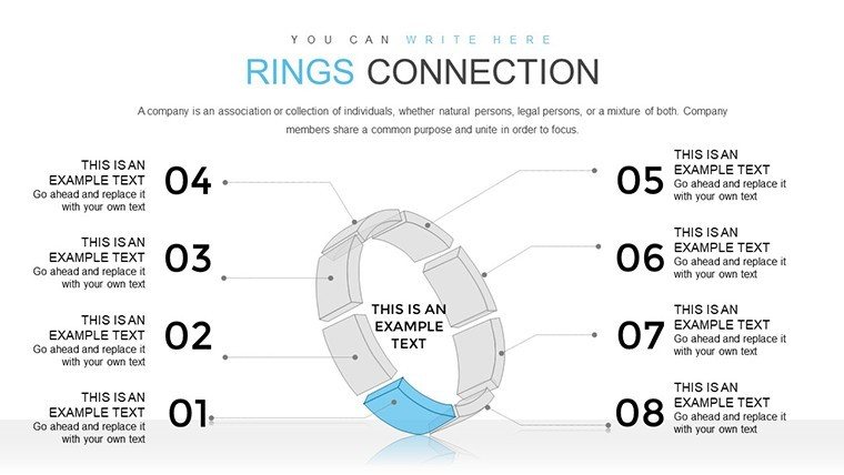
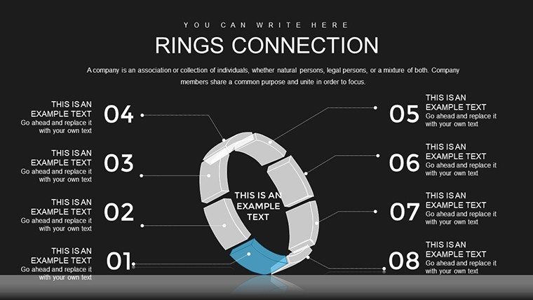
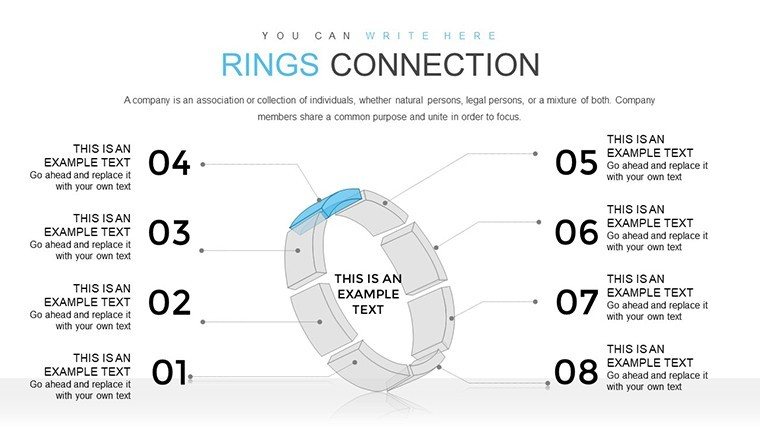
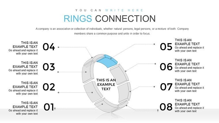
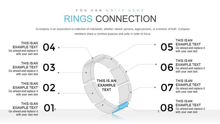
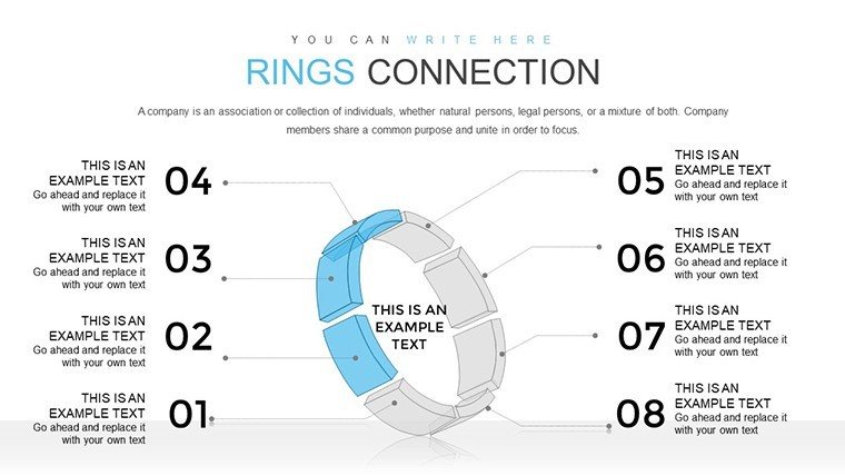
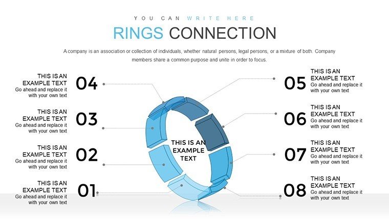
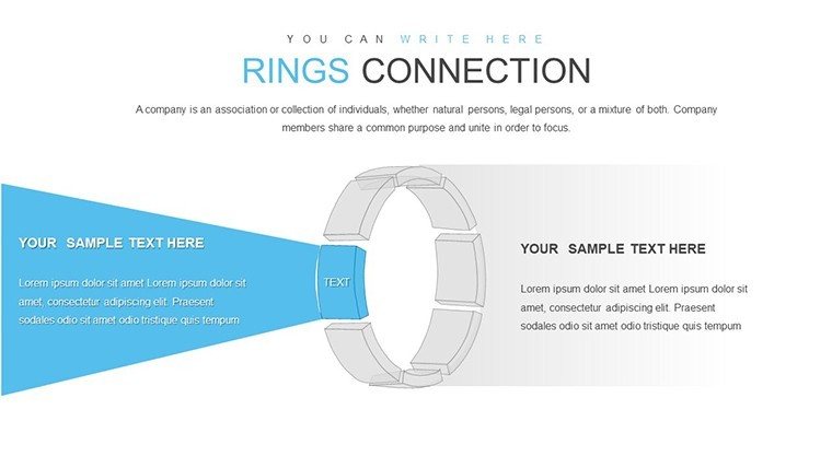
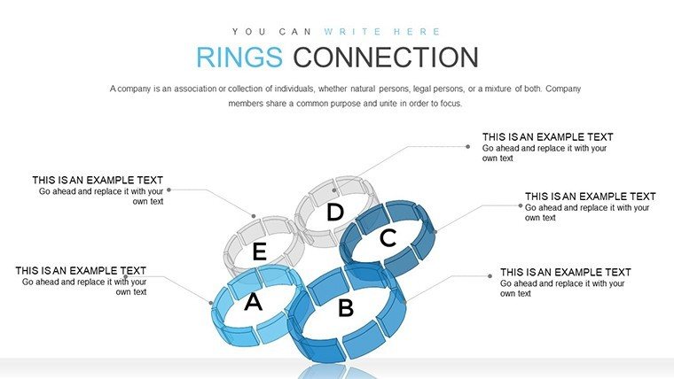
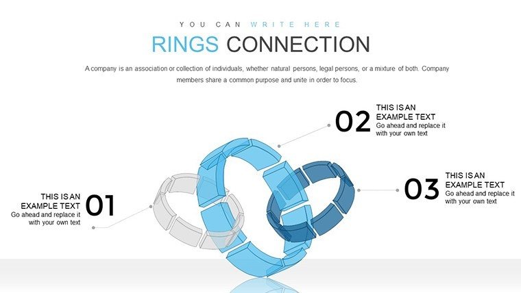
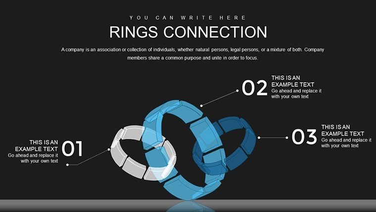
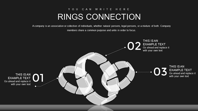
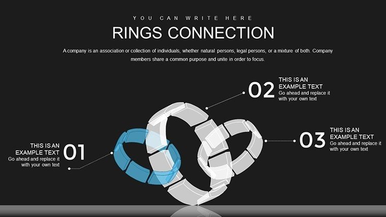
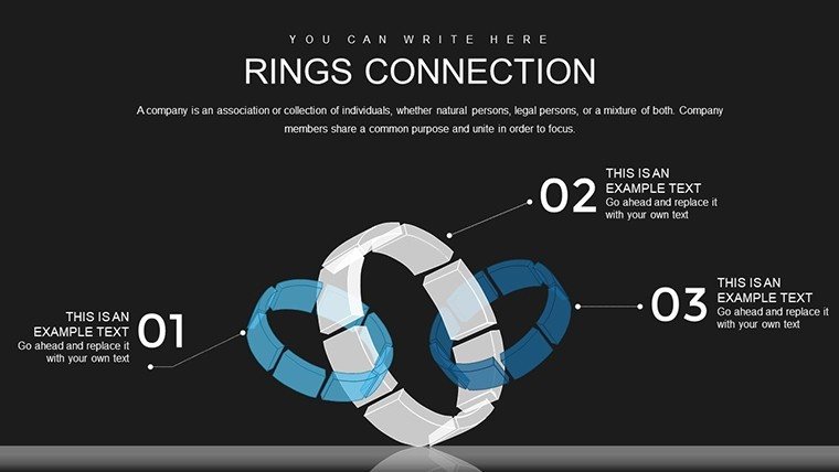
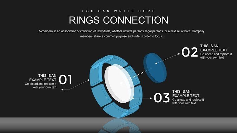
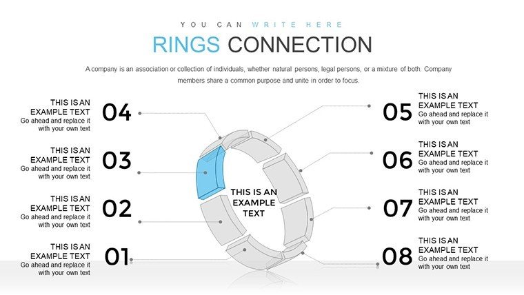
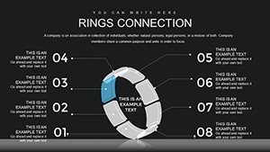
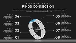
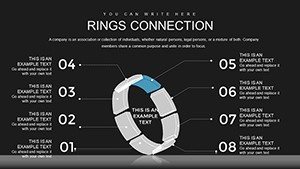
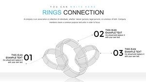
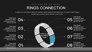
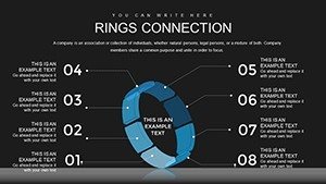
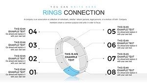
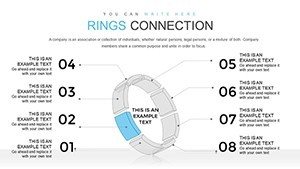
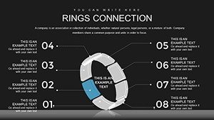
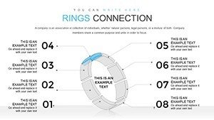
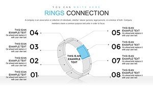
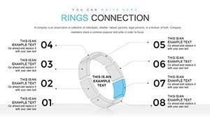
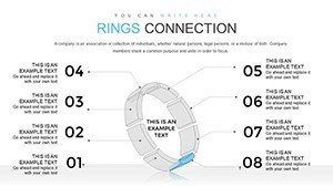
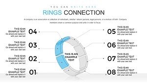
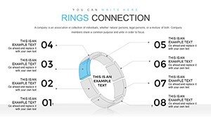
Layouts combine overlapping rings and cycle flows to map multi-phase initiatives through information spacing in business presentation contexts.
This set stands out with 3D ring volume visualization and interconnection lines unlike single-chart layouts or matrix puzzles as one specific visual characteristic.
It works best for multi-phase project mapping in internal reporting because the flow direction shows cross-functional dependencies at a glance.
The single purchase covers all 36 slides with complete editing options.
Technical Specs
| Feature | Details |
|---|---|
| Slides included | 36 rings connection diagrams |
| Diagram categories | cycle and process interconnections |
| Editable shapes | rings resize and recolor independently |
| Text placeholders | labels update without regrouping |
| Color theme adjustments | slide master palette updates all rings |
| Diagram connectors | lines adjustable in weight and direction |
| Aspect ratio | 16:9 |
From Download to Final Deck
Editing difficulty: Moderate.
1. Open the .pptx file in PowerPoint (1 minute).
2. Replace placeholder text with your content (3 minutes).
3. Adjust brand colors via the slide master (2 minutes).
4. Edit ring labels and connectors (4 minutes).
5. Export as PPTX or PDF (1 minute).
Secure the full set of 36 rings connection diagrams for your next project review.
Three Situations Where This Pays Off
Project managers in technology firms map cross-functional dependencies.
They reuse the rings across three client reports and reduce deck time from three hours to forty five minutes.
Internal teams in operations adapt the cycle layouts for quarterly briefings and maintain consistent information spacing when presenting to regional sales directors.
Professionals pair these with double ring cycle diagrams for layered workflows.
Building From Scratch vs. Starting Here
Creating equivalent rings diagrams manually demands two hours per slide for proper overlap alignment.
Intermediate design skill is required to preserve flow direction.
Many decks crowd labels inside rings reducing visibility during live meetings.
This layout keeps labels external with adjustable connectors maintaining readability without extra steps.
Teams also reference cycle-powerpoint_chart-templates or circle process layouts for complementary options.
Which PowerPoint versions does the template support?
The PPTX opens in PowerPoint 2016 and later versions including 2019 and Microsoft 365. Mac versions work as well. Earlier versions may need import but editable shapes and diagram connectors stay functional. Always verify compatibility on your system before large edits.
How do I change the color scheme?
Open the slide master view and update the theme colors once. All 36 diagrams receive the new palette through color theme adjustments automatically. No manual recoloring of each ring is required. The change takes under two minutes in any strategy meeting preparation.
What license terms apply for client work?
The single purchase permits use in paid client work and internal business presentation. You can modify diagrams for board briefing or investor deck needs. Resale of the file or diagrams as templates is not allowed. Sublicensing remains prohibited under the terms.
What file format is provided?
Only the PPTX format is included and opens directly in PowerPoint. No additional formats such as Keynote or JPG appear in the download. Export options remain available after edits via diagram connectors and text placeholders. The file size supports quick transfer for quarterly review preparation.
Does the template include animation support?
No built-in animations exist in the 36 slides. You can add standard PowerPoint entrance or emphasis effects to editable shapes afterward. Removal of any added animation requires only the animation pane. This keeps focus on visual hierarchy without extra complexity.
What differences exist between free and paid versions?
The page does not detail any free version. The paid purchase delivers the complete 36 editable slides in one PPTX file. Full access to all diagram categories and color theme adjustments becomes available immediately. No limited slide count or watermarks appear in the paid tier.