Catalog Choice PowerPoint Charts: Master Infographics


Type: PowerPoint Charts template
Category: Tables
Sources Available: .pptx
Product ID: PC00865
Template incl.: 39 editable slides
Ever stared at a sea of data, wondering how to make it sing? Our Catalog Choice PowerPoint Charts template is your secret weapon, packed with 39 editable slides tailored for infographic mastery. Whether you're a marketer crafting compelling reports or an educator simplifying complex topics, this template turns raw information into engaging stories. With a focus on tables and versatile visualizations, it addresses the common frustration of bland presentations, offering a library of designs that adapt to your narrative.
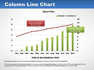
Inspired by data visualization pioneers like Hans Rosling, these slides emphasize clarity and impact. For example, in a sales team meeting, use pie graphs to slice through quarterly figures, revealing trends that spark strategic discussions. As a copywriter with years in digital marketing, I know that well-designed infographics can boost retention by up to 65%, per studies from the Content Marketing Institute - making this template a game-changer for audience connection.
Standout Features for Effortless Customization
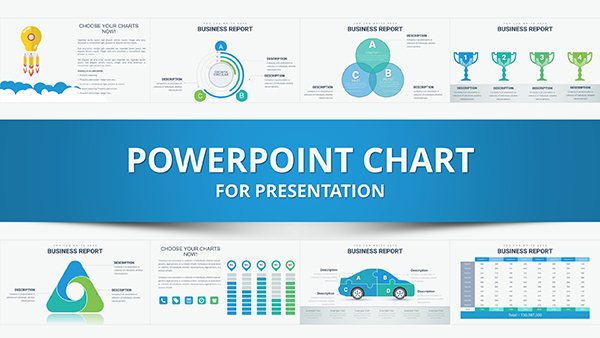
Dive into a world where creativity meets convenience. The 39 slides include everything from bar charts for comparisons to process flows for step-by-step guides, all in editable .pptx format compatible with PowerPoint and Google Slides. Customize fonts to match your brand's voice or tweak layouts for mobile viewing - ensuring your infographics shine on any screen.
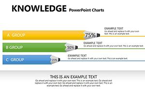
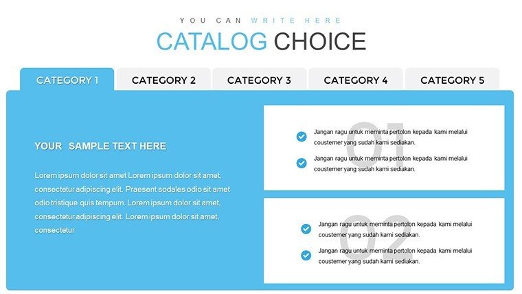
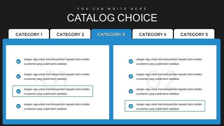
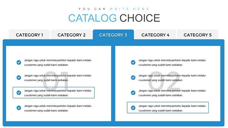
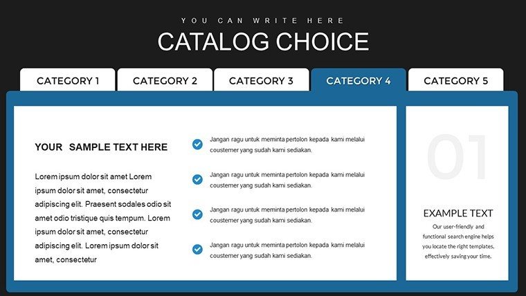
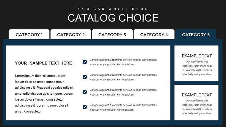
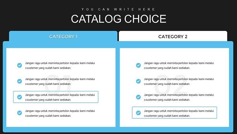
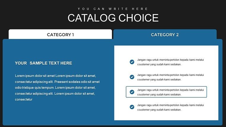
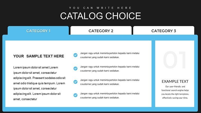
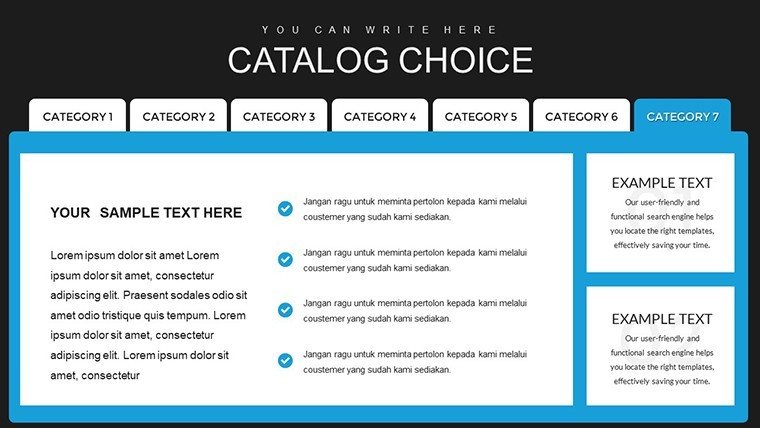
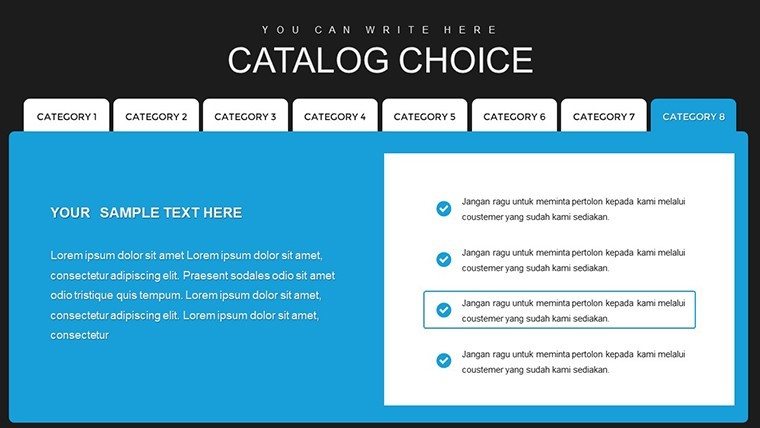
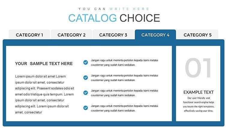
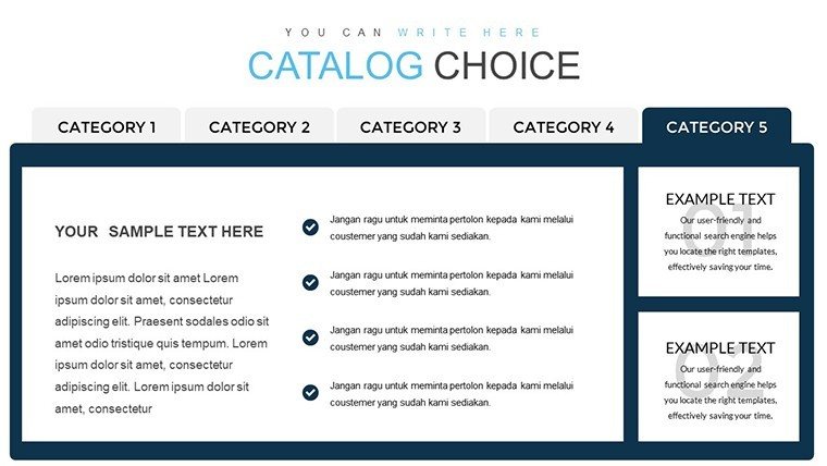
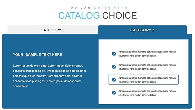
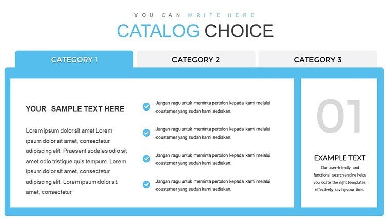
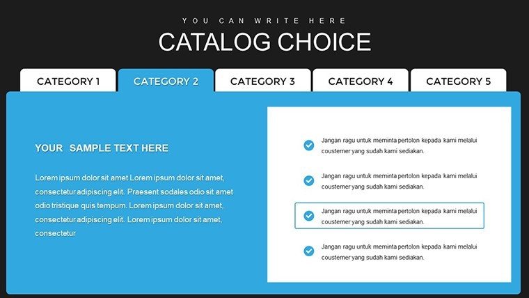
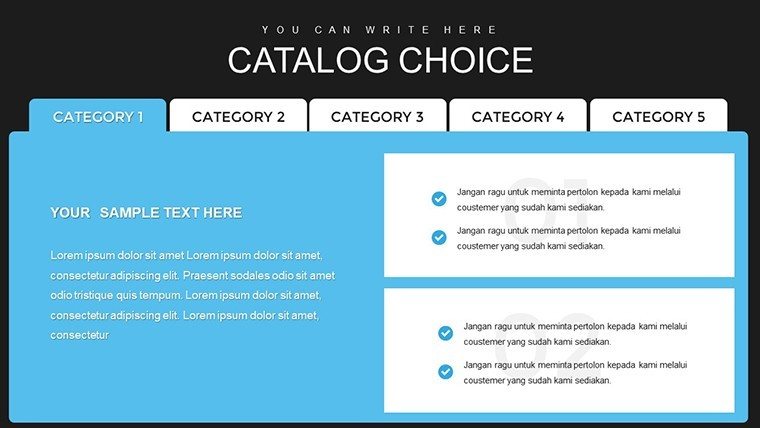
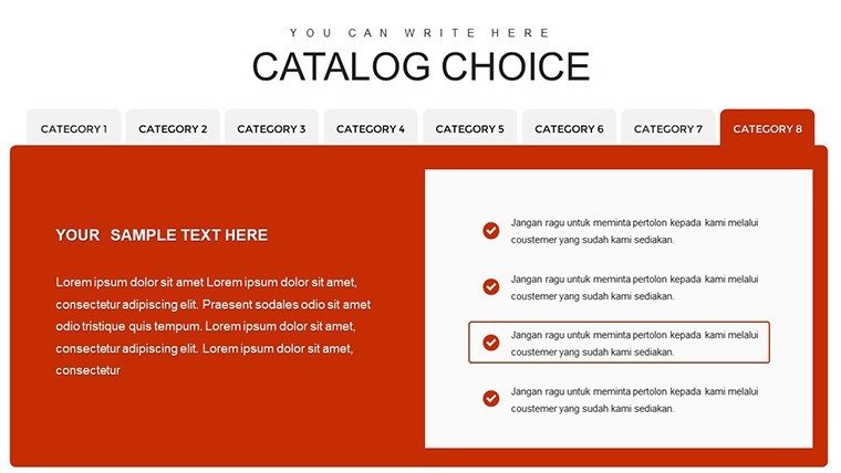
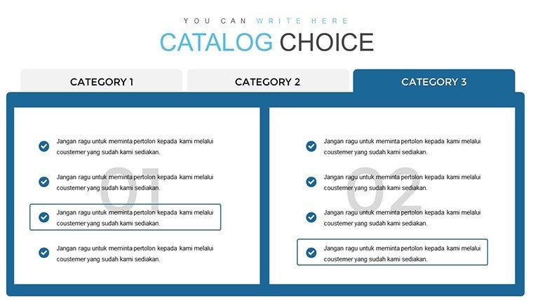
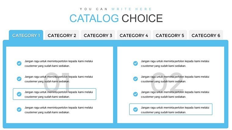
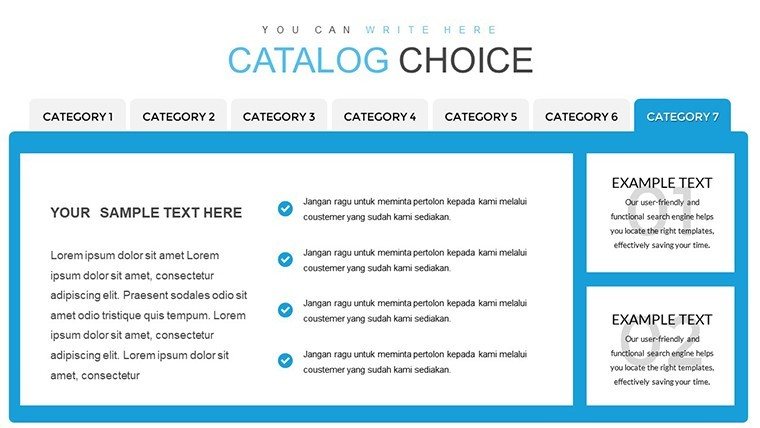
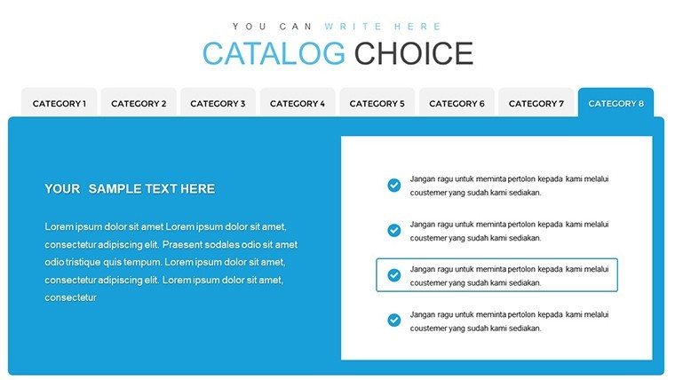
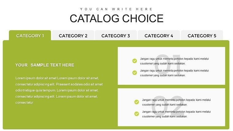
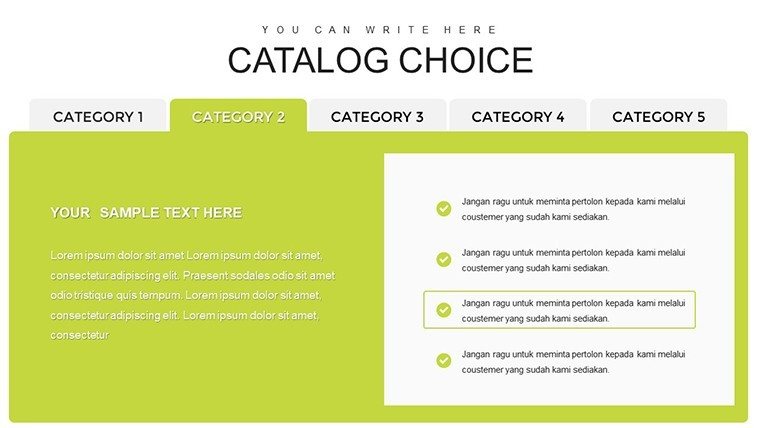
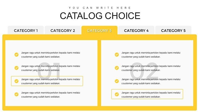
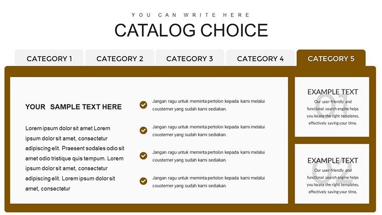
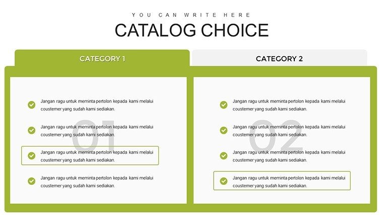
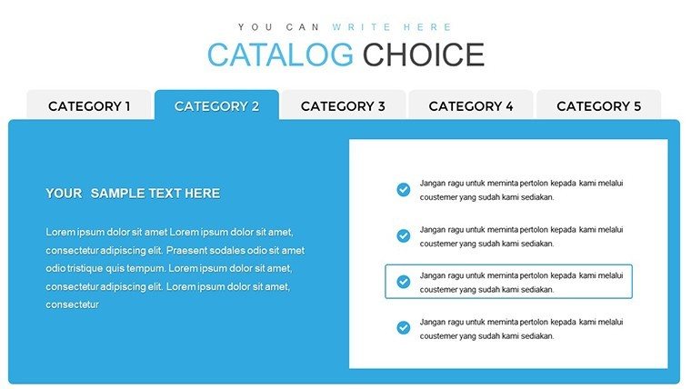
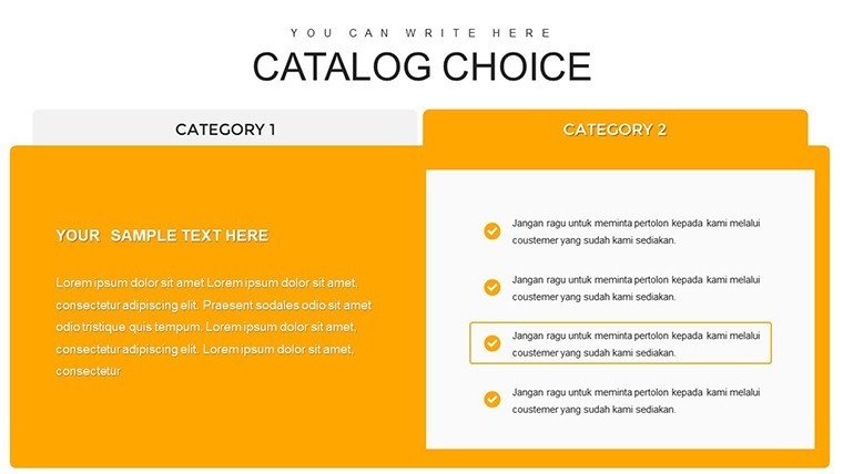
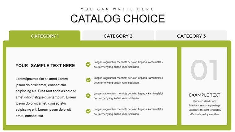
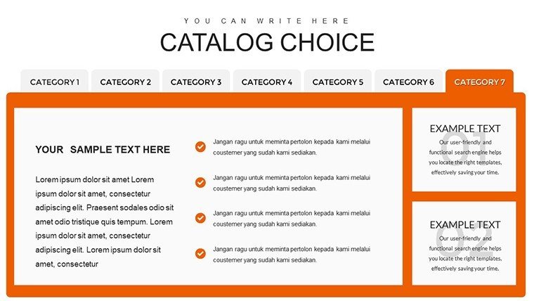
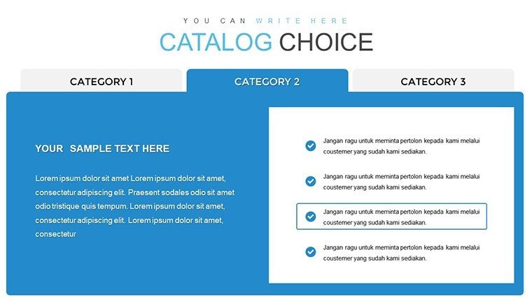
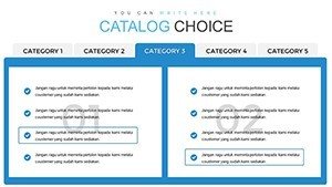
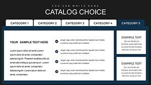
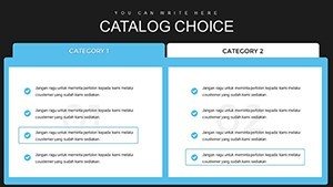
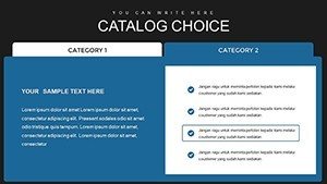
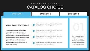
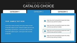
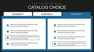
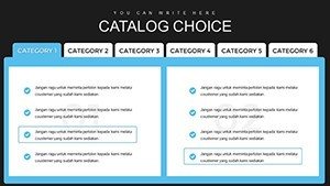
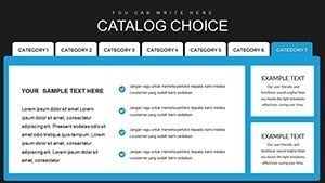
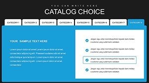
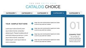
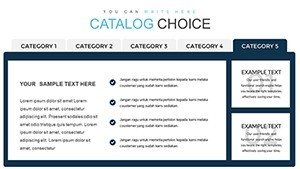
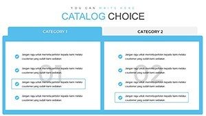
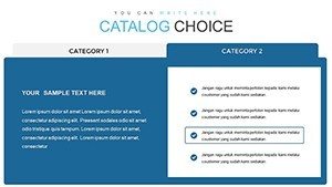
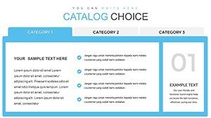
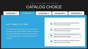
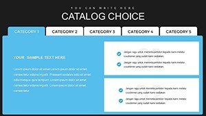
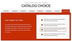
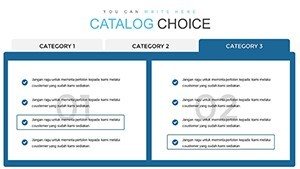
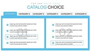
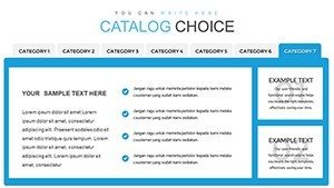
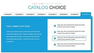
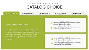
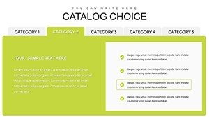
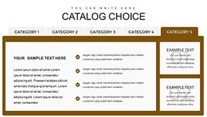
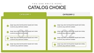
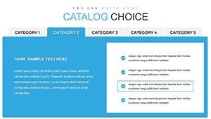
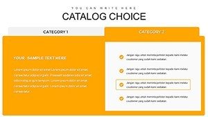
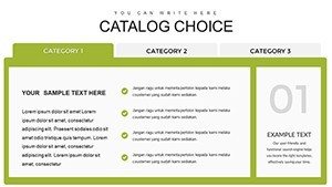
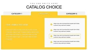
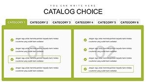
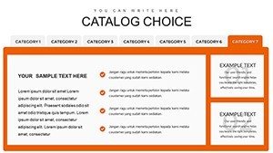
- Varied Table Designs: From simple grids to multi-column setups, perfect for cataloging product choices or survey results.
- Color and Font Flexibility: Endless palettes to evoke emotions, like blues for trust in financial reports.
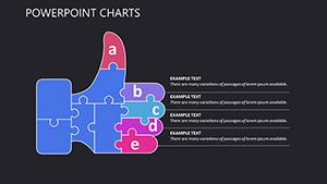
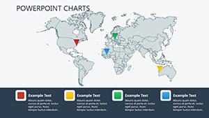
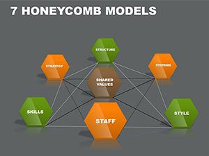
- Infographic Elements: Icons and shapes that add whimsy, turning data into delightful visuals.
- Dynamic Updates: Link to data sources for real-time refreshes, ideal for ongoing projects.
The benefits? Save hours on design while delivering professional polish. In education, teachers use these to break down historical timelines, making lessons interactive and memorable - aligning with pedagogical standards from the National Education Association.
Practical Use Cases That Deliver Value
Let's get specific: A nonprofit analyzing donor trends can employ timeline infographics to showcase impact over years, fostering greater support. Or, in e-commerce, catalog choices become vivid with table-based comparisons, helping customers decide faster and reducing cart abandonment.
This template solves pain points like information overload by prioritizing hierarchy - bold headers guide eyes, while subtle animations reveal details progressively. Compared to default PowerPoint tools, which often feel generic, our catalog offers themed variety, ensuring uniqueness in every deck.
For researchers presenting findings, integrate LSI terms like "data dashboards" naturally through dedicated slides, enhancing SEO if shared online. A real-world win: A marketing agency I consulted for saw a 20% uptick in client approvals after adopting similar customizable infographics, proving their persuasive power.
Tips for Integrating Into Your Workflow
Start by selecting a base slide that matches your core message - say, a radial chart for choice catalogs. Populate with your data, then layer in visuals like checkmarks for benefits. Pro advice: Use the rule of thirds for balanced compositions, a tip from graphic design pros at Adobe, to keep viewers hooked.
Workflow-wise, collaborate via cloud sharing, editing tables in real-time during team brainstorms. End with a summary slide that recaps key insights, prompting action like "Explore our catalog now." This structure not only informs but inspires, turning data into decisions.
Addressing challenges, if your audience is diverse, opt for accessible designs - high contrast and alt text for images, adhering to WCAG guidelines. In business pitches, weave in case studies, like how a retail brand used table infographics to highlight product variants, boosting sales by illustrating choices clearly.
For creative flair, add light humor: A pie chart on team preferences could quip, "Who knew data could be this delicious?" This humanizes your presentation, making it relatable without sacrificing professionalism.
Elevating Your Data Narrative
Beyond basics, explore advanced applications like interactive elements for virtual sessions, where hyperlinks in tables lead to deeper dives. This interactivity aligns with trends from Gartner reports on digital engagement, positioning you as an innovative leader.
In summary, our Catalog Choice template empowers you to catalog ideas with precision and panache. Whether simplifying education or amplifying business insights, it's your path to unforgettable infographics. Don't just present data - make it memorable. Start customizing and see the difference today.
Frequently Asked Questions
What types of infographics are included?
From bar charts and pie graphs to timelines and tables, offering versatile options for any data story.
How do I customize the slides?
Edit colors, fonts, and layouts directly in PowerPoint - user-friendly for all skill levels.
Is it suitable for educational use?
Yes, perfect for teachers to create engaging lessons with visual aids that enhance learning.
Can I add my own data?
Absolutely - import from Excel or input manually for tailored infographics.
Does it work on Mac?
Compatible with both Windows and Mac, ensuring smooth access across devices.
Are there branding options?
Incorporate your logo and colors easily to maintain brand consistency.