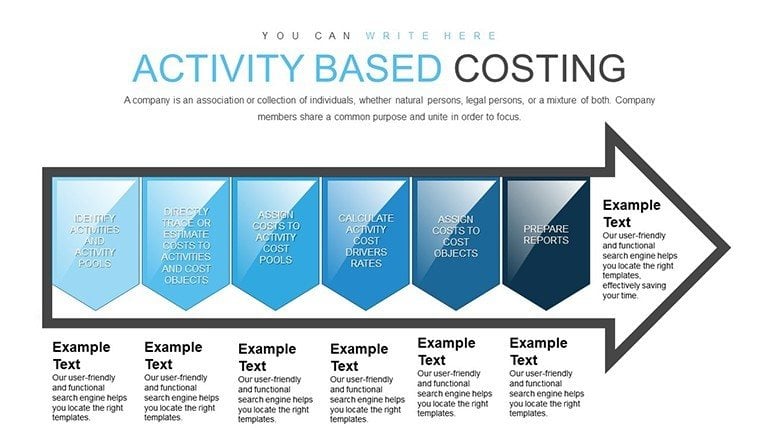
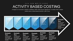
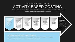
Activity-Based Costing Arrow PowerPoint Charts Template for Presentation


Type: PowerPoint Charts template
Category: Arrows
Sources Available: .pptx
Product ID: PC00823
Template incl.: 30 editable slides
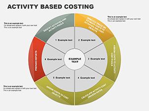
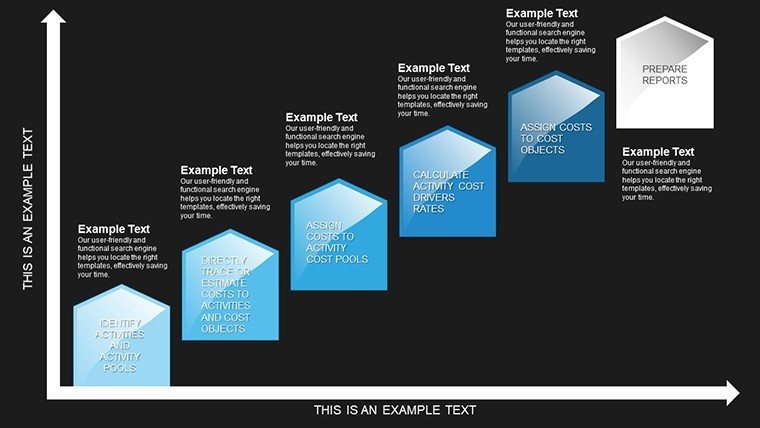
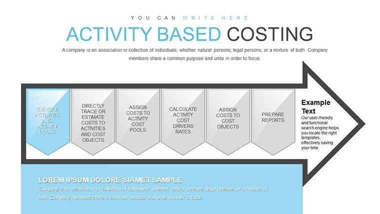
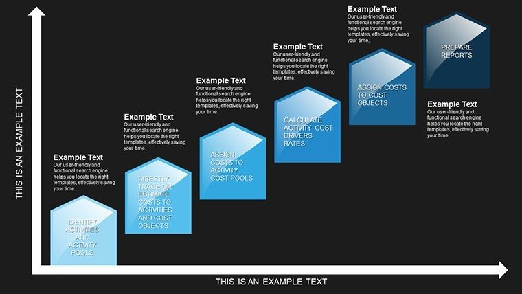
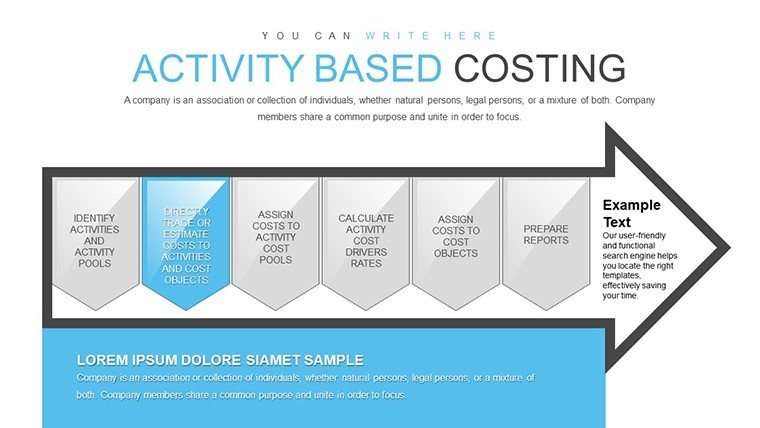
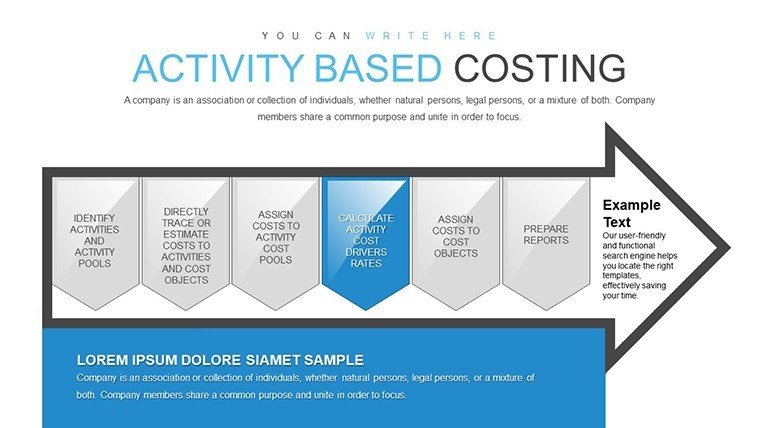
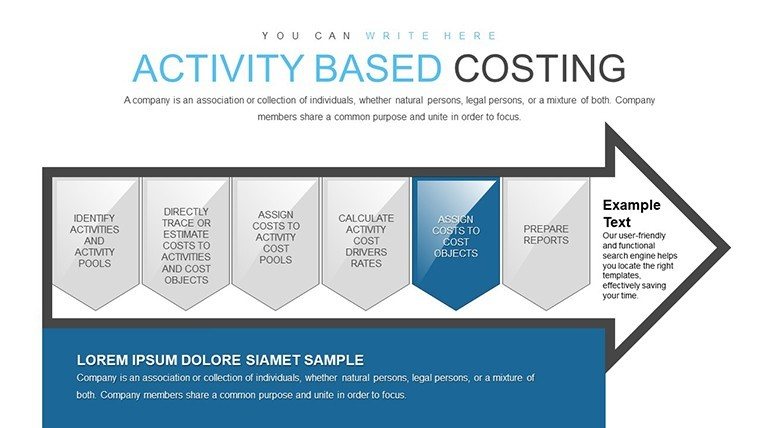
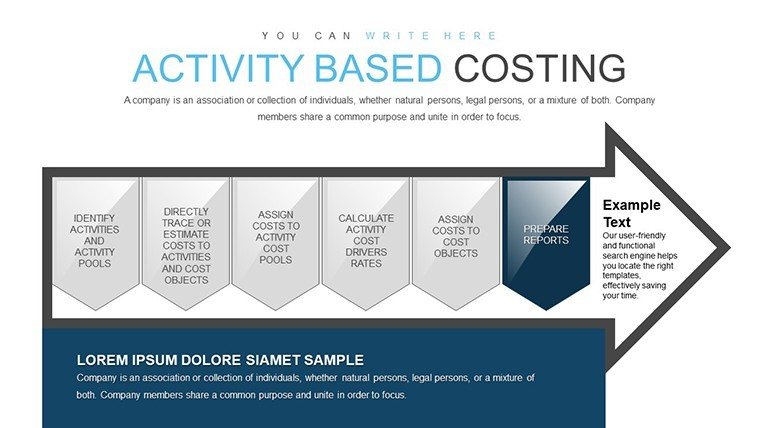
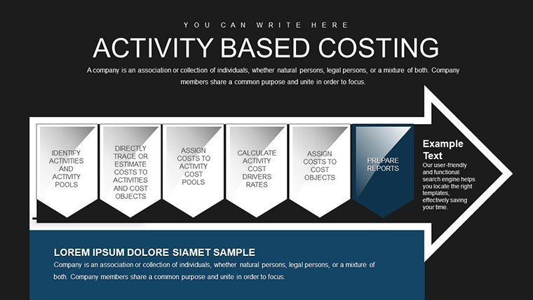
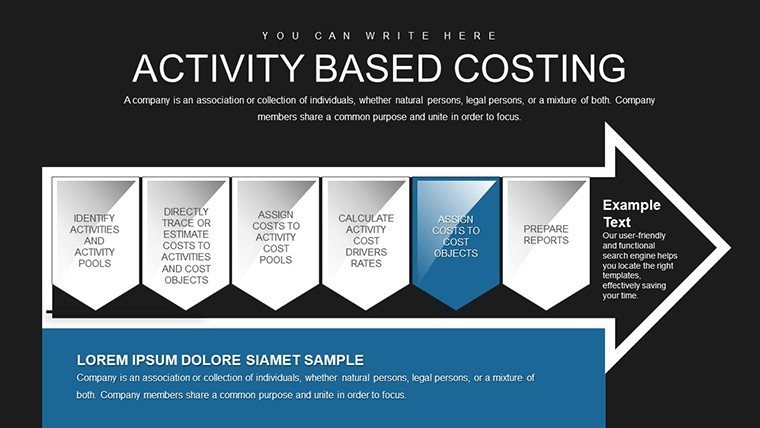
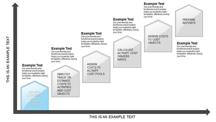
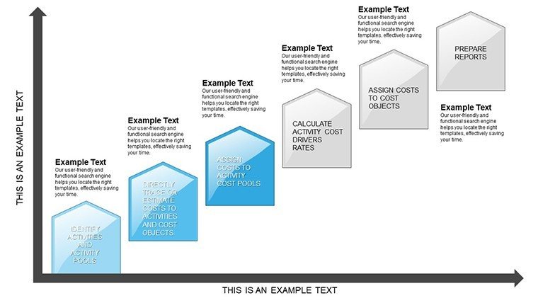
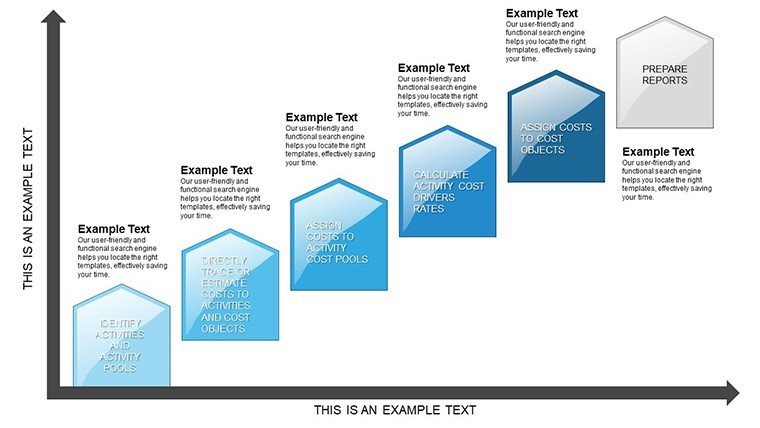
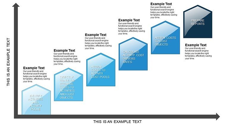
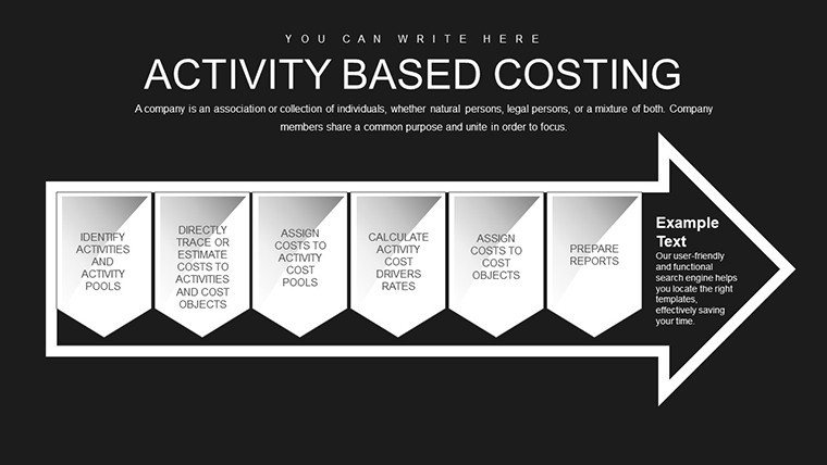
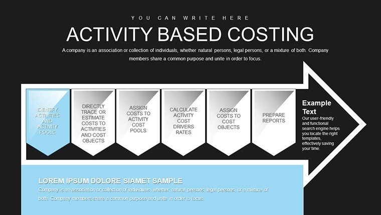
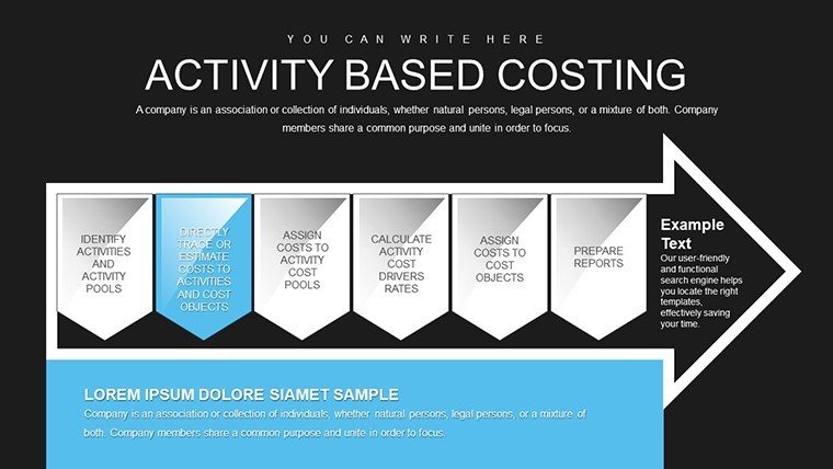
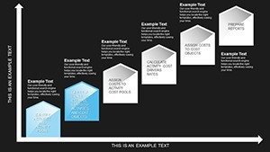
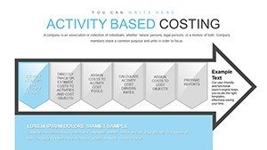
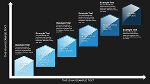
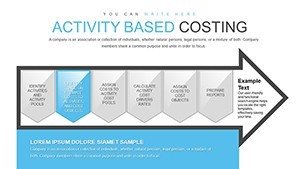
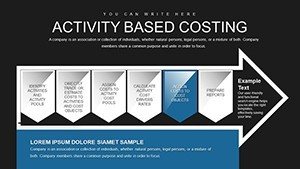
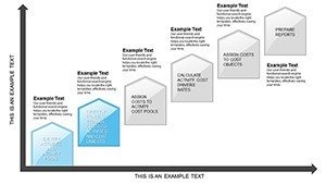
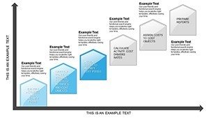
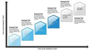
Navigating the intricacies of cost management requires tools that clarify rather than complicate. Our Activity-Based Costing Arrow PowerPoint Charts Template delivers exactly that, with 30 editable slides focused on arrow-based visuals for cost flows. Ideal for financial analysts and consultants, it demystifies ABC methodologies, turning dense data into directional insights. Whether tracing overhead allocations in manufacturing or service industries, these charts guide your audience through cost drivers with precision.
Beyond basic arrows, this template fosters strategic thinking. Fully compatible with PowerPoint and Google Slides, it allows for rapid customizations. In architecture, for instance, apply it to cost breakdowns of design phases, aligning with AIA budgeting standards to justify expenses clearly. The end goal: Presentations that not only explain costs but reveal opportunities for efficiency, positioning you as a trusted advisor in fiscal matters.
Essential Features for Cost Mastery
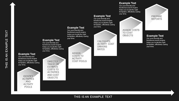
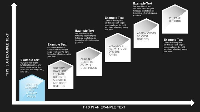
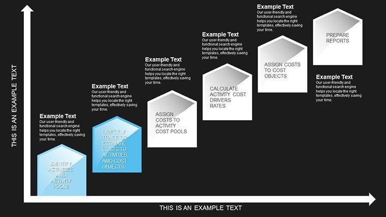
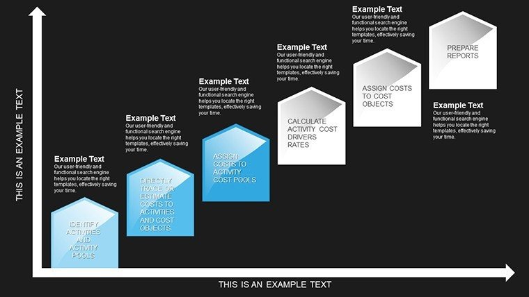
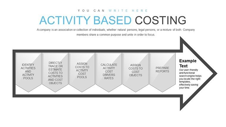
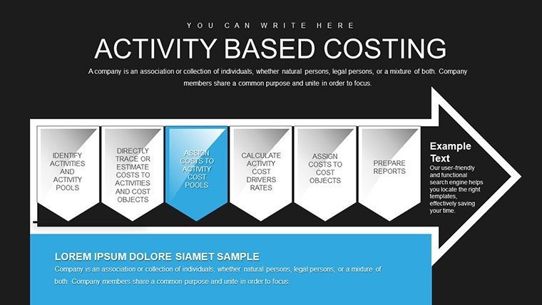
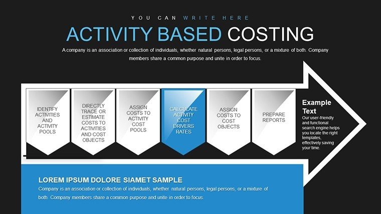
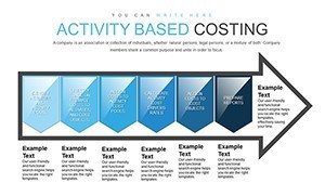
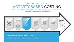
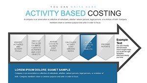
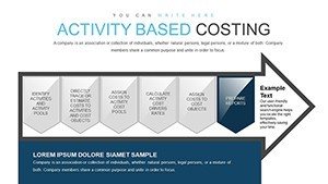
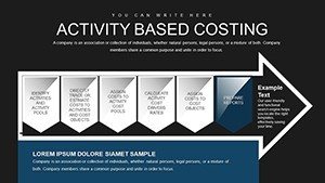
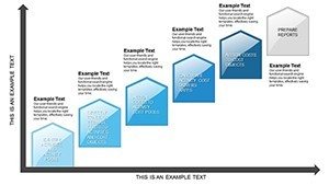
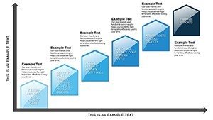
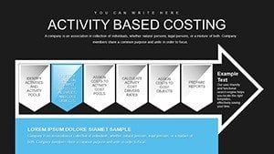
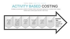
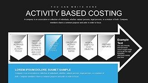
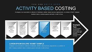
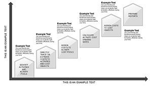
Within these 30 slides, find a spectrum of arrow configurations. Slide 3 could map simple cost paths, while slide 20 integrates multi-arrow networks for complex allocations. All are editable, from arrow thickness to label placements.
- Dynamic Arrows: Illustrate flows with adjustable directions and colors.
- Interactive Elements: Add clickable hotspots for deeper dives.
- Data-Driven: Link to spreadsheets for live updates.
- Financial Icons: Currency symbols and calculators enhance relevance.
Superior to standard tools, it includes branching arrows for scenario analysis, enabling what-if explorations that basic PowerPoint can't match.
Tailored Use Cases in Finance and Beyond
Consider a business consultant using these charts for a client audit. Slide 12's arrow diagram traces activity costs in an architectural project, highlighting overruns in material procurement per AIA reports, leading to renegotiated supplier terms. Corporate executives can visualize enterprise-wide efficiencies, reducing waste by pinpointing non-value activities.
The advantages are tangible: Faster insights mean quicker decisions, potentially saving thousands in operational costs. Real-world examples, like those from Harvard Business Review on ABC implementations, show ROI boosts of 20-30%.
Workflow for Effective Cost Presentations
- Secure the Template: Instant access upon purchase.
- Map Your Data: Identify activities and costs first.
- Build Arrows: Use placeholders to construct flows.
- Enhance with Details: Add annotations for clarity.
- Review and Refine: Simulate presentations for flow.
Pair with ERP systems for data import. Tip: In architecture costing, use red arrows for high-risk areas, drawing attention to potential budget pitfalls.
Pro Tips for Visual Cost Storytelling
Balance arrow density to avoid clutter - group related flows. Incorporate gradients for progression emphasis, inspired by data viz experts like Edward Tufte. A finance team adopted this approach, improving report comprehension by 40% in stakeholder meetings.
This builds an authoritative presence, backed by trustworthy methodologies.
Stand Out with Advanced Cost Tools
This template excels in specificity, offering ABC-focused arrows absent in generics. For compliance with standards like GAAP, it provides visual audits. Harness it to transform cost data into actionable intelligence.
Optimize your analyses - grab this template now and arrow your way to fiscal excellence.
Frequently Asked Questions
How do the arrow charts handle complex data?
With branching and layering, they manage multi-level allocations effortlessly.
Is it suitable for beginners in ABC?
Yes, intuitive designs make it accessible while scalable for experts.
Can I integrate with Excel?
Seamlessly - link charts to spreadsheets for dynamic updates.
What file formats are supported?
Primarily .pptx, with Google Slides compatibility.
Are there cost-saving examples included?
Slides offer templates for common scenarios, adaptable to your needs.