Flow Data Analysis PowerPoint Charts Template for Presentation


Type: PowerPoint Charts template
Category: Flow
Sources Available: .pptx
Product ID: PC00822
Template incl.: 20 editable slides
Data flows like a river - sometimes turbulent, always revealing. Our Flow Data Analysis PowerPoint Charts Template channels that energy into 20 editable slides, helping you navigate trends with finesse. From line graphs tracking metrics over time to bar charts comparing datasets, it's crafted for analysts and managers who need to present insights persuasively. This isn't mere visualization; it's a conduit for understanding, making complex flows accessible and actionable.
Adaptable to PowerPoint or Google Slides, the template shines in diverse scenarios. For urban planners in architecture, map data flows in traffic simulations, adhering to real-world models like those from the APA. The payoff: Audiences grasp patterns quickly, leading to informed discussions and smarter strategies, all while you save time on design.
Key Features Driving Data Flow
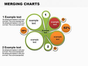
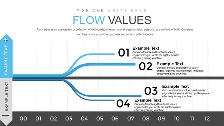
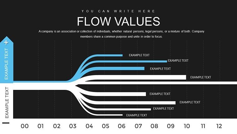
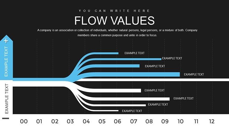
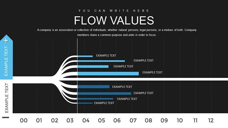
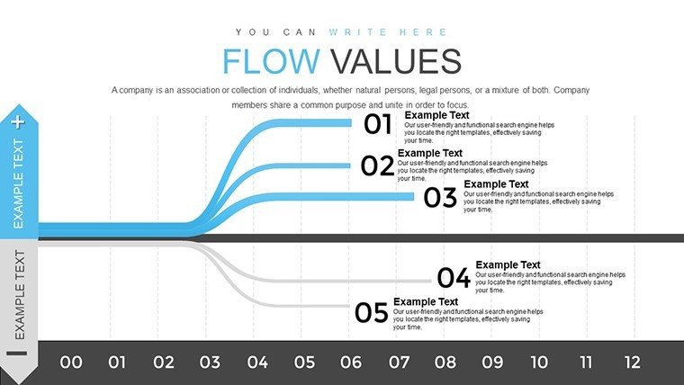
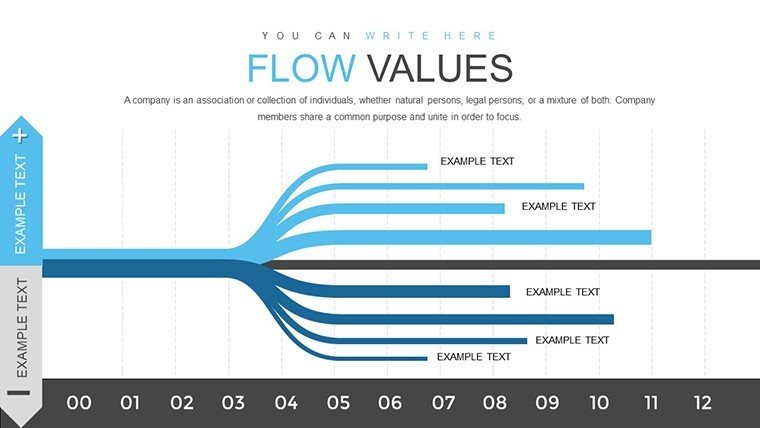
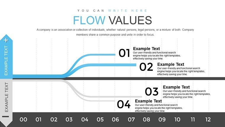
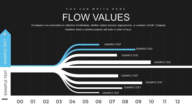
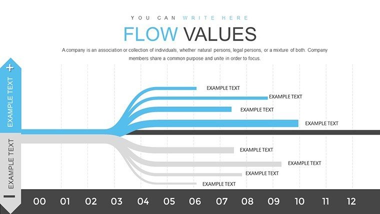
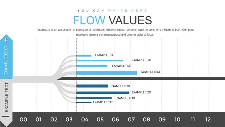
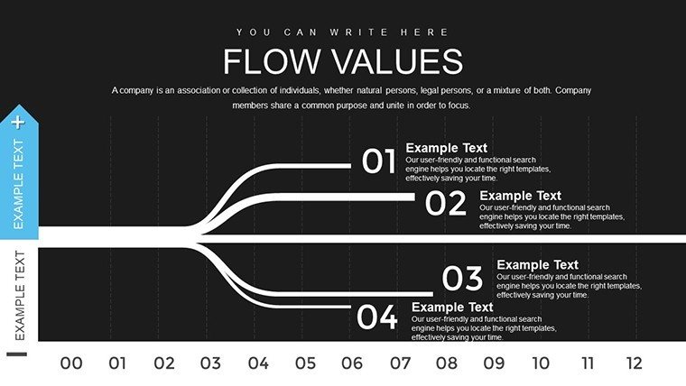
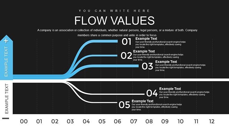
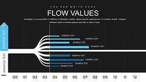
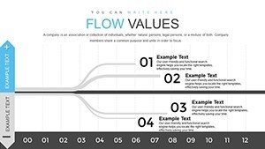
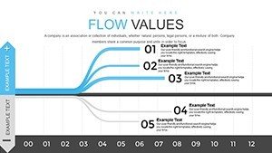
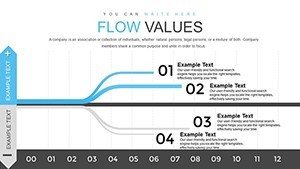
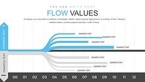
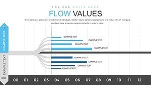
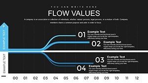
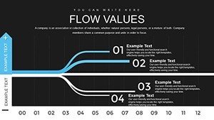
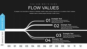
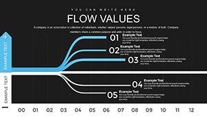
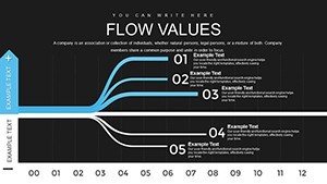
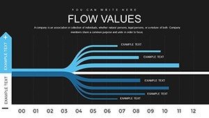
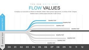
The 20 slides encompass varied layouts. Slide 4 focuses on flow diagrams, slide 18 on integrated bar-line combos. Everything's editable - colors, scales, labels - for precise tailoring.
- Range of Charts: Lines, bars, and hybrids for comprehensive analysis.
- Seamless Import: Pull data from sources like CSV files.
- Adaptive Themes: Match to your project's aesthetic.
- Annotation Tools: Highlight key flows with callouts.
Eclipsing basic options, it includes trend lines and error bars for statistical depth, elevating your analyses beyond the ordinary.
Applications That Streamline Insights
Imagine a project manager charting resource flows in an architectural build. Slide 7's flow chart reveals bottlenecks in supply chains, informed by case studies from firms like Gensler, optimizing timelines. Marketers track campaign data flows, adjusting tactics mid-stream for better engagement.
Benefits include heightened clarity - visuals aid 80% better recall per cognitive research. This template empowers data-driven narratives, fostering trust through transparent flows.
Guided Process for Flow Mastery
- Obtain and Launch: Download and open in your preferred app.
- Assess Data: Identify flows and patterns upfront.
- Construct Charts: Use templates to build visuals.
- Customize Further: Add legends or filters.
- Present Dynamically: Incorporate transitions for emphasis.
Sync with analytics tools like Tableau for enhanced flows. Tip: For architecture data, use blue tones for water-related flows, adding thematic relevance.
Tips to Enhance Data Narratives
Avoid overload by segmenting flows - use multi-slide progressions. Leverage storytelling arcs, as in Nancy Duarte's methods, to guide viewers through data journeys. An academic used this for research pitches, securing grants via compelling visuals.
This approach cements expertise and reliability in your field.
Why This Flow Template Flows Best
Its emphasis on flow-specific designs sets it apart, ideal for sequential data. In standards like those from IEEE for data viz, it aligns perfectly. Use it to make your data not just seen, but understood.
Channel your data effectively - download this template today and let insights flow freely.
Frequently Asked Questions
What data types suit flow charts best?
Time-series and process data excel here.
Is collaboration supported?
Yes, through shared editing in Google Slides.
Can I export to other formats?
Easily to PDF or images for reports.
Are advanced stats included?
Trend lines and basics; extend with add-ons.
How secure is the template?
Fully, with no external dependencies.
Any tutorials for beginners?
Our site offers quick-start guides.