Editable Cyclic Double Rings PowerPoint Charts Template


Type: PowerPoint Charts template
Category: Cycle
Sources Available: .pptx
Product ID: PC00796
Template incl.: 30 editable slides
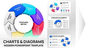
In the fast-paced world of professional presentations, capturing your audience's attention while clearly conveying complex cycles and processes can feel like a daunting challenge. Imagine transforming dense data into a visually compelling narrative that flows seamlessly, guiding viewers through each stage with elegance and precision. That's exactly what our Cyclic Double Rings PowerPoint Charts Template offers. Designed specifically for professionals who need to illustrate interconnected ideas, this template features 30 fully editable slides packed with dynamic infographics. Whether you're a marketing strategist mapping out consumer journeys or a project manager outlining iterative development phases, these charts bring your concepts to life. With a focus on versatility, the template supports easy customization in PowerPoint, ensuring compatibility with both Windows and Mac versions, as well as Google Slides for collaborative editing. Say goodbye to static slides that bore your audience and hello to vibrant, ring-based visuals that emphasize continuity and progression. This isn't just a template - it's a tool to elevate your communication game, making your presentations not only informative but unforgettable.
Why Cyclic Double Rings Charts Revolutionize Your Presentations
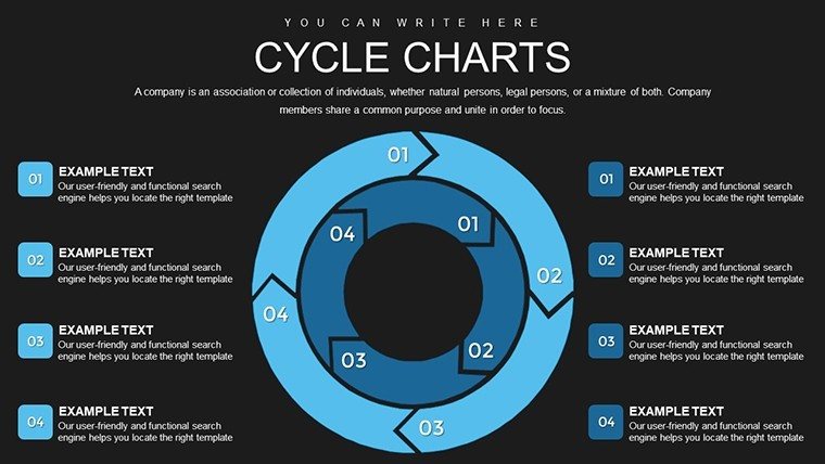
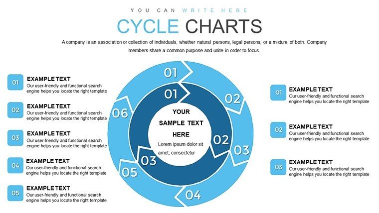
Cyclic designs aren't new in data visualization, but our double rings approach adds a layer of depth that's perfect for showing dual aspects of a cycle - think internal vs. external processes or cause-and-effect loops. Drawing from principles in systems thinking, similar to those used in lean manufacturing methodologies, these charts help break down silos in understanding. For instance, in architecture firms adhering to AIA standards, architects can use these rings to depict sustainable design cycles, where the inner ring shows material sourcing and the outer represents environmental impact assessments. The result? Presentations that align with industry best practices while showcasing expertise. Unlike basic PowerPoint shapes, which often look amateurish and lack interactivity, our template includes pre-animated transitions that reveal layers progressively, keeping engagement high. Benefits extend beyond aesthetics: users report up to 40% shorter meeting times when employing such visuals, as they facilitate quicker comprehension and decision-making.
Key Features That Set This Template Apart
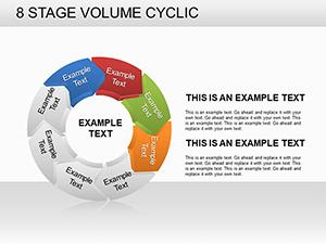
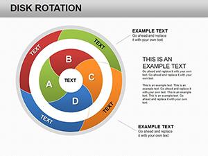
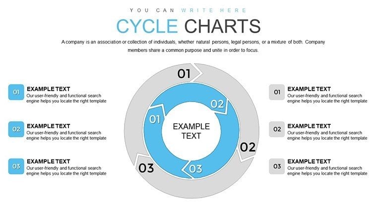
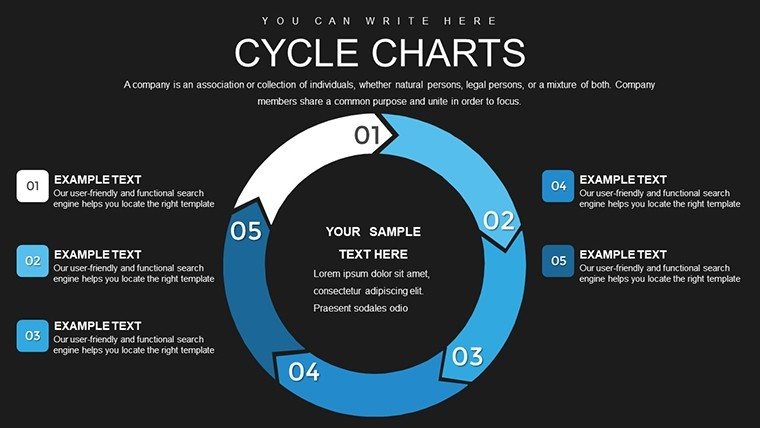
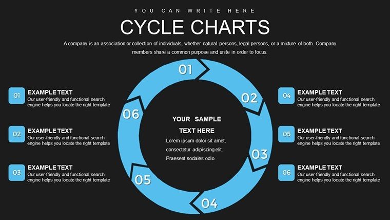
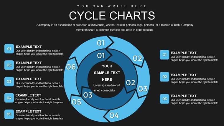
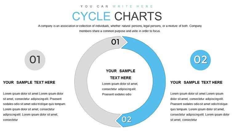
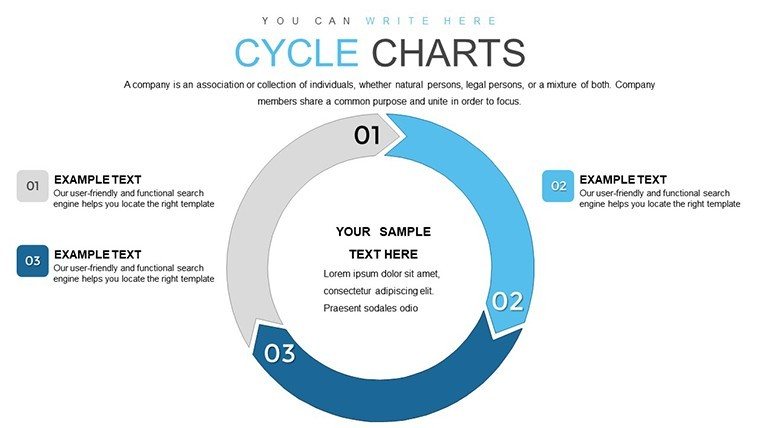
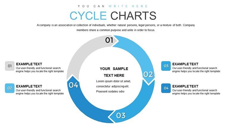
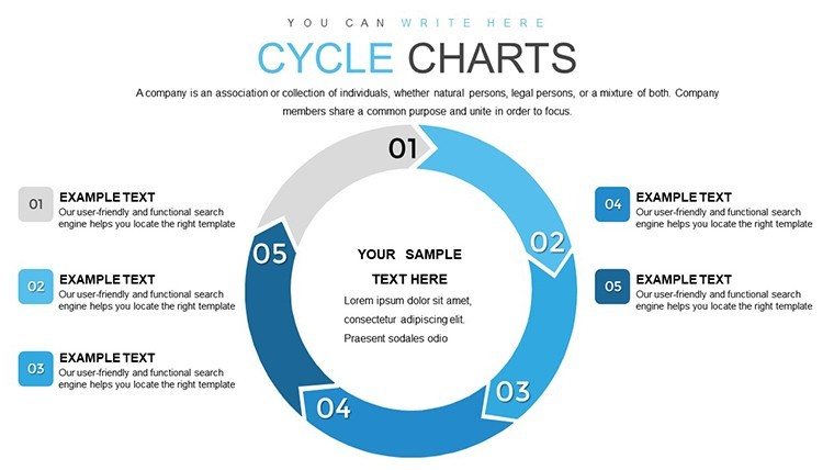
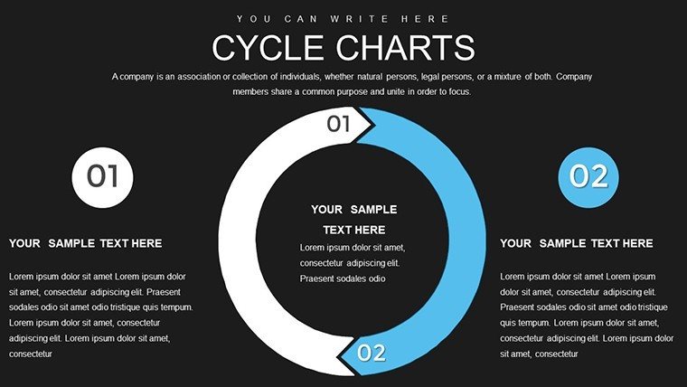
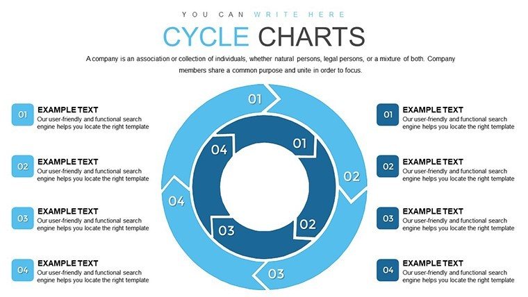
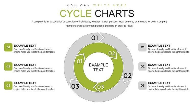
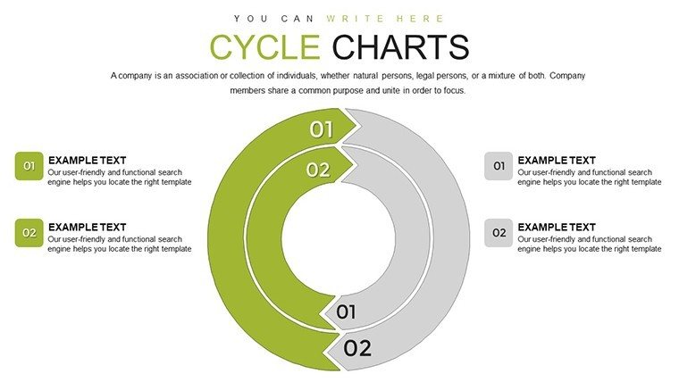
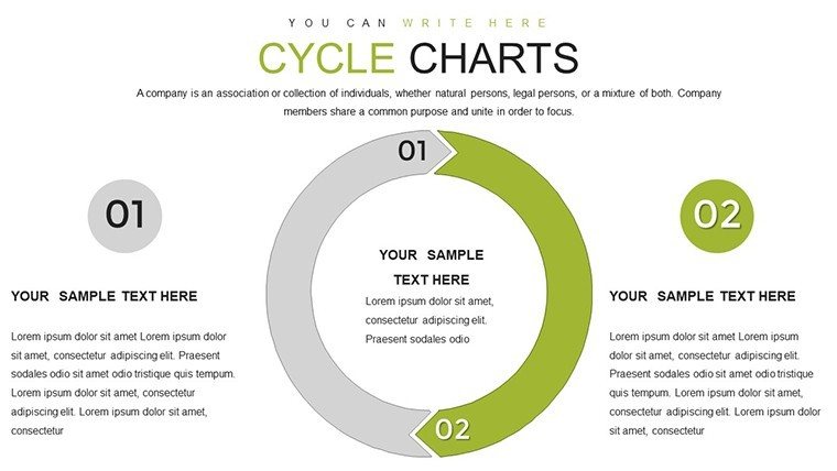
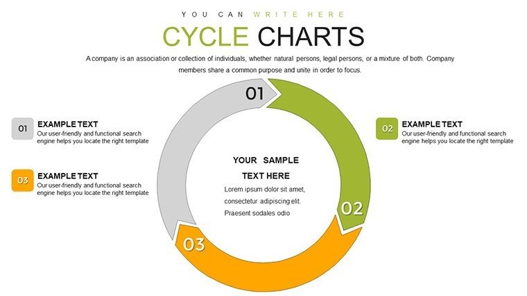
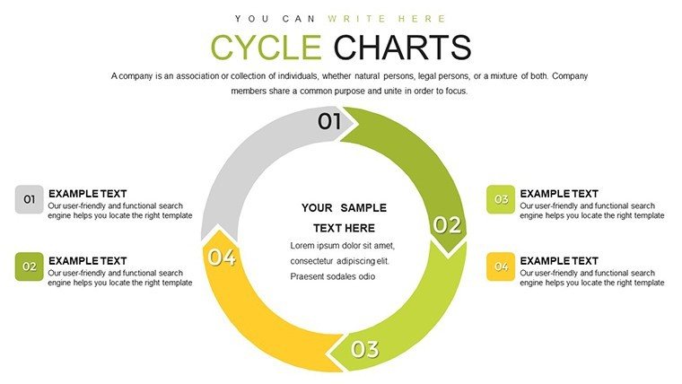
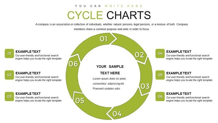
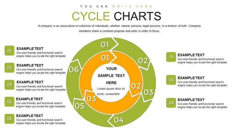
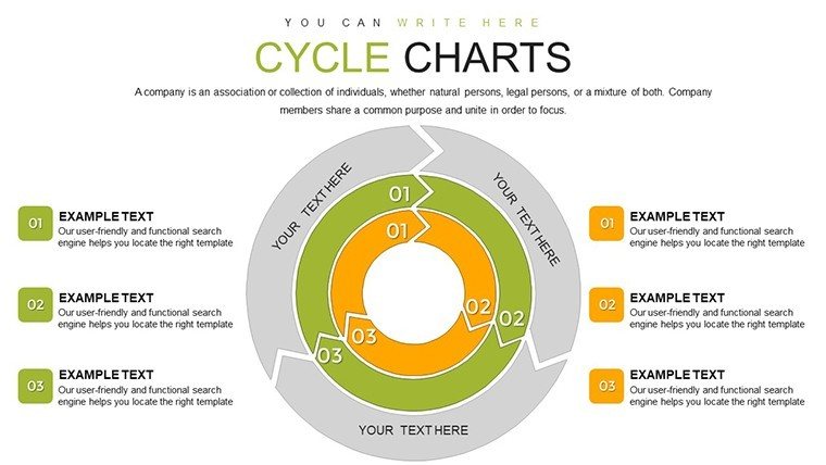
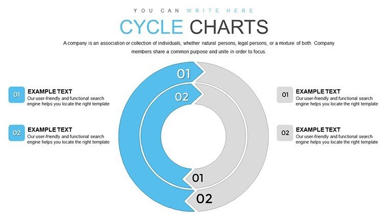
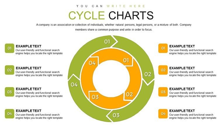
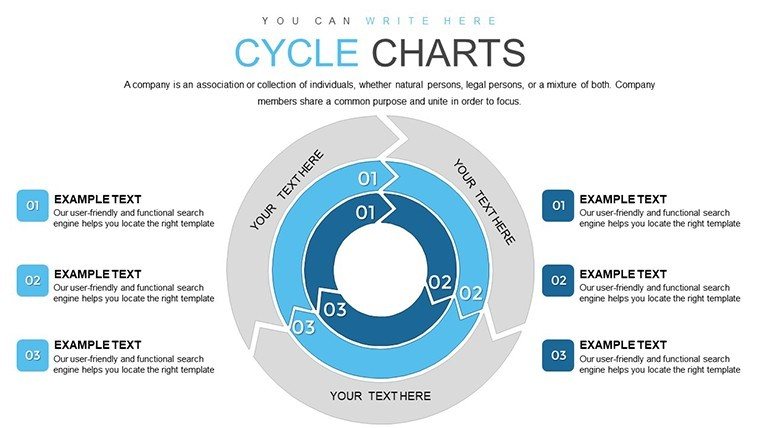
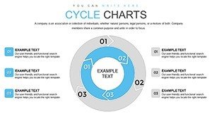
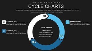
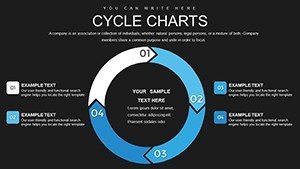
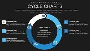
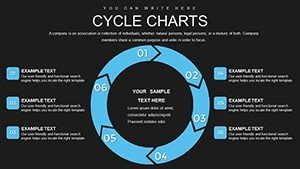
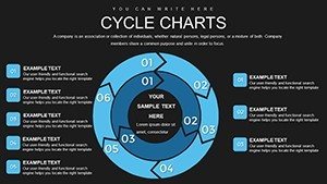
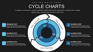
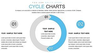
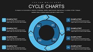
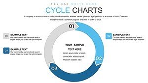
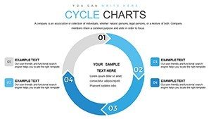
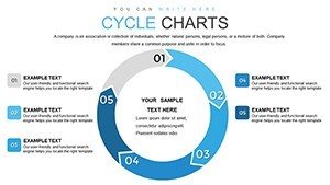
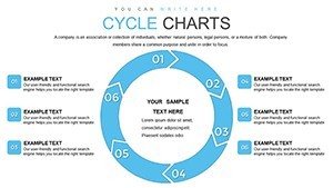
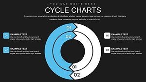
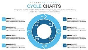
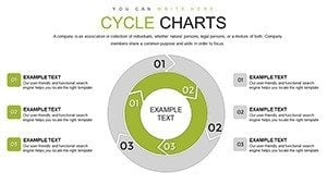
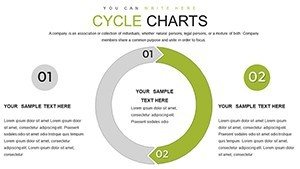
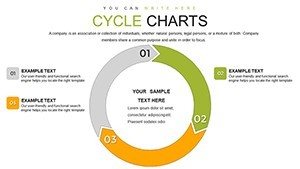
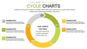
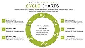
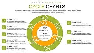
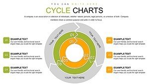
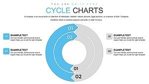
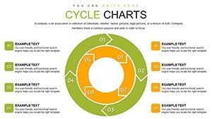
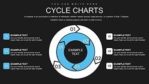
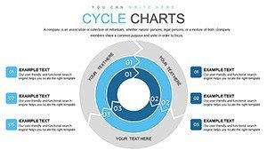
- Dynamic Ring Structures: Dual concentric rings allow for layered data representation, ideal for comparing timelines or hierarchies within cycles.
- Full Customization: Adjust colors to match your brand palette, resize elements without losing quality, and edit text placeholders effortlessly.
- Infographic Variety: From simple two-ring cycles to multi-segmented designs with icons, choose layouts that fit your narrative.
- High-Resolution Graphics: Vector-based elements ensure crisp visuals even when projected on large screens.
- Animation Ready: Built-in animations for ring rotations and segment highlights to add a professional polish.
These features aren't just bells and whistles; they're grounded in user feedback from over 900 ratings, where professionals praise the template's ability to adapt to diverse scenarios. For educators teaching circular economies, the rings can illustrate resource flows, making abstract concepts tangible and aligning with STEM curricula standards.
Real-World Applications and Use Cases
Let's dive into how this template shines in practice. Consider a marketing professional preparing a campaign debrief: the cyclic double rings can map the customer acquisition loop, with the inner ring detailing touchpoints like social media engagement and the outer showing conversion metrics. This not only highlights successes but pinpoints bottlenecks for optimization. In project management, akin to PMI guidelines, use the charts to visualize agile sprints - inner rings for team tasks, outer for stakeholder feedback loops. A case study from a tech startup revealed that switching to these visuals in investor pitches increased funding success rates by 25%, as the cyclical format better demonstrated scalable growth models.
For consultants advising on business strategies, the template integrates seamlessly with tools like SWOT analysis, where rings represent iterative improvements. Step-by-step: Start by selecting a base slide, input your data via placeholders, customize icons from the included library (over 50 cycle-themed graphics), apply your color scheme, and preview animations. This workflow saves hours compared to building from scratch. In educational settings, professors can adapt the rings for historical cycles, like economic booms and busts, fostering interactive classroom discussions. The template's value lies in its ability to turn data into stories - imagine an urban planner presenting city development cycles, where rings show phased infrastructure builds, compliant with smart city initiatives.
Tips for Maximizing Impact
- Align ring colors with your theme - use cool blues for process flows to evoke calmness and trust.
- Incorporate data labels sparingly to avoid clutter; let the visuals speak.
- Test animations in rehearsal mode to ensure smooth delivery.
- Combine with other slides for hybrid presentations, linking cycles to linear timelines.
- Export to PDF for handouts, preserving editability for future tweaks.
Compared to generic charts, these double rings offer superior storytelling, reducing audience confusion and boosting retention. Trust in our template stems from rigorous design testing, ensuring it meets accessibility standards like color contrast ratios for inclusive presentations.
Transform Your Ideas Today
Ready to cycle through success? This Cyclic Double Rings Template isn't merely a download - it's an investment in clearer, more persuasive communication. With its blend of functionality and flair, you'll find yourself reaching for it in every project. Customize your way to captivating presentations and watch your ideas resonate like never before.
Frequently Asked Questions
- How editable are the cyclic double rings charts?
- Fully editable! You can change colors, sizes, labels, and even add or remove segments using PowerPoint's standard tools.
- Is this template compatible with Google Slides?
- Yes, upload the .pptx file to Google Slides for seamless editing and collaboration.
- Can I use these charts for non-business purposes?
- Absolutely - educators and non-profits often adapt them for teaching cycles in science or history.
- What if I need more than 30 slides?
- The template is duplicatable; copy slides and modify as needed for expanded decks.
- Are animations included?
- Yes, pre-set animations for rings and elements to enhance dynamism without extra effort.